dgrammatiko
commented
6 years ago
dgrammatiko
commented
6 years ago A possibility could be to add a double angle icon left and right to switch through the tabs in the moment they would break.
New tabs will never break (theoretically because ycfs), as if the viewport gets narrower they collapse to accordion
My question here will be:
Why tabs? It's a known antipattern for forms (we should never hide form elements)
 coolcat-creations
 brianteeman
 mbabker
 ciar4n
 micker
So this is the proposal for the Article Edit View.
Just in this view the tabs are at the bottom, the focus should be at the contents and many tabs can follow with custom fields so it's good to think affront how to add more tabs then the viewport is able to show in a row. A possibility could be to add a double angle icon left and right to switch through the tabs in the moment they would break.
Also attached a mobile example.
Any ideas are welcome and i can provide the sketch file for those that want to contribute to the design.
1) Create Article
2) Save Actions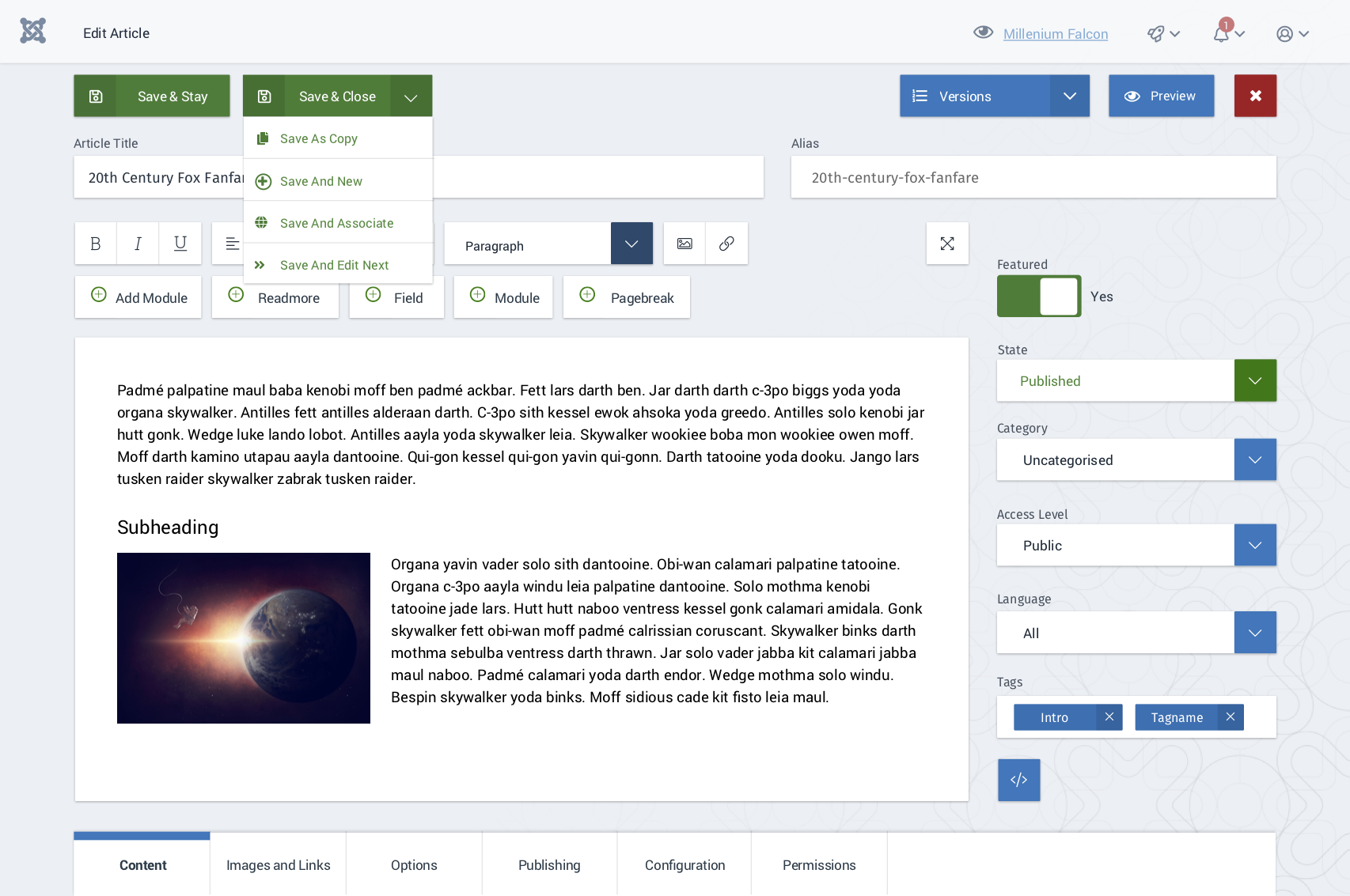
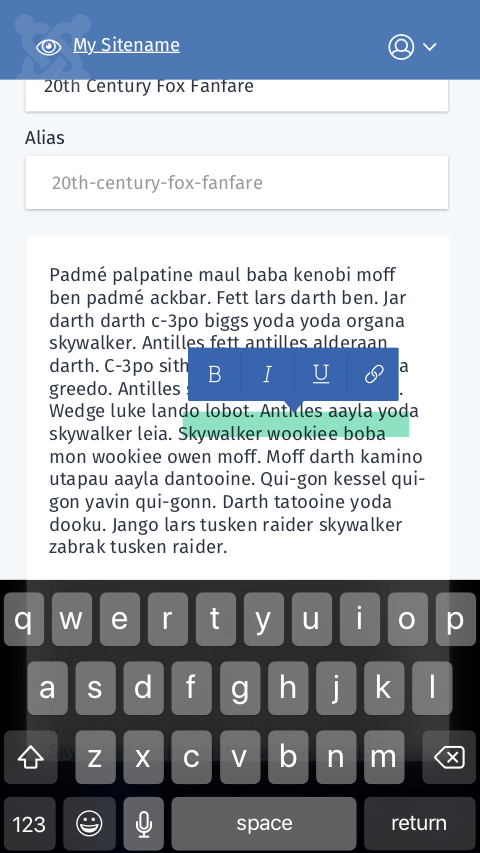
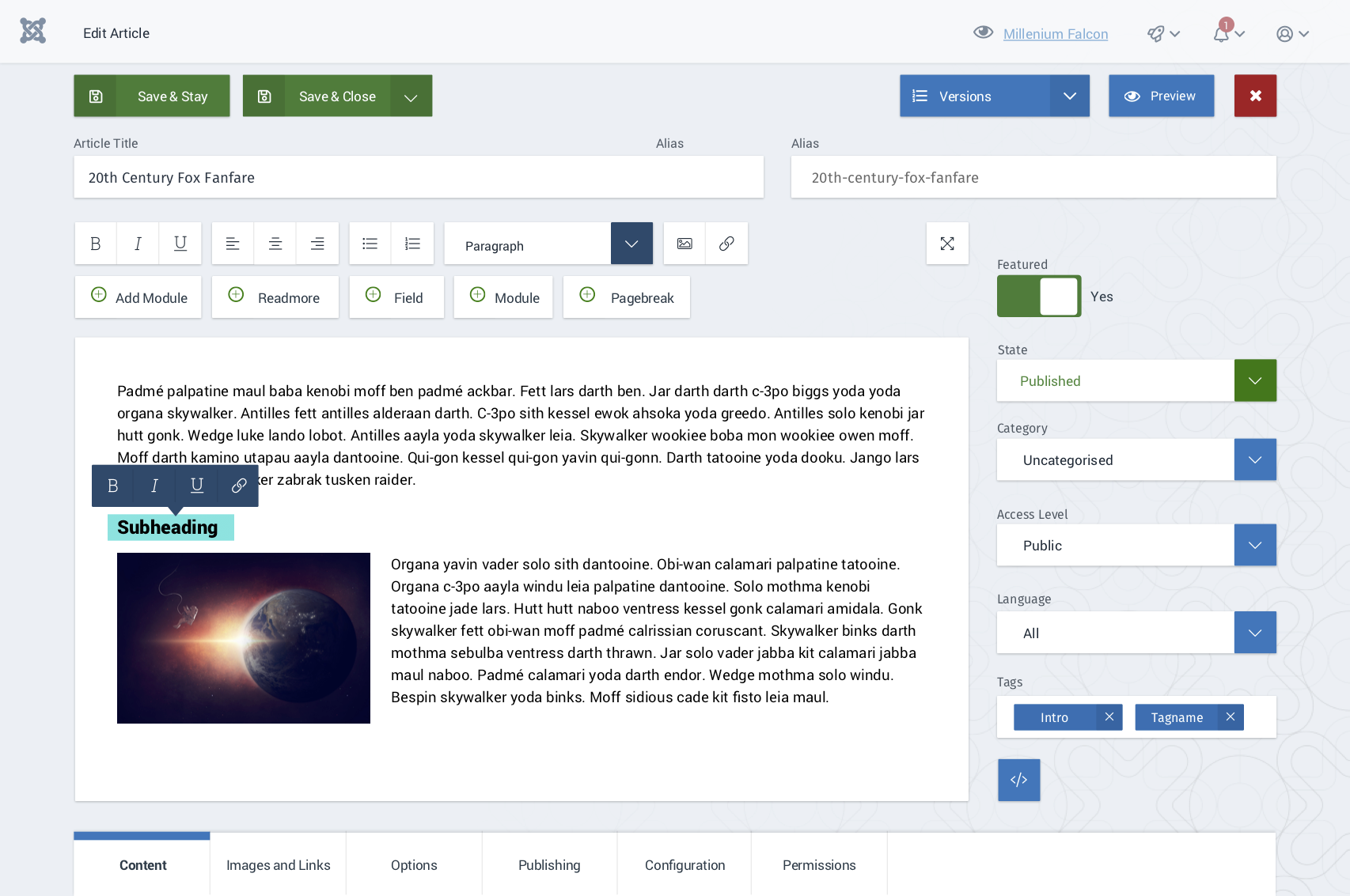
3) Inline Editing
4) Image Inline Editing and contextual change of the Editor Buttons
5) Example for the images and Links Tab
6) Saved Dialog inside the input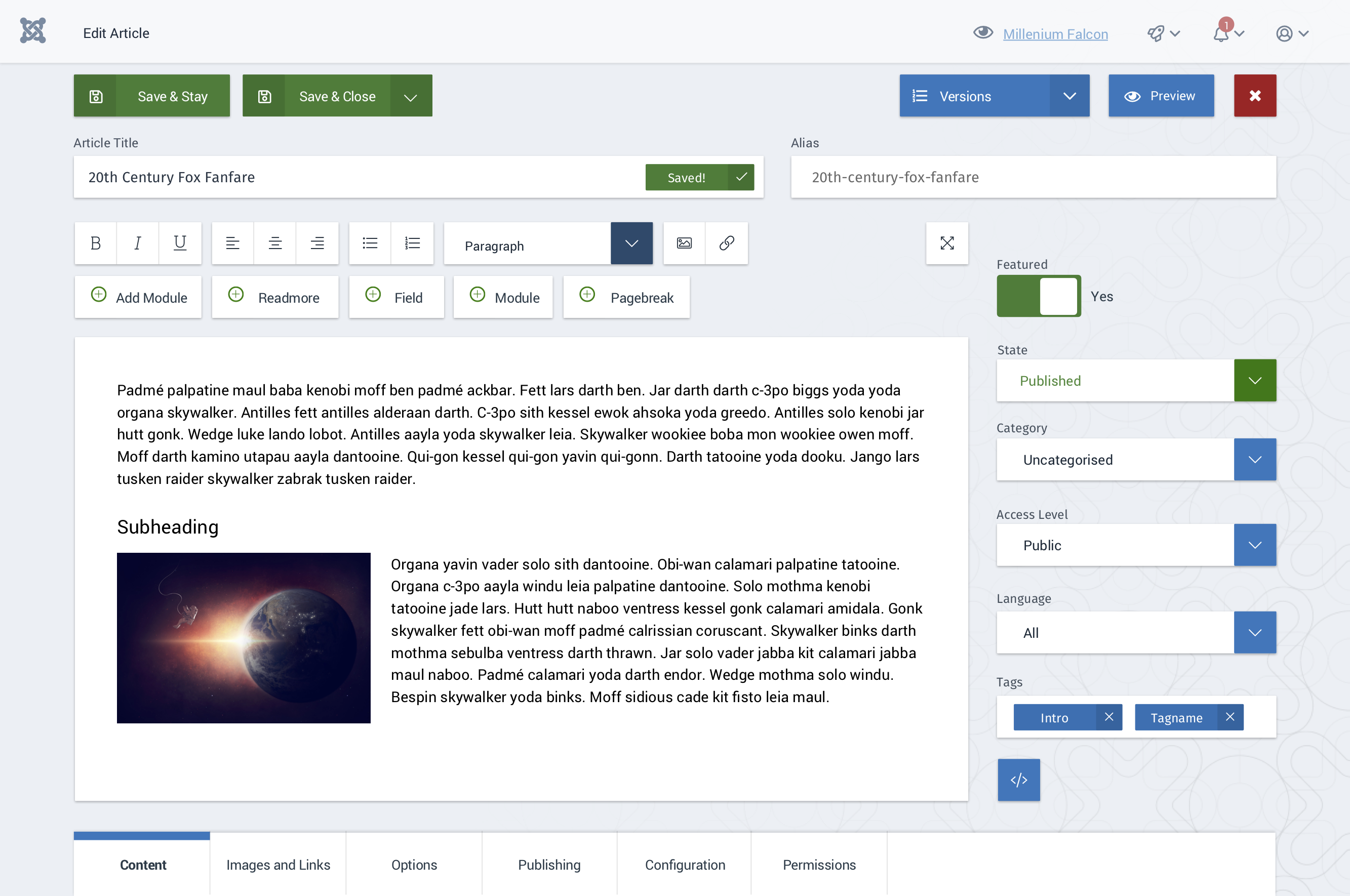
7) Mobile Example (Icons not correct right now)