 Sandra97
commented
5 years ago
Sandra97
commented
5 years ago @Joomv Could you please answer Anibal? It's nearly a five month old question
Closed anibalsanchez closed 4 years ago
Sandra97
commented
5 years ago @Joomv Could you please answer Anibal? It's nearly a five month old question
 conconnl
commented
4 years ago
conconnl
commented
4 years ago @Joomv can we take care of this?
conconnl
commented
4 years ago The Sponsor now button is part of the donation system itself. It just links to a general form where everybody can choose an amount.
If you have any good idea, prepared display, css and/or others things which are needed we can maybe add additional buttons at the top.
 anibalsanchez
commented
4 years ago
anibalsanchez
commented
4 years ago Sure, let me know how I can change the lead paragraph.
This code could do the trick:
<p class="text-center"> <a class="btn" href="https://www.joomla.org/sponsor.html">Sponsor $10</a> <a class="btn" href="https://www.joomla.org/sponsor.html">Sponsor $50</a> <a class="btn btn-primary btn-success" href="https://www.joomla.org/sponsor.html">Sponsor $100</a> <a class="btn" href="https://www.joomla.org/sponsor.html">Sponsor $250</a</p>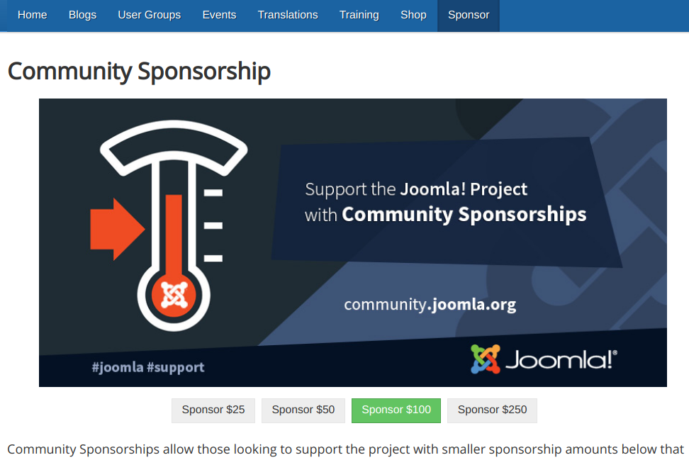
conconnl
commented
4 years ago Will this not confuse people.... When they click on one of the buttons, they will not get to the form where the amount is selected?
anibalsanchez
commented
4 years ago The buttons capture in a glimpse the intention to purchase. The buttons also show the most common popular choices and the recommended option.
Once the user clicks, then, yes, we must continue accordingly and prefill the amount. If it can't be done, then it is not so convenient. But, at least, the user is already engaged and motivated to continue with the process.
In the target link (https://community.joomla.org/community-2017.html), it seems there is no way to prefill the values, so a new snippet of code would be needed. We would have to add a parameter and add an override to the current form:
https://community.joomla.org/community-2017.html?amount=25Thanks :D This works https://community.joomla.org/community-2017.html?rd_amount=25 Can you test as well?
anibalsanchez
commented
4 years ago Confirmed,
The buttons can be associated with the proper amount.
conconnl
commented
4 years ago @Sandra97 can you say something about the layout? Any we need to change for the buttons..... Should they have colors or not, just one, 2 or all of them.
Please share your specialism. https://community.joomla.org/sponsorship-campaigns.html
Sandra97
commented
4 years ago We are used to have buttons in different colours, so it seems ok for me to have one different colour per button. I would not use the grey one, because it's a bit dull, making the button less visible than the others. You can have green / orange / red / blue buttons.
If you don't want 4 different colours, no issue, but in that case, I would use just one colour
conconnl
commented
4 years ago I hope I understood you correctly. Can you check again?
Sandra97
commented
4 years ago Yes, it's all good now. Thanks.
conconnl
commented
4 years ago Thank you both!
anibalsanchez
commented
4 years ago The original objective is completed.
However, there is one more twist. When I assigned the colours (remember that I'm colour-blind) in the previous screenshot, I featured the "most popular" option following the pattern to guide the user choice to $100.
Now, the buttons have all different colours so, as a user, I don't know what button click on. Ideally, it would be better if one button is featured. Of course, people can still choose any of the other alternatives.
@Sandra97 Please, could you adjust the colours to make them appealing and at the same time feature the main choice?
anibalsanchez
commented
4 years ago 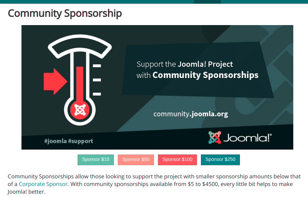
conconnl
commented
4 years ago @Sandra97 kind reminder. Can you respond on @anibalsanchez his last question?
Sandra97
commented
4 years ago I'm not a big fan of highlighting just one button. In fact, I'm not a fan of these 4 buttons, I don't agree with the 4 amounts selected, as they don't reflect the range of amounts you can donate (from $5 to $4 500) and it can make people think at 1st sight it's the only possible amounts (don't forget people don't read). If you really want a button there, I would just make a big one with Sponsor from $5 to $4 500.
conconnl
commented
4 years ago To bad that this wasn't your first respond, now I spend unnecessary time to solve other peoples issues. I hope you can still make the right proposal and supply the code, you are the specialist. I'm just clicking the buttons on request
Sandra97
commented
4 years ago Keep it simple:
<div class="center"><a class="btn btn-success btn-large" href="community-2017.html" title="Sponsor Joomla">SPONSOR FROM S5 TO $4,500</a></div>
It wasn't my first answer simply because I've been asked only about the colors/layout.
 brianteeman
commented
4 years ago
brianteeman
commented
4 years ago It is considered good practice from research in the non profit world to have suggested amounts and that one of them should be highlighted. That should not be the lowest or highest amount.
conconnl
commented
4 years ago If you all get to an agreement, I will copy the code and put it on the website. I don't have any opinion nor knowledge about these kind of buttons.
anibalsanchez
commented
4 years ago I concur with @brianteeman
The only improvement left is the simplification of colours to feature one button, $100.
I can't recommend the colours to choose from. So, it is better if @Sandra97 does it.
 mbabker
commented
4 years ago
mbabker
commented
4 years ago Since we all know what opinions are like, and since I'm generally considered the king of them, here's my opinion.
Have two primary CTAs; one with a suggested dollar amount for individuals, and one with a suggested dollar amount for organizations/businesses/whatnot. Then have a secondary CTA without a dollar amount. You don't need 5 buttons linking to the same page with a single field pre-filled at a specific value, and to me this applies the KISS principle while still giving the best of both worlds (having a suggested value and having a "just let me choose" type of button).
Leave the primary CTAs where the buttons are at now. Place the secondary CTA under the "If you have any questions..." sentence underneath the boxes.
(Also, while we're here critiquing that page, can someone remove the bullet points from the boxes and make them equal height; the latter should be possible if someone uses flexbox there or a bit of JavaScript, look here for an example that was used for the Framework website before switching to CSS Grid)
conconnl
commented
4 years ago (Also, while we're here critiquing that page, can someone remove the bullet points from the boxes and make them equal height; )
I changed 2 CSS values for you, they should now have the same size and no bullets
mbabker
commented
4 years ago A couple more critiques since I've derailed things.
1) Why does the card body need to be in a <ul>? Switch it to a <div> with some padding and it looks much better.
2) Change "Above $3,000" to "Over $3,000" so you don't get the word wrapping effect it has now.
Screenshot has the page with the edits I suggested and the browser console for reference, third card is the one I edited.

conconnl
commented
4 years ago I don't know, someone built this whole stuff. With an very big extension, with overrides and modules.
I'm just copying things this group ask and I'm not going to think about it and share my opinion about the page, I'm just helping by being the copy/paste slave.
conconnl
commented
4 years ago @mbabker I copied the things you wrote. It should now be as you wanted.
https://github.com/joomla/community.joomla.org/commit/52042ce0ad24ed344b92089b88a6306e911594ec
conconnl
commented
4 years ago As all proposed changes where performed and no new messages were added after 3 months. The issue seems to be solved. Closing an locking topic.
Hi,
From JED, we are linking the Sponsor Us page. https://community.joomla.org/sponsorship-campaigns.html
I'm finding that it is difficult to understand what to do to sponsor Joomla. The page is only in English, so people have to read and understand what to do.
There is no immediate Call to Action Above The Fold
The first level of buttons shows big numbers in the order of thousands UP TO $1,000 ... ABOVE $3,000
Since the latest payments have been in the order of $5 - $100, could move the Sponsor Now! button to the top of the page? Or, better if you define 3 buttons at the top of the page with three amounts from $25 up to $100.