@k-syusteem This logo is so cute. And it also has the 70s / 80s disco vibe I like.
Closed foways closed 5 years ago
@k-syusteem This logo is so cute. And it also has the 70s / 80s disco vibe I like.
Now I have to make more shirts 😱
Maybe we can use this thread to propose more logo ideas!
And I order 1 T-shirt from you @mrozbarry :100:
Hi @jorgebucaran Are there any other suggestions on logo concept for this project?
@k-syusteem Not at the moment, but hopefully there will be. So, why did you want to change the logo? Could you point out how this new logo is better from a designer's perspective?
Hi @jorgebucaran I will explain it through the visual image below:


I think people will get to know this logo better than "Hyper App"
The new one evokes more fun and approachable feelings to me than the griddy old one (and as he explained, looks more like "h" and "a" to me).
Some thoughts.
Logos should be relatively simple and look good at a very small size
Simple shapes are most recognisable and iconic (Apple's apple, React's atom, Facebook's text or F, Google's text or G)
An icon + hyperapp text is usually a good combo for a logo, as the icon can be used independently at times
Hyperapp's core values are a functional programming approach to building apps + functional purity but with a pragmatic approach to side effects
"Purity" is represented by a diamond or a droplet usually

h and a. The green thing in the center could mean it's containimated with side effects but still mostly pure. 🤣  My drawing here 😆
Exceptionally @atomiks, I really enjoy the inputs rather than you. @jorgebucaran Can! and I can give you some other variations!
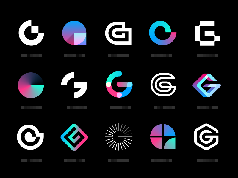
Hi @jorgebucaran! Following these are some new variations, and I also designed some versions as suggested by @atomiks.


@k-syusteem Wow, but what talent. Incredible work! 👏
The abstract one (4) is pretty cool.
Could we keep trying? What do other people think? Hmm, I think we could also experiment with the original logo idea which was nothing else but a hypercube. One more thing, the idea that the logo must stand as an ideogram of an h and a is not set in stone either.
As for the hypercube, something like this? 🤔

h y p e r c u b e
number 4 looks super clean. IMO it is much more appealing to the eye than the rough edges of the hypercube

This is a cube version like your hint "hypercube". What is your opinion?


i don't think anyone would be able to tell that's an "a" lmao
They looks like a maze. And a maze seem far from the idea of easy to reason about.
But the first logo my eyes went to is the (2).
I think for Hyperapp it makes more sense for the logo to have angular (not the Google kind) edges instead of smooth curves. Feels more like cutting-edge technology and less like a trendy brand of clothing.
I wish we had a logo that looked kinda like NASA, but I know that wouldn't really work haha.
We should list some keywords around Hyperapp to found the matching shape. Lets start with the words given in this issue : Functionnal, purity, ease, ligthweight, cutting-edge, Elm.
To be honest, since you (@jorgebucaran) showed it to us, I am pretty in love about the Dynamicron logotype
Special mention to the use of the same called Sony Dynamicron VHS color palette

We need something with easy shapes like this.
So let's talk about pixels. Pixels are the smalest units : 1x1 (1KB). They are simple, and somehow pure (and idempotent most of the time) ((R, G, B) => color). They are easy to reason about, one pixel have one and only one state. But they are powerfull because Pixels can be composed all together to make something incredible (Art, beauty, science, product). Also, if only one pixel is mutated, a brand new image is resulted (immutability).
So I would love to see a shape in a pixel art style.
Oh, Dynamicron, I love it too.
Well, I'll try!
@jorgebucaran, Do you have a discord or something?
There are a badge Join us on Slack in README:
Ok, thank you @Swizz and big thank to @frenzzy !


Here's my entry in proposal for the new hyperapp logo. P.s ( I'm a big fan of the old logo too and most of the new logos on this page!)
I was able to base this logo on the following criteria:
• Since Hyperapp follows the Elm architecture, hence the colors.
• Hyperapp promotes pure components, which is why the main logo structure comes from carbon chains components of organic compounds. 😎🙏
Feedback and changes are very much appreciated guys. I'm also making more samples to increase the variations.
Thank you!
Might I suggest
Purple Hot Pink (some kind of vibrant pink) Cyan (or the same blue we have now)
(cyberpunk colors pretty much)
Just a thought 😄
Much older logo (as well as modified for fun by @jorgebucaran), but I really liked the idea of this color scheme

With this logo would be cool:

Hello guys, thanks so much for your feedbacks, I managed to rebrand the original concepts to these:


My aim was something fluid, new and components based. I'm still making several iterations and research to see if these can be improved.
• The first one is based on pure components and hyperapp original color.
• The second is based on suggestions from comments I've read on this issue (phew! You guys are awesome 💥).
More feedback and comments are welcome 🙏😎

Wow I love this one:

Here is some color inspiration:

Thanks @atomiks I'll try out these too. They're cool 😎
Here is my Favourite one so far

Heyy! This thread looks awesome :tada:
But please stop the hexagon trend ;d I liked the droplet style. What about some droplet and 3 cubes in it? As about the text, original suggestions by the author are good.
True @olstenlarck
Being a designer/developer I've come across so many hexagon logo types, they're trends.😂
But again, this gives room for more work and research on it because hyperapp is really top stuff and deserves a quality logo.
I'm trying to make something similar to an emoji shape so we can use that alongside hyperapp mentions on twitter. 💫😎😎🤗
Yup, definitely good idea. : ))
Don't get me wrong, i'm love hexagons even since before nodejs was born :D
Hyperapp expires (at least that's how I pictured it (and still do) since the beginning) 90s, so what about something that resembles the infamous Power Glove? Just a thought.
lmao the power glove, I love it

@border-radius I'd buy that shirt!
I remembered this and since V2 is now just around the corner, I'm open to ideas again. Here's something I crafted myself.

Here's one more. What if the logo was not a logotype, but an ideogram/pictogram?

I kinda like the concept of an ideogram/pictogram, but I'm not sure about the specific example that looks a pointer cursor to me.
Just tossing out an idea [image: image.png]
On Sun, Apr 14, 2019 at 5:59 PM Wolfgang notifications@github.com wrote:
I kinda like the concept of an ideogram/pictogram, but I'm not sure about the specific example that looks a pointer cursor to me.
— You are receiving this because you are subscribed to this thread. Reply to this email directly, view it on GitHub https://github.com/jorgebucaran/hyperapp/issues/694#issuecomment-483061953, or mute the thread https://github.com/notifications/unsubscribe-auth/AG4-P003ONb1svMQu-oY4OOl3Mc3RhjGks5vg6TVgaJpZM4ULBrJ .
@jahoops Attachment fail? 😄

This is not triple A color combination (not WCAG 2 AAA Compliant) 😜

@frenzzy Hmm, not bad.
I think I like the new color better. But I'm less sure about the shape :bowtie:
@okwolf You are welcome to submit a proposal.

Hello !
I am a designer and I am proficient in designing a logo, for this project I am applying a logo renewal. This is just a suggestion.