Team's Response
No details provided by team.
The 'Original' Bug
[The team marked this bug as a duplicate of the following bug]
DG Bug - Inconsistent indicator formatting of User Story priority (PDF Page 19)
Note from the teaching team: This bug was reported during the Part II (Evaluating Documents) stage of the PE. You may reject this bug if it is not related to the quality of documentation.
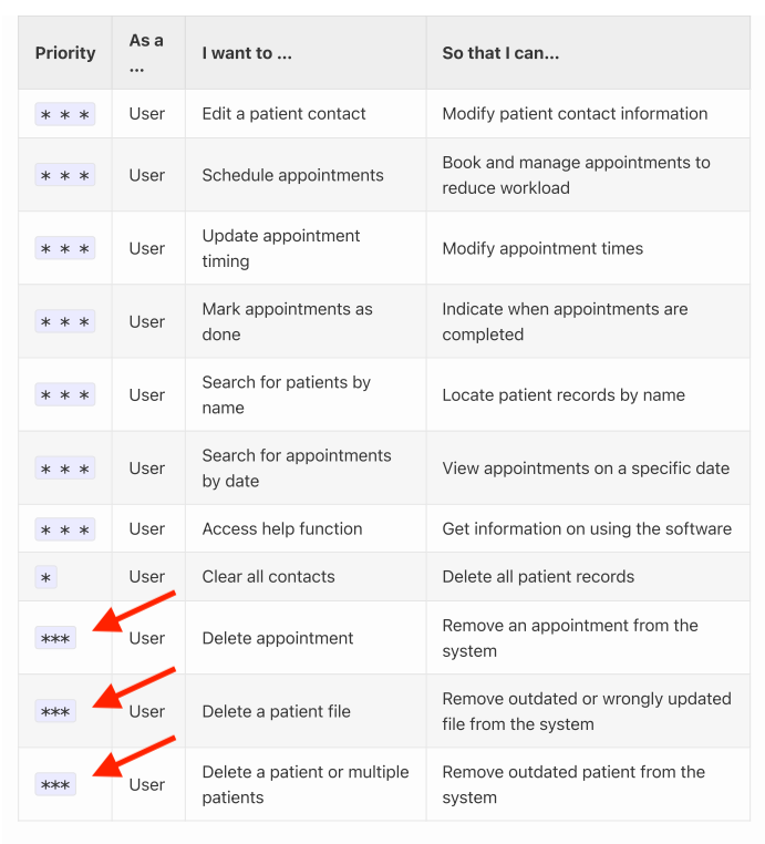
Screenshot: (DG User Stories section)
The 3 highlighted user stories appear to be missing a space in between each asterisk symbol.
[original: nus-cs2103-AY2223S2/pe-interim#1051] [original labels: severity.VeryLow type.DocumentationBug]
Their Response to the 'Original' Bug
[This is the team's response to the above 'original' bug]
First of all, there is no strict rule on the format of priority, so it should not be treated as a bug. Also, this minor typo will definitely not affect the readability for users. Therefore, we decided to reject this issue
Items for the Tester to Verify
:question: Issue duplicate status
Team chose to mark this issue as a duplicate of another issue (as explained in the Team's response above)
- [ ] I disagree
Reason for disagreement: [replace this with your explanation]
## :question: Issue response Team chose [`response.Rejected`] - [ ] I disagree **Reason for disagreement:** [replace this with your explanation]

Screenshot: (DG User Stories section)
The highlighted user story above has a Low priority and is incorrectly ordered above 3 other user stories with High priority.