jquery-archive / css-chassis

An attempt at creating an open standard for both CSS and JavaScript UI libraries.
https://css-chassis.com
Other
351 stars 67 forks source link

Determine which SVG icon set to use #1

Open scottgonzalez opened 9 years ago

scottgonzalez commented 9 years ago

Rather than create our own icons, we should pick an existing icon set. In the planning meeting, everyone agreed to use SVG icons and Google's Material Design icons were suggested. We should review a few icon sets and make a decision.

We should also document the process for using custom icons.

jslegers commented 9 years ago

@scottgonzalez :

Look at how long jQuery and jQuery UI supported IE6. Also, concentrating on the Western market isn't a goal for us.

If you consider the East-Asian market essential, the decision of the jQuery and jQuery UI teams to drop IE6 was early rather than late.

It's less half a year ago since IE6 support in China had dropped to an acceptable threshold (about 5%) to drop support for IE6 if the Chinese market is a market you wish to support. As late as March 2014 (see map below), 1/4 of all Chinese Internet users were still using IE6.

That's why I decided only recently to no longer support IE<8 in future versions of Cascade Framework, which should accelerate the release of v2.

IMO the decision not to ignore the lack of support for @font-face on browsers specific to budget phones with low memory still makes less sense than continuing to support IE6 today, as I explained in earlier comments.

IE6 usage on Feb 28, 2011 IE6 usage worldwide in March 2014, according to The Internet Explorer 6 Countdown
scottgonzalez commented 9 years ago

We look at world usage as a whole, we don't hold back based on a single country (just like we don't drop based on a single country). It's not a black and white issue.

Anyway, it does not seem that you have convinced anybody to change their mind about SVG icons. The decision has been made, you've made your arguments against, and the decision has been held. Please let the group proceed.

toddparker commented 9 years ago

One final thought: regardless of the technology you use here, if you offer a rich icon set with lots of glyphs that will add up to a very heavy download. Having tooling in place to let devs select the subset of glyphs is pretty critical.

In my experience, you need to assume devs will use the default skins and full icon packs because that is easiest for them, performance be damned.

If icons aren't the cornerstone of the value this project delivers, you might want to keep the icon stuff pretty light and informational to show some examples and cover SVG and icon font best practices and encourage folks to use existing tools like icomoon. Their output works with either approach so that could offer some choice and let you focus on the highest value areas of this framework.

cbracco commented 9 years ago

+1 @toddparker

jslegers commented 9 years ago

@scottgonzalez :

We look at world usage as a whole, we don't hold back based on a single country (just like we don't drop based on a single country). It's not a black and white issue.

Chine isn't just ANY country.

More than 1 / 3 of the world's +7,000,000,000 inhabitants lives in either China or India. About 1,364,000,000 of them live in China alone.

If you add to this that both China and India have a booming economy (unlike countries in the West), these two neighboring countries that together house no less than 2,630,000,000 people are both FAR more relevant than dozens of small countries combined.

Anyway, it does not seem that you have convinced anybody to change their mind about SVG icons.

@arschmitz is the only one who actually addressed several of the points I made, although he does ignore many of the counter-arguments I provided. Everyone else just seems to skip the entire discussion.

The decision has been made, you've made your arguments against, and the decision has been held.

How can I expect to convince anyone if no one even reads the arguments provided?

I must say I'm really disappointed by superficial analysis that's done with respect to technical decisions and only a single person seems to actually be interested in reading about the results from dozens of hours of R&D.

I've been shocked many times by the poor analysis made at corporations to cut down on costs and manpower, but never have I experienced anything like this. It's no wonder no noticeable innovation has happened for the jQuery UI project in years.

You can count my out. I have a PHP framework, a Drupal base theme, a SCSS-based rewrite of Cascade Framework and several customer projects to attend to. My time is much better spent actually building innovative project than explaining innovative concepts to people who aren't even willing to do some reading on the difference between those concepts and older techniques...

JoeBot0101 commented 9 years ago

+1 @toddparker

scottjehl commented 9 years ago

Hey folks, I'm going to tap out of this thread, but I wanted to send you a note that we'll be upgrading Grunticon soon to support inline svg, which will allow for all sorts of niceties like styling portions of icons with css, animating portions of icons, and scripting them as well. This will further expose the great advantages of svg to users so, figured I'd let you know it's on the way.

https://github.com/filamentgroup/grunticon/issues/203

kristoferjoseph commented 9 years ago

+1 on SVG Icons. They are the way forward. Anything we do to make them better is helping the web.

MichaelArestad commented 9 years ago

Jumping in a bit late to this conversation.

I'm would keep the icon set very light if included. I would also design it so that it's trivial for designers/developers to add to the icon set. We've learned a bit after working on Genericons and a few other sets. It's better to keep the base set pretty light.

I would then pick a set that works with your grid. If the grid is based on 12px intervals, you might want an icon set designed on a 24px grid. This means each icon is pixel-hinted to look good on both 1x and 2x screens. This is a pretty big deal as certain icons can become indistinguishable on 1x screens if not aligned properly.

If none is available, make one. Start with three or four to get the feel of the set and build out more. I would be happy to help with this.

We've already had the SVG vs icon font conversation a few times already at Automattic and have now settled on SVG and plan to implement them over the next several weeks.

We're using Grunt to minify and combine the SVGs into one file.This makes it rather trivial for someone to add or remove icons as needed for their projects. If you've ever built an icon font, you would know it's laden with gotchas. Especially if you're concerned with making sure the edges are aligned with whole pixels. There are also issues with aliasing, positioning, and using specific unicode characters. Using SVG alleviates much of that build process and makes it easier for others to contribute.

<button>&#9733; Add to favorites</button>

You can indeed do things like this with icon fonts. It sure feels nice and tidy until you use a screen reader. Some screen readers even pick up characters in the Private Use Area.

Which of the many approaches to adding SVG to an HTML page would be preferable and why is that approach preferable to the alternatives?

Inline is the best solution with SVG icons. The most efficient way to do this is by referencing an SVG sprite using the element Article. This technique makes them reusable and cacheable. It is preferable over other techniques mainly because it can be manipulated easily via CSS. It also can be semantic if labels are added within the SVG group.

Alternately, using SVGs as a background image is fine if you're using an SVG illustration or graphic.

Fallbacks SVG fallbacks can be tricky. If there's a build process involved, it's rather trivial to generate a few sets of PNGs of various colors. There are a few methods and we can choose which we can decide on later. There are CSS-Only options which we can likely generate in a build process.

Another thing to realize about fallbacks. The experience on older browsers doesn't have to match the experience on newer browsers. If the fallback icon colors don't have the exact color you need or are blurry, it's not a deal breaker. The best reason to make sure there are fallbacks are for functionality. As long as it works, is understandable, and looks pretty close, no one will no the difference.

arschmitz commented 9 years ago

@MichaelArestad Thanks i agree with almost everything you have said here. Also some nice hints and pointers as we develop our icon set. Would love to have you join meetings as well we have them every tuesday on freenode in #jquery-meeting at 1pm eastern time ( on hiatus next week for holidays )

One of our goals is to foster as much cross project collaboration as possible in this project so we would love to talk more!

MichaelArestad commented 9 years ago

Would love to have you join meetings

@arschmitz Already planning on it. :) Thanks for the invite.

arschmitz commented 9 years ago

@MichaelArestad Also #css-chassis for any sort of discussion anytime

scottgonzalez commented 9 years ago

There are some good tips that relate to this in http://calendar.perfplanet.com/2014/tips-for-optimising-svg-delivery-for-the-web/.

jslegers commented 9 years ago

@MichaelArestad :

You can indeed do things like this with icon fonts. It sure feels nice and tidy until you use a screen reader. Some screen readers even pick up characters in the Private Use Area.

How exactly is that an issue if you use aria-hidden="true" in your HTML in combination with speak: none in your CSS wherever you really care about screen readers skipping an icon?

How exactly would this implementation be an issue for screen readers?

Cascade Framework

MichaelArestad commented 9 years ago

How exactly would this implementation be an issue for screen readers?

I was referring to your suggestion that it's as simple to implement as this in the 12 principles you posted (specifically #3): <button>&#9733; Add to favorites</button> In that example, there would be no way to skip the special character.

It's still an issue because there is no value added for screen readers. If a title, desc, and aria-labeledby are baked into the each SVG icon, each icon used can convey good information. I suspect something similar could be done with the HTML you use when implementing the icon font, but it's not nearly as easy as having the information baked into the icon file.

jslegers commented 9 years ago

@MichaelArestad :

In that example, there would be no way to skip the special character.

If you use standardized unicode characters, screen readers are more likely to understand them today... and even more tomorrow, if this technique is to become widely adopted.

In those cases, you might not want to skip the special character. In those cases, you might actually WANT them to read it!

It's still an issue because there is no value added for screen readers

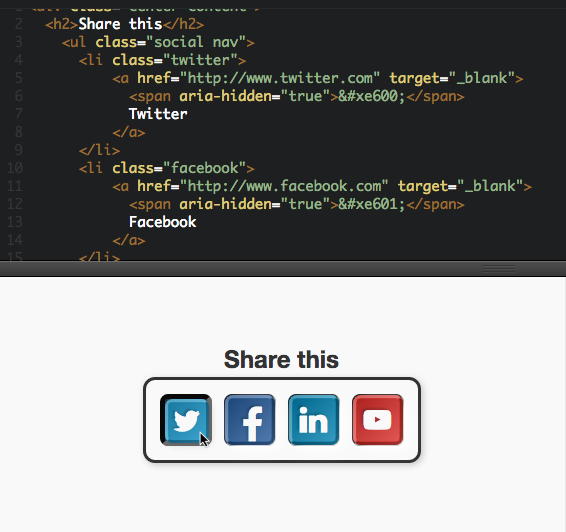
There's no need for that here. The values are already there. They are present as normal text in the HTML but hidden on normal browsers. Screen readers get the values twitter, facebook, linkedin or youtube.

it's not nearly as easy as having the information baked into the icon file.

Being easy to use and being flexible often require opposite conditions. It's important an icon set is easy to use, but it shouldn't result in a major loss of flexibility.

Having the information baked into the icon file isn't a good idea because it restricts access to that information to those who want to choose which text screen readers get to read.

MichaelArestad commented 9 years ago

Being easy to use and being flexible often require opposite conditions. It's important an icon set is easy to use, but it shouldn't result in a major loss of flexibility.

The thing about SVG icon sets is the flexibility. Designers wouldn't be restricted to one size or even one set. Baked in information might be excellent for one set, but not all the sets, in which case, using .visually-hidden spans would work just as well. It would be trivial to add baked in info to one icon in a set with no baked in info.

MichaelArestad commented 9 years ago

I think a good start would be to use icons that are common for app interfaces and go from there. I would rather have a smaller icon set and make it easy to expand upon rather than building an ultimate end-all icon set or using an entire massive set.

Quick list

kristoferjoseph commented 9 years ago

@MichaelArestad great starting list. Only additions for me would be:

cbracco commented 9 years ago

@MichaelArestad @kristoferjoseph and perhaps conversely,

MichaelArestad commented 9 years ago

@cbracco @kristoferjoseph

Upload/Download :+1:

I'm not sure about folder yet.

The way I see this, if we design these icons (or choose them from a preexisting set), we can have additional sets that are easy to add via the build process or even to drop in individually. Things like social icons, email icons, WYSIWYG icons, etc. I think keeping the core set as light as possible will keep our sanity in tact. At least for V1.

MichaelArestad commented 9 years ago

Added a PR with basic grunt setup and placeholder icons. https://github.com/jquery/css-chassis/pull/32