Open sfrisk opened 10 years ago
Taking another page out of @csswizardry's book, I am a fan of fluid (%) columns and fixed (px/rem/em) gutters. With the HTML comments included <!-- -->
, this should work in IE8 (minus the @media query modifiers).
See the upcoming Inuit.css implementation of this here: https://github.com/inuitcss/objects.layout/blob/master/_objects.layout.scss
I prefer to use the %-width classes as general purpose "width" utility classes that can be applied to anything, not just grid columns. I also like being able to manipulate grid behavior across a predetermined set of breakpoints (which I typically store as preprocessor variables, and modify on a per-project basis).
Below is some CSS to illustrate what I mean (sorry for the length, I don't currently have this online anywhere yet. A version of it will likely be included in the upcoming Cardinal 3.0.0).
As for offsetting (aka push & pull), if we use the below implementation we can do something like this for offsetting: http://codepen.io/cbracco/pen/hjFDL ... it should work the same way as it would in a traditional float-based grid system.
EDIT( @arschmitz ): Moved code sample to a gist for improved issue readability https://gist.github.com/arschmitz/39fd81718bb3b3829124
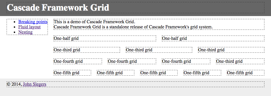
The grid I'm using in Cascade Framework integrates Nicole Sullivan's original OOCSS grid and the media object. It includes the following features :
AFAIK, there is no grid system with better browser support (IE6) and greater flexibility.
EDIT( @arschmitz ): Moved code sample and detailed description to a gist for improved issue readability https://gist.github.com/arschmitz/2ce0b464ed5dab2d283f
A process suggestion: Consider creating pull requests with the code above, along with test pages to view it in a browser. That allows testing and reviewing and commenting on individual lines, which might be more effective.
That could work, great suggestion, @jzaefferer
@jzaefferer & @sfrisk :
I just released Cascade Framework's grid system as a standalone project, with three test pages. You can find it at jslegers/cascadeframeworkgrid. The code is MIT-licensed, just like other releases of Cascade Framework.
Would that be sufficient?
Nice grid! A few comments / things to consider:
xs-*
, .sm-*
, .md-*
, .lg-*
, ..xl-*
, etc as a convention, since the grid behavior is dependent on viewport size and not device type.Edit ( @arschmitz ) See detailed response from @jslegers along with grid code here: https://gist.github.com/arschmitz/2ce0b464ed5dab2d283f
:+1: thanks for the explanation, I had misunderstood a few things upon first glance. It's a very robust grid!
In regards to the clearfixing, I sometimes need to append styles to pseudo elements of these common elements (bg images, CSS shapes, etc), and having to "unclearfix" them each time feels a bit hacky to me, but alas. Why not just apply the clearfix to the elements / components / objects that need it? Using a grid with inline-block
has been nice, since I only seldom have to worry about clearfixing.
Also, is there any way for grid cells to sit flush with their parent? What if I wanted a grid that behaves as 100%-width stacked items on small devices, but then switch to a three column layout with gutters on larger devices? Looks to me like every .cell
gets a margin (which is also equal to the gutter?). Let me know if I missed this option somewhere.
I'm not a huge user of most grid systems. I find them bloated or goofy in syntax. That said, I'm a pretty big fan of Susy. It's as much or as little of a grid system as the project requires. We could generate any of the above systems with it, but with the added ability of allowing the grid system to be customized easily on a per-project basis. Susy is crazy flexible and makes changing the settings and doing the math quite easy.
Personally, I don't recommend a grid system at all and would like to raise this question: Do we want to include a grid system at all?
I've picked up projects that have used Bootstrap and a few others. Most of the time (from my experience), the grids are used incorrectly despite the quality of the grid documentation.
I've worked on a pretty wide variety of web projects from marketing sites, to products, to CMS's. I've yet to actually need a grid. At most, I need to create a grid for a specific component which is all of a few lines of code.
I have thought about the possibility of creating a mixin that allows people to customize their grid implementation, maybe even with #17 we could help users set up the grid they need in the browser before download?
I definitely understand the 'grids are bloated/goofy in syntax' feeling. It's not to bad if you just have 12 columns, but once you start going into behaviors of each grid depending on the size of the screen, you end up with a lot of css (not to mention documentation).
I would expect the grid to be an optional thing with maybe some customization as you mentioned via the build process. I know it's usually the first thing I remove from any framework.
The problem is the need for multiple types of grids (flexible, fixed) for various situations which tends to make them over complex to begin with. Adding in the ability for functionality based on screen is sure handy to have as well.
I think using a mixin that pulls from a settings map (like Susy uses) would be a good choice for allowing for pretty good manipulation of the grid setup.
I tried to create a custom grid builder: _mixins.scss http://pastebin.com/59GbJp0c grid.scss http://pastebin.com/kUM1MQju Right now everything works fine.I am adding more features. Please, have a look. http://jsbin.com/nuvaxihiro/3/
We should consider allowing users to specify the number of columns, this really simplifies things for a user. But the implementation would be heavy? We could allow the user for instance to define a variable in scss about the number of columns his grid should support? We could later add it to theme roller Just an idea.
+1 to keeping the grid optional!
@geekman-rohit I am creating more mixins to ease the calculations and create margins
Having a grid optional/custom is a great idea IMO. It keeps the framework clean and minimal impact for the user. A lot of people like having things clean, minimal and little bloat. This would give them the option to go super lightweight. Keeping things as modular as possible is also important.
+1 for customizable grid system(s) especially when it's so easy to use tools like Susy.
Just to be clear here. We always planned the grid to be optional. We plan to support custom builds so any and all components are optional. There was originally the question of making the grid itself customizable. However i think we long ago decided that was the direction we were taking. So I think this issue is really now just about hammering out an actual implementation of this.
So in the name of going all John Henry on this, is the idea to: include as dependency, create "wrapper" mixins that generate classes that conform to the project's spec or a much more ambitious undertaking to fork Susy and optimize for Chassis' needs?
@maikuru If we wanted go a route like Susy, I'd prefer we just include it as a dependency rather than build out a custom version. Maintaining and building a grid system like Susy can be a pretty big project itself.
@arschmitz Browser support for that is pretty sparse, IIRC. Can't wait to mess with it, though.
@sfrisk in case you guys are still interested in my grid suggestions, I've made some minor updates to the grid since I last posted ... basically added some shorthand options for widths and some grid gutter options (1px, 0, double, half). Let me know if you'd like me to make any contributions here!
https://github.com/cbracco/cardinal/blob/master/layout/grids.less https://github.com/cbracco/cardinal/blob/master/utilities/widths.less
Items to consider:
Update 3/29/15
Summing up the issue so far
display:grid
, and consider only supporting layouts possible with what will be the grid standard that way in the future we could potentially drop the grid component all together? ( IE only right now )