 sdetweil
commented
1 year ago
sdetweil
commented
1 year ago the individual delete button is due to this pr, cause some wanted the ability to delete a specific list entry, instead of just the last https://github.com/jsonform/jsonform/pull/400/files (for my use, I will have to check on the unique record delete, it should be optional, I see I am still using my fork, which has two changes over the base, so that is why I haven't seen indivdual delete button)
this causes the 'delete' on the add/delete pair to be redundant, but not add.. this is implemented as a pair of buttons..
the drag element is an element above the element title, because it also moves the title over the field..(a group) vs your positioning just in front of the field.. so re-positioning it might be more difficult.

(I'm the one that submitted the draggable:false function )
 drveresh
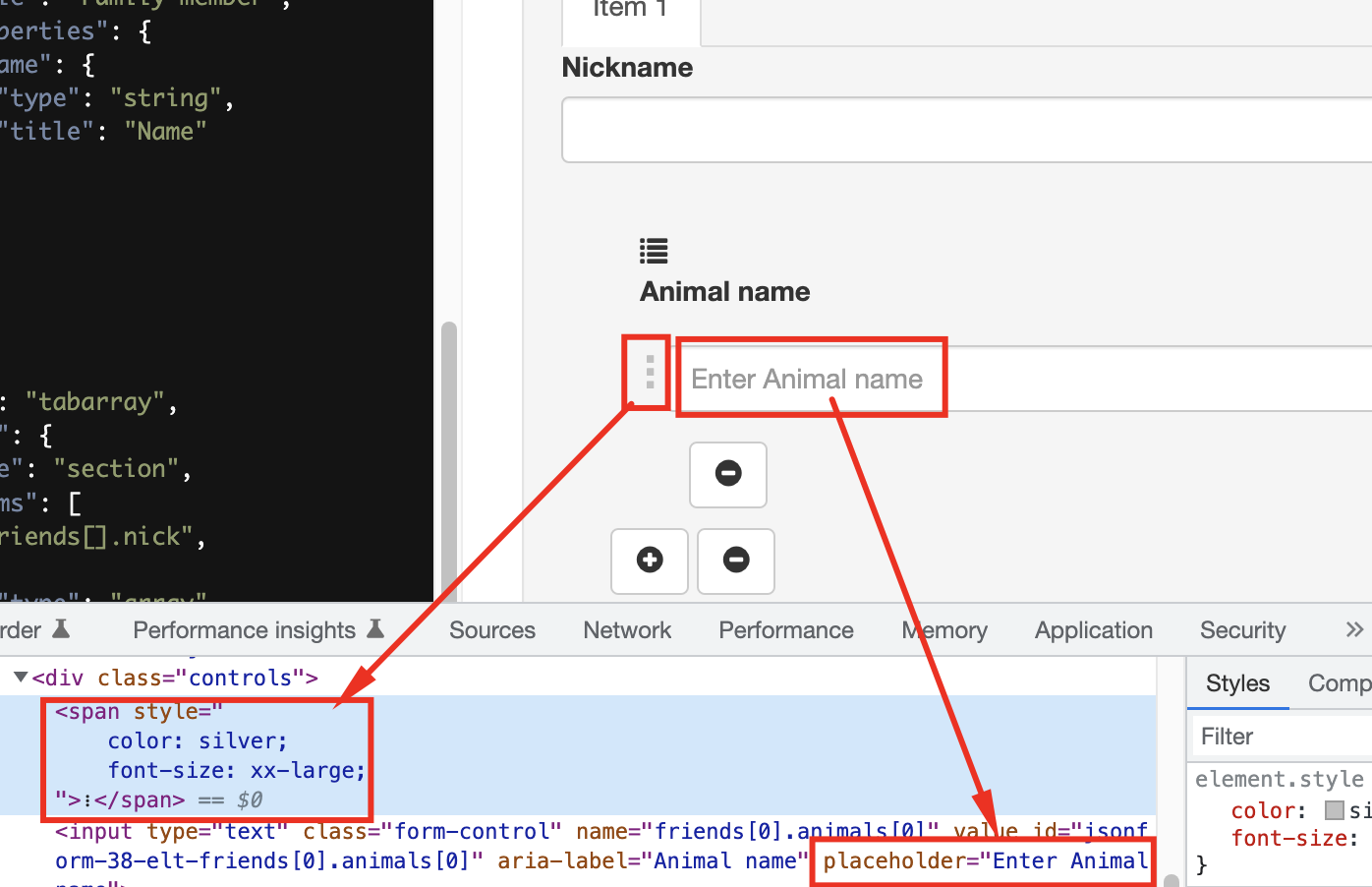

 stale[bot]
The add/remove icons for fields are redundant and misplaced.
Ref links: https://jsonform.github.io/jsonform/playground/index.html?example=fields-tabarray https://jsonform.github.io/jsonform/playground/index.html?example=templating-idx
Screenshots:
If there is a section containing >1 field, then there should be one single remove icon and the entire section should have some border to indicate the area where the action takes place on.