Team's Response
We believe that the examples we have provided are sufficient to allow users to understand how to use the commands without the excessive use of visuals.
Items for the Tester to Verify
:question: Issue response
Team chose [response.Rejected]
- [x] I disagree
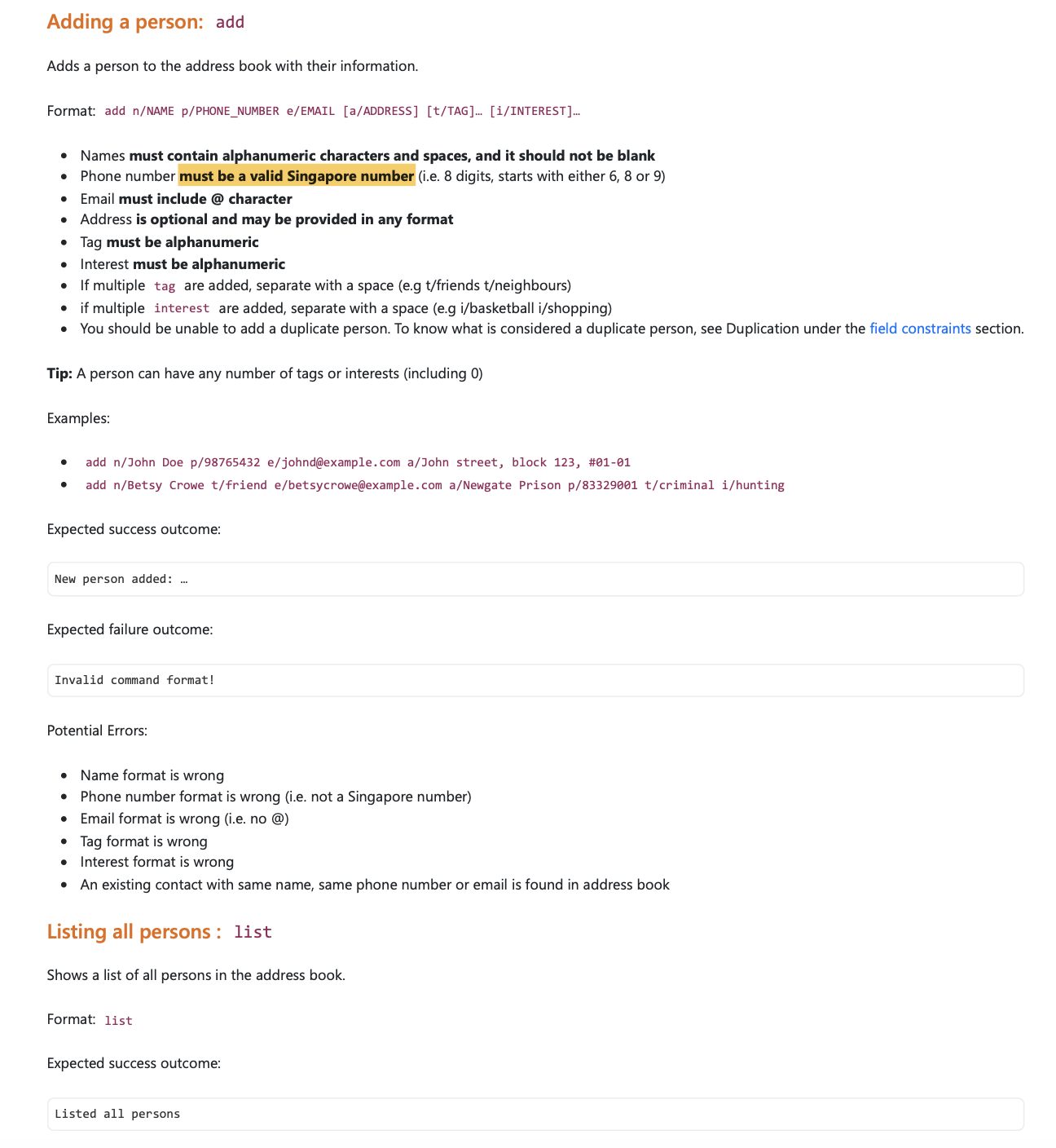
Reason for disagreement: There were barely any visuals in the features part of the UG. At the very least can add some visuals for the part that cannot be described properly by typing them in.
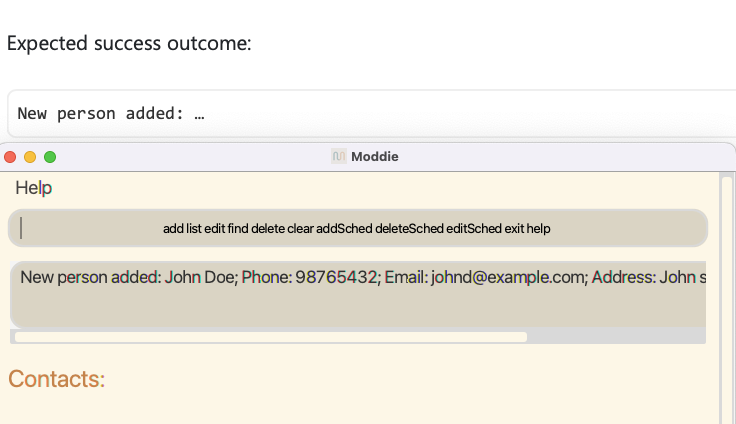
For example here, you can see that there is a disparity between the UG and the actual screenshot, which is caused by the "..." replacing the person's detail.
This part can benefit from a screenshot.

This can also be said for the expected failure outcomes. A screenshot can show to the user, that their input text will turn red if it fails. This can assure the user that their input is correct if they don't see any red text on the screen.

Expected: Use of screenshots to display the expected outcomes of the commands
Actual: no screenshot provided for the outcomes of most of the commands