Open dhirschfeld opened 7 years ago
These are some nice icons! But I feel if applied to current file icons in FileBrowser, those git marks would be too small to see or distinguish. The current Git-plugin design is to list files in different stages , and has a letter to mark its current status (A, M, D, R), we can borrow these git marks to replace letters
If the icons are too small to show the git status themselves, perhaps we could do something similar to Visual Studio Code where you have a separate changes view which shows the status of all files and which are staged or not:
+1 I love how VSCode has done that
On Wed, Aug 16, 2017 at 8:41 PM, Dave Hirschfeld notifications@github.com wrote:
If the icons are too small to show the git status themselves, perhaps we could do something similar to Visual Studio Code where you have a separate changes view which shows the status of all files and which are staged or not: [image: image] https://user-images.githubusercontent.com/881019/29395079-c2985faa-8351-11e7-8174-b4c13d1ef168.png
— You are receiving this because you are subscribed to this thread. Reply to this email directly, view it on GitHub https://github.com/jupyterlab/jupyterlab-git/issues/124#issuecomment-322960975, or mute the thread https://github.com/notifications/unsubscribe-auth/AABr0ISMU6Dl6DLjTphYbRkVhj-U4-V3ks5sY7aFgaJpZM4O5ruS .
-- Brian E. Granger Associate Professor of Physics and Data Science Cal Poly State University, San Luis Obispo @ellisonbg on Twitter and GitHub bgranger@calpoly.edu and ellisonbg@gmail.com
We can do something similar, a floating label showing the total number of staged and unstaged files
Here are two ideas I mocked up, with a label on the Git Tab. We could explicitly state the number of changed files, or we could just put an indicator that changes were made:
Let me know what you all think!
The number of changes could also be rotated to match "Git"
Heh, after actually giving it a go I was going to open an issue to request some form of indication that a folder is a git repo and found that I'd already opened one! :P
@dhirschfeld for the screen below, do you see any issues with merging the visual of "git tracking" into the folder icon, rather than a separate icon to the left (see below)?
(Sample add repo flow) https://www.figma.com/proto/UyNpeQNuTj6Uv74MoEJDh3ji/Git-extension?node-id=513%3A3712&scaling=min-zoom
@weihwang - I'd be happy with any indicator that its' a git repo. The icon on the side as above works perfectly well for that however it might be nicer to have the git icon merged with the folder icon as that would probably take up less space which is often a valuable commodity
@weihwang I think another option is to add indicators to right column that (similar to vscode above), this will allow us to also reflect status of individual files in the file browser.
Here's one more iteration. I don't think we need to remove "last modified" completely, unless we need the space for actions or other indicators in the future. We may need another icon for file status "tracked in a repo" such as "added, modified, deleted" as opposed to "repo indicator"
Proposal to deprecate 3-letter status and opt for simpler single letter icons. Checking color contrast with dark mode next.
It would be nice if the FileBrowser were "git aware" and could display the git status with the icons.
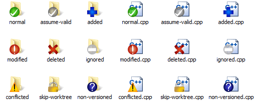
Coming from Windows I'm thinking of something similar to the TortoiseGit overlay icons for Windows Explorer: