 BingxinS
commented
5 years ago
BingxinS
commented
5 years ago A workaround function in #371 can generate both risk tables and confidence intervals when facetted.
Open BingxinS opened 5 years ago
BingxinS
commented
5 years ago A workaround function in #371 can generate both risk tables and confidence intervals when facetted.
 djnusbaum
commented
1 year ago
djnusbaum
commented
1 year ago Thanks for figuring this out. Is there any way to switch the order that the strata labels are listed on the left side of the "number at risk" table? For example, I want strata #1 to be listed first, and then strata #2 (currently #2 is listed first). Factor level doesn't seem to influence this.
Also, is there an easy way to customize the plots (e.g. change the color palette, add p-value to the plots)? Or would I need to modify the functions directly?
Thanks!
Similar issue reported at: https://github.com/kassambara/survminer/issues/330
Expected behavior
Use data frame lung as an example:
Survival plots can be generated with risk table:
or been faceted by factor ph.ecog:
However, the risk table can not be generated with faceting in the current Survminer package:
Actual behavior
The plot generated from the above code does not include risk tables.
Steps to reproduce the problem
The output plot is missing the risk tables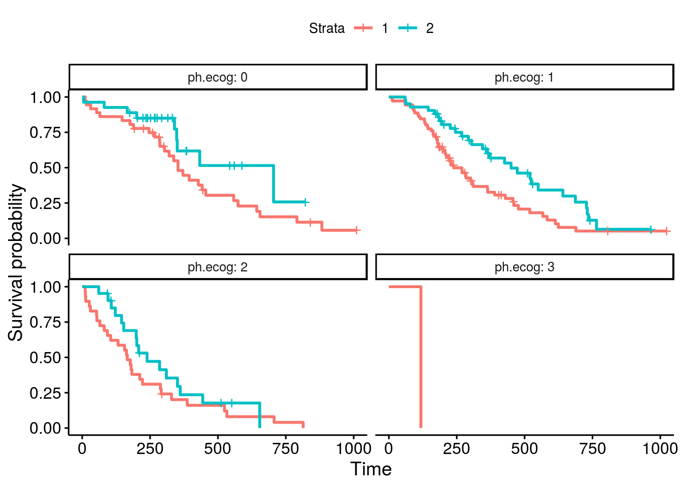
A workaround function
A way to work around is to generate the survival plotseparatelytable separately and combine them on the same plot.
The plot
Use ggsurvplot_facet_fix() to obtain the survival plots, with fixed origins (refer to the previous issue report, related issue: https://github.com/kassambara/survminer/issues/254 and pull request https://github.com/kassambara/survminer/pull/363).
The risk table
Although neither ggsurvplot() nor ggsurvplot_fix() generates the risk table in a plot, the data of risk table is available as ggsurv$table$data:
Below is the risk table data returned by ggsurvplot():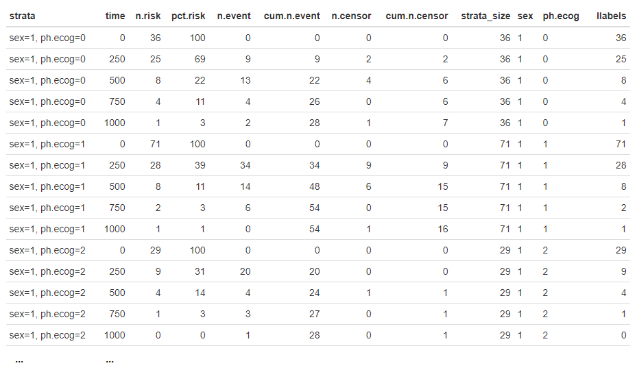
We can use ggplot2 to plot the risk table directly:
We can format the above risk table as:
Combine the survival plots and risk tables
We now combine the above plot and table together:
Wrap up as function
I had warped it as a function and available at: https://github.com/BingxinS/survminer-fix/blob/master/ggsurvplot_facet_risktable.R Examples are available: https://github.com/BingxinS/survminer-fix/blob/master/README_facet_risktable.md
Example I: with 1 facet factor ph.ecog
These lines will generate the same plot just shown above.
Example II: with 2 facet factors ph.ecog and ph.karno
Extra discussion
In all the examples above, the starta factor is sex, which has two levels, 1 and 2. Once been faceted, for instant, by facet factor ph.ecog, which has four levels, 0, 1, 2, and 3, we will not be able to generate a combined facet plot with facet risk table with the current survminer package. The main reason of missing risk table when faceting is caused by the colum strata in the data table: