Team's Response
I don't really think this deserve a high severity status.
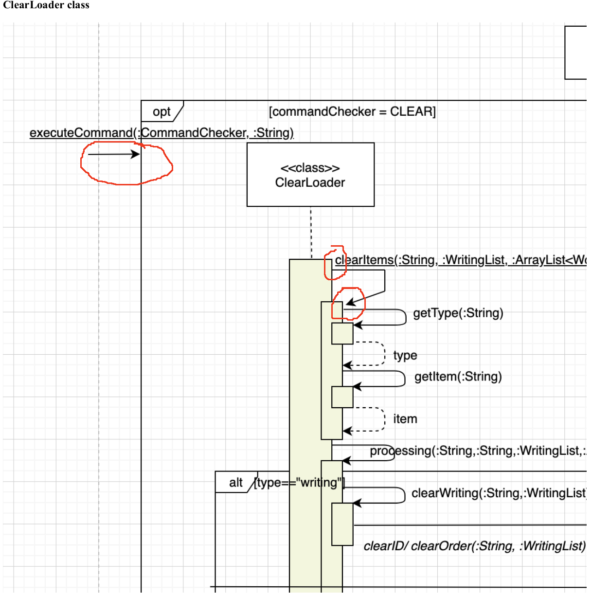
Also, even though it makes the diagram slightly less visually appealling, the reader can still logically deduce where the arrows should be easily. So despite the technical issue with formatting the issue is not significantly severe.
Items for the Tester to Verify
:question: Issue response
Team chose [response.Rejected]
- [x] I disagree
Reason for disagreement: This is considered a real bug and should not be rejected.
:question: Issue severity
Team chose [severity.VeryLow]
Originally [severity.High]
- [x] I disagree
Reason for disagreement: While the arrows not touching the activation bar may be a low or very low severity, there is one arrow that touches the optional frame instead of the object box. I think this is at least a medium severity as it might confuse the user at the first glance.
Arrows are not touching the activation bar:
Developer's Guide Page 17