kenset / obsidian-theme-picker

MIT License
39 stars 4 forks source link

How does it actually change Obsidian behavior? Enabled or disabled, Obs UI theme section behaves same? #11

Open xbliss opened 3 years ago

xbliss commented 3 years ago

https://forum.obsidian.md/t/new-here-any-quick-theme-changer-dropdown-or-plugin-or-faster-easier-make-the-modal-dialog-box-moveable-not-darken-main-ui-for-preview-as-is/23963

kenset commented 3 years ago

Thanks for making me aware of the question! Here's my response, mostly copied here:

Here’s a gif that may help. There’s a new item in the status bar called “Change Theme”. Click on it, and a modal will appear and show you the list of themes that you currently have installed. You can both click with your mouse or use the arrow keys to preview your theme selection. Enter to select a theme, ESC to revert to your existing theme. Next to “Change Theme” in the status bar is a button to toggle between the theme’s dark and light modes.

The plugin currently only shows themes you already have installed, so if you don’t see any themes to choose from, download a few from Settings > Appearance > Community Themes – or download some from the internet and put into your <vault>/.obsidian/themes folder. Here’s some that I like: https://github.com/gammons/base16-obsidian.

Let me know if you have any questions or suggestions!
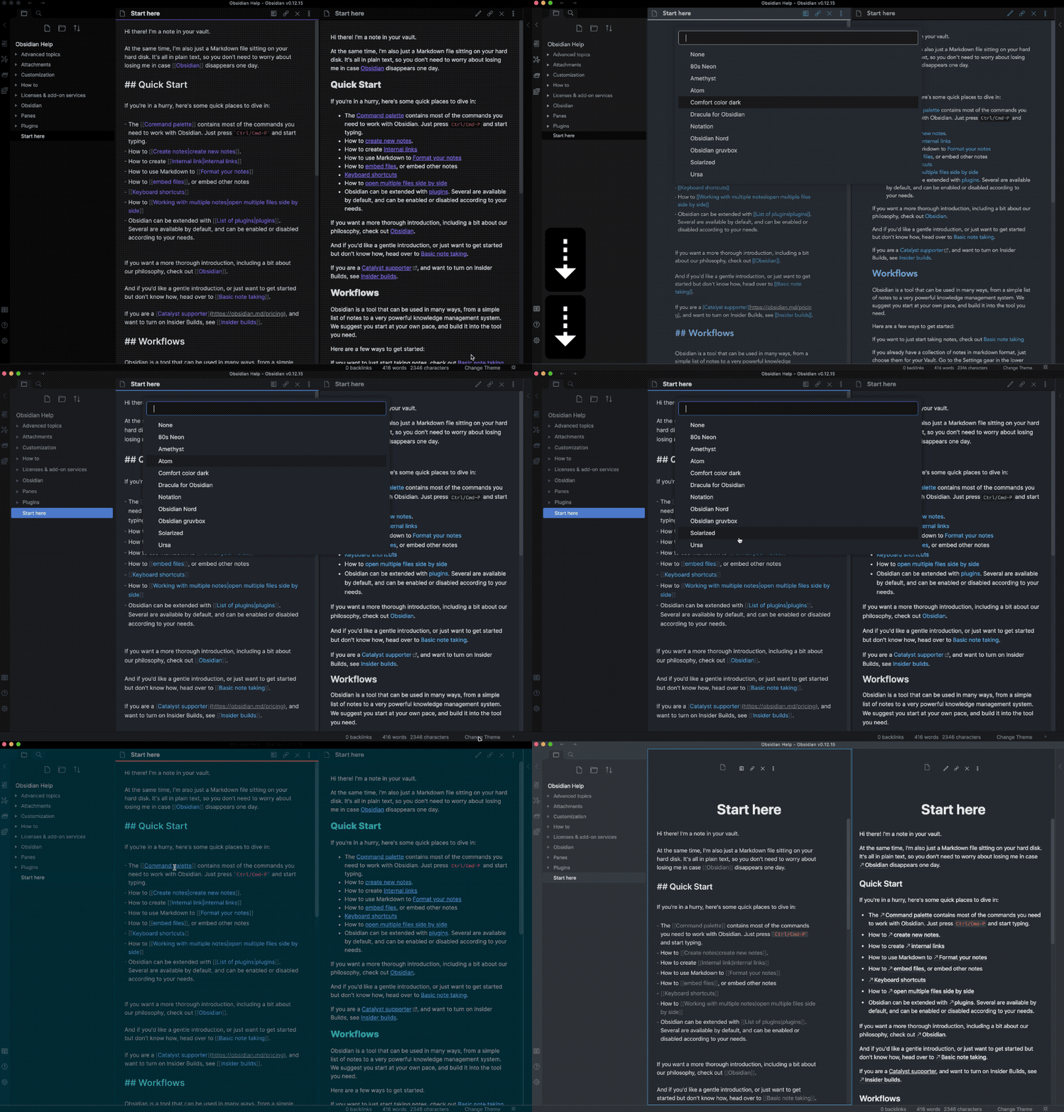
Plugin Usage GIF

xbliss commented 2 years ago

Thanks for making me aware of the question! Here's my response, mostly copied here:

Here’s a gif that may help. There’s a new item in the status bar called “Change Theme”. Click on it, and a modal will appear and show you the list of themes that you currently have installed. You can both click with your mouse or use the arrow keys to preview your theme selection. Enter to select a theme, ESC to revert to your existing theme. Next to “Change Theme” in the status bar is a button to toggle between the theme’s dark and light modes.

The plugin currently only shows themes you already have installed, so if you don’t see any themes to choose from, download a few from Settings > Appearance > Community Themes – or download some from the internet and put into your <vault>/.obsidian/themes folder. Here’s some that I like: https://github.com/gammons/base16-obsidian.

Let me know if you have any questions or suggestions!

Plugin Usage GIF

Lovely. Almost what I imagined in terms of “quick change” mechanism. You are a god! :D. I pay homage to thy magical divinity :smiley:

Is there any way to have it be moved or reduced to be more “non blocking” of major part of the UI (esp. when I may be testing out lots of installed themes - nit picky minds of ours).

It does not darken the “UI” (as the Obs Preferences Modal) but given its own size & placement, they both “block” the “majority of the text/ panels” we’d love to see.

PS: As a former tech geek (what’s Obs being developed on/ in - terms of tech) and are you extending these plugins via the same?

Is it default by design, under the said dev framework for the modals/ dialog boxes to be this way? i.e. unmoveable & darkening/ graying/ blocking?

Feels a bit odd in terms of design that an appearance section of an app (Obs devs - great job but a slight oversight), pretty much blocks our ability to see real time the UI appearance we’d like to tweak.

Coming from the Win32 world, it was always default for “such dialogs” to be moveable to side and they allowed for us to see changes as we tweaked to our visual satisfaction with an “Apply” as one continued “tweaking” until “that’s it”.

Either way :smiley:

Given that you’ve gotten me with the product hat on and greedy (sorry :smiley: ) also would be great to by able to pull & quick manipulate the other “attributes” & “scaling” from the Appearance section.

Maybe if Obs can fix their modal, then your plugin can take whole another tangent of evolution.

I think a themes designer & data gives a great baseline, but being able to scale up/ down the fonts & spacings (para, line, indents etc.) can be quite key, when “data trees” and “density” increase within the UI.

Imagine being able to see so much “outlined” data on a massive 4K UHD. Geek screen estate heaven. I think some “big complex data trees” folks would get this.

@kenset - Following up, I wonder if you saw the response and had any thoughts on the above. Would love to hear back.