Team's Response

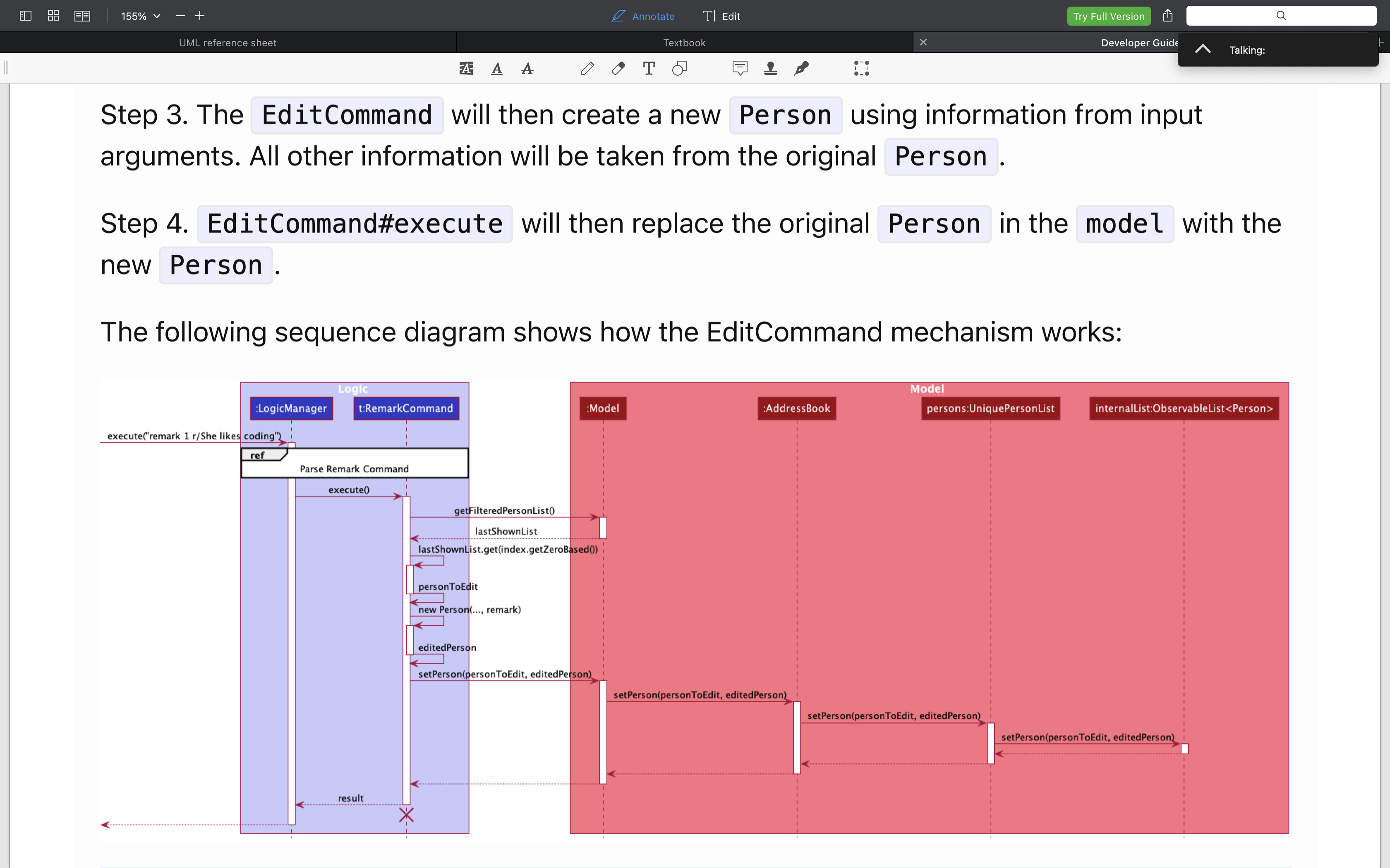
This is how a max-out screen page looks like on the pdf. The words, despite smaller than the text, are readable, can be seen clearly enough and should not cause any confusion.
Items for the Tester to Verify
:question: Issue response
Team chose [response.Rejected]
- [x] I disagree
Reason for disagreement: The team responded with an example where the image was zoomed in to be able to see the text, however, it does not reflect the actual DG pdf provided or the DG website of the team (under the edit implementation section), where the font size is too small to be read without zooming in.
Evidence:
This is further evidenced by the screenshot provided by the team showing a 155% zoom in on the top left corner due to the small font size of the UML diagram.

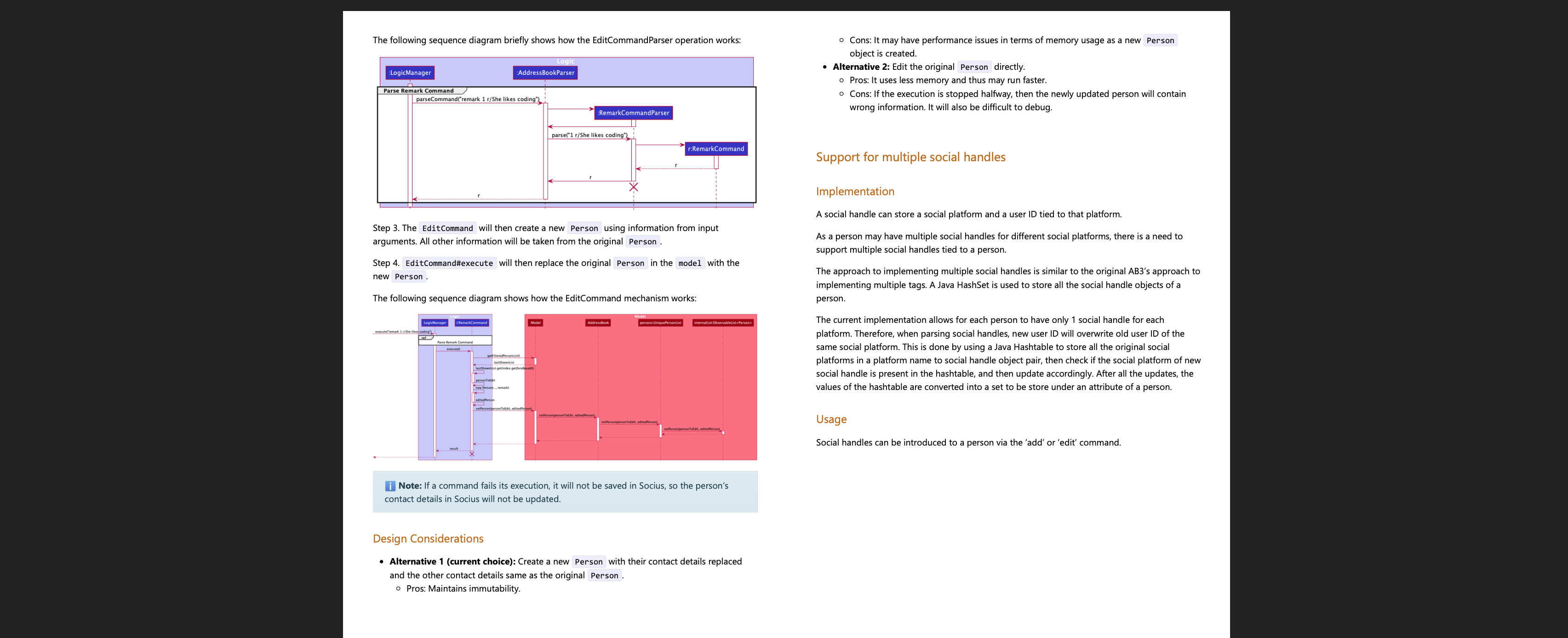
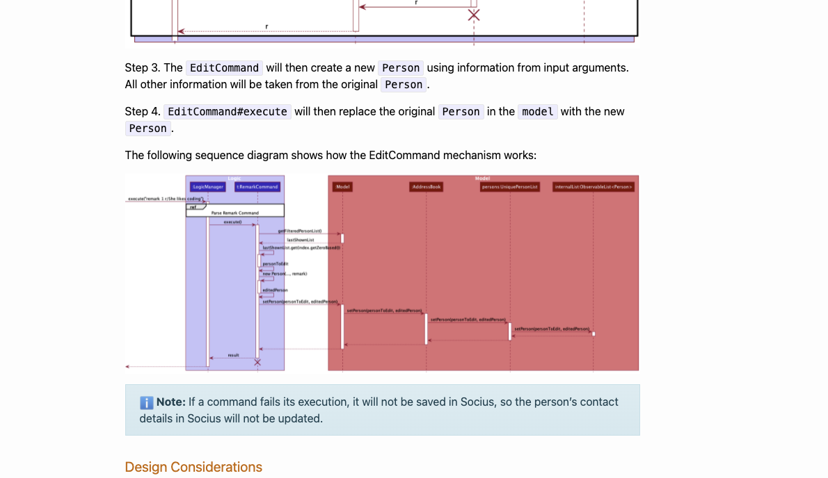
Actual DG pdf and website font size too small:
However, this is the diagram as shown on a 34" monitor from the pdf file provided in the PE at 100% zoom(default), which shows the font being too small to be read.

Additionally, on the UG website, the diagram font size is also shown to be significantly smaller than what is shown in the screenshot provided by the team.

Rationale for disagreeing:
Therefore, I believe that the font size is too small - which is a valid bug as referenced from the module website.

Hence, I believe that this is a valid 'veryLow' cosmetic documentation bug and should not be rejected.
As described, font is too small and causes a hindrance to the developer reading the DG.