 kilmc
commented
4 years ago
kilmc
commented
4 years ago This is intentional although I think it’s more maybe pointing out a flaw in the design.
I designed this donate interaction Desktop first so I was thinking that users would hover over the cards and discover the donation functionality that way.
When I started testing this on mobile I realized 2 things. 1) The donation functionality was basically impossible to discover 2) When an element that’s tappable is fully transparent (at least on iOS devices) you have to tap once to make it visible and then again to have the onClick fire
My solution was to make the icon slightly opaque on smaller screens where I presumed folks would be tapping rather than using a mouse and wouldn’t have hover capabilities. This helped with both discoverability and got rid of the 2 tap issue.
The final reason I only did this on smaller screens was because I felt like showing the donation buttons constantly cluttered up the page especially when you were on a device wide enough to show several cards per row. I figured you’d discover the functionality and then you’d not want those buttons cluttering up the visuals so you could focus on the info.
As far as addressing this, I think for the moment I’m going to keep it as is, but I’m going to noodle on some ways to make this better across devices and maybe have a more universal treatment in a future iteration of the design.
Thanks for the detailed report. And thanks for using the Toolkit!
 bedirhansolo
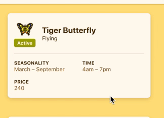
If a bug/creature/fish has not been donated to the museum, the museum icon disappears from the interface just after the browser changes from single column to 2+ column view.
This is consistent in Chrome, Firefox and Safari.
Despite the donate icon disappearing, clicking on the top right corner of a bug/fish/creature does toggle the donate to museum functionality.
If a bug/creature/fish has been donated, the icon does not disappear.