 kroitor
commented
6 years ago
kroitor
commented
6 years ago Hi, @arkihillel !
Thanks for your feedback!
Multiple series Colors
These two points I'm going to do hopefully soon (need a few days free of other tasks to do it). Also, I highly recommend you to take a look at these awesome packages by @xpl:
- https://github.com/xpl/ansicolor
- https://github.com/xpl/ololog
- https://github.com/xpl/as-table
- https://github.com/xpl/printable-characters
Max width
This cannot be done robustly for all terminals, so it's a little beyond the scope of this small library (I'm trying to keep it simple). But I did use the ansicolor and blessed together with asciichart to render a dashboard and a chart inside it, like this one:
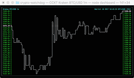
You can use any curses-like library to do the same. Alignment, center, full-width, full-height, etc... So blessed takes care of that, and can crop or scroll the "inside" content according to your rules. It also detects resizes, mouse events and much more. Hope this answers your questions.
 joergd
 theBliz
 el3ment
 crbyxwpzfl
I like this simple, easy to use package that I use for node statistic clis. I'm missing some nice to have options though:
Multiple series Ability to see more than one series on the same chart
Colors Ability to affect colors to lines. npm's
colorsmay be used thereMax width Some charts can be way larger than a terminal. Detecting the terminal length and sub-setting the series sent may be a good way to tackle this issue