labscript-suite / runviewer

π—Ώπ˜‚π—»π˜ƒπ—Άπ—²π˜„π—²π—Ώ is a graphical interface for visualising hardware-timed experiments composed using the 𝘭𝘒𝘣𝘴𝘀𝘳π˜ͺ𝘱𝘡 𝘴𝘢π˜ͺ𝘡𝘦.
http://labscriptsuite.org
BSD 2-Clause "Simplified" License
2 stars 39 forks source link

Smaller plots for digitals #14

Open philipstarkey opened 7 years ago

philipstarkey commented 7 years ago

Original report (archived issue) by Jan Werkmann (Bitbucket: PhyNerd, GitHub: PhyNerd).


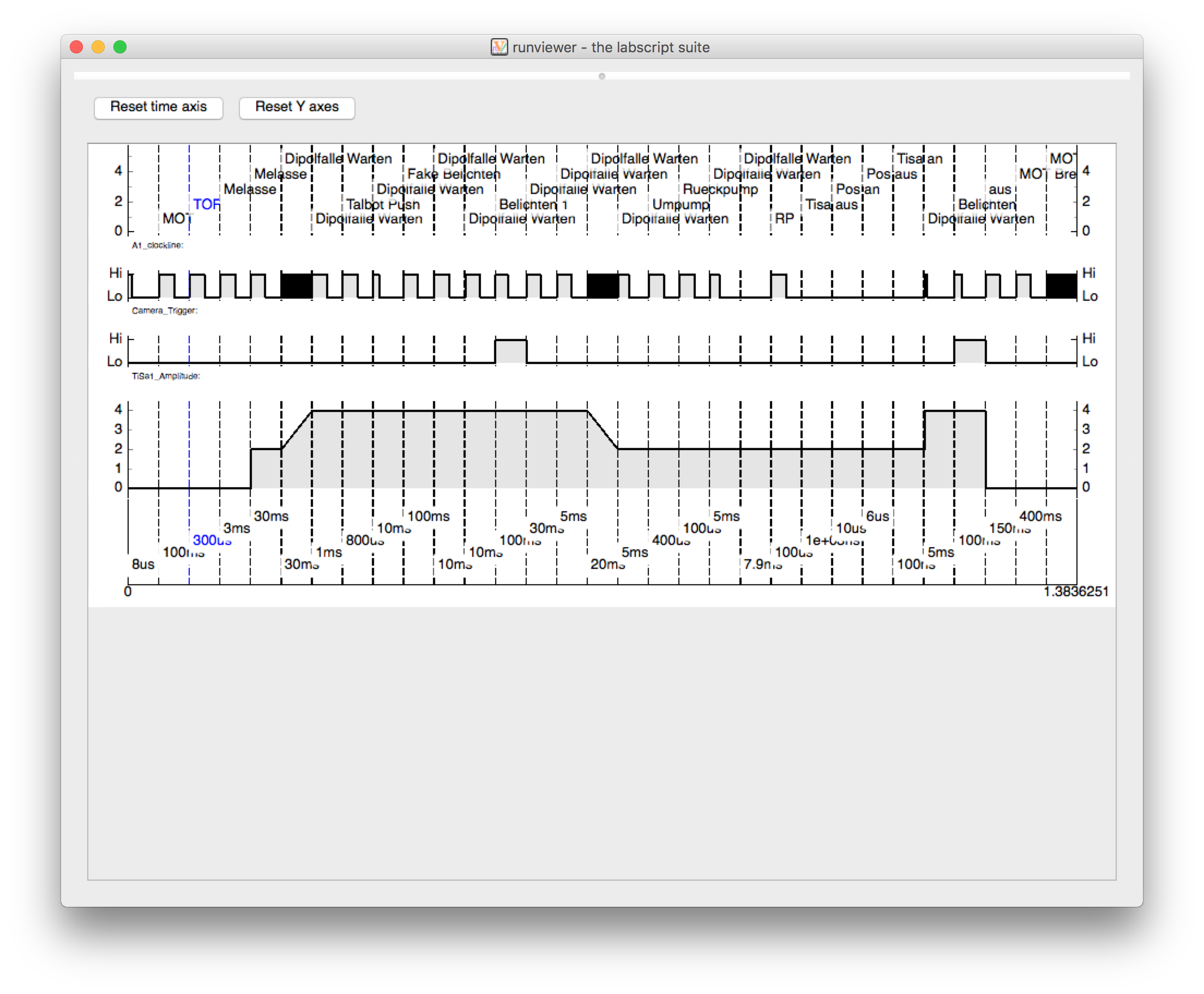
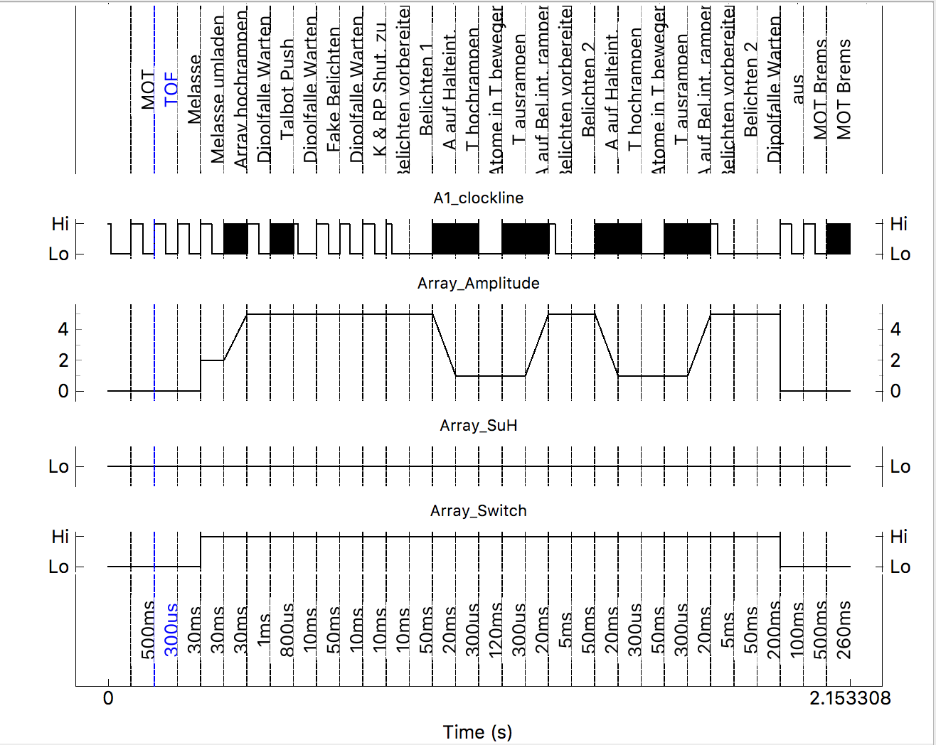
I propose having digital outputs such as shutters, digitalouts and clocklines display in a smaller plot (smaller y axis) as they don't profit from the extra space. They should also get their y-axis-ticks replaced with Hi and Lo to distinguish them from analog outputs. Here is a screenshot I made of how things could look (ignoring the markers, non linear time and different label position): Bildschirmfoto 2017-06-27 um 22.18.16.png

philipstarkey commented 7 years ago

Original comment by Philip Starkey (Bitbucket: pstarkey, GitHub: philipstarkey).


Yeah, this makes sense. We should probably have a preferences pane so you can configure the height of them or something like that.

philipstarkey commented 6 years ago

Original comment by Shaun Johnstone (Bitbucket: shjohnst, GitHub: shjohnst).


Preferences for settings on a per output type basis would be good. Could we make it that the height of each plot can be adjusted manually by dragging a bar between them too? E.g. if you have a channel with lots of variation you can then make it bigger than other channels that don't change much.

philipstarkey commented 6 years ago

Original comment by Philip Starkey (Bitbucket: pstarkey, GitHub: philipstarkey).


I had been wondering recently if we should just put the plots inside a QSplitter. We could save the splitter positions as part of the channel config.

philipstarkey commented 6 years ago

Original comment by Jan Werkmann (Bitbucket: PhyNerd, GitHub: PhyNerd).


I've tried to create a pull request with our labs code for the smaller plots, but quickly realized that this is not really possible with the axis names on the left axis (they are quickly cut off). Because we use non linear time in most cases we disable the time axis for all plots in our lab. This allows to placed the channel name in the plot titles without losing space. This will also allow to make plots arbitrarily small. Here is a screenshot: screenshot.png Before I create a pull request with these changes are there better ideas to maximize the amount of visible plots?

Jezz3 commented 5 months ago

hey, just wondering what the status is ? Is the code generating the above runviewer view with lo/hi for digital outputs still working with the newest update ? We are currently implementing labscript in our lab and we would really like such a view.

Until i found this idea, our initial idea was to make only 1 or 2 plots for digital output devices and plot each output as a horizontal line with a predefined width, indicating by the colors red and green if the channel is currently turned on or off. The names of the Outputs would be to the left of the plot, replacing the Hi/Low. This would compress the view even further and would allow to have and overview of all digital outputs at a glance.