Closed marcoagpinto closed 9 months ago
Maybe it is a difference in philosophy. The score starts at the position, where the cursor is placed in the text. If you don't leave the dialog, it runs from 0 – 100% (1 – full text length) paragraph by paragraph (after reaching the end of text, starting with the first paragraph of the document). If you switch between dialog and text, the dialog starts again at the position of the cursor (0%).
@marcoagpinto:
Possibly you are confusing a "quality-of-writing" (editorial) score of a chunk of text with what the LT GUI widget "Checked text:" represents, which is a text scanning progress bar -- gives the user an indication of how much text remains to be scanned until end of document. Has nothing to do with editorial assessment.
Yes, I was trying to suggest a “quality-of-writing” like Office 365 has and so does the LanguageTool on-line.
@marcoagpinto :
Ah, then what you need in your description is a reference to the LT online feature. Keying on the coincidental "0%" of the "Checked text:" progress bar feature misdirected @FredKruse to that progress bar feature. I suggest re-stating your request as an enhancement for the LT offline version. Maybe find a Microsoft text snippet describing that O365 feature. Find or write up a description of the LT online feature. Provide additional reference pointers to other examples if they exist. All to give the LT team a more rounded idea of what you mean.
I suggest deferring design of GUI elements until there is convergence on functionality. The existing LT offline GUI is very state of the '90s Java Swing components. I've worked with @FredKruse in other issues on minor changes to existing elements but given how resistant LT is to presumptively simple changes to the existing design for readability (larger fonts & text boxes in the S&G pane, etc. given 2022 modern screen resolutions) I suspect there are technical debt barriers to adding whole GUI new widgets and their required real estate.
Additionally, such editoral assessment features might be consider for the Premium version only.
Regards.
It is right, the GUI is based on java swing components. A change to another technology is complex. From my feeling, the best would be to change to LibreOffice GUI-elements. But this is an enhancement for future work. How can we go on with this issue? If the technical behavior of the dialog or the design of the status bar is user confusing, we should change that. Do you have any concrete ideas?
“Checked text progress:” ?
@FredKruse
Also, the “Ignore” button in the check window is confusing.
I haven't clicked on that button because I don't know if it will add the marked word to ignore or if it just proceeds to the next error.
Maybe we should have a “Next” button.
or "Skip".
@marcoagpinto has a point about the Ignore button. Goes back to lack of public doc that should expand on the meaning of GUI elements. In isolation, the single-word label 'Ignore' presents as <ignore what?>, then possibly <do what?>.
I do note that the 3 buttons in the local vertical group together do give a hint: the "Deactivate Rule" button tells us that the visually associated Ignore buttons refer to an LT rule (Grammer Rules, Style Rules) that was triggered, then is asking 'should this rule be ignored for this specific text location?'. @marcoagpinto, the LT S&G pane function is not directly a spelling checker in the conventional sense, the controls for such are not offered. Compare to the LO Writer Tools->Spelling interface (LO native or LT version). In that interface, controls are offered to manage both the list of dictionaries to be used and the custom WORD lists for substitution and stops (ignores).
The GUI design of that LT S&G pane stack of 3 buttons clearly takes its cue from the design of a conventional spell checker interface, but the conceptual framework for what is being ignored has changed from that of a base function spell checker. My guess is this:
Ignore --> Ignore once the triggered rule indirectly indicated in the uppermost S&G pane text window.
Ignore All --> Ignore the triggered rule for the current dynamic user interaction something. Intended as temporary but over what dynamic user interaction scope is completely unclear. The current scan session of the S&G pane? The current open session of the document? The current LO instance session?
Deactivate Rule --> ignore_all+change the current persistent profile to deactivate the rule. Assuming the profile update is saved to disk, then the rule-set change persists across all subsequent LT activations.
Changing the button labels to other than 'Ignore' does avoid the word-association link with the spell check interface and its conceptual framework of WORDS (rather than RULES). The problem then for a different label is conveying complex meaning in ~15-20 characters of horizontal space. So, exploring:
ignore_button --> We mean ignore this rule trigger event. Don't care what rule was triggered. Want to convey (A) nothing will be done with the current rule complaint then (B) scan for the next complaint. 'Next' alone tells us (B) but is silent about (A). We could take a phrase-association cue from the LO Writer Edit->Find and Replace. In that function, "Find Next" (9 chars) means do nothing and resume scan.
ignore_all_button --> We mean ignore this trigger event and all subsequent trigger events during some concept of user interaction session for this specific rule. We now care about the specific rule because we have to temporarily disable it and not some other rule for this whatever_session. "Ignore Rule This Scan" is what we mean but that is 21 characters. Implies if we Close the S&G pane then re-open, the rule involved will again be active.
deactivate_rule_button --> ignore_all_button plus also persistently in the profile for all subsequent LT use. The existing label is in terms of RULE, so I suggest it is fine as is.
Regards.
I think, we should change the wording of the buttons, but the changes should be done in LT 6.0, because of the actual freeze of 5.9. We could orient on the original spelling dialog of LO. than the following changes in wording should be done:
A small help text pops up, if you stay with the mouse cursor over a button (without pressing the mouse button). If you know, I'm not a native English speaker and my English is not as good as it should be. So, it would be a big help, if you could correct the small help texts, to describe the functionality of the button.
Just to clarify for all following this issue: as mentioned above, lacking documentation, the user interaction dynamic scope is still ambiguous. That is, by what visual signs or user actions or LT events does a user know that a "Session" for S&G purposes has started, that an S&G Session has ended? This is important for a user to understand because in turn it models the persistence duration of the Ignore and Ignore All choices in the sequence of actions a user might take with LT, including possibly multiple partial S&G scans or re-scans of a document, possibly also Recheck Document or Refresh Check Results actions.
A) An open then Close of the S&G pane? B) An open then close of the entire document? C) A Refresh Check Results closes the existing Session (whatever that is) and starts a new one? D) Something else?
Clarifying the meaning of "Session" is important to word/phrase choice for the buttons and the Help text popup.
How many characters available in the Help text popup? Knowing this allows us to consider how we allocate expressing meaning between the button labels and the Help text so that they complement each other rather than duplicate each other to the extent possible. We then design a button label and its Help as a unit.
@marcoagpinto ?
Regards.
At the moment I am stressed and can't think properly… sorry.
Take all the time you need. This thread isn't going anywhere.
Regards.
Also, regards issue topic discipline, this thread has wandered in to 3 topics:
Regards.
@FredKruse
Tomorrow night I will test the nightly and provide some feedback.
I have been under terrible pressure and can't think properly.
Regards bullet 3 above: thanks for the clarification on the meaning of "session." Hopefully I have summarized correctly in the following table:
Hello @FredKruse
I opened the check dialogue in my thesis and this is what it appears:
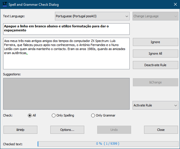
How can it be 0%? Microsoft Word 365 scores it at near 100% (their “Editor” evaluation).
Anyway, I had another idea for text scoring: ACADEMIC SCORE: 100% | 0/20 | 5/5 | A+ colour in bar: less than 50%=red orange between 50% and y green above y
The “academic score” would appear below the bar, and the bar could have three colours: red, orange and green.
The scale: 0-100%, 0-20, 0-5, A something (the adding of letters seem to depend on the scholar institution, so maybe it shouldn't be implemented).