 laurent22
commented
6 years ago
laurent22
commented
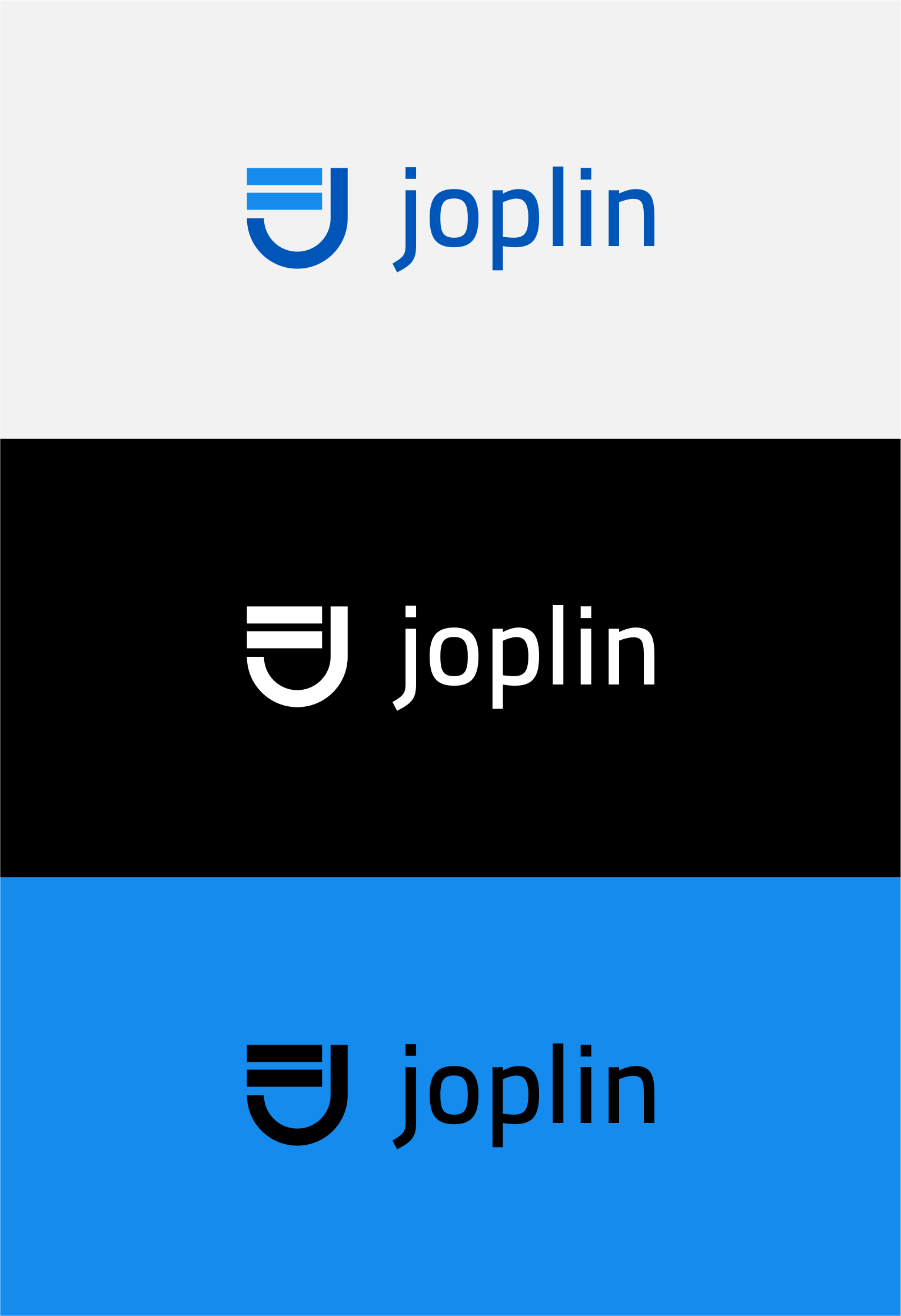
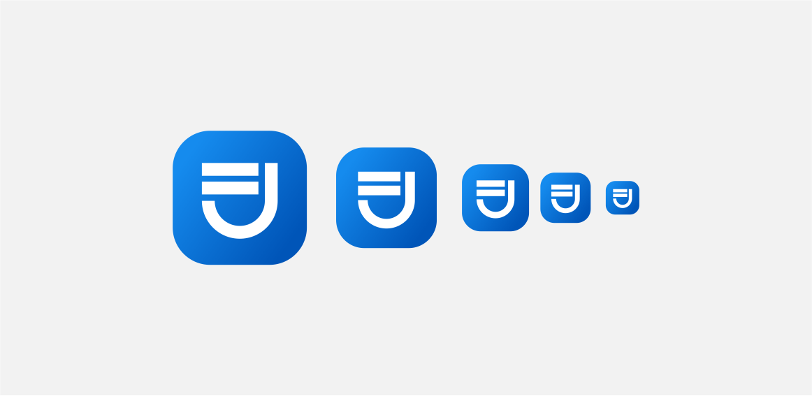
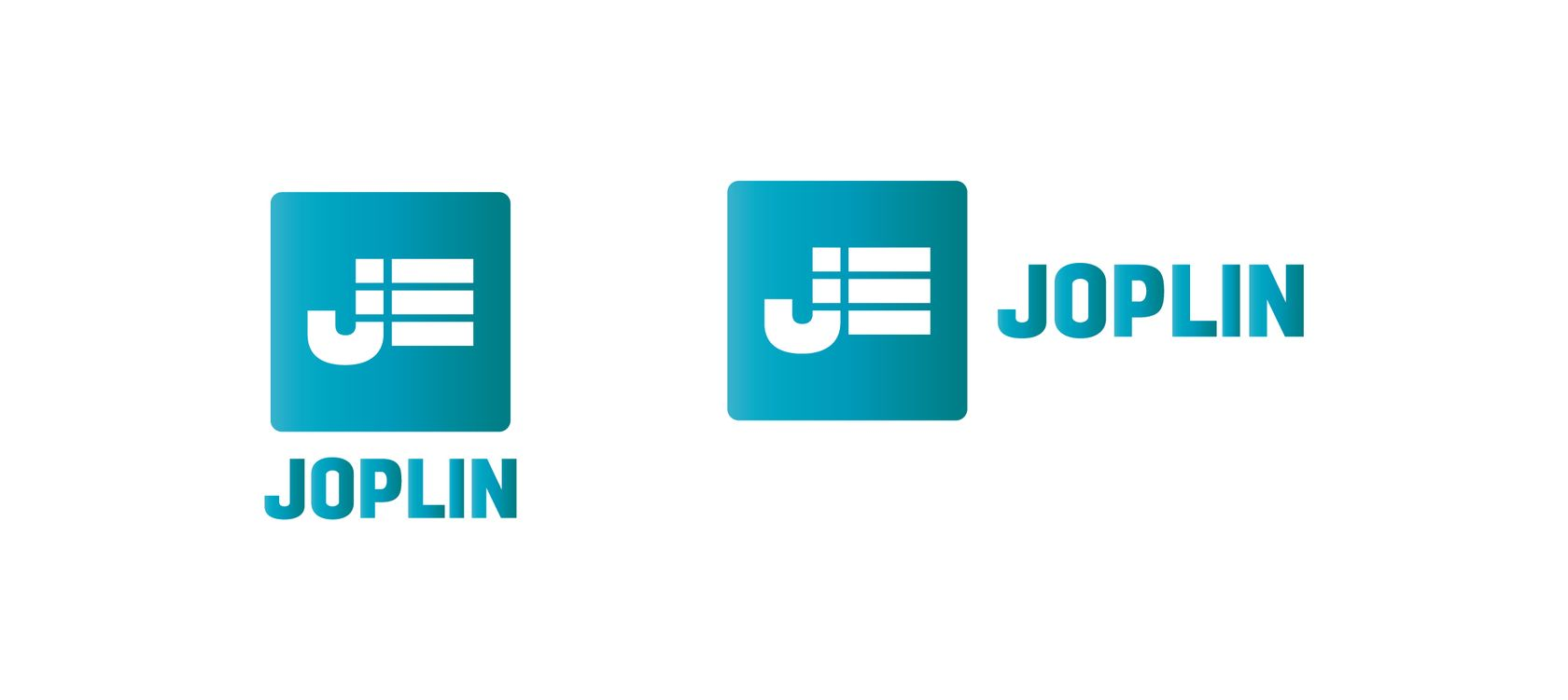
6 years ago Yes I find the blue colour a bit too generic that's why I was using something else in the desktop app, but it also makes sense to be consistent, so I've changed it to blue in the desktop app.
So unless someone with designing skills can come up with something more original, blue will be Joplin's colour for now.
 jcgerhard

 mr-bolle
 alexdevero
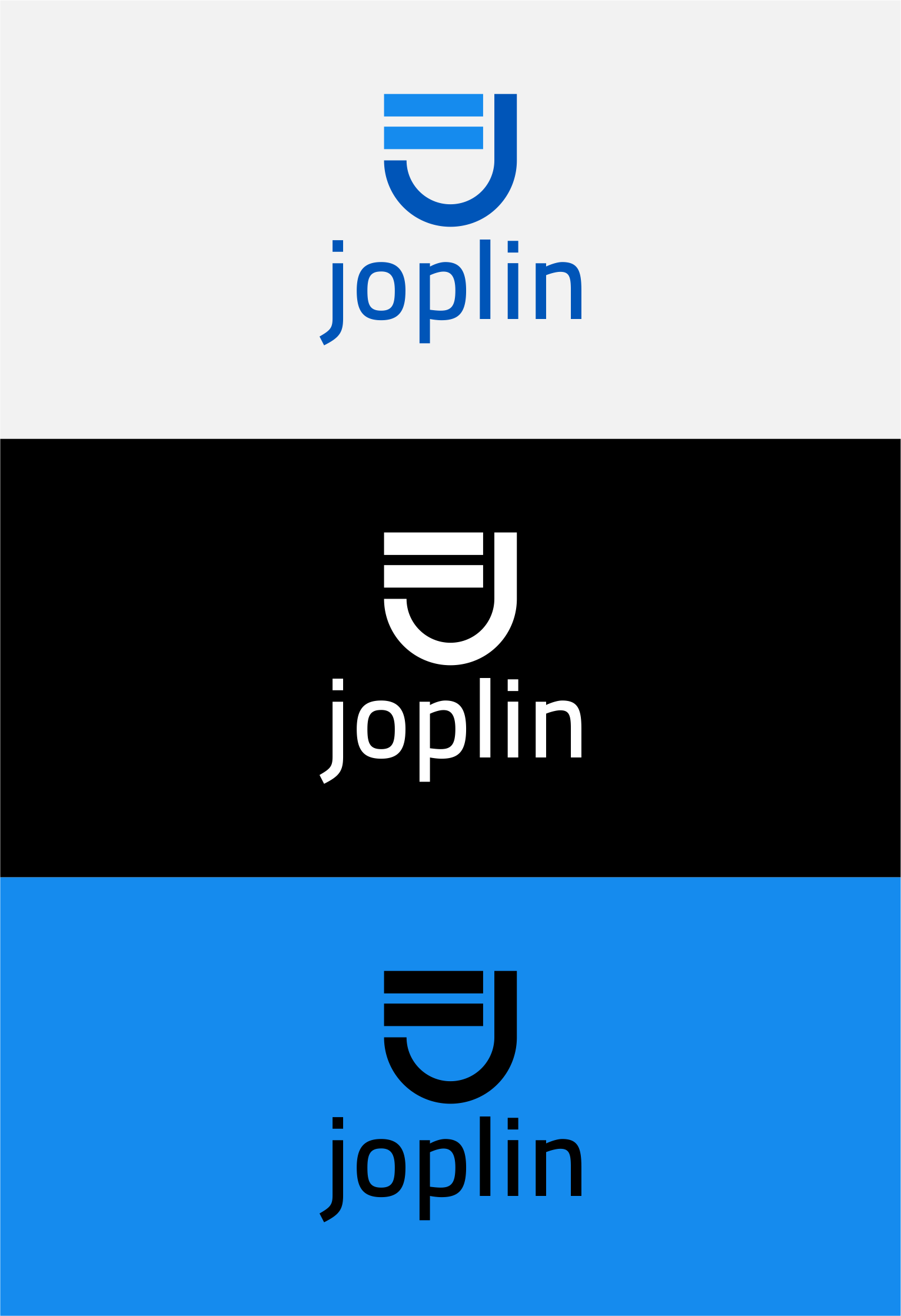
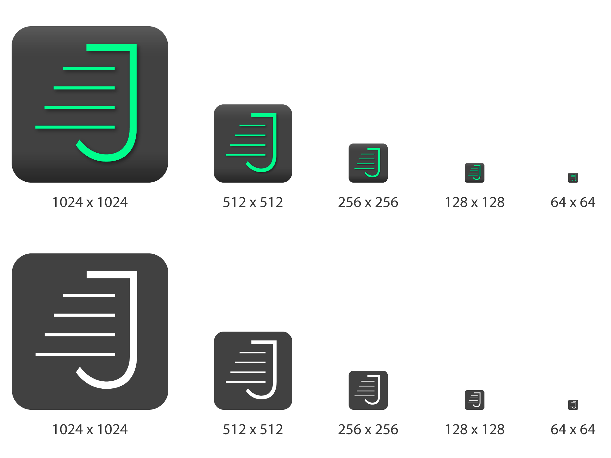
 tessus
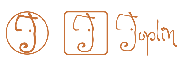
 (but instead of blue it will be a black square)


 saivan

 andrea-marini


 stale[bot]
 etho201


It’s just a cosmetic adjustment, but I think it would be advisable to harmonize the appearance of all UI variants in terms of color. Hence I mean it would be nice to have the same colors on mobile and on desktop. At the moment the mobile apps are coming in blue while the desktop counterpart is coming in this shade of violet (or whatever). For creating a corporate design you should align the one with the others. I‘d like to have the blue color for all UIs...or maybe a new uniformed modern dark theme.