Open roy7 opened 6 years ago
It looks really nice and neat. Great job! One suggestion, is it possible to include estimated Elo under each network? Hopefully it's not too much work. If it is, please just ignore my comments. Also, using real life estimated Elo scores (e.g. https://docs.google.com/spreadsheets/d/1QhYWYQvXBhI5eHJm45fvf97CaV2rRmgrATwVgBFGKoU/edit#gid=806323235 ) probably would be more useful for general go players. I mean, if we see a network with an elo 3600, we can immediately know it's about the strongest human player's strength. Some people might feel that the current LZ best's 11455 elo a bit confusing. Just my two cents.
suggest add a graph of winrate of each match, as following
for those promoted match, also point out when pass and the winrate value of that time
I want to have a tab to download the raw sgf files and training files from the new home screen. By the way, the two links do not work right now.
Very cool, works well on mobile too.
Maybe i'm blind, but i don't see where we can watch some lastest self-play match ? The equivalent of this ? http://zero.sjeng.org/self-plays
And there is a padding/margin thing here that is triggering me, but i'm a crazy person ^^
Looks very cool.
Is it possible to add winning statistics in the opening analysis section?
It looks like you're sacrificing functionality and ease of access to important or desirable information for some very slight improvements to look and feel. If it were me, I would scale down the size of the graph, make the "recent matches" section much more compact and cleaner, add the recent self-play game and match game functionality back in somewhere, add the very useful text explanations on the current front page back in somewhere, and perhaps choose a different color scheme than a mix of white/black text on a black/gold/sky blue/white backgrounds. Maybe just find a simple image or pattern that captures some aspect or essence of the LZ project and use that for a banner, and then just leave the rest as black text on a white background, and maybe also some descriptive language about what the graph actually tells people.
If you think about how people parse the information on the graph on the current page, most of them probably end up referring back and forth between the graph and the network list and test matches list to make good sense of the data, but with the new set up you're testing, they'd have to switch back and forth between 2 pages to do that, and the new network page is still less descriptive than the current one, so it would be more difficult to do in many ways.
As a general rule, the less pages you have to go through and the less clicks you need to get somewhere, the better.
The openings page is an interesting idea, but it looks a bit clunky and awkward to use. Having to scroll down the page through a long list of what appear to be very simplistic joseki sequences with a hard to decipher scatter plot and some statistical data and no other functionality seems very nebulous.
From the standpoint of people already familiar with the project, the excessive use of space for each element and the dividing of important related elements on separate pages is just an irritating inconvenience. But for new people who are coming to check it out for the first time, they're being presented with elements almost in isolation of one another that have no explanations about their relationships or importance, so it's like "oh, here's a graph", then they scroll down and "oh, here's a table of something, but I can't immediately tell what it is", and then they either spend several seconds to several minutes trying to figure it out, they stare at for a second it without bothering to try and understand it and continue searching for whatever it is that's important to them, or they just leave the website. Also, the navigation links would probably be somewhat cryptic for people not familiar with the project already.
Honestly, there's very little that needs to be changed on the current one, except to clean up and organize the text a little bit with headers, maybe some simple stylistic features, and better placement, and a container for the self-play games list, and maybe an additional scroll bar for the list of networks and test matches so that you don't have to constantly scroll down a screen and lose the image of the graph in order to check information about the older networks. Also, maybe some code to display the local time for each visitor instead of GMT+1. And then, maybe, if it strikes your fancy, finding some simple art or pattern like I suggested above for a banner to add some character to the page and a navigation menu like you have on the new page for any new features you feel deserve a separate page, such as a bio on gcp and significant contributors, or a news feed with links to articles that reference or are about the project.
The most important thing that people need from the website is an easy overview of the status of the project, which the current page does very well. My two cents.
i also agree to keep current version, at least as a lite version for whom like it. the big and Deluxe version mainly add new features, such as opening lib, the duplicate features develop can be delay a little more time
@Cabu had a lot of suggestions over at https://github.com/gcp/leela-zero/issues/1555#issuecomment-397212788:
The link on the front page "Leela Zero 0.15 + AutoGTP v16. Update required." doesn't work. It goes to http://zero.sjeng.org/%22https://github.com/gcp/leela-zero/releases/%22
Openings section is a good idea (minigo pages have great information), but is quite confusing now. My best understanding is that the list of openings that are there now are hand-curated. I'd really enjoy something similar to that (e.g. how would Network X play out different fusekis with some standard settings). I realize this requires additional games or analysis, so may be out of scope for you.
I love it. I think it's great.
And I do think that the opening tag is a cool demo of "innovations" that LeeLa brings. I also like the scatter graph a lot, and I do think that its meaning is obvious. However, the horizontal axis of the graph is missleading. It runs all the way to 10 million even though LeeLa only played 7.8 million games so far. The maximum value of the horizontal axis should be 7.8 million, i.e. the number of played games.
If you are looking for more patterns to add, here are some bot influences that I spotted in recent pro games:
As others pointed out, the most wonderful thing would be a more powerful opening library, e.g. an online pattern search website that has indexed those 7.8 million games (or the most recent ones). But really, please just stay focussed on what you're doing. :-) 'Cause you're doing a great job.
@bvandenbon The idea itself is interesting, but the implementation needs work. Honestly, there's already a formula for it, more or less, which is an sgf tree on a single player, like eidogo, wgo, josekipedia, waltheri, and now Deepmind have with the AZ teaching tool. What none of those sites have that roy7 and whoever else may be working with him to build a newer site seem to be trying to build are analytics tools specific to the LZ project, like the scatter plot.
You may very well be able to understand the scatter plot, as would most people who are already familiar with the project, but with no clear explanation of the data you're going to lose anyone who's interested in the tools but isn't familiar with the project.
If the aim is to give the LZ project a face-lift and engender broader appeal, then it's an important point that needs to be addressed. If it's just for the people already involved, I'm sure we've all gotten really comfortable with the current page and don't really care too much about L&F, although extra functionality, when it's done right, is always nice.
I mean, if they're looking for a good example of website design to inspire the LZ website, they already have a great one right here on github: a very simple and easy to navigate layout with great functionality and without too much art, color, or images to distract from what it's here to do.
Just so you know the credit for this work largely goes to @rchs819 and @bood.
@bvandenbon I love that Tang Weixing used the Leela Zero flower joseki!
@roy7 I see. Thanks for the information. :D
Also, you know that that's been a joseki and seen common use for decades before computers even entered the scene, right? I'm not sure it's appropriate to attribute that joseki to LZ. If anything, it's more attributable to Go Seigen, who really redefined the value of central influence and popularized 4-4 openings in general. The sequence itself has been known for centuries, but just wasn't considered joseki until around the early 1900's.
Download link does not work: it's http://zero.sjeng.org/"https://github.com/gcp/leela-zero/releases/" instead of https://github.com/gcp/leela-zero/releases
First of all, the use of the word "opening" for joseki is wrong, as many moves could already have been played in the other quadrants. Also, the scatter plots should have a vertical line at the current number of training games so as not to falsely imply the joseki simply stopped being played past that point during non-existing games. It might also be interesting to have these statistics make a distinction between black and white being on one side or the other in these sequences.
I know I mostly lurk while providing training games, but I thought I might chime in anyway. I understand some of these comments are more nitpicky than others. I apologize for the length. I have been working on this issue bit by bit. I hope the headings and bulleted lists increase the digestabilty. I also made a mockup of the new homepage. It roughly incorporates my ideas and some others' ideas. Others have been contributing great ideas. I know it has some spacing issues. I am sure someone with better could resolve said issues.
:sweat_smile:
#666666
instead.#ffe6cc
instead.#cce6ff
instead.#5b9bd5
instead.Failed
SPRT tag the matches column, I might suggest #ffcce6
for the background instead.Pass
SPRT tag in the matches column, I might suggest #e6ffcc
for the background instead.Promoted
tag for matches that promote a network using #cce6ff
.Test
tag for test matches using #e6e6e6
.yyyy-mm-dd hh:mm
and have it be consistent throughout the website.it shows old message(now lz150, it shows lz148), and the result of top 2 lines is error
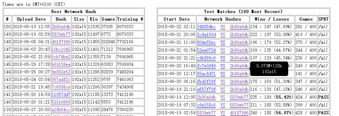
the data of new page is still wrong
@l1t1 Fixed in #180
recent matchs doesn't show on chrome
@bood @l1t1 Fixed in #180 latest match http://zero.sjeng.org/ shows 314 games http://zero.sjeng.org/match-games/5b30226d9ecc2573bd5720ae also shows 314 but http://zero.sjeng.org/home shows 315
On the "old" home page, hovering over a network's short name in the match list gives more information than it does on the "new" home page. E.g., for the ELF network it tells you it's ELF, says which version of the ELF weights, etc.; for regular LZ networks it tells you the network architecture. It would be nice to have that back.
The match list takes up a lot more space on the "new" page than the old. Perhaps some of the information currently in hover text could be un-hidden. I'm thinking in particular of the test / regular match information, without which the table is kinda misleading since when there's just been a match against something strong like ELF it looks as if the LZ networks have suddenly made huge progress :-).
Would you support https?
I think /home would be friendlier to newcomers and more useful to everyone if (1) it displayed at least a little information about what the heck it is and (2) it had one line of info saying what the latest network is, perhaps also when it was last updated, and with a link to download it. For (1) I'm thinking something like "Leela Zero is a strong go-playing program trained by self-play on the computers of thousands of volunteers. For more information, see the README" with "README" being a link. If the FAQ were more approachable, there could be a link to that too. Might mention AlphaGo Zero too, might not. For (2), something like "Latest network is LZ153, 15 blocks x 192 channels, from 2018-06-29 at 18:41." with "LZ153" being a link to the actual weights file.
sugguest add a list of link to strongest weight of each size. eg. https://github.com/gcp/leela-zero/files/2162485/best_5b.txt.gz at https://github.com/gcp/leela-zero/issues/1557#issuecomment-402580126
How often do you update Joseki?
The number of Joseki appearances should be wider, as some of the Josekis appear intensive.
could you add a graph like this ( https://github.com/gcp/leela-zero/issues/2058#issuecomment-443094677 ) for each match?
I can't zoom out in mobile, so I can't see anything on my phone
How do you update joseki?
I think that is too long time ago.
I don't actually know but I think @sethtroisi was looking at it.
Could you not include commas in all those long numbers? It makes them much easier for people and not much harder for programmes to read. (The site https://zero.sjeng.org/ is down (502), so I cannot check out more right now.)
@sethtroisi Please update the joseki, which has been 541 days ago! It must have many many countless changes of josekis, please update it.
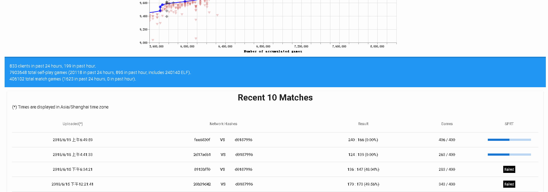
The new front page for LZ is being tested here:
http://zero.sjeng.org/home
Please review and provide feedback!