leeoniya / uPlot

📈 A small, fast chart for time series, lines, areas, ohlc & bars
MIT License
8.51k stars 371 forks source link

[Question] Is it possible to render special values separately without skewing the graph? #888

Closed trufflesprouts closed 6 months ago

trufflesprouts commented 6 months ago

Hi, first of all thanks for creating this amazing library it blows my mind how good it is!

I need help to nudge me in the right direction. I've got some data that looks like this:

const data = [
  [0, 1, 2, 3, 4, 5, 6, 7, 8, 9, 10, 11],
  [50, 200, 52, 45, 70, 32, 44, -200, 42, -200, 53, 200],
];

const specialValues = {
  [-200]: "Min",
  [200]: "Max",
};

I want to render a line chart between all the non special values, and I want the special values to be rendered separately at the top.

Here's an example: Group 2

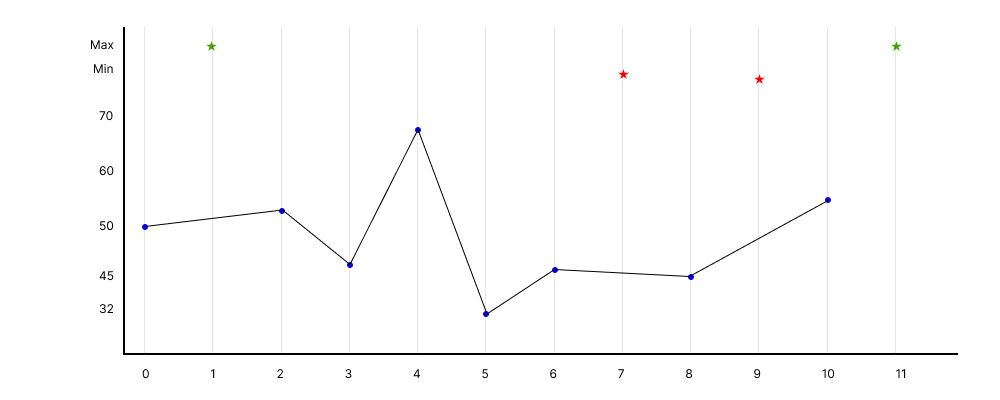
One thing I tried is splitting the data into multiple series and connecting the gaps for the non-special values. The issue is that the min and max values are skewing the graph too much thats why I want them to be stacked on top. Also, min and max are just examples, there could be lots of other special values .

Screenshot 2023-11-03 at 12 38 32 AM

Just want some guidance on which options to use to achieve this result.

Thanks very much in advance!

leeoniya commented 6 months ago

The issue is that the min and max values are skewing the graph too much thats why I want them to be stacked on top.

if you just want to prevent outliers from affecting the others too much you can use the asinh scale.distr.

https://leeoniya.github.io/uPlot/demos/arcsinh-scales.html

Also, min and max are just examples, there could be lots of other special values

maybe stick them on an additional y axis & scale, possibly also with ordinal/uniform scale.distr?

we do something like this for volume bars in Grafana's candlestick panel: https://play.grafana.org/d/candlestick/candlestick?orgId=1

trufflesprouts commented 6 months ago

Thanks for the quick response. Due to the nature of the data it doesn't make sense to use asinh since they're not always outliers in the mathy sense. Another example is

const data = [
  [0, 1, 2, 3, 4, 5, 6, 7, 8, 9, 10, 11],
  [50, 0, 55, -45, 0, 80, 0, 100000, -45, -50, 53, 60],
];

const specialValues = {
  [0]: "Reset",
  [100000]: "Overflow",
}

One hacky way I did is preprocess the data, split it into multiple series and change the values of those special values to max(non_special) + special_val_index This way they always show up at the top and don't skew the plot

Screenshot 2023-11-03 at 8 40 58 AM

Is there a way to achieve this with a plugin or custom paths method? I understand this is a really special case and don't expect any kind of native support for this, just wondering how I can build it my self.

leeoniya commented 6 months ago

i think this is probably a good way to approach it.

an alternative could be to make 2 stacked & synchronized charts like these in https://leeoniya.github.io/uPlot/demos/log-scales2.html. though this requires a bit more work (and DOM poking if you want a combined legend)

image