Closed CrashLaker closed 4 years ago
hey @CrashLaker
i'm assuming no errors are thrown in the console?
can you attach your dataset (or a subset that still triggers the issue) and paste your opts
here? (or make a jsfiddle).
My bad.. my script wasn't properly sorting the data.
i'm assuming no errors are thrown in the console?
yeah. no errors are shown
Now this is the resulting array: and plot when it's zoomed in:
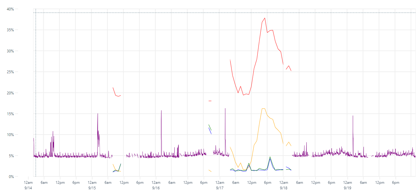
can you attach your dataset (or a subset that still triggers the issue) and paste your opts here? (or make a jsfiddle).
ok i'll try
Any advice on how to save that much data?
My opts
:
Any advice on how to save that much data?
all the data is probably not necessary to trigger the issue. maybe start chopping 50% down until you get to a small size that still reproduces the issue, then do JSON.stringify(data)
and attach it here.
for your opts, please paste them into a code block in this issue, so i don't have to re-type everything from your screenshot. see here: https://help.github.com/en/github/writing-on-github/creating-and-highlighting-code-blocks
JSON.stringify(data)
thank you. got it.
{
"title":"Chart",
"width":1344,
"height":600,
"series":[
{
},
{
"label":"CPUUtilization",
"scale":"%",
"color":"blue"
},
{
"label":"CPUUtilization",
"scale":"%",
"color":"red"
},
{
"label":"CPUUtilization",
"scale":"%",
"color":"green"
},
{
"label":"CPUUtilization",
"scale":"%",
"color":"orange"
},
{
"label":"cpu|usage_average",
"scale":"%",
"color":"purple"
}
],
"axes":[
{
},
{
"scale":"%"
}
]
}
here's my issue. https://codesandbox.io/s/friendly-lalande-4wxvi
ok, thanks.
i think this is a bug in the last commit (6941e05f488763c3594cab482ea0132b491b71d8) where i refactored the clipping code. it looks like it's creating a clipping region if any data within in a single pixel is missing. if that's the problem, the fix should be easy.
ok, thanks.
thank you rly. also thanks for fast replies ;)
got another behaviour https://codesandbox.io/s/uplotbehaviourv2-3qrsw on that plot if you scroll just a few you might be able to see the plot. if one scrolls a huge range nothing is shown hope it helps!
c.
this should be fixed now.
for your data i would recommend the opts below with spanGaps: true
, otherwise you will not see sparse, single data points at higher zoom levels.
const opts = {
title: "Chart",
width: 1344,
height: 600,
spanGaps: true,
series: [
{},
{
label:"CPU1",
color:"blue"
},
{
label:"CPU2",
color:"red"
},
{
label:"CPU3",
color:"green"
},
{
label:"CPU4",
color:"orange"
},
{
label:"CPU_AVG",
color:"purple"
}
],
};
you may also disable y auto-scaling, for a bit of extra performance (80ms -> 70ms for me):
scales: {
y: {
auto: false,
range: [0, 100],
}
},
thanks for the report!
Wow! It worked!
I used your demos/missing-data.html as a starter. Now I just realized that was the only one I shouldn't pick since it was supposed to do that right? haha
Anyways thanks a lot for all your help. made my first codesandbox ever!
you may also disable y auto-scaling, for a bit of extra performance (80ms -> 70ms for me):
got it. thank you for the performance notes.
C.
awesome. if you ever feel like contributing and learning more about uPlot, i could use some help finishing the docs up before tagging v1 :)
made my first codesandbox ever!
cool, though i prefer https://jsfiddle.net/ or https://flems.io/ or https://codepen.io/, since codesandbox is super heavy and slow, and not really necessary for minimal repros in my libs (which can just be included via script tags). e.g. see how fast this loads: https://jsfiddle.net/v4xuohk6/, codesandbox won't even finish booting.
awesome. if you ever feel like contributing and learning more about uPlot, i could use some help finishing the docs up before tagging v1 :)
great! atm i feel i still need to build up some more knowledge so maybe one day i could be of any help ;)
I tried to use jsfiddle like you suggested but I couldn't find a way to drag/upload the json file. As i've seen in your example https://jsfiddle.net/v4xuohk6/ (which indeed loads amazingly fast) you dumped the whole content in the javascript frame. that's why i used codesandbox where vue devs were using more often these days.
thanks for the support. C.
@CrashLaker, heads up, spanGaps
opt has moved from global to per-series.
Got it thank you!
Mind to ask you why?
I can't see any partiular use case in dividing plots between spanGaps: true||false
Actually I was sometimes having trouble trying to find a particular value in the chart because merging multiple different sources results on many NaN values so I just interpolated everything.
One possible solution would be using voronoid http://bl.ocks.org/nbremer/65f03d1ebd1742196200 but i've no idea on how to implement that.
Mind to ask you why?
spanGaps
can now be a function which can choose which gaps to span, and this can vary per dataset. it made more sense to move it into the datasets otherwise that decision would have to be global and would be difficult to adjust precisely.
another reason is because that function deals with gaps in canvas pixels (not css pixels). the series line width is also determined in canvas pixels, while chart width/height is in css pixels. it's more logical for the gap spanning to be near other options which deal in the same units.
Actually I was sometimes having trouble trying to find a particular value in the chart because merging multiple different sources results on many NaN values so I just interpolated everything.
yeah, that's why the intro says [1] it might be awkward to have non-alignable datasets :D
however, since you implement your own legend already, it should not be too hard for you to find the closest datapoint in each series and display that (including multiple time values), and even draw your hover points at the proper positions.
u.cursor.idx
will get you the starting point for your search in the arrays, then simply search outwards to the nearest non-null values. once you have those for your legend, you can use u.valToPos(val, scaleKey)
to get the css top
or left
coordinate to update your hover points. should be pretty simple. you can turn off the native hover points via opts.cursor.points: false
. should all be pretty simple.
Hi all.
I'm having some weird issues when dealing with many time series from multiple sources (meaning timestamps won't always match).
My guess it that when the dataset has many values separated by nulls some lines simply don't appear in the chart.
Example: 
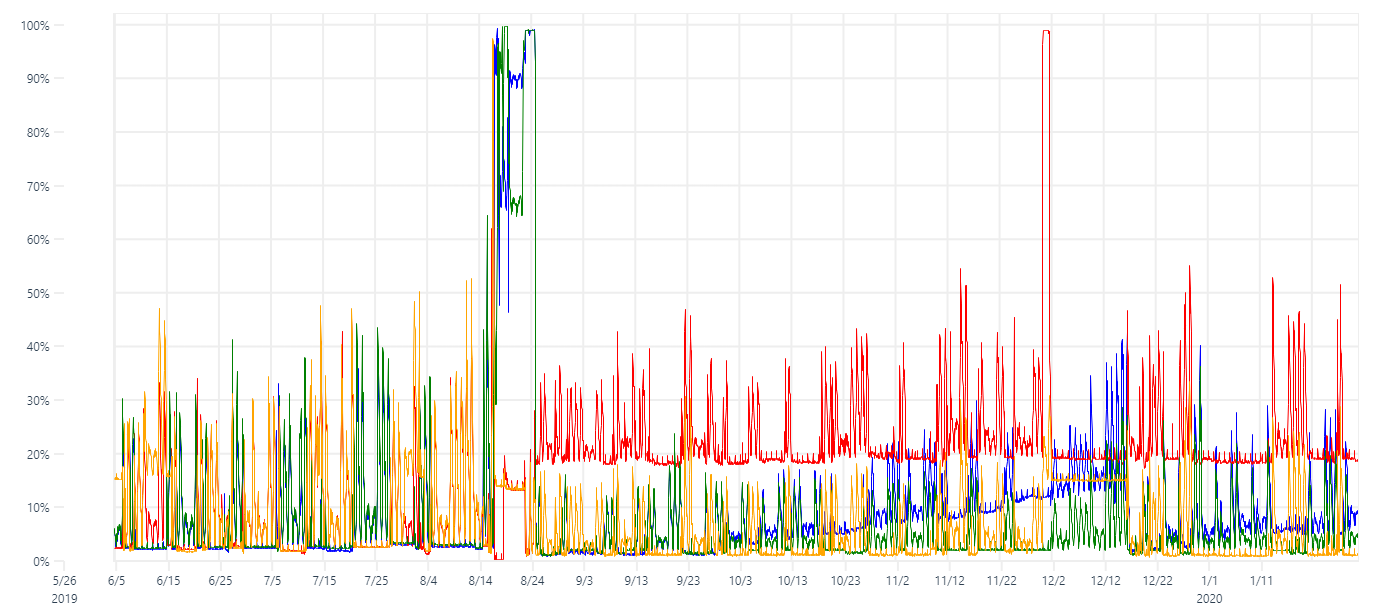
The figure above has data displayed as:
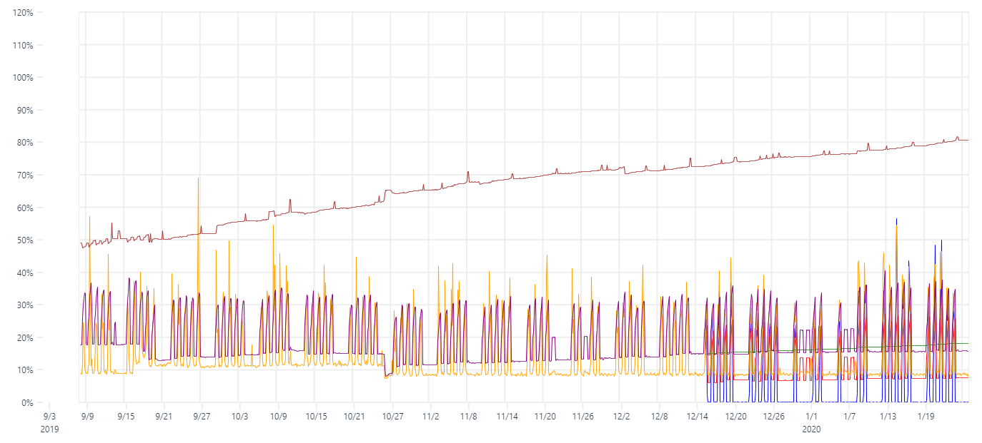
When I then try to merge it with another dataset all the other lines disappear as shown below: I know the other points are there as highlighted in the black box. Here's the final array struct:
Regards, C.