Closed H-For-Hitesh closed 2 weeks ago
take a look at the first two examples here: https://leeoniya.github.io/uPlot/demos/multi-bars.html
you can provide disp.fill
and disp.stroke
callbacks to the bars pathbuilder that can do per-bar coloring.
Hi @leeoniya Thanks for the response. I understood the solution you suggested but it does not resolve the complete problem in my case. In this case I can render bar charts of different colour with different labels but I'm not able to select/deselect different colors in the metric legends(same goes for the demo which you have shared). Any solution on this is highly appreciated!
Added some images for your reference @leeoniya :)
when Legend Selected when legend is not selected
uPlot's legend is series-based.
since there is only one series here, what you're looking for is a value-based legend. so probably you can make your own legend that would act as a data/value filter when clicked and use u.setData(filteredData)
to update the plot with the "off" values removed. so, for example if you wanted to disable "Wed", you can have your custom legend filter out data at index [2].
this is a bit of an unusual requirement, i think. do you have examples of other chart libraries that do this?
for example, Chart.js legend is also series-based: https://www.chartjs.org/docs/latest/charts/bar.html same with echarts: https://echarts.apache.org/examples/en/index.html#chart-type-bar same with high charts: https://www.highcharts.com/demo/highcharts/bar-basic
Hi @leeoniya Thanks again for the response. I worked on the solution you suggested, this is working well. :)
Hi @leeoniya Regarding the same issue. Is there any way tooltip may work for similar bar chart. Checked the current tooltip plugin shared in demos. It works with series so there is single text for whole chart, Is there any way I can have a separate tooltip label for each bar?
First of all thanks for the amazing library and I honestly appreciate your work. :)
I'm working on the following type of bar chart.
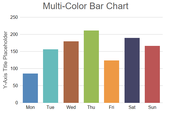
I was able to rendered this type of bar chart by creating data and series in the following way.
I feel this is a workaround and I am not sure if this is the right way of rending multicolor bar charts.
can you please guide me if there is any better way of doing this? Thanks!