Team's Response
The verification checks are not completely unnecessary as different checks will all give different error messages. Most importantly, it shows the order in which the input is being checked, as in the case of a wrong name and wrong position, only the wrong name error message will appear, which is an important detail to note in how the feature is implemented. Additionally, most of the texts are still readable despite the additional checks displayed.
Items for the Tester to Verify
:question: Issue response
Team chose [response.Rejected]
- [x] I disagree
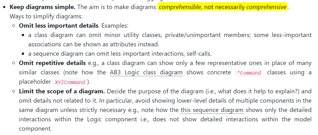
Reason for disagreement: As a reader of the guide, it hinders me as there is so many if else conditions in this heavily nested sequence disgram. Looking at the module's guidelines,

I believe that these validation checks do not need to be explicitly stated out, bur rather one check would be sufficient. The heavy amount of nesting makes it confusing for a new reader and all the validation checks seem to serve the same purpose. I believe that the order the input is checked is not that important and the reader does not need to see it.
In this diagram, all the verification checks are listed which is unnecessary since it could be abstracted as just one verification check. This makes the diagram unnecessarily large and complicated for the user to follow.