lepoco / wpfui

WPF UI provides the Fluent experience in your known and loved WPF framework. Intuitive design, themes, navigation and new immersive controls. All natively and effortlessly.
https://wpfui.lepo.co
MIT License
7.73k stars 755 forks source link

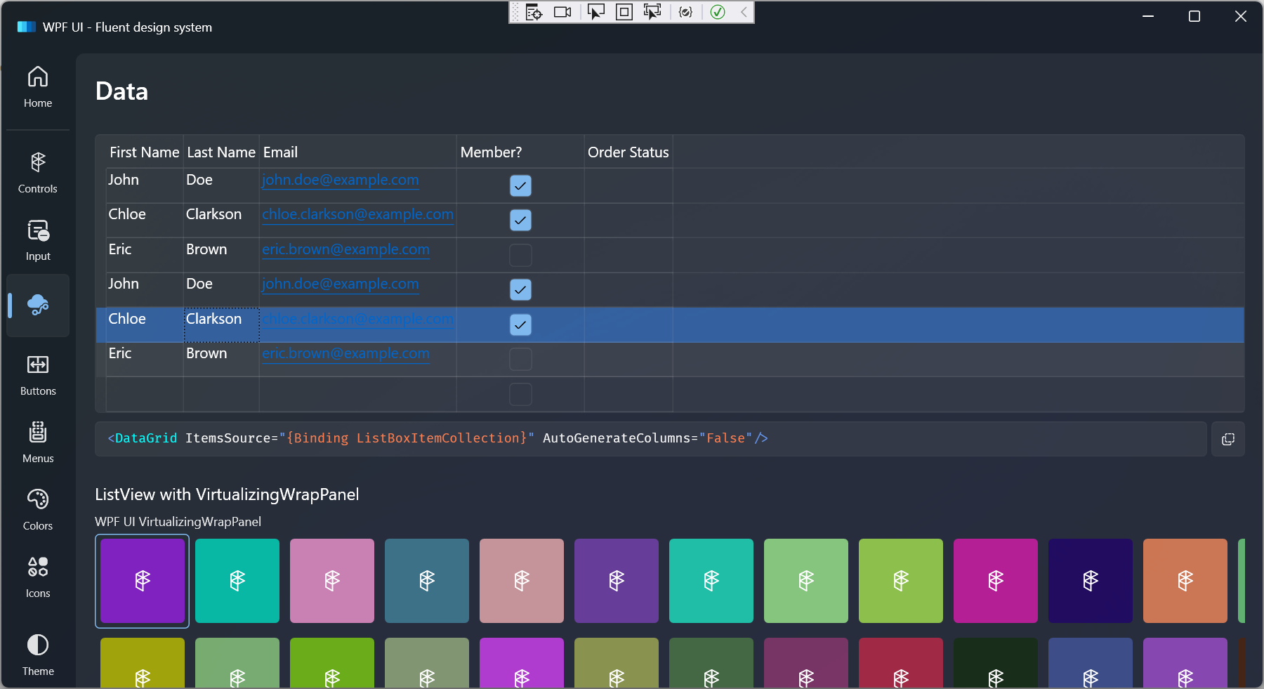
DataGridRow not highlighted when selected and hovered on #410

Open trungnt2910 opened 2 years ago

trungnt2910 commented 2 years ago

Describe the bug

DataGridRow not highlighted when selected and hovered on.

To Reproduce

Expected behavior

Screenshots

https://user-images.githubusercontent.com/57174311/192426848-f4edae99-8354-4d44-a42d-a625fa8f2720.mp4

OS version

Windows 11 22H2

.NET version

.NET 6.0.401

WPF-UI NuGet version

Built from source, development branch commit 299a90e966c9eba4cb45a9044039d694b4053c41.

Additional context

This is due to the VisualStates for the WPFUI default DataGridRow style are not implemented:

https://github.com/lepoco/wpfui/blob/299a90e966c9eba4cb45a9044039d694b4053c41/src/Wpf.Ui/Styles/Controls/DataGrid.xaml#L226-L371

I have a sample implementation based on the WindowsCommunityToolkit's DataGrid for UWP:

which gives this result: image

The Windows Community Toolkit implementation basically:

Note that unlike other WPFUI controls such as TreeViewItem, the sample DataGridRow implementation does not have a 0:0:0.16 animation duration. Everything happens instantly similar to the WCT DataGrid.

If the code and screenshot above seem appropriate please let me know so I can open a pull request with it.

vmiwouter commented 1 year ago

When i apply this fix the selected color seems too dark when the theme is on light and if you change it back and forth from dark/theme then its normal.

Dark doesn't seems to have this issue.

The grid text seems to to be aligned on top. How can this be streched over the whole cell, so that its 'centered'?

trungnt2910 commented 1 year ago

When i apply this fix the selected color seems too dark when the theme is on light and if you change it back and forth from dark/theme then its normal.

You can try to change the opacity in the VisualStateGroup and make it lighter.

The grid text seems to be aligned on top. How can this be streched over the whole cell, so that its 'centered'?

Try editing the style, find any ContentPresenter you can see, and set the HorizontalContentAlignment and VerticalContentAlignment to Stretch.

Agwebberley commented 1 year ago

This should be implemented.

blackier commented 1 year ago

Will this style issue be resolved soon? Without this selected style, the datagrid is incomplete.

SuperBrain commented 5 months ago

@pomianowski is there a chance for this to get some attention please, or are you now fully focused on transferring WPF-UI to WPF?

I (and I guess many other devs) am using DataGrid a lot and having no selection highlight for me is a major obstacle, so I would really appreciate it if this got properly implemented.

trungnt2910 commented 5 months ago

A fix has been implemented here, but someone will need to clean it up and open an actual PR.

Feel free to use that code in your own fork long as you put my name as a co-author in the commit.