 ghost
commented
4 years ago
ghost
commented
4 years ago 
Closed ghost closed 3 years ago
ghost
commented
4 years ago
ghost
commented
4 years ago i think the last 2 knights are pure gold. its either 1 knight or 1 white and 1 black knight.
ghost
commented
4 years ago 
ghost
commented
4 years ago 
ghost
commented
4 years ago 
ghost
commented
4 years ago 
ghost
commented
4 years ago i think this one hits all the button -squareish -simple and slick -easy to remember -hidden ( Li ) in his face -knight with a proud father-figure
 superuser-does
commented
4 years ago
superuser-does
commented
4 years ago I've written about this before, this is my personal take on what would be required for a new logo and my views don't represent Lichess as a whole.
superuser-does
commented
4 years ago Commenting on the actual suggestions now: I think these are very strong. I wouldn't go for the knights with the flat mouths, I believe Lichess as a whole has a more curvy look. The various arrangements you made near the top are also brilliant, like with the knight and a bigger outline of the same knight behind, but slightly modified and in a very specific colour palette. This is some seriously advanced thinking, especially if you narrow down towards a single design.
In fact makes me curious if you have a design/publishing background as I've seen this kind of thing before - different ways the same logo base can be used. Impressive stuff. Of course, this is easiest to do with a simple and straightforward logo (think of Google Search and their frequent 'Google Doodles'). A more complex logo is harder to modify.
I'm not sure how good these would look at favicon size, but keep going! You seem to be very familiar with vector now, but you can always sketch ideas in a raster program like Photoshop or The GIMP, whichever is easiest, and convert to vector later.
ghost
commented
4 years ago @superuser-does I am structural engineer :)) I design just for hobby, some days are very full for me ,some are not. Thank you for your support.
Here are more variants. If the lichess team likes one, then we can interate further on that one design.

ghost
commented
4 years ago 
 ornicar
commented
4 years ago
ornicar
commented
4 years ago Great stuff, @sadsnake1, very impressive indeed.
Looking at these logo I realize that I enjoy plain shapes more than line drawings. Lines often look weird when put next to text.
Another example of a logo that I like is the starcraft teamliquid logo.
By the way if we choose a new logo, it will very likely replace the huge cburnett knight on homepage: https://lichess.org/
ghost
commented
4 years ago The team liquid is a competitive esport team, so the logo must be something agressive( spartan shield with a serios knight). Also that logo is made to be big, like a banner, it is not made to be portable
But look at the firms that are working with people or selling product or services. Their logos are friendly, colorfull and simple.
Also, please tell me which of those knights do you like. How serious looking should be the knight and also the background ( circle, square, shield, etc.) and colors
ornicar
commented
4 years ago I like the plain ones mostly.
 simple and plain. Not sure about the lilac.
 very nice try with the circle
 again I appreciate the plain-ness and disc. Can the knight be simplified further?
It would be easier to talk about the designs if they had a unique name or number.
ornicar
commented
4 years ago Note: as we all know chess knights on a board look to the left, but in my opinion we don't need to respect that in a logo. I don't mind knights looking to the right. It's actually more instinctive for most left-to-right readers.
ghost
commented
4 years ago 
ghost
commented
4 years ago I compiled here all designs for easier discussions

superuser-does
commented
4 years ago Really good. The circular knight was the one that caught my eye as well, the one with just the outline. It's not totally common but the shape is interesting, yet still fits with the clean, basic lines throughout Lichess's design. I'd go so far as to say that it's great, but unique enough to make it ideal for a logo. You won't find a set like this (and that's okay, the logo doesn't have to be playable as a set).
I also think it's interesting that many designs work without eyes and nose. Or with. They're both okay and worth exploring :)
In terms of an Android/iOS app icon, it would be a bit tougher with a basic shape that relies on having no fill. It's also hard for the favicon. If we look at GitHub's favicon, it encloses the outline for Octocat (see it in full form here) in a dark circle. The same goes for other single-colour logos, like Slack's and Reddit's.
I can't speak for iOS, but at least on Android, you have a choice of bubble, square images, rounded squares, or just the image the app provides. Currently Lichess just uses the cburnett knight, and it's the biggest looking icon of them all! I quite like that myself, though I appreciate it's subjective. Here's how that looks on my phone.
So the last one Thibault pointed out is cool. but I prefer a more involved design so it looks more striking on mobile. There can always be a separate, simpler version for e.g. for the lobby background, Thanks again!
ghost
commented
4 years ago The circular knight is the best choice. For the lobby background is perfect. Maybe it can spin slowly when searching for a match, like a loading aperture. I will make some iterations, having in mind that will also has to be a full fledged logo for the app.
ghost
commented
4 years ago 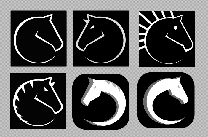
ghost
commented
4 years ago 
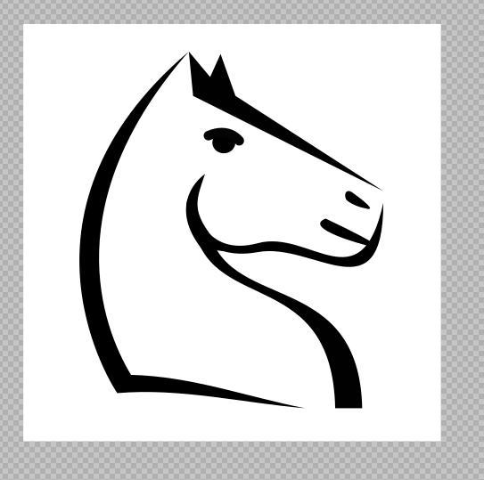
i would go with one with the last two knights. Period
ghost
commented
4 years ago This baby right here is the answer. Familiar knight, friendly, not easy to forget, close to cburnett, can be spinned like a watch, can be a minimalist app icon, a favicon, etc.
ornicar
commented
4 years ago Man, that's great work you're doing here. Gonna discuss it with the team now.
ornicar
commented
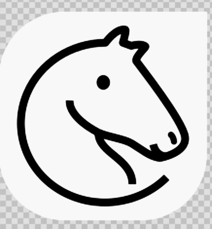
4 years ago So far this one is our favourite:

Simple, memorable, elegant. We also like the similar:
 But we think maybe it's better when the curved line becomes thinner at the end.
That last one you posted is very cute, too much maybe, seems childish to me. Some of us love it but it's not my personal favourite.
More generally the 6 proposals in https://github.com/ornicar/lila/issues/5680#issuecomment-559242016 are very strong.
If you're inspired to try more variations, we'd love to see them.
Here's a few things the team hacked while brainstorming:


ornicar
commented
4 years ago for giggles:

ornicar
commented
4 years ago I should add that we have team members across different timezones, and most of them have not seen these logos yet. So this is provisional feedback.
ghost
commented
4 years ago I work with people everyday and I know when somebody just made a decision. that logo is the best choice for lichess and I would like to ask you something in return for my work it is a simple thing : changing the icons for blitz and bullet modes to match their names. it's just something that poped into my eyes when I first entered the site. I can also provide you better alternatives for the rest of the icons.
ghost
commented
4 years ago 
 icp1994
commented
4 years ago
icp1994
commented
4 years ago hey @ornicar would it be feasible for your team to finalize on 4 (or some number) logos and then put them up for a vote on the lichess home page?! That poll should be fun to watch :)
ghost
commented
4 years ago ghost
commented
4 years ago 
ornicar
commented
4 years ago OK let's move forward with this. Can we get SVG for these:
^ B1 and D2
^ A1 and A2
^ A1
We'll try them out on the test server.
Regarding the bullet icon: I hear you. Can we finish dealing with the logo first? Then we'll discuss it.
Regarding the piece sets: I thought about showcasing them in the same blogpost that we'll make if/when we pick a new logo.
ghost
commented
4 years ago Here are the svgs. personally i will go with nr. 4 (see zip). Regarding the rest, yes the priority is the logo.
ghost
commented
4 years ago I saw the logo on lichess.dev, my opinion is to make it 10% smaller, so it wouldn't touch the margins of the lobby screen
ornicar
commented
4 years ago The current cburnett knight has no margin. We'll try with margins as well.
 CynicusRex
commented
4 years ago
CynicusRex
commented
4 years ago The new logo isn't discernable at all at favicon size. The lines are way too thin; it just looks like a slightly rotated letter e. The following three logos are significantly better (provided that the first one is corrected to a perfect circle):

The latter two would look fantastic on swag store items.
 awsumbill
commented
4 years ago
awsumbill
commented
4 years ago There seems to be a gray border around the logo


Browser: Microsoft Edge 44.18362.449.0 Microsoft EdgeHTML 18.18363
awsumbill
commented
4 years ago This does not seem to happen on Chrome.
I tried on Chrome 80.0.3984.0
 kspalaiologos
commented
4 years ago
kspalaiologos
commented
4 years ago @awsumbill can't reproduce.

superuser-does
commented
4 years ago The same, can't reproduce on latest W10.

This will soon be a moot point anyway due to ChrEdge.
awsumbill
commented
4 years ago That's quite odd, look at mine

Specs:
Windows version:
 Edge version:
 Display settings:
 Browser info:
https://whatismybrowser.com/w/ZREQJ9K
Browser info:
https://whatismybrowser.com/w/ZREQJ9K
 ZacharyTalis
commented
4 years ago
ZacharyTalis
commented
4 years ago Love the new logo! It'd make an excellent loading icon, if need be :)
awsumbill
commented
4 years ago New Logo TO-DO:
og) images - when you embed on chat and social media like WhatsApp, Discord, Facebook, Twitter, etc)Double-check:
Third-party:
If any else sees an outdated icon feel free to add on.
superuser-does
commented
4 years ago Hope you don't mind me using my collaborator access for this - I added all the other ones I could think of!
 niklasf
commented
4 years ago
niklasf
commented
4 years ago @superuser-does Here's one you could update or close: https://github.com/discordapp/discord-open-source/pull/193
awsumbill
commented
4 years ago Thanks for editing @superuser-does and @niklasf
ghost
commented
4 years ago Just a tought. The logo on the lobby screen should be scaled down by 10-20%, so it would be even less invasive and to be even more transparent. Also, maybe we can change all knights in the all the sets to look to the right, just to show that lichess is something else.
ghost
commented
4 years ago Maybe a bit to late, but here are some more iterations...

awsumbill
commented
4 years ago Notifications haven't been fixed yet.
Tried on both Edge and Chrome and cleared cache beforehand.


awsumbill
commented
4 years ago @sadsnake1 I really like the second one, it looks more like a real knight than the current one.
i would go with the lilac color and with 2 knights