Team's Response
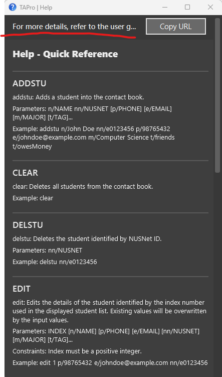
This issue is on the help panel text at the top being truncated, not the quick reference.
Thanks for raising this. We agree that the text could be wrapped, so this could be fixed.
However, this is not in scope, because the value of adding this is very low, since the help is pretty detailed, there is a low chance the user guide will be accessed anyways. Even if so, this would be a very small feature enhancement that is of low priority. Other implemented features took precedence and hence not in scope.
For a new user, when the user loads the help window initially, the default size of the help window is large enough so that the text does not get truncated. The new user is able to read the text and associates accessing the user guide with the Copy URL button.
If the user wants to access the help window again, they would use the Copy URL button, instead of reading the full text. The text does not any value even if it is displayed in full for a repeated user, becuase the purpose of that bar of text is to allow the user to copy the URL of our user guide, which is why the Copy URL button is not truncated.
In fact, by wrapping the text, it takes up more space in the user's UI, which may be counterproductive for a user wanting to read the quick reference, since the user may need to scroll slightly more to read a line of text.
Items for the Tester to Verify
:question: Issue response
Team chose [response.NotInScope]
- [ ] I disagree
Reason for disagreement: [replace this with your explanation]
When the Help panel is minimized, the text at the very top of the panel is truncated and the full instruction cannot be seen. It is demonstrated in the following picture:
An improvement can be made to do text wrapping on this instruction so that it can be seen regardless of window size.