Not sure what this really has to do with mint-themes. The look of Mint's built in themes haven't changed. They've always looked this way.
Open attah opened 1 year ago
Not sure what this really has to do with mint-themes. The look of Mint's built in themes haven't changed. They've always looked this way.
Fair enough, i had honestly forgotten, but with the change last year you were handled the full problem as it could no longer be compensated for. All the same; artificially blurring the lines between these two very distinct surfaces is very unhelpful.
Fair enough, i had honestly forgotten, but with the change last year you were handled the full problem as it could no longer be compensated for. All the same; artificially blurring the lines between these two very distinct surfaces is very unhelpful.
It's really not. You already have a very obvious indicator where the titlebar is: at the very top. A separator between the titlebar and the rest of the window is redundant.
Uh, no?

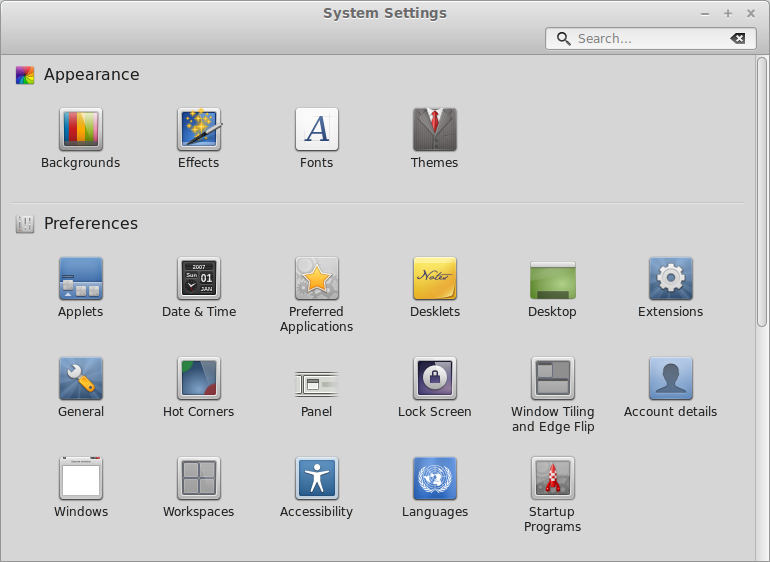
Here, the window stops responding the way you expect it to some indistinguishable way down the "forehead" of the window. Only on the uppermost 40% or so you can right-click, middle-click, or even drag it. But the theme insists on making it look like one surface.
Uh, yes! The titlebar is the titlebar, at the title, at the top, where the title of the app is. You know what it does and what you expect from it. You know how to get to it and what you can do with it. Couldn't be simpler.
Whether you can use the interface below to drag the window around is only an extra, a little cherry on top. As you may probably know, there are some apps that straight up let you drag the window around by dragging from the toolbars (like Xapps) or from the menubar (like LibreOffice) and with these apps the unified titlebar/toolbar look makes sense. If you were using Adwaita though, which does separate the titlebar from the toolbar, you wouldn't even consider the possiblity that the window is draggable from the toolbar in some apps. As it turns out, many apps work like this. So in a way, Mint-Y lets users know that certain UI elements beside the titlebar can be used to drag a window. It exposes this feature when other themes would not. I'd say it's a plus.
Worst case scenario? The toolbar isn't draggable. Oh no! Well, use the titlebar then, you know where it is.
TL;DR: It's a non-issue. It looks great in its current version.
If it was only about dragging you would have a point. But it is not. There is also right-click, middle-click and double-click which none of those applications handle below the titlebar. And if that was changing it would already have started - so no this unification is a false friend. Not to mention, nobody really needed more draggable-by-default surface, since holding the alt key makes the whole window work like that - regardless if the developer added it in extra.
What part is the actual titlebar is only obvious because we used computers before this silly redesign. Good luck teaching new users that.
With the change to combined themes for window titles/borders and rest of the window, it is no longer possible to distinguish between the titlebar and rest of window, e.g. menu items.
The "high forehead" look of when there is no separation between the two might look nice... (personally i find it really ugly on light themes, but that's besides the point) But being unable to distinguish these areas is really unhelpful. They respond very differently to double, middle and tight clicks, so why they should look the same is really puzzling.