Team's Response
No details provided by team.
The 'Original' Bug
[The team marked this bug as a duplicate of the following bug]
Mismatch in image in the quick start with the actual GUI
In the User Guide, the image contains at least 6 users while in the actual product, it contains only 5 user. This may cause user to wonder whether they have performed something wrong(eg. missing data) which leads to discrepency.
The level of confusing is low, and user need to pay attention to notice the difference, so I give it severity low. However, it may even qualify for severity medium since it appears at quick start section. This means that is will affect almost all users, and given the user are beginner when referring to the quick start, they are likely to be vulnerable to such confusion.
[original: nus-cs2103-AY2324S1/pe-interim#4051] [original labels: severity.Low type.DocumentationBug]
Their Response to the 'Original' Bug
[This is the team's response to the above 'original' bug]
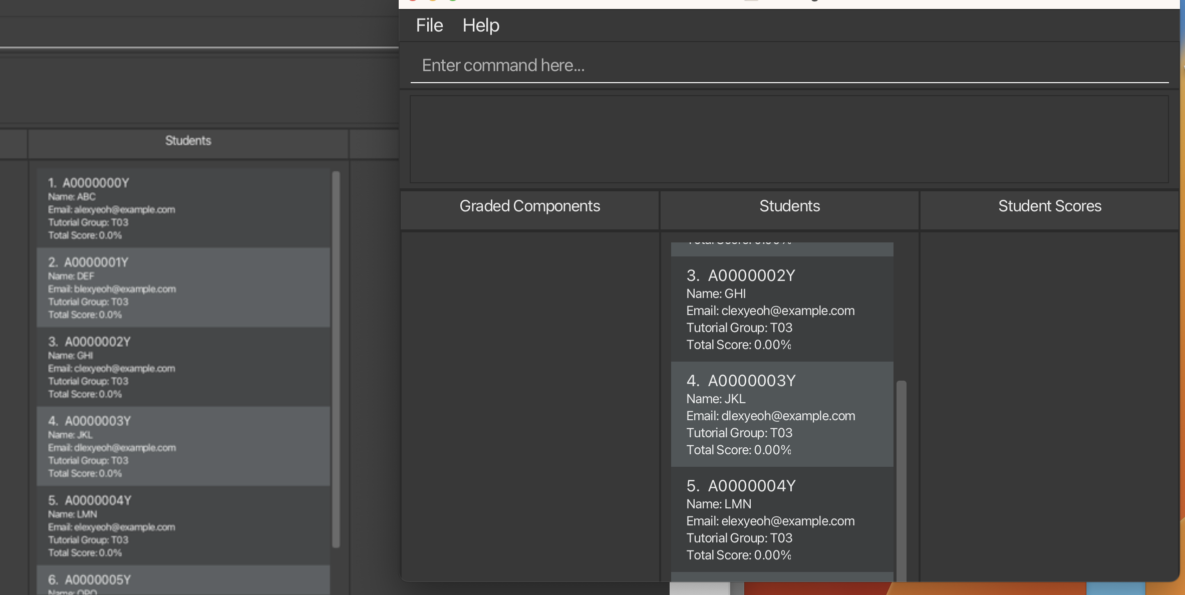
This issue arises because when the window is minimized below a certain size, the application does not scroll to the latest entry in the lists. Hence, we've marked these as duplicates.
Items for the Tester to Verify
:question: Issue duplicate status
Team chose to mark this issue as a duplicate of another issue (as explained in the Team's response above)
- [x] I disagree
Reason for disagreement: The other student wrongly classified it as a documentation bug because they did not realise it was a window resizing issue.
## :question: Issue type Team chose [`type.DocumentationBug`] Originally [`type.FunctionalityBug`] - [x] I disagree **Reason for disagreement:** This is not a documentation bug as it occurs when using the app.
## :question: Issue severity Team chose [`severity.Low`] Originally [`severity.Medium`] - [x] I disagree **Reason for disagreement:** The problem seems to appear for all users at startup, so it is not a rare issue. This can be very confusing for the user and affects their usage because entries are being cut off while the app appears to be functioning correctly - for me, it caused me to think that my add commands were not working since I could not see the newly added Student. It is also not documented anywhere in the user guide.

The window can be collapsed in such a way that the last entry is hidden, and the user is unable to scroll down to access it. This is potentially very confusing for the user as it is not acknowledged in the user guide as well. Additionally, the window started for me at this size, so the user might think that the add command is not working, for example.