How much can we reuse the Lua logo? (AFAIK we can if we change the text.) Do we want to?
Open Etiene opened 6 years ago
How much can we reuse the Lua logo? (AFAIK we can if we change the text.) Do we want to?
We can reuse it within the guidelines it has.
We want to --- to some extent. I.e. our logo should "feel" related to Lua. IMHO.

I submit this Lua Eye design for your consideration.
what are the guidelines?
The only modification you can make is to adapt the orbiting text to your product name.
This is what I was saying above, so no to the eye...
A task assignment for the logo designer should include references and some description. Let's try to create such assignment here.
There is a good reference for the questions asked here: https://99designs.com/launch/logo-design/ (note that you do not really need to fill out anything to go to next steps, just click continue).
How about?
Name: Lua Users Foundation
We are a non-profit foundation for a community around a programming language called
"Lua", which means moon in Portuguese.

Ideally the logo will be modern, exploring blue colors and references to the moon. It is
important that the typeface allows for a clear distinction between the capitalization. It
should read Lua, not LUA.  References to the moon should be a full moon, in tones of
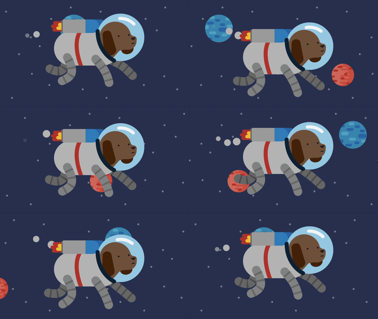
white, not yellow. Logo could reference an astronaut dog (homage to laika), which opens
the possibility for the illustration to follow a soviet-art style.As a side node, I think that whoever did the work for the lua in moscow conference logo, did an excellent job: http://lua.moscow/conf/2018/
I have the same artist available for the conference logo.
Etiene, thank you for the description! We also do need references and "how should the logo feel" (see reference I linked above).
Regarding references (the 1st step of @agladysh's link) I guess that's a bit subjective and personal but personally I picked this amongst those it showed me:


A few thinks that we may want to take into account:
Logos that work well with a single color (black and white) such as the last two (the one with the crow and the animals with negative space) work better to make swag (t-shirts etc).
The current trend is mascots, I especially like Renée French's work in the Go community (e.g. Glenda from Plan9, the Gopher and Upspin's logo which I add below). Not sure we want to go that route though.

@catwell a wolf howling is also already the logo of the howl editor https://howl.io/
What if we explored an astronaut dog? reference to:


@agladysh I got high scores on modern and youthful and neutral on rest
PS: updating the initial description to mention the moon should be full and in tones of white
Some more art:
https://dribbble.com/shots/215664-Laika-First-Dog-In-Space
https://dribbble.com/shots/2103894-Dog-in-space-wallpaper
https://dribbble.com/shots/2979104-Spacedog
https://dribbble.com/shots/3947164-Inch-x-Inch
https://dribbble.com/shots/3221153-Fantastic-Planet-001
https://dribbble.com/shots/3479967-Moon


I wanna say that the “user foundation” version is my favorite. It matches the example on Lua.org and our Lua workgroup logo has the same style.
https://github.com/LuaWorkgroup/Logo/blob/master/lua-workgroup-logo.jpg
And if you ask me the Lua user wiki logo should look the same
The only thing that needs changing is "user" to "users". And while it looks good, I don't think that it's the best one, because it's so similar to Lua's logo.
Without the label it's just a Lua's logo! Maybe we should have a logo which will make us recognizable even without the text?
I like the idea of having a dog similar to Laika. Maybe sometimes it can be drawn flying around the moon. :)
Here's a very raw drawing of an idea I had... Not suitable for logo, but maybe good for a mascot (if it's drawn well enough). It kinda looks like Lua's logo! :)

Without the label it's just a Lua's logo! Maybe we should have a logo which will make us recognizable even without the text? I like the idea of having a dog similar to Laika. Maybe sometimes it can be drawn flying around the moon. :)
+1, and I really like your doodle!
I love the doodle too. Lua is orbiting the community! I think it will be a very good logo, after an artist will spend some time on it.
Thanks a lot! I think it's good to have the dog look at the moon with a cute doggy smile - it will add the charm and show the love that Lua users have for Lua. :)
Via Slack discussion there are two additional ideas:
Like mankind forming a new society/community on the moon. That’s pretty matching the situation and goals of the Lua users foundation
 .
. Cute, round and can have moon orbiting around it, resembling Lua's logo. It's a nice nod for Lua's origin being Brazil.
What do you think about something like this?

I like it! Terrain is a good concept to pair with users. :)
On Thu, May 17, 2018 at 5:34 PM, mackomando notifications@github.com wrote:
What do you think about something like that? [image: logo - 1] https://user-images.githubusercontent.com/22604512/40210165-6b9406f4-5a11-11e8-8146-03f21e7827ba.png
— You are receiving this because you are subscribed to this thread. Reply to this email directly, view it on GitHub https://github.com/lua-users-foundation/foundation/issues/2#issuecomment-390056648, or mute the thread https://github.com/notifications/unsubscribe-auth/AAm4Cw3KzytEipYCq2CIc14a3Fpt9ywHks5tzhcngaJpZM4SqTzw .
-- George Georgalis, (415) 894-2710, http://www.galis.org/
Thank you! I hope it helps :) let's see what others think about it.
I have some other suggestions:
A)
 B)
B)

We need a logo for the foundation, at least so we can set it as the profile image of the github organisation. Let's discuss about it here