This PR modify the package build scripts to flatten the exported SVG icons.
While source icons are made up of several shapes (<line>, <rect>, <circle>, etc), all the shapes now get converted to <path> and merged together in a single <path> element during the build.
As mentioned in #1687, this has two benefits:
Overlaps are no longer visible when using semi-transparent colors.
The size of the build output is decreased by ~13%.
Implementation
We use the Convert Shape to Path and Merge Paths SVGO plugins to convert shapes to paths and merge the paths together. Currently SVGO cannot optimize rectangles with rounded corners (svg/svgo#1963), so this PR includes a custom plugin to do that.
Impact on icon size
In most cases, converting shapes to <path> reduce the icon's size, especially for icons made up of many shapes (e.g. sliders-horizontal.svg). In some cases, we observe a small increase of the size (e.g. layout-grid.svg), because circles and rounded rectangles are more compact than paths. Overall the output size is reduced by ~13%.
Impact on the build time
One would assume that processing each icon for every build target would be bad for the build time. However, I haven't observed any significant increase of the average build time on my machine (it actually went slightly down).
Impact on icon appearance
Icons should appear the same. However there are two noticeable differences.
When using a semi-transparent stroke color, the icon now has a consistent appearance instead of showing overlaps.
Edges are a little bit smoother in places where several shapes converge. This isn't visible to the naked eye.
 jguddas
commented
1 week ago
jguddas
commented
1 week ago
Related to #1687.
What is the purpose of this pull request?
Description
This PR modify the package build scripts to flatten the exported SVG icons.
While source icons are made up of several shapes (
<line>,<rect>,<circle>, etc), all the shapes now get converted to<path>and merged together in a single<path>element during the build.As mentioned in #1687, this has two benefits:
Implementation
We use the Convert Shape to Path and Merge Paths SVGO plugins to convert shapes to paths and merge the paths together. Currently SVGO cannot optimize rectangles with rounded corners (svg/svgo#1963), so this PR includes a custom plugin to do that.
Impact on icon size
In most cases, converting shapes to
<path>reduce the icon's size, especially for icons made up of many shapes (e.g.sliders-horizontal.svg). In some cases, we observe a small increase of the size (e.g.layout-grid.svg), because circles and rounded rectangles are more compact than paths. Overall the output size is reduced by ~13%.Impact on the build time
One would assume that processing each icon for every build target would be bad for the build time. However, I haven't observed any significant increase of the average build time on my machine (it actually went slightly down).
Impact on icon appearance
Icons should appear the same. However there are two noticeable differences.
When using a semi-transparent stroke color, the icon now has a consistent appearance instead of showing overlaps.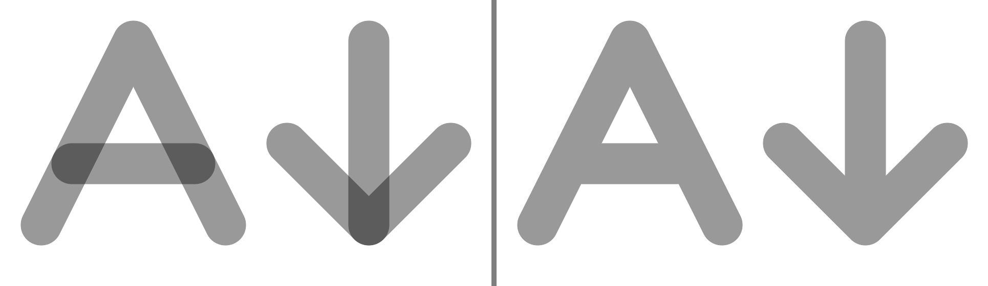
Edges are a little bit smoother in places where several shapes converge. This isn't visible to the naked eye.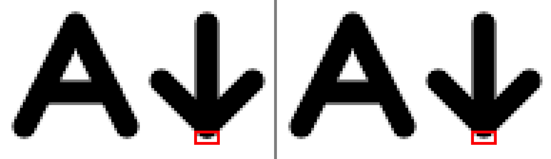
Before Submitting