lunakurame / firefox-gnome-theme

A theme for Firefox 57+ matching GNOME Adwaita.
The Unlicense
200 stars 15 forks source link

Support new GNOME 3.32 theme #55

Open rafaelmardojai opened 5 years ago

rafaelmardojai commented 5 years ago

I will work on this as soon as I get GNOME 3.32

brudolp commented 
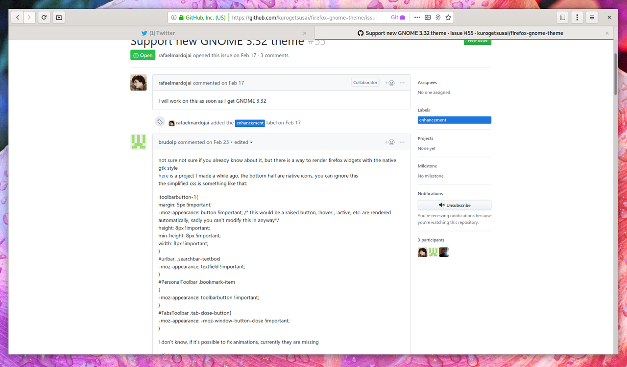
5 years ago

not sure not sure if you already know about it, but there is a way to render firefox widgets with the native gtk style here is a project I made a while ago, the bottom half are native icons, you can ignore this the simplified css is something like that:

.toolbarbutton-1{ margin: 5px !important; -moz-appearance: button !important; / this would be a raised button, :hover , :active, etc. are rendered automatically, sadly you can't modify this in anyway/ height: 8px !important; min-height: 8px !important; width: 8px !important; }

urlbar, .searchbar-textbox{

-moz-appearance: textfield !important; }

PersonalToolbar .bookmark-item

{ -moz-appearance: toolbarbutton !important; }

TabsToolbar .tab-close-button{

-moz-appearance: -moz-window-button-close !important; }

I don't know, if it's possible to fix animations, currently they are missing

official documentation: https://developer.mozilla.org/en-US/docs/Web/CSS/appearance

rafaelmardojai commented 5 years ago

@brudolp Yeah i know about it, but never considered it. Maybe can help to make code simpler. Thanks for advice.

JohannesKahl commented 5 years ago

If it helps speeding up the work, i've been playing with the light theme recently:

@namespace xul url("http://www.mozilla.org/keymaster/gatekeeper/there.is.only.xul");

/* Colors */
:root {
  /* Variables that start with --gnome- are added by me and are assigned
     * to elements somewhere in this code. The rest of the variables are
     * built-in in Firefox, so you need to add an !important if you wanna
     * override them. */

  /* Browser area before a page starts loading */
  --gnome-browser-before-load-bgcolor: #d6d6d6;

  /* Extra toolbars like the bookmark bar */
  --toolbar-bgcolor: var(--gnome-tabbar-bgcolor) !important;
  --toolbar-bgimage: none !important;

  /* Popups */
  --gnome-menu-bgcolor: #ffffff;
  --gnome-popup-bgcolor: #ffffff;
  --gnome-popup-border: 1px solid;
  --gnome-popup-border-color: #b6b6b3;
  --gnome-popup-shadow: 0 1px 2px rgba(0, 0, 0, 0.3);
  --gnome-popup-button-hover-bgcolor: #f4f4f4;
  --gnome-popup-separator-color: rgba(0, 0, 0, 0.1);

  /* Header bar */
  --gnome-headerbar-bgimage: linear-gradient(
    to top,
    /*#dad6d2,*/ #cdc9c3,
    #ddd9d5 2px,
    #e0ddda
  );
  --gnome-headerbar-border-bottom: 1px solid #bdb7b0;
  --gnome-headerbar-box-shadow: 0 -1px rgb(217, 217, 217) inset,
    0 1px #fff inset;
  --gnome-headerbar-button-bgimage: linear-gradient(
    to top,
    #edebe9 2px,
    #f6f5f4
  );
  --gnome-headerbar-button-border: 1px solid #cdc7c2;
  --gnome-headerbar-button-border-bottom: 1px solid #bfb8b1;
  --gnome-headerbar-button-box-shadow: inset 0 1px white,
    0 1px 2px rgba(0, 0, 0, 0.07);
  --gnome-headerbar-button-hover-bgimage: linear-gradient(
    to top,
    #f6f5f4,
    #f8f8f7 1px
  );
  --gnome-headerbar-button-active-bgimage: linear-gradient(#cdc9c3, #cdc9c3);
  --gnome-headerbar-button-active-box-shadow: 0 1px rgba(0, 0, 0, 0.07) inset,
    0 2px 0px -2px rgba(0, 0, 0, 0.6) inset, 0 1px #fff;
  --gnome-headerbar-button-disabled-bgcolor: #faf9f8;
  --gnome-headerbar-button-disabled-border: 1px solid #b7b7b4;
  --gnome-headerbar-button-disabled-box-shadow: 0 1px rgba(255, 255, 255, 0)
      inset,
    0 1px rgba(255, 255, 255, 0);

  --gnome-headerbar-button-suggested-action-bgimage: linear-gradient(
    to bottom,
    #4a90d9,
    #3986d5 60%,
    #2a76c6
  );
  --gnome-headerbar-button-suggested-action-border-color: #215d9c;
  --gnome-headerbar-button-suggested-action-border-bottom-color: #184472;
  --gnome-headerbar-button-suggested-action-box-shadow: inset 0 1px
    rgba(255, 255, 255, 0.4);
  --gnome-headerbar-button-suggested-action-hover-bgimage: linear-gradient(
    to bottom,
    #63a0de,
    #4a90d9 60%,
    #3986d5
  );

  --gnome-headerbar-button-destructive-action-bgimage: linear-gradient(
    to bottom,
    #ef2929,
    #ee1616 60%,
    #d51010
  );
  --gnome-headerbar-button-destructive-action-border-color: #a60c0c;
  --gnome-headerbar-button-destructive-action-border-bottom-color: #760909;
  --gnome-headerbar-button-destructive-action-box-shadow: inset 0 1px
    rgba(255, 255, 255, 0.4);
  --gnome-headerbar-button-destructive-action-hover-bgimage: linear-gradient(
    to bottom,
    #f14545,
    #ef2929 60%,
    #ee1616
  );

  --gnome-inactive-headerbar-bgimage: linear-gradient(#f6f5f4, #f6f5f4);
  --gnome-inactive-headerbar-border-bottom: 1px solid #c0c0bd;
  --gnome-inactive-headerbar-box-shadow: 0 1px #fff inset;
  --gnome-inactive-headerbar-button-bgimage: linear-gradient(#f6f5f4, #f6f5f4);
  --gnome-inactive-headerbar-button-border: 1px solid #c0c0bd;
  --gnome-inactive-headerbar-button-border-bottom: var(
    --gnome-inactive-headerbar-button-border
  );
  --gnome-inactive-headerbar-button-box-shadow: 0 1px rgba(255, 255, 255, 0)
      inset,
    0 1px rgba(255, 255, 255, 0);
  --gnome-inactive-headerbar-button-disabled-bgcolor: var(
    --gnome-headerbar-button-disabled-bgcolor
  );
  --gnome-inactive-headerbar-button-disabled-border: var(
    --gnome-inactive-headerbar-button-border
  );
  --gnome-inactive-headerbar-button-disabled-box-shadow: var(
    --gnome-headerbar-button-disabled-box-shadow
  );

  /* URL bar */
  --gnome-urlbar-bgimage: linear-gradient(#fff, #fff);
  --gnome-urlbar-border: 1px solid #b6b6b3;
  --gnome-urlbar-box-shadow: none;
  --gnome-urlbar-color: #020202;
  --gnome-urlbar-height: 34px;
  --gnome-inactive-urlbar-bgimage: linear-gradient(#fcfcfc, #fcfcfc);
  --gnome-inactive-urlbar-border: 1px solid #c0c0bd;
  --gnome-inactive-urlbar-box-shadow: none;
  --gnome-inactive-urlbar-color: #323232;
  --gnome-focused-urlbar-border-color: #4a90d9;
  --gnome-focused-urlbar-outline: none;
  /* for private-urlbar.css only */
  --gnome-private-urlbar-bgimage: linear-gradient(#e6c2ff, #e6c2ff);

  /* Tab bar */
  --gnome-tabbar-bgcolor: #e0ddda;
  --gnome-tabbar-border-bottom: 1px solid #b6b6b3;
  --gnome-tabbar-tab-color: rgb(141, 144, 145);
  --gnome-tabbar-tab-hover-bgcolor: #e4e2de;
  --gnome-tabbar-tab-hover-border-bottom: 3px solid #b6b6b3;
  --gnome-tabbar-tab-hover-border-sides: 1px solid #c9c9c9;
  --gnome-tabbar-tab-hover-color: rgb(93, 98, 99);
  --gnome-tabbar-tab-active-bgcolor: #eae8e6;
  --gnome-tabbar-tab-active-border-bottom: 3px solid #4a90d9;
  --gnome-tabbar-tab-active-border-color-sides: #c8c8c5;
  --gnome-tabbar-tab-active-color: rgb(46, 52, 54);
  --gnome-tabbar-tab-active-hover-bgcolor: #e6e6e6;
  --gnome-inactive-tabbar-bgcolor: #dadad8;
  --gnome-inactive-tabbar-border-bottom: 1px solid #c0c0bd;
  --gnome-inactive-tabbar-tab-color: #8b8e8f;
  --gnome-inactive-tabbar-tab-active-bgcolor: #f6f5f4;
  --gnome-inactive-tabbar-tab-active-border-bottom: var(
    --gnome-tabbar-tab-active-border-bottom
  );
  --gnome-inactive-tabbar-tab-active-border-color-sides: #c0c0bd;
  --gnome-inactive-tabbar-tab-active-color: var(
    --gnome-inactive-tabbar-tab-color
  );
  --gnome-tabbar-tab-icon-filter: invert(100%) sepia(100%) grayscale(100%)
    brightness(200%) brightness(85%) invert(100%);

  /* Bookmark bar */
  --gnome-bookmarkbar-border-bottom: 1px solid #a1a1a1;
  --gnome-bookmarkbar-height: 38px;
  --gnome-inactive-bookmarkbar-border-bottom: var(
    --gnome-bookmarkbar-border-bottom
  );

  /* Burger menu */
  /*--arrowpanel-padding: 10px;*/
  /*--arrowpanel-background: -moz-field;*/
  --arrowpanel-color: rgb(
    46,
    52,
    54
  ) !important; /* applies to text and icons */
  /*--arrowpanel-border-color: ThreeDShadow;*/

  /* Dirty hack for replaced symbolic icons, they load from
     * /usr/share/icons/<theme>/ and on some systems they need to be
     * inverted, on others they don't, adjusts the filters below to your
     * needs (you may also adjust icon brightness here). */
  --gnome-icons-hack-filter: invert(30%); /* without invert: none */
  --gnome-icons-hack-close-button-border: 1px solid #b7b7b4;
  --gnome-icons-hack-close-button-border-bottom: 1px solid #94948f;
  --gnome-icons-hack-close-button-filter: none; /* without invert: none */
  --gnome-icons-hack-close-button-hover-bgimage: linear-gradient(
    #f6f6f6,
    #eaeae9 50%,
    #dededd
  ); /* without invert: none */
  --gnome-icons-hack-close-button-hover-box-shadow: 0 1px #f9f9f9 inset; /* without invert: none */
  --gnome-icons-hack-close-button-active-bgimage: linear-gradient(
    rgb(220, 216, 216),
    rgb(214, 210, 210) 40%,
    rgb(210, 205, 205)
  );
  /* ^ without invert: linear-gradient(rgb(35, 39, 39), rgb(41, 45, 45) 40%, rgb(45, 50, 50)) */
  --gnome-icons-hack-close-button-active-box-shadow: 0 1px
      rgba(255, 255, 255, 0.07) inset,
    0 2px 1px -2px rgba(255, 255, 255, 0.6) inset, 0 1px rgba(17, 17, 19, 0.1);
  /* ^ without invert: 0 1px rgba(0, 0, 0, .07) inset, 0 2px 1px -2px rgba(0, 0, 0, .6) inset, 0 1px rgba(238, 238, 236, .1) */
}

Preview (i also replaced some icons with the Adwaita version): 3-32-light.png focus-3-32-light.png

rafaelmardojai commented 5 years ago

@JohannesKahl looks awesome. Next week i'm will working on this and other small fixes.

Pd: I was also thinking replace all firefox icons whit Adwaita ones. Do you think this should be default or an option?

JohannesKahl commented 5 years ago

I think it's better to make it an option. While i was replacing them, i noticed that firefox uses animations in some of them (animations that i had to hide in the css). For example the reload/stop button draws an "X" for a brief interval while the page is loading, the download button draws the progress of the current download, etc...

rafaelmardojai commented 5 years ago

Yeah, that's why we still using FF icons. But what about menu, sidebar, new tab, home, etc?

JohannesKahl commented 5 years ago

Static icons should be safe to replace. Eventually, replacing them could be default, and replacing the animated ones available as option.

aadilayub commented 5 years ago

@JohannesKahl What version of Firefox are you using? I'm using the css you shared under Firefox 67 and wasn't able to replicate the same look in your screenshots

Specifically, I saved your css as ui/gnome-3.32-light.css and then imported it like this:

/*GNOME 3.32 light theme *
@import "ui/gnome-3.32-light.css"; 

This is what my FF currently looks like with this css: image

Whereas with gnome-3.26.light.css it looked like this:

image

JohannesKahl commented 5 years ago

I've been using it with firefox 66 and 67. The snippet above was just meant to help sorting some colors differences with the new version of Adwaita, since i posted it this theme have been modified as well (i didn't catch up with the latest commits, not sure if changes on master require to rewrite the 3.32-light.css i posted).

If i can find some time to work on it, i could try to rewrite it with the code on master and post a proper pull request.

JohannesKahl commented 5 years ago

@aadilayub Also, make sure that these lines are at the top of your gnome-3.32-light.css :

@import "theme.css";
@namespace xul url("http://www.mozilla.org/keymaster/gatekeeper/there.is.only.xul");
aadilayub commented 5 years ago

Thanks! Adding @import "theme.css"; worked!

Just need to make the buttons a bit more rounded now.

image

JohannesKahl commented 5 years ago

Yeah, the border radius for buttons (and maybe other stuff i can't remember right now)require to create a variable to ensure compatibility with the other styles this theme offer - which, unfortunately in my version i didn't do, editing the values directly. I'll look into that too, if hasn't been done in master already.

The values i edited should be in ui/parts/headerbar-buttons.css, for example:

/* Header bar buttons */
#nav-bar toolbarbutton:not(#urlbar-zoom-button):not(.subviewbutton) {
  border: var(--gnome-headerbar-button-border);
  border-bottom: var(--gnome-headerbar-button-border-bottom);
  border-radius: 5px !important; /* this one, if i recall correctly */
  margin: 6px 3px !important;
  padding: 0 2px !important;
  width: 34px;
  height: 34px;
}
aadilayub commented 5 years ago

Yep, that seems to have fixed it! Thanks again for the help.

image

I tried setting border-radius to var(--gnome-headerbar-button-border-radius); and then adding --gnome-headerbar-button-radius: 5px; to gnome-3.32-light.css, but it seemed to have no effect.

JohannesKahl commented 5 years ago

Try with:

border-radius: var( --gnome-headerbar-button-border-radius ) !important;

aadilayub commented 5 years ago

That did the job!

Do you think this is good enough for a PR now?

JohannesKahl commented 5 years ago

Almost: i need to try it with the latest version on master and most importantly polish the parts i wrote while experimenting. Not sure if the colors are 100% accurate, but that can be fixed later. Additional stuff i've put inside the theme:

I've also played a little with the border-radius for dialogs, but the results were a bit disappointing.

rafaelmardojai commented 5 years ago

@JohannesKahl I'm working on a new hard fork here https://github.com/rafaelmardojai/firefox-gnome-theme. I'm dropping many things, and it only target latest adwaita version.

JohannesKahl commented 5 years ago

@rafaelmardojai i've read about it in your reply on another issue, this morning, and i was waiting for a new repo to appear. Thanks for warning me, i'll follow the new repo, and eventually collaborate whenever i can ;)