lxn / walk

A Windows GUI toolkit for the Go Programming Language
Other
6.78k stars 885 forks source link

CustomWidget layout/growth #731

Closed Kimbsen closed 3 years ago

Kimbsen commented 3 years ago

I'm having some trouble making a custom pushbutton. ( i need to color it and have nice rounded edges :/ )...

In any case i have a working button but i'm struggeling to keep it from expanding and taking all availiable space in the layout. I've tried using spacers to take the extra space but it doesn't work. I've used spacers like that before with Qt, but at this point i'm sure i'm misunderstanding layouts, spacers etc somewhat.

The code i have is modified from the drawing example:

main.go

package main

import (
    "log"

    "github.com/lxn/walk"
    . "github.com/lxn/walk/declarative"
)

type MyMainWindow struct {
    *walk.MainWindow
    paintWidget *walk.CustomWidget
}

func main() {
    mw := new(MyMainWindow)

    font, err := walk.NewFont("Arial", 14, 0)
    if err != nil {
        panic(err)
    }

    if _, err := (MainWindow{
        AssignTo: &mw.MainWindow,
        Title:    "Walk Drawing Example",
        MinSize:  Size{320, 240},
        Size:     Size{800, 600},
        Layout:   VBox{},
        Children: []Widget{
            VSpacer{},
            Label{
                Alignment: AlignHCenterVCenter,
                Text:      "Button test",
            },
            Composite{
                Layout: VBox{},
                Children: []Widget{
                    Composite{
                        Layout: HBox{},
                        Children: []Widget{
                            HSpacer{},
                            PushButton{
                                Text: "TopButton",
                            },
                            HSpacer{},
                        },
                    },
                    VSpacer{},
                    Composite{
                        Layout: VBox{},
                        Children: []Widget{
                            VSpacer{},
                            Composite{
                                Layout: HBox{},
                                Children: []Widget{
                                    HSpacer{},
                                    PushButton{
                                        Text: "leftButton",
                                    },
                                    NewButton(ButtonOpts{
                                        FontColor:             walk.RGB(255, 255, 255),
                                        Text:                  "Hello World!",
                                        BackgroundColor:       walk.RGB(90, 90, 90),
                                        BackgroundActiveColor: walk.RGB(150, 150, 150),
                                        Font:                  font,
                                        Callback: func() bool {
                                            log.Println("Clicked!")
                                            return false
                                        },
                                    }),
                                    PushButton{
                                        Text: "rightButton",
                                    },
                                    HSpacer{},
                                },
                            },
                            VSpacer{},
                        },
                    },
                    PushButton{
                        Text: "BottomButton",
                    },
                    VSpacer{},
                },
            },
            VSpacer{},
        },
    }).Run(); err != nil {
        log.Fatal(err)
    }

}

button.go

package main

import (
    "github.com/lxn/walk"
    . "github.com/lxn/walk/declarative"
)

func (b *CustomButton) BackgroundBrush() (walk.Brush, error) {
    if b.mousedown {
        return walk.NewSolidColorBrush(b.opts.BackgroundActiveColor)
    }
    return walk.NewSolidColorBrush(b.opts.BackgroundColor)
}

func (b *CustomButton) drawStuff(canvas *walk.Canvas, bounds walk.Rectangle) error {
    // draw background color
    background, _ := b.BackgroundBrush()
    canvas.FillRoundedRectanglePixels(background, bounds, walk.Size{
        25, 25,
    })

    // find a nice rect centered vertically to write text into
    boundsText, _, _ := canvas.MeasureTextPixels(b.opts.Text, b.opts.Font, bounds, walk.TextCenter)
    boundsText.Y = (bounds.Height/2 - boundsText.Height/2)

    // draw text
    canvas.DrawTextPixels(b.opts.Text, b.opts.Font, b.opts.FontColor, boundsText, walk.TextCenter|walk.TextVCenter)
    return nil
}

type ButtonOpts struct {
    Text                  string
    Font                  *walk.Font
    FontColor             walk.Color
    BackgroundColor       walk.Color
    BackgroundActiveColor walk.Color
    Callback              func() bool
}

type CustomButton struct {
    paintWidget *walk.CustomWidget
    opts        ButtonOpts

    mousedown bool
}

func NewButton(opts ButtonOpts) CustomWidget {
    b := &CustomButton{
        opts: opts,
    }
    return CustomWidget{
        StretchFactor:       0,
        AssignTo:            &b.paintWidget,
        DoubleBuffering:     true,
        ClearsBackground:    true,
        InvalidatesOnResize: true,
        PaintPixels:         b.drawStuff,
        OnMouseDown: func(x, y int, button walk.MouseButton) {
            if button != 1 {
                return
            }
            b.mousedown = true
            b.paintWidget.Invalidate()
        },
        OnMouseUp: func(x, y int, button walk.MouseButton) {
            if button != 1 {
                return
            }
            b.mousedown = false
            if !opts.Callback() {
                // only invalidate if we are to redraw.
                // if callback returned false we should still be visible
                // and need to redraw
                b.paintWidget.Invalidate()
            }
        },
    }
}

This ends up looking like walk_example

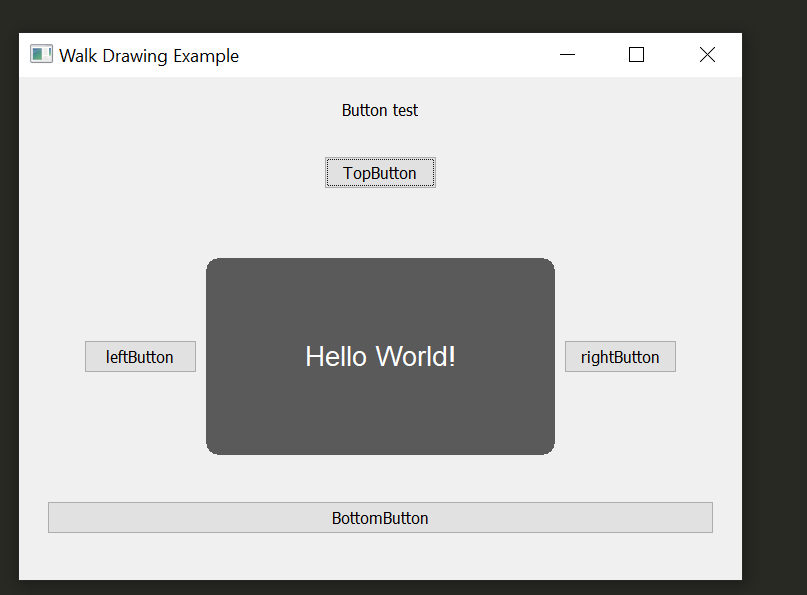
The button will expand in size as i increase the window size. Or shrink to smaller than its "boundry" if i make the window smaller.

walk_example2

What i would like to achieve is to have it stay the minimum size it needs to render the text properly when the window grows. And ideally not shrink so the text becomes cropped. Like TopButton in the example. It has one spacer on each side and they take the space on each side.

Any ideas?

lxn commented 3 years ago

To control the layout, your CustomButton will have to implement the CreateLayoutItem method of the walk.Widget interface. The code below is very similar to that of walk.Button and should get you going:

func (cb *CustomButton) idealSize() walk.Size {
    canvas, err := cb.CreateCanvas()
    if err != nil {
        return walk.Size{}
    }
    defer canvas.Dispose()

    bounds, _, _ := canvas.MeasureTextPixels(/* TODO: Insert appropriate args here. */)

    // TODO: Adjust size if required.
    return bounds.Size()
}

func (cb *CustomButton) CreateLayoutItem(ctx *walk.LayoutContext) walk.LayoutItem {
    return &customButtonLayoutItem{
        idealSize: cb.idealSize(),
    }
}

type customButtonLayoutItem struct {
    walk.LayoutItemBase
    idealSize walk.Size
}

func (li *customButtonLayoutItem) LayoutFlags() walk.LayoutFlags {
    return 0
}

func (li *customButtonLayoutItem) IdealSize() walk.Size {
    return li.MinSize()
}

func (li *customButtonLayoutItem) MinSize() walk.Size {
    return li.idealSize
}

For the declarative part, you could have a decarative sub package and do something like this:

package declarative

import (
    "github.com/lxn/walk"
    . "github.com/lxn/walk/declarative"
)

type CustomButton struct {
    // Window

    Background         Brush
    ContextMenuItems   []MenuItem
    Enabled            Property
    Font               Font
    MaxSize            Size
    MinSize            Size
    Name               string
    OnBoundsChanged    walk.EventHandler
    OnKeyDown          walk.KeyEventHandler
    OnKeyPress         walk.KeyEventHandler
    OnKeyUp            walk.KeyEventHandler
    OnMouseDown        walk.MouseEventHandler
    OnMouseMove        walk.MouseEventHandler
    OnMouseUp          walk.MouseEventHandler
    OnSizeChanged      walk.EventHandler
    Persistent         bool
    RightToLeftReading bool
    ToolTipText        Property
    Visible            Property

    // Widget

    AlwaysConsumeSpace bool
    Column             int
    ColumnSpan         int
    GraphicsEffects    []walk.WidgetGraphicsEffect
    Row                int
    RowSpan            int
    StretchFactor      int

    // ImageView

    Image  Property
    Margin Property
    Mode   ImageViewMode

    // CustomButton

    AssignTo   **yourpackage.CustomButton
    OnClicked walk.EventHandler

    // TODO: Put additional CustomButton fields here.
}

func (cb CustomButton) Create(builder *Builder) error {
    w, err := yourpackage.CustomButton(builder.Parent())
    if err != nil {
        return err
    }

    if cb.AssignTo != nil {
        *cb.AssignTo = w
    }

    return builder.InitWidget(cb, w, func() error {
        // TODO: Do additional initialization here.

        if cb.OnClicked != nil {
            w.Clicked().Attach(cb.OnClicked)
        }

        return nil
    })
}
Kimbsen commented 3 years ago

Thanks, i got it working using a custom layout item!