 nus-se-script
commented
7 months ago
nus-se-script
commented
7 months ago Team's Response
No details provided by team.
The 'Original' Bug
[The team marked this bug as a duplicate of the following bug]
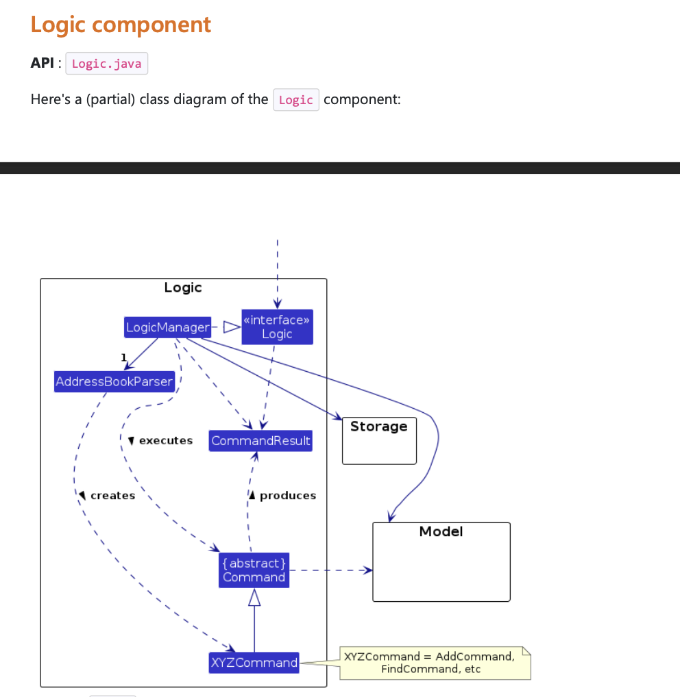
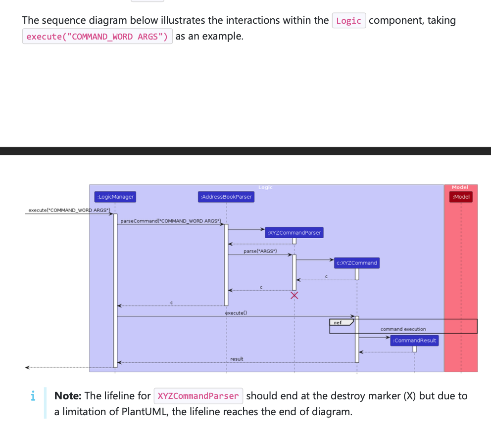
Logic component diagrams are in a different page than expected.
Note from the teaching team: This bug was reported during the Part II (Evaluating Documents) stage of the PE. You may reject this bug if it is not related to the quality of documentation.
The sentences introducing the diagrams are in a different page than the diagram itself. This could hinder/confuse readers which do not have pages scrolling vertically but have it set up horizontally instead.In the screenshots below, the black bars represent a separate page.
Diagram 1:
Diagram 2:
[original: nus-cs2103-AY2324S1/pe-interim#242] [original labels: severity.Low type.DocumentationBug]
Their Response to the 'Original' Bug
[This is the team's response to the above 'original' bug]
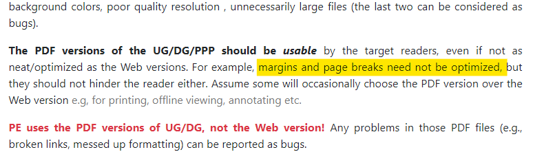
Hi tester. Based on the website, we are not required to optimise page breaks unless it hinders the reader. The diagrams are not split into two pages, and also the page breaks are not of a large margin. As such we do believe that this does not hinder the readers.
Items for the Tester to Verify
:question: Issue duplicate status
Team chose to mark this issue as a duplicate of another issue (as explained in the Team's response above)
- [x] I disagree
Reason for disagreement: This issue deals with tables in the Developer Guide getting cut off in mid sentence which will affect the users in understanding the table of use cases due to the lack of page breaks whereas the duplicate is due to the size of the diagrams being too big and thus not being in the same page.
They impact different parts of the document and require separate interventions. The use case box issue is about incomplete visibility of content, whereas the diagram issue is about content placement relative to its accompanying text. The nature of the content affected (use case boxes vs. diagrams) and the solutions required are different. Consequently, addressing one of these issues does not inherently resolve the other.
Since one can be fixed independently of the other, they are not duplicates (as per the module website).
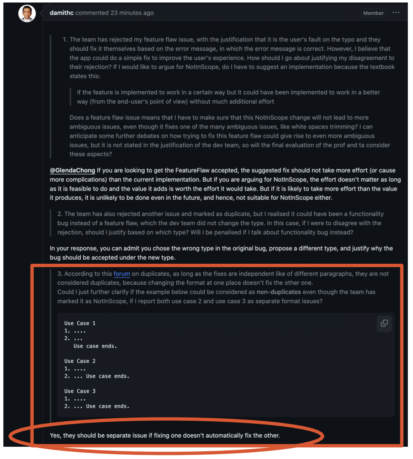
Prof has also justified this in the forum that this should not be duplicates as fixing one does not automatically fix the other.
Moreover, your team decided to mark this as a duplicate without any justification.
## :question: Issue response Team chose [`response.Rejected`] - [x] I disagree **Reason for disagreement:** I appreciate your perspective on the page break issue. However, I must respectfully disagree with your assessment as it does significantly hinder the reader. The use case table breaking off into the next page, as evidenced in the screenshot, does impact the readability and user experience of the documentation. A table that is cut off mid-sentence and continues onto the next page disrupts the reader's ability to follow the flow of information, causing breaks in continuity that necessitate unnecessary back-and-forth navigation. Tables and diagrams should be properly formatted and contained within single pages where possible (and it's not that difficult as well, with a simple before the table. This small change could greatly improve the user experience and clarity of the documentation. The issue is not merely a visual inconvenience but a functional impediment to the users of the Developer Guide. Developers rely on these documents for a comprehensive understanding of use cases. If the table is cut off, it hinders their ability to quickly reference necessary information, potentially slowing down their workflow and leading to frustration.  Above shows a specific guideline from the teaching team, which clearly states: "Cases such as a diagram being split between pages are considered bugs, because they hinder the reader." Just as a diagram split between pages is acknowledged as a bug due to its negative impact on readability, the same principle should apply to our situation with the use case table breaking off in mid sentence into the next page. This is not merely a minor formatting issue; it's a substantial impediment to the user's ability to effectively consume and understand the information presented (as phrased from the teaching team "require the reader to put more effort than necessary") . The teaching team's statement underscores the importance of seamless information presentation in technical documentation. When a reader encounters a table or a diagram split across pages, it disrupts their cognitive flow, requiring additional effort to piece together disjointed information. Furthermore, In your response, is attached a screenshot from the teaching team that states: "Any problems with the PDF files - messed up formatting can be reported as bugs". Therefore, this bug of messed up formatting of your use case table is a bug and is of severity. Low as it does hinder the user in using your pdf version of your User Guide (especially those that prints out documents and do not use continuous scrolling pdf readers) and this use case table is such a vital part of your user guide, thus not purely cosmetic. In fact I think that Rejection should not be the correct response from the dev team.  According to prof, rejection of bugs are only for bugs that should not be carried out in the DG at all, now or later. However, i think it is agreed that proper formatting of the table should be something that the team strives towards and thus this bug should be accepted by the dev team.
users find it hard to read