 arjunsalyan
commented
5 years ago
arjunsalyan
commented
5 years ago Thank you very much for this detailed feedback. It is very helpful. I will keep updating and discussing here as I work on individual suggestions.
Open dmitriz opened 5 years ago
arjunsalyan
commented
5 years ago Thank you very much for this detailed feedback. It is very helpful. I will keep updating and discussing here as I work on individual suggestions.
 mojca
commented
5 years ago
mojca
commented
5 years ago Here is my user feedback on the web app
Amazing, thank you very much for the very detailed feedback.
running OSX 10.8.5 that is old by now, I began facing increasing number of broken installations with Homebrew,
Didn't they completely remove support from HB 2.0 earlier this year?
In any case support for pre-10.9 systems could be improved further if you switch to libc++. At the moment you don't get any binaries.
since menu and other items have all words capitalized, it may be consistent to similarly format the labels
I would be slightly more in favour of de-capitalizing things. Maybe start with uppercase, but then continue with lowercase. That said, I'm not a native speaker, but I agree that consistency is important (I just didn't want to nitpick too much so far).
It is always nice to see the top requested ports, while the numbers feel rather small. I see that users can explicitly opt-in to statistics submission. If only these users are counted, that should explain the small numbers
Yes, only those users who opted in are counted. We should continue working on getting more users opt in. But until now we didn't have that much to show, so we didn't spread the word as much.
We've had http://stats.macports.neverpanic.de/ since a couple of years, but that one had some serious database design flaws that made the statistics semi-useless, and we didn't have any serious expertise in ruby on rails, so nobody submitted any serious patches.
I hope this will change now, and we should be able to advertise more.
in which case, perhaps a clarification would be suitable:
I leave it up to Arjun to decide what to do. We already have something written, but maybe it should in fact be made more clear that we don't just have 30 users in total.
Of course, it would be even more interesting to view the number of all installations, not only from the opted-in users.
With many mirrors in place and a generic attitude that we don't want to spy on our users, this will be impossible to get. But we could provide some other metrics like monthly download volume etc. I don't have access to those.
The list currently only contains 5 ports, which can perhaps be increased to 10 (the usual number used for top searches).
Yes, maybe 10 makes more sense. And the Continue to overall stats could be More ..., potentially linking to /statistics/ports
The list of categories looks more like keywords that are often short with unclear meaning, at least for new users.
To some extent I find browse-by-category semi-useless, in particular on the first page taking up the most valuable space. See also #47. I mean: I would not necessarily take it away, but maybe we can find a better place for that.
Also numbers of ports in each category would be helpful to display.
Yes, that would be one of my requests as well if we keep showing that list. A single database query should be sufficient to retrieve all categories together with the number of ports in that category.
There seems to be no footer right now, that would be a helpful feature. I always find it very convenient to see all the external links from the page collected again in the footer.
Good point. Maybe we can add this to #47.
Also I imagine, there will be some credits and information about the people behind the project.
As well as "Contribute" with links explaining how to improve the site :) The general idea would in fact be to integrate the site into https://www.macports.org/, I'm just not yet entirely sure how exactly would work best.
Some of the description I find rather short, e.g. "circuit-drawing program" is the same description for both
xcircuitandxcircuit-devel, where the latter feels like Developer version that could be briefly indicated in the description.
This is something that needs to be corrected "upstream", in the Portfile to which the page links if you follow the yellow badge.
(Most -devel ports would have the same description as the main port. If you suggest to fix the guidelines that, it's something that might be best discussed on the mailing list. However there are tons of ports, and I doubt this is doable with a small amount of effort. Plus it complicates the ports to quite some extent.)
One thing missing that I find important would be to update the URL with the search keywords. That way people can easily pass search links in emails or forums.
Agreed.
Another thing missing is the number of search results that could be displayed e.g. in parens:
Showing results for "irc" (20 results).
Agreed.
The "Cancel Search" button label is in red, which feels a bit aggressive on the eyes. I would avoid red or any unusual color and use plain black instead. There is only one button that can't be missed, so there is no need to attract more attention via colors.
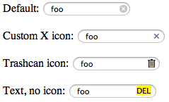
What about a cross at the end of the input field? Here is an example that functionally doesn't work for me, but I'm linking it for the screenshots just to convey the idea:
In addition, another search by name with string appearing at the beginning could be helpful.
We were discussing this a bit :)
We could probably accept ^foo to mean "only find anything starting with foo" and document it well to avoid too many new input fields.
Port Health
This actually looks like the version list, so title "Versions" instead might be less confusing:
Versions: 10.14 10.13 ...
We could definitely come up with something better, but Versions would be confusing to me as well. Red means that the port did not successfully build on buildbot, but that doesn't always mean that the port is broken. Even a website that was temporarily down could cause this.
Also here the last version label is not clickable, which is confusing: http://ec2-52-34-234-111.us-west-2.compute.amazonaws.com/port/bzip2/?tab=summary
If that version is not functional and there isn't even a link to it, why even mention it?
This means that we have no data about the builds. This may happen for various reasons:
I am looking at this page: http://ec2-52-34-234-111.us-west-2.compute.amazonaws.com/port/ircii/?tab=summary
The "version" looks confusing:
Please complain to upstream :) ... and of course feel free to submit a PR for an update as it apparently hasn't been touched for a while.
Is this the last update date rather than version? If yes, maybe change to date and format as date:
Last update: 2017/07/04
No, it's not a date, it's really supposed to function as a version. But you'll find numerous packages having dates as part of the version. Sometimes that's the date of the commit being used, in particular when there is no version / no tag for that commit. Sometimes upstream simply decides to use such versions. A software I regularly use makes daily updates, sometimes maybe ten times per day (by a single developer). The developer simply decided to use YYYY.MM.DD for version string as there are no bugfix branches or tags or whatever. Just a "rolling release".
(Also, I'm not sure if slash is even valid in version specification.)
This is, of course, sad but very useful to know:
Maintained by: No Maintainers Found
I would replace this by none or None or (None) and also make it a clickable link pointing to the list of all unmaintained ports, similarly to links for other maintainers.
This one is confusing:
ClosedMaintainer: FalseWhat is "Closed Maintainer"?
I wanted to suggest a change a while ago, but didn't want to distract Arjun too much with unimportant things at the early stages of the project.
I would remove this line and draw a lock (maybe just take a symbol from one of the web fonts) next to maintainer. When you point mouse over the lock it would provide a hint explaining what this is (opposite of openmaintainer; I would like to suggest changing the policy and opting into closed maintainership rather than having to opting into open maintainership).
Clicking on "universal" next to "Variants" delivers over 8k results! Really so many?
Yes, that's a special meaning. Actually all ports should have the universal variant, except for those that don't install any binaries / libraries, and those that cannot be built for a particular architecture, or cannot easily be cross-compiled.
Another puzzling thing, this kind of search is not discoverable from the main page. I did not know this was even available.
The only way I see to make this generally discoverable would be to offer some universal search filtering functionality where one could apply any criteria (search for port name, ports belonging to a particular maintainer, having a particular variant, being requested more than N times, being broken on a particular OS version, ...)
I got curious due to so many results and their order. And indeed, on page 4 something strange happens: http://ec2-52-34-234-111.us-west-2.compute.amazonaws.com/ports/variant/universal?page=4
The first half of the page has ports ordered alphabetically until
zlib, after which the order becomes "random"??
Looks like a bug (that might be trivial to fix).
Dependencies
Very nice to know, but what is "lib" and "run" here?
Maybe we need to provide some hints. We would likely need one single page explaining the concepts in more details and then provide links to that page.
To answer your question: runtime dependencies are tools like "python" which you might need to run your script, but you don't need to link against the python library itself. Or maybe you need unzip as part of the process.
In contract, if you want to use libpng, you need to link against that library at build time already.
Runtime dependencies may in principle not be needed when building the port, and this could optimize the build speed.
Visually, the dependencies appear one row below that felt like design error, until I checked some other pages, e.g. http://ec2-52-34-234-111.us-west-2.compute.amazonaws.com/port/openssl/?tab=summary
The alignment seems to be the problem here: "Dependency of:" is left-aligned, while "build" below is right-aligned.
I would display all labels consistently left-aligned, while the "build" and "lib" can be indented to appear as sub-classifiers.
@mf2k recently requested right alignment. This might stay confusing to some extent independent of how we do it :)
I cannot decide what would look better.
(Longer) description on the right
This is of course much more useful than the brief description in the search results. It could be helpful to show at least some of it directly in the search results.
I'm not sure how without making the search results semi-useless due to its potentially very long length. Also, many ports cheat and provide just one (long description being the same as the short description). This would also make rending slower, of course.
For instance, searching for
ircsiishows two results with tiny description and leaves a lot of empty space. It could be more helpful instead to use that long description to fill in some space left. For instance, make the rows thicker and show that description, possibly truncated if too long, right below the short description, in the same smaller and lighter font.
I would make this a low priority to maybe experiment with once other things are done.
Also it is not clear to me what "Requested Installations:" means.
This might belong to category of "we need to explain some term".
But it's basically the difference in whether you ran sudo port install perl5.30, most likely because you wanted to actively use perl for your coding, versus it being installed automatically as soon as you needed some other tool written in perl.
Some ports are important because "the whole world" depends on them, even if nobody explicitly installs them. Other tools are important because users want to use precisely those tools. There is a significant difference between the two.
The controls for the Stats are very nice but the number of installations appear the same for all selections starting from 30 days
That's because we have only been receiving submissions for just a tiny bit longer than a month.
Maybe there are too many choices in the selections? I would probably limit to 3 choices, with the last one being "all times" rather than 1 year, which feels random.
All choices are pretty random, to be honest :) I would definitely keep 1 week, 1 month, 1 year.
While we could add "All times" / Total, I don't expect super useful results for that. It makes more sense to then draw time charts showing how various parameters kept changing over time.
Something between 1 month and 1 year still sounds reasonable, as the factor is quite large. We would write 3 months, but duration of a month is ambiguous. I believe that Homebrew is reporting statistics for 1 month and 1 year, but I didn't check right now.
The second control "starting from" is less useful and returns empty results for starting from 90 days ago and above.
That's totally expected because we don't have any statistics older than 2 months. But I feel it's a waste of resources if we try to fix this now, since the problem will automatically be resolved once sufficient time passes.
Which is also incorrect, because "previous 365 days starting 180 days ago" should certainly include "previous 365 days starting 30 days ago".
We just discussed that our wording is misleading and we need a better way to word this. Suggestions welcome.
365 days starting 180 days ago means the interval (-365-180, -180). That is: starting 18 months back and stopping 6 months back.
Here I am not even sure what is the use of that second classifier and making things simpler by keeping only the first selection with 3 choices would likely suffice for most users (at least for me).
We would like to keep the second option. It lets you check the previous month (excluding the last one) and compare it with the last month. But wording should be improved.
(Actually, you could also easily submit the change in wording yourself by submitting a pull request But that code is still undergoing code review and fixes, so it is not yet in the master branch. Once it will be, I can send some links.)
"Most installed version" is interested to know, but again, are these all users or only those who opted-in?
Just those who opted in. We don't track users, so there's nothing else.
From the OS versions, it is a pleasure to see some older OSX versions installed that must be then generously supported. This is certainly appreciated by the users still running these systems for whatever reasons.
I found however surprising the gap with no OS between 10.5 and 10.9 here: http://ec2-52-34-234-111.us-west-2.compute.amazonaws.com/port/gcc7/?tab=stats&days=30&days_ago=0 But then I see the number of only 6 installation (for the major port like
gcc7!).
Note that gcc9 is out. Why would anyone still want to use gcc7?
We may need to add the total number of unique users submitting statistics during the same period of time for comparison (30), and then maybe also write the percentage and rank (like: this is the 850th most installed port (16.75 %) and 85th most requested port (10 %); ordered and worded differently, of course).
These are always straight lines, which feels weird. Also only last two months shown.
Given that we only have statistics for June and July, any graphs will be straight lines by definition :) Maybe wait at least until around the 10th of August to see something more interesting? That said, other suggestions for improving style are welcome.
I presume these would be more useful for the authors. If I were one, I'd like to see both immediate very short term results, and ones over very long period if the port is old. Showing only stat by month here could be less helpful to the new authors looking for immediate statistics.
The authors will see new installations with up to one week of delay (down to zero delay if super lucky). Our statistics submissions are somewhat flawed in that it's basically a cron job running (submitting) list of installed ports once per week, with no retry in case it fails (which includes the user not being online at the time of the day when submission is supposed to happen). We somehow rely on the submission succeeding at least once in a month.
For that we just took the work from another GSOC student from around 2011. The submission process could be improved later, we just didn't feel this was the highest priority to get the basic work done.
I would probably prefer daily statistics for the first moth or two and then monthly over several years.
For that we would need to actually submit immediately after port installation happens. We could implement it at some point, but doing it now is not realistic as it would be a lot of effort over very little gain, and the little time we have left during this year's GSOC project would better be spent implementing features with more impact.
It is not clear to me the meaning of "Watcher" here, if that could be explained somewhere...
This might significantly change once we switch to the new buildbot. We could explain it, but it's not too important for anyone else but the maintainers (or random users interested in fixing build errors?) to actually look into the links.
Track Tickets
So maybe add some field names for the table?
Ticket       Title                                                         Status
#52101  openssl @1.0.2h_1: update to 1.1.1b update
Adding table header should be relatively easy.
Actually, if you feel like making the first contribution to the project, you could add them here and submit a PR :)
Top Menu: All Builds
http://ec2-52-34-234-111.us-west-2.compute.amazonaws.com/ports/all_builds/
Very nice, as is the option to filter by search!
What is not clear here is the sorting order of the entries.
They are ordered by time.
A really nice and clean feature here would be to have the table field name clickable with arrows up and down, which would make the list ordered by that label increasing or decreasing.
I agree, but maybe not just yet as there are more important features pending for implementation, and this one would take a bit more time to be implemented in a clean way, and would likely not be of much immediate benefit.
What I would mainly like to use this table for is to check whether recent builds have failed. What would be a more useful change to that table right now would be to update it more frequently.
Statistics
http://ec2-52-34-234-111.us-west-2.compute.amazonaws.com/statistics/
Also helpful. However, what is the meaning of "Users vs Month"? Also users in plural while month in singular... Maybe "Users per Month"? Also the font is too small perhaps.
Or simply some shorter version of "Number of (opt-in) users submitting statistics" or "Number of participating users". The "vs. month" part is evident from the graph. And I would probably remove the legend.
The table on the right entitled: "Opt-in for submitting stats by installing the port mpstats-gsoc." This looks like title, so perhaps larger font, while the table rows below in smaller.
Not the title, but useful hint for users. The one you complained earlier is missing :)
Using the same font as in "Users per Month" would feel consistent. The title itself maybe rephrase:
Users opted in for stats submission
Which of the titles?
And then, why not make it a link to the dedicated page explaining all the details about the opt-ins and what ports to install?
Yes, that would be helpful. One way would be to create a Markdown document inside the documentation part of repository itself, and then link to the GitHub repository directly. Another way would be a dedicated page, of course. But having a link on GitHub might attract more users to submit patches and wording improvements, as well as potentially contribute to other parts?
Table rows: not clear to me what is difference between "submissions" and "unique users"
Submission: each time the user submits the data (usually 4 times per month, or less in case the user was off-line). It can be submitted manually more often than that. User may accumulate tens of hundreds of submissions.
Unique users: that should be clear, at least. The number of unique users who ever submitted something. That said, of course one user may have 5 computers submitting statistics, and that would count as 5 unique users.
Yes, we probably need to explain in detail about how submissions are done. But I would do it in a document in repository, not deploy it to the site.
That looks like all pages I could find.
Feel free to provide feedback also on those you didn't find :)
(Seriously though. I'm curious what would be the number one missing feature, for example.)
 dmitriz
commented
5 years ago
dmitriz
commented
5 years ago Amazing, thank you very much for the very detailed feedback.
You are welcome, happy to help.
Didn't they completely remove support from HB 2.0 earlier this year?
No idea, it doesn't even tell me its version:
➜  ~ brew --version
ERROR: Your version of macOS (10.8.5) is too old to run Homebrew!

/System/Library/Frameworks/Ruby.framework/Versions/Current/usr/bin/ruby: invalid option --enable-frozen-string-literal  (-h will show valid options)
ERROR: Your version of macOS (10.8.5) is too old to run Homebrew!

==> Downloading https://homebrew.bintray.com/bottles-portable-ruby/portable-ruby-2.3.7.mavericks.bottle.tar.gz
Already downloaded: /Users/dmitrizaitsev/Library/Caches/Homebrew/portable-ruby-2.3.7.mavericks.bottle.tar.gz
==> Pouring portable-ruby-2.3.7.mavericks.bottle.tar.gz
Error: Failed to vendor ruby 2.3.7.
Error: Failed to install vendor Ruby.
➜  ~
Not exactly the most helpful message of my life :)
In any case support for pre-10.9 systems could be improved further if you switch to libc++.
Thank you for this advice, I had actually stumbled on the C11 support issue that brought me here: https://trac.macports.org/wiki/LibcxxOnOlderSystems and here: https://trac.macports.org/ticket/55926 and here: https://apple.stackexchange.com/questions/362478/c11-on-snow-leopard-10-6-8
But I wasn't sure how to follow the instructions:
Start with a new install of MacPorts or uninstall all ports that use C++
How can I see which of my ports are using C++?
Edit /opt/local/etc/macports/macports.conf to contain:...
Can I try it or something else without removing the ports first (that took hours to build)?
At the moment you don't get any binaries.
This is a concern for me if building from source will fail. You say "at the moment" implying there will be a change for better? :)
Lion and Mountain Lion systems have libc++ installed with the OS but still use libstdc++ as the default C++ runtime.
That reads like some dark intentions by Apple to impede my functionalities, is it?
Installing but use their older version instead?
The CLI option -stdlib=libc++ I can only use when running it myself, not when it is run by others like dat, right?
If yes, then it does indeed impede my workflow :(
Here is my current state:
➜  ~ port installed|grep "libc"
  clang-5.0 @5.0.2_3+analyzer+defaultlibcxx+libstdcxx (active)
  clang-6.0 @6.0.1_2+analyzer+defaultlibcxx+libstdcxx (active)
  clang-7.0 @7.0.1_1+analyzer+defaultlibcxx+libstdcxx (active)
  clang-8.0 @8.0.0_0+analyzer+defaultlibcxx+libstdcxx (active)
  libcomerr @1.44.5_0
  libcomerr @1.45.2_0 (active)
  libcroco @0.6.13_0 (active)
  libcxx @5.0.1_4 (active)
➜  ~
I would be slightly more in favour of de-capitalizing things. Maybe start with uppercase, but then continue with lowercase. That said, I'm not a native speaker, but I agree that consistency is important (I just didn't want to nitpick too much so far).
That would be another way to make it consistent but might miss out on the readability advantage of the capitals to call user attention to the nouns, away from propositions. Are there advantages to de-capitalize all words in labels?
Yes, only those users who opted in are counted. We should continue working on getting more users opt in. But until now we didn't have that much to show, so we didn't spread the word as much.
Now it comes to my mind that some of the biggest user frustrations that companies ignore or unaware are providing search options with empty or too few results. It is probably better to disable them by default until enough data is there, or at least give some clear warning (which still be more confusing than disabling).
With many mirrors in place and a generic attitude that we don't want to spy on our users, this will be impossible to get. But we could provide some other metrics like monthly download volume etc. I don't have access to those.
I can't think of anyone objecting to collecting and showing total numbers of downloads. And to address people's concerns, I find a dedicated privacy page linked from each page's footer doing generally great job users appreciate.
And the Continue to overall stats could be More ..., potentially linking to /statistics/ports
Yes, linking to total stat is always helpful from any partial stat page.
To some extent I find browse-by-category semi-useless, in particular on the first page taking up the most valuable space. See also #47.
Thanks, will reply there...
Good point. Maybe we can add this to #47.
The footer should be the same on all pages, so it might not fit into the landing page discussion?
As well as "Contribute" with links explaining how to improve the site :)
Spot on :)
The general idea would in fact be to integrate the site into https://www.macports.org/, I'm just not yet entirely sure how exactly would work best.
The easiest way to begin would probably be just linking it from there, with some short explanation about the differences. Then people can use whatever they like. I would certainly not recommend removing anything from the old site, that might "feel redundant". This is the mistake made by so many companies that always make people angry because it disrupts their workflow even if the new site is (in the company's view) "much better".
This is something that needs to be corrected "upstream", in the Portfile to which the page links if you follow the yellow badge.
Yes and no. :) For instance, you can always add a comment or two beyond the upstream version.
(Most -devel ports would have the same description as the main port. If you suggest to fix the guidelines that, it's something that might be best discussed on the mailing list. However there are tons of ports, and I doubt this is doable with a small amount of effort. Plus it complicates the ports to quite some extent.)
I certainly wouldn't want to add to people's work, especially to volunteers. But that might not be needed if the app simply inserts standard comments say in parentheses explaining it is the developer version and what it means (which is currently unclear).
What about a cross at the end of the input field?
Indeed, that is the standard simple way and probably the best. The cross should appear as soon as user types and click on it will reset the search.
Here is an example that functionally doesn't work for me, but I'm linking it for the screenshots just to convey the idea
The default white cross on grey is probably the best, plain and simple. The other cross doesn't feel standard and might be harder to click.
The trashcan and all other icons I would stay away from in any no-nonsense project :) The yellow DEL feels confusing and out of place.
One extra feature that might be useful though is to turn the cross into "Undo" when clicked, to account for the user clicking on it by accident to quickly recover the last search. Better than retyping it again from scratch.
We were discussing this a bit :) We could probably accept ^foo to mean "only find anything starting with foo" and document it well to avoid too many new input fields.
That will work too for any tech crowds, which is the case here.
We could definitely come up with something better, but Versions would be confusing to me as well. Red means that the port did not successfully build on buildbot, but that doesn't always mean that the port is broken. Even a website that was temporarily down could cause this.
Are these not versions? This is how they look to me, if they mean something else, that would be definitely good to mention :)
Red means that the port did not successfully build on buildbot, but that doesn't always mean that the port is broken.
That sounds like a reason to explain all the notation, similar to how you already nicely do it for the stat colors.
This means that we have no data about the builds. This may happen for various reasons:
Thanks for clarifying. I would probably suggest then to link to a page where these are explained. Even just a page stating what you said here will work :)
The port has last been built so long ago that it vanished from history. Our CI infrastructure cleans the old logs after 10k builds. We have 20k+ ports, with some being updated on a regular basis, so there's definitely history missing. We started storing the data only about a month ago.
So the search only refers to history, not the actual database? This might be worth stating somewhere to avoid any confusion.
That particular builder is currently defunct. I don't know the reason why, but since it hasn't been a super high priority to fix it and the owner of the machine is somewhat busy, it didn't get a chance to attempt the build.
That would also be helpful to explain with a brief note. And any potentially helpful task for new contributors, to reduce the owner's workload, is definitely worth mentioning in some dedicated task wishlist.
Not having such wishlists is IMO a mistake made by many projects wanting to encourage new contributors. There are sadly too many project owners out there not acting welcoming to new contributors, so people get discouraged and may think twice before investing their time in what might later hit the wall of rejection.
And given how many people use this project, and how Homebrew is going nuts and people like yours truly coming over here, that might work really well. :)
Please complain to upstream :)
About the version notation?
... and of course, feel free to submit a PR for an update as it apparently hasn't been touched for a while.
... and of course feel free to submit a PR for an update as it apparently hasn't been touched for a while.
I wouldn't know where, as it doesn't seem to link to GH?
No, it's not a date, it's really supposed to function as a version.
Wow, really confusing though.
But you'll find numerous packages having dates as part of the version.
That is ok, as long as they are recognizable as dates :)
Sometimes that's the date of the commit being used, in particular when there is no version / no tag for that commit. Sometimes upstream simply decides to use such versions. A software I regularly use makes daily updates, sometimes maybe ten times per day (by a single developer). The developer simply decided to use YYYY.MM.DD for version string as there are no bugfix branches or tags or whatever. Just a "rolling release".
I see where you come from, and you certainly don't want to impose anything on the port authors already dedicating their time. But on the other hand, there might be some minimal agreement needed to avoid confusing end user, that may reflect on the project itself. For instance, one simple way would be to require to either begin with a version number or, if they really hate those, just prefix with some "v" followed by whatever they want.
(Also, I'm not sure if slash is even valid in version specification.)
Or any of . or - would be just fine :)
I would replace this by none or None or (None) and also make it a clickable link pointing to the list of all unmaintained ports, similarly to links for other maintainers.
Absolutely. :)
In these cases, any info about the actual state of the project, whether a new maintainer is desired and possible alternatives would be helpful. It is always frustrating to see projects that look "dead" without knowing which one of the following is the case:
That page doesn't seem to use the "Closed Maintainer" terminology...
I would remove this line and draw a lock (maybe just take a symbol from one of the web fonts) next to maintainer. When you point mouse over the lock it would provide a hint explaining what this is
Removing is always a simple way, whenever you have other higher priorities. :) Not sure I quite follow the suggestion but generally I'd be wary of relying on the mouse on a site that doesn't do it systematically. Which would perhaps be a distraction?
(opposite of openmaintainer; I would like to suggest changing the policy and opting into closed maintainership rather than having to opting into open maintainership).
So your suggestion is to default to "Open"? Sounds like a good idea to me :)
Yes, that's a special meaning. Actually all ports should have the universal variant, except for those that don't install any binaries / libraries, and those that cannot be built for a particular architecture, or cannot easily be cross-compiled.
That must be totally confusing to me as I've thought "universal" here is the name of an alternative port :). So "Variants" is a label (that sounds like alternative) and "universal" is content, i.e. the alternative port. :) Still can't make sense of that long list though, what is it good for...
The only way I see to make this generally discoverable would be to offer some universal search filtering functionality where one could apply any criteria (search for port name, ports belonging to a particular maintainer, having a particular variant, being requested more than N times, being broken on a particular OS version, ...)
It would be nice to have all the search pages easily discoverable from the landing page. Otherwise, it might be frustrating to find that nice page I've just seen and closed.
Just having a simple list of links on the landing page to all already existing search facilities might work just fine, then you can always enhance it later if you have the time. But I'd be wary to regard as "discoverable" any "fancy stuff" that would only appear after certain actions.
Looks like a bug (that might be trivial to fix).
Hopefully, but it is actually not the first time I've seen it.
To answer your question: runtime dependencies are tools like "python" which you might need to run your script, but you don't need to link against the python library itself.
Is this for the installation runtime? Or running it as binary after?
Will certainly help to have an explanation of this terminology.
Or maybe you need unzip as part of the process.
Isn't it already used for all ports after downloading?
In contract, if you want to use libpng, you need to link against that library at build time already.
"Link" here means creating a symlink?
Runtime dependencies may in principle not be needed when building the port, and this could optimize the build speed.
Optimizing speed would be welcome as some ports seem to take what feels like hours to build. Especially if it takes so long, giving some approximate time would be very helpful, if it is not possible to show any detailed progress like with downloading.
@mf2k recently requested right alignment. This might stay confusing to some extent independent of how we do it :)
That would feel confusing to me, why that label is left- and that other is right-aligned...
I'm not sure how without making the search results semi-useless due to its potentially very long length.
Just truncate text whenever it is long, followed by the "more" link is an easy way.
Also, many ports cheat and provide just one (long description being the same as the short description). .
Cheat... how could they? :) But you can display these next to each other, so they may feel embarrassed and change it or leave it if they don't care, which would also be something good to know for the user :)
This would also make rending slower, of course
How?
But it's basically the difference in whether you ran sudo port install perl5.30, most likely because you wanted to actively use perl for your coding, versus it being installed automatically as soon as you needed some other tool written in perl.
I see. That sounds like downloaded as dependencies. However, I have recently experienced ports breaking installation when being indirectly requested as dependencies, while they would perfectly install directly with sudo port install.
Some ports are important because "the whole world" depends on them, even if nobody explicitly installs them. Other tools are important because users want to use precisely those tools. There is a significant difference between the two.
I see. It is true that sometimes it is good to know the difference, instead of just seeing all downloads like with npm, where you keep wondering where all that downloads come from.
That's because we have only been receiving submissions for just a tiny bit longer than a month.
Then maybe disabling any control leading to empty results? Currently there are too many choices and keeping clicking with no use can be frustrating.
While we could add "All times" / Total, I don't expect super useful results for that. It makes more sense to then draw time charts showing how various parameters kept changing over time.
True. If no one had used them for a year, it is probably better not to use them.
Something between 1 month and 1 year still sounds reasonable, as the factor is quite large. We would write 3 months, but the duration of a month is ambiguous.
It depends on how many choices are there already. Anything above 3 would feel too many IMO.
I believe that Homebrew is reporting statistics for 1 month and 1 year, but I didn't check right now.
I wouldn't exactly regard them as a masterpiece project to follow, after years of a frustrating experience. Also, their aggressive stance of support-dropping and insisting on upgrades is rather disconcerting. I feel sad to see it mentioned everywhere as the first choice, which is not necessarily in users' interest.
365 days starting 180 days ago means the interval (-365-180, -180). That is: starting 18 months back and stopping 6 months back.
And to me, it means (-180, -180+365), which goes 180 days into the future. :)
We just discussed that our wording is misleading and we need a better way to word this. Suggestions welcome.
I wouldn't even know the use for any interval not ending with 0. That is, "last X years/days/months" would seem to cover all needs I could think of.
(Actually, you could also easily submit the change in wording yourself by submitting a pull request But that code is still undergoing code review and fixes, so it is not yet in the master branch. Once it will be, I can send some links.)
Sure, if I know these changes are welcome. :)
Note that gcc9 is out. Why would anyone still want to use gcc7?
Because the latest version could be broken on my old system?
We may need to add the total number of unique users submitting statistics during the same period of time for comparison (30), and then maybe also write the percentage and rank (like: this is the 850th most installed port (16.75 %) and 85th most requested port (10 %); ordered and worded differently, of course).
I hope it won't take away too much of your time. :) Especially when these data are only based on some small group of users.
Given that we only have statistics for June and July, any graphs will be straight lines by definition :)
But your data are spread over these periods, aren't they? E.g. one day you have more and another day fewer downloads within the same month. Then the graph should obviously show that, so I am still puzzled by the line.
Maybe wait at least until around the 10th of August to see something more interesting? That said, other suggestions for improving style are welcome.
I personally find the OSX versions most interesting, being, unfortunately, a big painful issue. (In the ideal world, would shouldn't even have to deal with it.) Just to see people still using those old versions, despite what many users think, is quite revealing.
The authors will see new installations with up to one week of delay (down to zero delay if super lucky). Our statistics submissions are somewhat flawed in that it's basically a cron job running (submitting) list of installed ports once per week, with no retry in case it fails (which includes the user not being online at the time of the day when submission is supposed to happen). We somehow rely on the submission succeeding at least once in a month.
I understand this is related to that voluntary submission, but many users might be concerned about their privacy. Instead, maybe the real downloads statistic with some simple transparent privacy statement as I mentioned above?
This might significantly change once we switch to the new buildbot. We could explain it, but it's not too important for anyone else but the maintainers (or random users interested in fixing build errors?) to actually look into the links.
Then maybe just removing it, so no one asks :)
They are ordered by time.
Then maybe briefly mention it.
I agree, but maybe not just yet as there are more important features pending for implementation, and this one would take a bit more time to be implemented in a clean way, and would likely not be of much immediate benefit.
True, this wouldn't of high priority. Maybe mention in the wishlist of desired future contributions (if it is).
What I would mainly like to use this table for is to check whether recent builds have failed. What would be a more useful change to that table right now would be to update it more frequently.
I find the TravisCI interface really clean. Are you using it? Or something similar? Then possibly just link there instead of any duplication of they already have?
Or simply some shorter version of "Number of (opt-in) users submitting statistics" or "Number of participating users". The "vs. month" part is evident from the graph. And I would probably remove the legend.
Indeed, time classifier may be unnecessary.
Not the title, but useful hint for users. The one you complained earlier is missing :)
But it appears like a title. Having title is always a good thing I think for any text that gets longer. Did I ever complain about something? :)
Which of the titles?
For the list on the right.
Yes, that would be helpful. One way would be to create a Markdown document inside the documentation part of repository itself, and then link to the GitHub repository directly. Another way would be a dedicated page, of course. But having a link on GitHub might attract more users to submit patches and wording improvements, as well as potentially contribute to other parts?
Indeed, a Github link is even better.
Unique users: that should be clear, at least. The number of unique users who ever submitted something. That said, of course one user may have 5 computers submitting statistics, and that would count as 5 unique users.
That would just be 5 downloads for me. Any detailed classification might feel confusing and benefits wouldn't be clear (to me).
Feel free to provide feedback also on those you didn't find :) (Seriously though. I'm curious what would be the number one missing feature, for example.)
Ah, that's interesting perspective :) Let's look at the competitors...
One thing I notice is the API endpoint /api/formula.json (JSON API), maybe a link to MacPorts API could indeed be useful for API fans among us. I can see the API endpoints are consistently mentioned across different pages there, but the usefulness is not evident to me.
Another thing is their search is powered by Algolia, with no sign of gcc 9 btw.
What I find nice, are links to Github repos everywhere, which can be really useful if you want to check out the status or contribute.
All-time periods are measured in days only:
30 days 90 days 365 daysFeels simpler than day/month/year perhaps.
The analytics is basic and mentions only "Install Events" for what looks like total ones. And one single page displays the ranking of 10000 top entries! The loading time is 5 seconds, not great, but the visible part appears instantly, which is the main point.
Links to troubleshooting are certainly useful.
"Tips and Tricks" ... everyone seems to love tricks, a neat way of turning features that are confusing and hard to find into something (looking) cool. :)
A page on "Anonymous Aggregate User Behaviour Analytics" with decent explanation: https://docs.brew.sh/Analytics
And a simple command to opt-out at the end feels neat.
Here is an interesting comparison:
https://www.slant.co/versus/1588/1674/~macports_vs_homebrew
Homebrew makes it easy for people to quickly install any open source software (that is contained within the apps repositories) for Mac.
Which is quite interesting to read in combination with the listed numbers of packages. :)
And looks like claiming to be easy and have everything is a big thing here. :) Which perhaps suggests to visibly display the total number of ports 20572 .
These are perhaps the most important to address
Bad at limiting dependencies MacPorts has a habit of pulling very specific versions of dependencies for each package. It downloads a different version of already existing dependencies even in cases where the existing dependency version would have worked seamlessly.
This sounds like a claim that might not be correct. But the mere fact it appears there might suggest putting some visible statements on the landing page stating the opposite :)
CON Downloads unneeded libraries duplicating functionality already provided by Apple's libraries As MacPorts eschews Apple-supplied libraries and links sources against its own a large duplication of functionality across MacPorts and Apple libraries can be found.
Again, as this seems like what people pay attention to, a visible statement emphasizing the positive sides would help.
CON Requires root permissions (sudo) for installation of packages
The same.
By negation, any Pro mentioned that that does not appear for MacPorts, may land into the Cons.
PRO Open Source
This is quite surprising to see only for HB. I any case, worth making as visible as possible on the landing page.
Generally having such a list of advantages over competitors (with or without mentioning the latter's) always looks good. It seems like HB is good at selling itself, why delivery langs but people don't see it so easily.
This might be a great feature! Show real users happy about the product and providing useful tips. Many blog writers will surely be happy to be listed and attract more traffic (that sometimes even pays their bills). While in exchange they might be willing to write helpful reviews. There might be some real gems to explore here...
Like this article: http://terrychay.com/article/macports-vs-homebrew.shtml
Also, comments are interesting, e.g.:
I find the arrogance of taking over /usr/local and changing permissions to single-user intolerable in a tool set I would use.
Here is some opposite opinion:
https://apple.stackexchange.com/a/34972/56300
HB is all Ruby whereas MacPorts, and its package formulae, are written in TCL which is....not exactly a popular scripting language. That said its pretty damn simple to create your own portfile.
HB is based around GitHub & thus seems a lot more welcoming to new contributors whereas MacPorts hosts its own SVN repository somewhere I think - which basically reflects the different ages of both projects I suppose.
Are these actually true?
As mentioned the general consensus is that MacPorts has been superseded by HB &, rightly or wrongly, that draws more people towards it.
Just stunning the kinds of vague superficial conclusions people can put in their "shopping lists".
mojca
commented
5 years ago I would say that thes explanations and testimonials would be really beneficial, but they belongs to the main page, not necessarily to the "here's statistics" page, but just to answer some of your questions (sorry, this is all so long, so it takes time to digest everything and respond).
Bad at limiting dependencies MacPorts has a habit of pulling very specific versions of dependencies for each package. It downloads a different version of already existing dependencies even in cases where the existing dependency version would have worked seamlessly.
This sounds like a claim that might not be correct. But the mere fact it appears there might suggest putting some visible statements on the landing page stating the opposite :)
This is mostly true, and would definitely require explanation. Some of those cases are done on purpose and fully justified. Some are not wanted, but it would be difficult to work around it without breaking stuff or without a lot of effort.
HB does the opposite and excludes everything they can. To some extent they started including stuff they excluded earlier as they later figured out it might be a good idea to include that after all. To some extent I would say this is also one of the reasons why MacPorts can afford to support Tiger, while HB only works on the latest versions.
The biggest pain is for example bootstrapping the latest compiler toolchain when you end up with gazillion of clang compilers. That said, HB doesn't know how to even do that (and doesn't care), making it difficult to do a fair comparison.
HB is all Ruby whereas MacPorts, and its package formulae, are written in TCL which is....not exactly a popular scripting language.
Sadly very true.
That said its pretty damn simple to create your own portfile.
True. It's easy to write and maintain Portfiles, and we have tons of pull requests for those, but the bus factor of base developers is alarmingly low and that might become more and more of a serious problem in the future unless we recruit new people, which is not the most trivial task either.
HB is based around GitHub & thus seems a lot more welcoming to new contributors whereas MacPorts hosts its own SVN repository somewhere I think - which basically reflects the different ages of both projects I suppose.
No longer true since 2016.
dmitriz
commented
5 years ago On Saturday, August 10, 2019, Mojca Miklavec notifications@github.com wrote:
I would say that thes explanations and testimonials would be really beneficial, but they belongs to the main page, not necessarily to the "here's statistics" page,
Yes, certainly to the main page, truncated whenever if takes too much space.
but just to answer some of your questions (sorry, this is all so long, so it takes time to digest everything and respond).
Bad at limiting dependencies MacPorts has a habit of pulling very specific versions of dependencies for each package. It downloads a different version of already existing dependencies even in cases where the existing dependency version would have worked seamlessly.
This sounds like a claim that might not be correct. But the mere fact it appears there might suggest putting some visible statements on the landing page stating the opposite :)
This is mostly true, and would definitely require explanation. Some of those cases are done on purpose and fully justified. Some are not wanted, but it would be difficult to work around it without breaking stuff or without a lot of effort.
Not breaking things might be a very compelling justification :)
The "untruth" in this testimonial is subtle. It mentions superficials while omits much serious and valid reasons behind. I'd give away .0001% of my drive to a second copy any day over getting a mess or cryptic errors that might cost hours searching to fix.
Interestingly, this is exactly what npm is doing, that is regarded by
many (incl. myself) as one of the most stable package managers. And even
more interestingly, there is pnpm https://github.com/pnpm/pnpm, the
alternative to npm that cleverly avoids duplication via caching and
symmlinking, that I personally love to use. However, there are regular
occasions where it breaks and I have to use the official npm instead.
HB does the opposite and excludes everything they can. To some extent they started including stuff they excluded earlier as they later figured out it might be a good idea to include that after all. To some extent I would say this is also one of the reasons why MacPorts can afford to support Tiger, while HB only works on the latest versions.
It was already hard to get working from the beginning. Took me several iterations of searching, posting, replying to get the "right" version of ruby, then to get it actually recognized. I suppose it is designed to work out-of-the-box only for whatever they regard as "regular users", with little regard for others. Which is ok for a niche FOSS project, but imho NOT ok for a major package manager aiming to play a key role with few alternatives.
The biggest pain is for example bootstrapping the latest compiler toolchain when you end up with gazillion of clang compilers. That said, HB doesn't know how to even do that (and doesn't care), making it difficult to do a fair comparison.
That is a very good point to mention even on the home page to some extent. With invitation to contribute for anyone who doesn't like it that way :)
Reminds me the joke https://suckless.org/sucks/:
Clang http://clang.llvm.org/ is written in C++. If you don't believe that it sucks, try to build clang by hand.
HB is all Ruby whereas MacPorts, and its package formulae, are written in TCL which is....not exactly a popular scripting language.
Sadly very true.
A niche language feels like a minus indeed, which selection would have had its reasons at the time I presume. Not that moving over to ruby might be a big plus :)
http://harmful.cat-v.org/software/ruby/
(A joke of course, that may have parts of joke :))
And how do you find this: https://developer.apple.com/documentation/macos_release_notes/macos_catalina_10_15_beta_5_release_notes
Scripting language runtimes such as Python, Ruby, and Perl are included in macOS for compatibility with legacy software. Future versions of macOS won’t include scripting language runtimes by default, and might require you to install additional packages.
That said its pretty damn simple to create your own portfile.
True. It's easy to write and maintain Portfiles, and we have tons of pull requests for those, but the bus factor of base developers is alarmingly low and that might become more and more of a serious problem in the future unless we recruit new people, which is not the most trivial task either.
That is always true of course and is a long subject. I imagine some kind of collaboration with HB (instead of competition) might help here, and would certainly benefit the end users.
HB is based around GitHub & thus seems a lot more welcoming to new
contributors whereas MacPorts hosts its own SVN repository somewhere I think - which basically reflects the different ages of both projects I suppose.
No longer true since 2016.
That is another problem -- things get mentioned that are not true anymore. :(
— You are receiving this because you authored the thread. Reply to this email directly, view it on GitHub https://github.com/macports/macports-webapp/issues/51?email_source=notifications&email_token=AATFSKK7RZ7HESDMNTWR2ZTQDXZ2JA5CNFSM4IHMXV6KYY3PNVWWK3TUL52HS4DFVREXG43VMVBW63LNMVXHJKTDN5WW2ZLOORPWSZGOD377JIA#issuecomment-520090784, or mute the thread https://github.com/notifications/unsubscribe-auth/AATFSKPKM7MU23DZ53LMNSLQDXZ2JANCNFSM4IHMXV6A .
mojca
commented
4 years ago @dmitriz: would you be willing to take another look at http://macports.silentfox.tech/ (the URL might change soon) and open a new ticket or tickets with whatever you still feel would be nice to change?
Here is my user feedback on the web app version located at http://ec2-52-34-234-111.us-west-2.compute.amazonaws.co as requested by @mojca on the MacPorts mailing list.
Disclaimer.
I am an old Mac OSX user but am very new to MacPorts. I have been using Homebrew for many years. However, running OSX 10.8.5 that is old by now, I began facing increasing number of broken installations with Homebrew, to the point that it eventually stopped working. So I looked around and discovered MacPorts that thankfully worked wonderfully on my old OS. Having dealt with typical unpredictable behavior of Homebrew, I have found MacPorts pleasantly solid and stable.
There was only one exception that led me to post this question: https://stackoverflow.com/questions/57162325/macports-error-clang-4-0-has-been-replaced-by-clang-8-0-please-install-that/, and then on the mailing list https://trac.macports.org/wiki/MailingLists, where I received very quick help that enable me to find a solution that I subsequently wrote: https://stackoverflow.com/a/57212770/1614973
Given such positive experience and so much help received, I would like to give back by posting this feedback.
Browser setup
I am viewing the app on my by now very old Chrome 49.0.2623.112 with developer console open to view the app statistics and responsiveness to browser width change.
Landing page
The initial page http://ec2-52-34-234-111.us-west-2.compute.amazonaws.com/ loads instantly and it is satisfying to see no console errors unlike I observe with many other webpages. In the Network console I see only 9 requests of total size 3.8KB, that I find phenomenal in the world of massively bloated webpages. Compliments!
Responsiveness
The page is nicely responsive to browser width changes till some very narrow vertical window, the range should more than cover all imaginable browser setups.
Menu
The menu is simple and clean with no possible confusing or ambiguity, which is the main point.
Search Widget
Again clean and simple. One small remark: since menu and other items have all words capitalized, it may be consistent to similarly format the labels:
Top Installations
It is always nice to see the top requested ports, while the numbers feel rather small. I see from @mojca email that users can explicitly opt-in to statistics submission. If only these users are counted, that should explain the small numbers, in which case, perhaps a clarification would be suitable:
With possible explanation page linked from
opted-in. Of course, it would be even more interesting to view the number of all installations, not only from the opted-in users.The list currently only contains 5 ports, which can perhaps be increased to 10 (the usual number used for top searches).
Browse by Category
The list of categories looks more like keywords that are often short with unclear meaning, at least for new users.
However, there is a lot of space left to the right, that can be filled with some useful description about what is actually contained in each category.
Also numbers of ports in each category would be helpful to display.
Footer?
There seems to be no footer right now, that would be a helpful feature. I always find it very convenient to see all the external links from the page collected again in the footer.
Also I imagine, there will be some credits and information about the people behind the project.
The Search
It is certainly very nice to have separately search by name and description. Some of the description I find rather short, e.g. "circuit-drawing program" is the same description for both
xcircuitandxcircuit-devel, where the latter feels like Developer version that could be briefly indicated in the description. Of course, this is more a feedback for the descriptions rather than the app that pulls these from outside.One thing missing that I find important would be to update the URL with the search keywords. That way people can easily pass search links in emails or forums.
Another thing missing is the number of search results that could be displayed e.g. in parens:
This would be especially helpful, when not all results fit into the page. Also at the end I imagine they can be a "More results" button.
The "Cancel Search" button label is in red, which feels a bit aggressive on the eyes. I would avoid red or any unusual color and use plain black instead. There is only one button that can't be missed, so there is no need to attract more attention via colors.
There seems to be a difference in finding search results for both searches. Search by port-name seems to allow the keyword to appear anywhere inside the name, while in the search by description, the keyword must appear as exact word. This is what I guessed myself experimentally, which can be confusing and might be worth making explicit:
In addition, another search by name with string appearing at the beginning could be helpful.
Port Description Page
Again, very pleasant to see instantly loading pages with tiny footprint of < 30KB of < 20 requests in total, no bloat.
Also keeping the same menu and search window is nice.
Name/Description window
Clean and well done. The only remark about the "view in Github" button, that would perhaps be even better to theme with Github's own colors, i.e. white on black, maybe even with Github's logo, where on smaller screens just the logo will be enough.
Port Health
This actually looks like the version list, so title "Versions" instead might be less confusing:
The current title "Port Health" is somewhat confusing but also unnecessary due to clear difference in colors and the links attached, where people can get more information.
Also here the last version label is not clickable, which is confusing: http://ec2-52-34-234-111.us-west-2.compute.amazonaws.com/port/bzip2/?tab=summary
If that version is not functional and there isn't even a link to it, why even mention it?
Summary Page
I am looking at this page: http://ec2-52-34-234-111.us-west-2.compute.amazonaws.com/port/ircii/?tab=summary
The "version" looks confusing:
Is this the last update date rather than version? If yes, maybe change to date and format as date:
This is, of course, sad but very useful to know:
This one is confusing:
What is "Closed Maintainer"?
Variants page
Clicking on "universal" next to "Variants" delivers over 8k results! http://ec2-52-34-234-111.us-west-2.compute.amazonaws.com/ports/variant/universal
Really so many? Most names and descriptions don't seem to be related to
universalthough.The search window here is confusing. It feels puzzling that I cannot move cursor over the window text
Search Ports with variant 'univeral'Another puzzling thing, this kind of search is not discoverable from the main page. I did not know this was even available. As a suggestion maybe add some dedicated links to these pages? For instance, when searching for
ircii, the additional linkcan appear right below the search. Clicking on that would lead to that same search in window, where the search text should probably be made editable consistently with other search windows.
But now I see the helpful information about the search, that seems to be missing from the regular search:
along with the pagination buttons.
Pagination
I got curious due to so many results and their order. And indeed, on page 4 something strange happens: http://ec2-52-34-234-111.us-west-2.compute.amazonaws.com/ports/variant/universal?page=4
The first half of the page has ports ordered alphabetically until
zlib, after which the order becomes "random"??Then it restarts again from
aand then random again further ahead...Category Search
http://ec2-52-34-234-111.us-west-2.compute.amazonaws.com/ports/category/irc
Similar issues here, cursor is not movable in the search window.
Dependencies
Very nice to know, but what is "lib" and "run" here?
Visually, the dependencies appear one row below that felt like design error, until I checked some other pages, e.g. http://ec2-52-34-234-111.us-west-2.compute.amazonaws.com/port/openssl/?tab=summary
The alignment seems to be the problem here: "Dependency of:" is left-aligned, while "build" below is right-aligned.
I would display all labels consistently left-aligned, while the "build" and "lib" can be indented to appear as sub-classifiers.
(Longer) description on the right
This is of course much more useful than the brief description in the search results. It could be helpful to show at least some of it directly in the search results.
For instance, searching for
ircsiishows two results with tiny description and leaves a lot of empty space. It could be more helpful instead to use that long description to fill in some space left. For instance, make the rows thicker and show that description, possibly truncated if too long, right below the short description, in the same smaller and lighter font.Also it is not clear to me what "Requested Installations:" means.
(Detailed/Installation) Stat(istics)
On the summary page on the right below, it is called "View detailed statistics for openssl". I find the name redundant here, because we are clearly on the page for
openssl. Also it is called "detailed statistics" here, while the tab is labeled "Installation Stats". I think the latter is better as it is more descriptive and precise, so maybe just use the same label for consistency?Another issue: When, on the Summary page, I click that link "View detailed statistics for openssl", it sends me to the Stats tab, as I can see from the URL, but the tab itself is not highlighted, which feels inconsistent.
The controls for the Stats are very nice but the number of installations appear the same for all selections starting from 30 days here: http://ec2-52-34-234-111.us-west-2.compute.amazonaws.com/port/openssl/?tab=stats&days=30&days_ago=0
Maybe there are too many choices in the selections? I would probably limit to 3 choices, with the last one being "all times" rather than 1 year, which feels random.
The second control "starting from" is less useful and returns empty results for starting from 90 days ago and above. Which is also incorrect, because "previous 365 days starting 180 days ago" should certainly include "previous 365 days starting 30 days ago".
Here I am not even sure what is the use of that second classifier and making things simpler by keeping only the first selection with 3 choices would likely suffice for most users (at least for me).
Again, it is not clear what "Requested installations" mean.
"Most installed version" is interested to know, but again, are these all users or only those who opted-in?
From the OS versions, it is a pleasure to see some older OSX versions installed that must be then generously supported. This is certainly appreciated by the users still running these systems for whatever reasons.
I found however surprising the gap with no OS between 10.5 and 10.9 here: http://ec2-52-34-234-111.us-west-2.compute.amazonaws.com/port/gcc7/?tab=stats&days=30&days_ago=0 But then I see the number of only 6 installation (for the major port like
gcc7!).Port installations by month
These are always straight lines, which feels weird. Also only last two months shown.
I presume these would be more useful for the authors. If I were one, I'd like to see both immediate very short term results, and ones over very long period if the port is old. Showing only stat by month here could be less helpful to the new authors looking for immediate statistics. I would probably prefer daily statistics for the first moth or two and then monthly over several years.
Build Information
Impressive amount of details!
Again, perhaps both labels Capitalized for consistency:
The next line "Showing All Builds on All Builders" contains underlined text that can be confused for links. It could be better to used different fonts rather than underline.
The selections displayed are also redundant since the same information is shown in the selection bars right above.
It is not clear to me the meaning of "Watcher" here, if that could be explained somewhere...
Track Tickets
Quite impressive indeed to see so detailed information. Certainly helpful to people having problems.
What I find confusing here is the issue list looking formatted as table with the control tabs right above looking like table field names, that of course, have nothing in common. So maybe add some field names for the table? Like:
Top Menu: All Builds
http://ec2-52-34-234-111.us-west-2.compute.amazonaws.com/ports/all_builds/
Very nice, as is the option to filter by search!
What is not clear here is the sorting order of the entries. A really nice and clean feature here would be to have the table field name clickable with arrows up and down, which would make the list ordered by that label increasing or decreasing.
Statistics
http://ec2-52-34-234-111.us-west-2.compute.amazonaws.com/statistics/
Also helpful. However, what is the meaning of "Users vs Month"? Also users in plural while month in singular... Maybe "Users per Month"? Also the font is too small perhaps.
The table on the right entitled: "Opt-in for submitting stats by installing the port mpstats-gsoc." This looks like title, so perhaps larger font, while the table rows below in smaller. Using the same font as in "Users per Month" would feel consistent. The title itself maybe rephrase:
This is more of generic description that I think is more helpful. And then, why not make it a link to the dedicated page explaining all the details about the opt-ins and what ports to install?
Table rows: not clear to me what is difference between "submissions" and "unique users"
That looks like all pages I could find. Hope these detailed feedback helps to make it even greater than it is now!