mapschool / course

An introduction to the art and science of modern cartography
MIT License
50 stars 11 forks source link

Visualizing Earthquakes #38

Closed rasagy closed 5 years ago

rasagy commented 5 years ago

For the final assignment, let’s use the USGS Earthquake Catalog to visualize earthquakes on a map.

For the assignment, try to narrow down on the three filters for your narrative: Minimum magnitude, Date range and Geographic Region and add that as a comment below.

Next, pick one of the following tools to visualize this data:

  1. Mapbox: Use the Mapbox Studio to make custom basemap (Or use Cartogram to create it from an image/use one of the designer map styles), upload your dataset and use the exported tileset to visualize the data, and add interactivity using Mapbox GL JS.
  2. Tableau: Use Tableau to visualize data on a map, and also create accompanying charts or filter specific part of the data to create your narrative.
  3. Flourish: Use one of the existing templates to create the visualization.
  4. Vega-lite: Use the examples to create the visualization by encoding data to properties of a mark.

For future reference, keep this list of selected visualization tools bookmarked, along with ColorBrewer for picking your color palettes.

vishnubpg commented 5 years ago

I downloaded earthquake data from ASGS website. These were the filters I used:

The idea was to see all the major earthquakes that happened around the world since I was born.

I used Flourish to visualize the data. Size of the dots varies according to the magnitude of the earthquake in Richter scale.

eq_1

The visualisation gave a clear view of the earthquake belts around the world.

Next thing that came to my mind was to see where I was when these earthquakes happened. Or how far I was during these earthquakes.

These were the steps involved:

  1. Create a sheet with year,location, long, lat
  2. Calculate distance between my location and EQ
  3. Categorise the distance as per safety and color code them

I created a sheet with my location values and calculated the distance from earthquakes using this formula: =ACOS(COS(RADIANS(90-G2)) COS(RADIANS(90-I2)) +SIN(RADIANS(90-G2)) SIN(RADIANS(90-I2)) COS(RADIANS(H2-J2))) 6371 where G2,H2 are lat and long values of earthquake and I2 and J2 are my lat long values.

Three categories were made:

I varied the size of the circles as per the magnitude of the earthquake. So basically, a big green dot means that an earthquake of large magnitude happened but it happened somewhere far away from me. With these, the visualization looked like this.

screen shot 2018-09-18 at 5 04 48 pm

I came across an interesting point while watching this video. Earthquake’s magnitude is measured in logarithmic scale. Which means an earthquake with magnitude 5 is 10 times stronger than one with magnitude 4. Also, area of a circle is proportional to the square of its radius. So, √ (10^ (magnitude)) would be a better variable to compare the strength of an earthquake than the magnitude in Richter scale, if we are encoding it with the size of circle.

I created a new variable - strength and encoded that variable with the size of the circle. The new visualization is here.

I compared the two cases: case1 - magnitude with size of circle with case 2- strength with size of the circle. Case 1:

screen shot 2018-09-18 at 5 19 40 pm

Case 2:

screen shot 2018-09-18 at 5 20 09 pm

In both cases, red circle has magnitude 6.1 and yellow circle has a magnitude 7.4. They look comparable in the first case which is actually not the case. In case 2, the difference between the two earthquakes is more clear.

RishabhMakes commented 5 years ago

I began to explore the data from here. For the initial exploration and playing around with the data I used flourish.studio. This is the exploration, based on this example.

image

I used flourish for exploration since it was hassle free and easy to begin using. You just plug in the data in one of the examples and you're good to go. As an added cool feature it had a ripple effect too ❤️


Next, I shifted to Mapbox, also since Flourish was becoming limiting. Then there was trouble with the data. It had 'holes' ie missing coordinates in some rows. Mapbox refused to work with those. Then I spent some time trying to clean the data and exporting it to the right format. But since I used Google Sheets to clean the data I could only export a csv file. Then I converted it to a geoJSON using an online converter. Uploading and working with the geoJSON was a breeze.

I began with a simple plot with the earthquakes sized based on the magnitude of the earthquake. The colour was chosen based on whether the earthquake led to a Tsunami.

image

While playing around with the settings in Mapbox I found a Heatmap layer. But it turned out looking like this. 😂 image

But I thought it is still useful in indicating the general earthquake prone areas only if used properly tho. image Bliss!

But it messed up with the colours :( image

image

Nothing a quick shift in the palette couldn't fix 😄 image

image

The current version and all subsequent changes would be made here.

Going ahead I will be working on an animated year by year timeline, tweaking the color palette and adding a legend.

naveenshaji commented 5 years ago

Visualizing seismic action around the Himalayas

Screenshot of the project

The idea was to visualize and estimate the accurate extent and intensity of earthquakes around the Himalayan region. All data including GIS shapefiles are from USGS.

The Process

It wasn't really straightforward to get to this result or this data, so I'll be detailing the steps I took, in case someone else wants to use this dataset for better visualizing their story.

Procuring the data

The data was spread across multiple file sources on USGS. The shapefiles were separately available for each earthquake - pure shape data without magnitude. The first challenge was combining the shape data and the proper magnitude for each earthquake before aggregating them to one big file with shape geometry as polygons and magnitude values ad properties.

From the Earthquake Catalog Search, the required earthquakes were identified and filtered out. This produced a JSON file with date, id, magnitude, and a few other properties for each earthquake.

From here, there was no easy way to query the shapefiles, but what could be done was to request more information. The "detail" key-value pair in the above JSON provides a URL from which you can request a more detailed version of the earthquake information.

import urllib, json detailed_data = json.loads(urllib.urlopen(data["features"][0]["properties"]["detail"]))

This gives you another longer JSON - one per earthquake, with a large amount of data - which includes links to request all linked files.

url2 = detailed_data["properties"]["products"]["shakemap"][0]["contents"]["download/cont_pgv.json"]["url"]

Requesting a response from that URL gives you the required shapefiles.

Now comes another problem - the shapefiles are not in the FeatureCollection polygons format that Mapbox works with - which means we have to parse through the geometry that is already there and generate our own GeoJSON file that includes geometries from the multiple shapefiles, and magnitude from the details JSON.

The shapefiles come with a value property for each polygon. However, that property is very inconsistent among datasets from different years. Some earthquakes have values on a scale of 0.2 to 0.8, while some others of the same magnitude have values over a hundred. However, they were only accurate relative to other polygons in the same earthquake data.

In order to normalize this, the magnitude can be taken as a factor and using the maximum value in each scale, we can obtain fairly accurate normalized data. I'm gonna store this as the height property for each polygon.

polygon_num["properties"]["height"] = float(datai["properties"]["mag"])*float(polygon_num["properties"]["value"])/max

Running the code against the USGS server made me realize that some earthquakes have incomplete shapefiles. These cases are rare, but they exist, and you don't want that stopping your code from querying all the data. We just need to drop in a try-except block to catch the errors to fix that.

try: url2 = datai["properties"]["products"]["shakemap"][0]["contents"]["download/cont_pgv.json"]["url"] except: print "No Shapefile for this" continue response = urllib.urlopen(url2) datai2 = json.loads(response.read())

And, that's it. We should be good to go!

screen shot of terminal

Just testing it against a random data set. - and, it works. The generated GeoJSON file is over 5MB, for just 20 earthquakes. This means that I won't be able to upload the GeoJSON to Mapbox without using their APIs. The alternative here is to generate your own tilesets offline and then upload the generated vector tilesets to Mapbox. The upload limit is much higher for tilesets, and we should be able to upload large files without any issues.

I'm using the Mapbox recommended command line tool tippecanoe to generate tilesets from my GeoJSON.

screen shot 2018-08-31 at 11 19 31 am

This takes a while depending on how big your data is, and how fast your computer is. It took around 7 minutes for the data that I was working on. Once it's done, you're left with a *.MBTILES file which can then be uploaded to Mapbox.

Mapbox then takes some time to process it (took me half an hour!).

Visualizing the procured data

The data is essentially different groups of stacked polygons, and as such can be extruded in Mapbox. I've used the height value that we calculated earlier to set the heights, as well as a color scale as it's a function of the relative scale and the magnitude, and therefore is ultimately a function of that earthquake's magnitude.

screen shot 2018-08-31 at 11 30 29 am

You can also see how the form produced by an earthquake in land differs greatly from one at sea which tend to mostly be uniform and circular.

screen shot 2018-08-31 at 11 31 48 am

Link to the Visualization

Use the source, Luke!

The entire code is on the repository here. I have not included any of the data files in order to keep the repo clean, and because they are trivial to generate with the script.

The way forward

Feedback

Would love to hear @venkatrajam and @rasagy 's feedback on this. If anyone has issues with the code, open an issue here.

venkatrajam commented 5 years ago

Rishabh crop screen to show appropriate level of detail. For example when you talk about about color and palette, showing the full screen is not very useful. Naveen, the 45 degree tilt of the map doesn't help (I am not talking about the pitch). Any particular reason?

richavagrawal commented 5 years ago

The narrative I first decided to visualize was earthquakes in and around India in the year 2017. To visualize this, I started off by exploring Flourish.

https://public.flourish.studio/visualisation/98631/

geodata1

By visualizing this data on a timeline, I observed India has a geographical advantage and is not really affected by earthquakes, while the areas neighboring India are.

Next, I decided to change my narrative. I read an article about how a huge number of earthquakes are recorded but only a fraction of them actually cause damage. So I decided to plot this ratio based on magnitude. I switched from Flourish to Mapbox to do this.

https://api.mapbox.com/styles/v1/richava/cjlgdfny637cn2sll01q9s0lv.html?fresh=true&title=true&access_token=pk.eyJ1IjoicmljaGF2YSIsImEiOiJjamwwdGhoMngwc3Z4M3FuMncyaXN3b2V4In0.evXbKXJoh_-6c6uN6eD7_A#1.2/0/128.4

geodata2

With feedback from the professors, I realized that this narrative was very indicative and not very accurate about the indication either. So, next I decided to map the the earthquakes based on their magnitude. I created bins based on magnitude, following the Richter Scale.

https://api.mapbox.com/styles/v1/richava/cjlgj8w0b2dov2so5b9rj6t56.html?fresh=true&title=true&access_token=pk.eyJ1IjoicmljaGF2YSIsImEiOiJjamwwdGhoMngwc3Z4M3FuMncyaXN3b2V4In0.evXbKXJoh_-6c6uN6eD7_A#1.8/27/133.7

geodata3

I intend to work on this further and improve the encoding of data into into visual.

savshikha commented 5 years ago

For my earthquake visualization, I decided to look into earthquakes and it's possible effect on tourism.

The initial ideas was to plot earthquakes overtime and the cumulative ranking as of the country as a tourist destination.

screen shot 2018-09-14 at 11 00 46 am

However later on, I found a dataset on the number of international tourist arrivals in a country measured for every year from worldbank.com. I then decided to map those instead of rankings to see any shift in tourism numbers overtime. It felt too cumbersome to map this for all countries as there would be too many datapoints and hence the story would get too noisy. So I decided to stick only one country for this visualization. Japan seemed to be the best example from both a tourist and earthquake POV.

screen shot 2018-09-14 at 11 00 58 am

I used tableau for the visualization and created a dashboard with it. The graph maps tourist arrivals with earthquakes occurrences along a period of 10 years. The map illustrates the position of these earthquakes. The period slider gives users a zoomed in view of this relationship.

View the dashboard on Tableau Public here: https://public.tableau.com/views/JapanTourismandEarthquakes/JapanTourismandEarthquakes?:embed=y&:display_count=yes&publish=yes

enlinquental commented 5 years ago

I took earthquake data from year 2004 - 2014 and used Flourish as the tool for data visualization. The data covers major earthquakes : 2004 - Indian Ocean earthquake & tsunami and 2011 - Tōhoku earthquake & tsunami.

The data gives 5 types of magnitude : MW - moment magnitude, larger than 4, covers 1 - 90 degrees MB - short-period body wave, 4.0 to 6.5, covers 15 - 100 degrees MWW - moment W-phase, 5.0 and larger, covers 1 - 90 degrees MWC - centroid, 5.5 and larger, covers 20 - 180 degrees MWB - body wave, 5.5 to 7.0, covers 30 - 90 degrees

and the magnitude of earthquake. After the earthquake of 2011, there is a significant rise in number of MWW, while the number of MWC and MWB magnitudes are slowed.

earthquake_1

earthquake_2

From the visualization, it shows that there is a rise in MWW magnitude and large earthquakes are caused by repeated MB magnitudes in an area at a particular time. Trends ( including the origin ) of MWC & MWB shows those places are likely to get earthquakes, must have good infrastructure and should be prepared for it.

earthquake_3

link : Earthquake 2004-14

supriyaDutta commented 5 years ago

I wanted to see the relationship between the magnitude type and magnitude of the earthquake in India from the year 2000 to 24th August 2018.

The data used was collected from USGS. The tool that I have used is Tableau.

Encoding used: Since magnitude type defines the area affected, degree and frequency, the size of the circle were used for encoding the magnitude type. For magnitude, I used color as an encoder.

screenshot_9

Link here

ThuliChishi commented 5 years ago

For my earthquake visualization, I decided to explore the events that could possibly lead to a major event. Most people take small earthquakes as a pre-warning to a larger more devastating quake. This could sometimes lead to unrest and spreading of absurd fake news. For my Visualisation, I took four major quakes that affected the Indian subcontinent and collected the data of quakes 2 months before and after the quake. Using Flourish's time map, I plotted the areas and watched them light up.

screen shot 2018-09-18 at 4 54 33 am

It was quite easy to use flourish and I did manage to come to a conclusion, however, I would like to explore more. Flourish does not really give you the freedom to customize things, like the graph scale in this case. It provided me with an easy way to tell the story of four earthquakes.

https://public.flourish.studio/story/15129/
jonathanmathew commented 5 years ago

For the Earthquake visualization, I looked at the Depth at which the Earthquakes occur mapped across the Earth's longitudinal axis. Pretty interesting stuff did come up! like specific seismic activity across particular axis and depths.

depthvslongitude

Here's a Link to the Visualization here.

TapiaRidhima commented 5 years ago

For the Earthquake visualization , I have compared the major earthquakes with magnitude 6+ all over the world for last 5 decades. I wanted to see if there is any significant trend in seismic Activity.

screen shot 2018-09-18 at 1 14 54 pm

Here's the Link to the visualization https://public.flourish.studio/story/15052/

smokeybot7 commented 5 years ago

Japan is frequently hit by earthquakes and they have developed effective disaster management systems to mitigate their effects.

My attempt was to look for any significant patterns by plotting the earthquakes with magnitude 5 and above between the years 2000 to 2016. The visualisation below has the earthquakes plotted as dots over the geolocations of their epicenters. The radii correspond to the magnitude.

screen shot 2018-09-18 at 5 55 14 pm

Here's the link to the shareable map.

nebinbiju1 commented 5 years ago

Being unable to find an interesting narrative, I started exploring various options and functions available in Mapbox and Flourish. Knowing the fact that earthquakes are caused by the movements of tectonic plates, I thought, how about plot a considerable amount of earthquakes and see whether the outline of plates emerge out of it. And if there are other major earthquake not along the boundaries, what were the reasons for it.

I worked with flourish and took all the earthquakes that happened across the world after 1940 which has a magnitude of 6 and above in Richter scale. screenshot 250 earth-s-tectonic-plates fig: the map of tectonic plates

One could figure out the plates emerging out from the visualisation by comparing it with the real map.

I further tried exploring the tool and went on to see if there is any relationship with the magtype of the earthquake and time/intensity of the earthquake. screenshot 252

The visualization was interesting. Taken a period from 1990 to 2018, we could see a clear demarcation of various magtypes. The mw type was prominent in the 1990-1995, from 1995-2011 the mwc type began to emerge and later till 2018 the mww type became prominent. Also the earthquake of highest intensity was caused by an mb type (the white peak between 2010 and 2012).

Link to the visualization

VarunVikash commented 5 years ago

Timing of Earthquakes and Deaths caused in various regions

screenshot 133 screenshot 134

Link to the Visualization

Size of circles: No. of deaths Color of circles: Magnitude range

Line graph: No. of Earthquakes vs Time of Day

Inferences:

  1. Earthquakes are more likely to occur in the dark, irrespective of where you live.
  2. Deaths to earthquakes are highly contained in Japan, despite facing higher magnitudes.
  3. India, China and Hawaii have lost the most lives to a single earthquake, all of them occurring in the early morning or at night.
ArunJRK commented 5 years ago

Visualization of occurrence of disasters in US

Earthquake data from the States was a huge data so started playing with data and lateri found they have very good documenting of the other disasters too. So I looked it from a tourist point of view.

-Blue are Tornadoes -Green are Earthquakes -Orange are Volcanoes volcano Designed this tiny icon for volcanoes screenshot 128 An Overview

Insights

States from east coast to Middle of US face the gust of tornadoes

screenshot 130

States in the middle to the west have Earthquakes and Volcanoes

screenshot 131 The occurrences increase from the middle part to West coast

State of Alaska sports maximum Volcanoes

screenshot 132 Bottom coast Line has the most volcanoes

Tectonic plate

screenshot 129

Link to the Visualization

Abhi98krishna commented 5 years ago

This being my first time working with any kind of big data, I initially took time in playing with the data itself: understanding the differences between how the data is encoded, and how the translation from an excel file to a geojson happens. Playing with the data received from the NDGC website, I manually edited the data and removed few tags I felt unnecessary to reduce the file size as I was having issues with the immense size.

Major earthquakes by the Year The edited file I then took to Flourish. My rationale behind picking Flourish was that I felt it was an easier software to start with. I started by Mapping major earthquakes of 6.0 or higher against the year, from 1975 to 2015 alalal1 
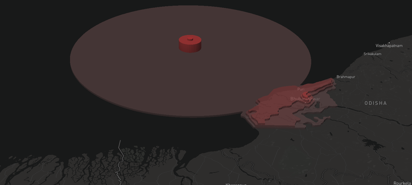
I didn't find any interesting insights to work upon, and also felt Flourish to be a bit restrictive, hence I shifted the data to Mapbox.

Earthquakes by area and cause I started by mapping out the earthquakes over a few particular years geographically. I kept a minimum magnitude of 7.0. alala3

I then recognized patterns in locations of earthquakes and figured that coastlines were common fracture points. I then realized that if many coastlines were fracture lines, it was highly probable that these areas have higher casualties because of the chance that a Tsunami could brew up due to earthquakes in this region. To testify this hypothesis, I first lowered the minimum reading to 5.0 and tagged the earthquakes that triggered tsunamis with a white colored dot, while the rest were red colored dots. The dot sizes also corresponded to the no. of deaths. The obtained results were fascinating. alala2

A zoomed in view to the East coast: alala1

tarunmugunthan commented 5 years ago

I worked on visualising and trying to see if there is a correlation between earthquake depth and it's magnitude... I made this visualisation where the diameter of the bubble indicates the size,(exponentially, to filter out smaller earthquakes) and the colour indicated the depth at which they had occurred. more yellow = greater depth. On mapping this, I got the following visualisation...

screenshot 2018-11-13 at 9 48 31 am

This visualisation was styled across zoom levels for easy detailed exploration.

screenshot 2018-11-13 at 10 02 57 am

The emerging pattern did not show much correlation between the depth and the magnitude but indicated the fact that earthquakes around the Pacific Ocean are significantly deeper than those happening elsewhere. To be explored further... Tarun Mugunthan :)

pranjalmeena commented 5 years ago

I wanted to find the connection between earthquake and other events. The data that I selected was about how many earthquakes led to a tsunami establishing the connection between earthquakes and tsunamis. I started working on the visualization on Map box and made the following Geo Visualization. The earthquakes were of magnitude >=6 and it represents the tsunamis caused by earthquakes in the past 14 years.

capture

I represented the tsunami caused by earthquake by red dots.

screenshot 8

advaitmb commented 5 years ago

My goe visualization focused on showing the number of deaths that happen all around the world because of earthquakes. Red translucent circles around a white world map seemed like an apt metaphor to represent bloodshed.

image

image

https://api.mapbox.com/styles/v1/advaitmb/cjlf2i9ly5puu2sl4l093rkns.html?fresh=true&title=true&access_token=pk.eyJ1IjoiYWR2YWl0bWIiLCJhIjoiY2psNTVpZGJrMmJlazNwczF5NmFtdnBzaiJ9.AFbda9WE73PFJvM5K0CxUA#0.9/25.142169/74.400673/0

r1ckrck commented 5 years ago

https://api.mapbox.com/styles/v1/r1ckrck/cjlgevnhp0xau2sok3do88uwy.html?fresh=true&title=true&access_token=pk.eyJ1IjoicjFja3JjayIsImEiOiJjamxlNjI2bDcwZWJuM2tydmNxMWh4eTdwIn0.PsCev_ErX1DHR8BUZsJCdg#2.3/34.061216/119.487690/0

I wanted to visually understand how much more devastating tsunami earthquakes are compared to normal earthquakes, because of the after effects of the wave.

screenshot 2018-11-13 at 14 22 18

The radius is a linear scale of the damage in monetary terms The colour of the circumference represents if there was significant numbers of deaths. The colour of the circle represents if it was tsunami or not.

The map background is dull so that it doesn't distract the users but visible enough to know which country is where.

One drawback is that the magnitude is not accounted for.

AarchaSuresh commented 5 years ago

image

I tried visualising magnitude of earthquakes around the world. Given below is the link to the same.

https://api.mapbox.com/styles/v1/advaitmb/cjofis2ml60jy2snvm6ifx435.html?fresh=true&title=true&access_token=pk.eyJ1IjoiYWR2YWl0bWIiLCJhIjoiY2psNTVpZGJrMmJlazNwczF5NmFtdnBzaiJ9.AFbda9WE73PFJvM5K0CxUA#1.41/18.6/50.4

VishnuPriyan1998 commented 5 years ago

I was fascinated by the connection between the duration of an earthquake and its strength, and wanted to delve into this relation. I found that the earthquake and the time it takes to cause destruction are fairly unrelated, but I found a bunch of anomalies as well

screenshot 2018-11-13 at 2 50 18 pm

Here the markers are for the time they lasted, and their magnitudes are listed next to the event name. We observe that the time and strength are in someways related but not entirely, or in any pattern.

https://api.mapbox.com/styles/v1/vishnupriyan/cjofd0q4d55mc2qnx5rwi3bu0.html?fresh=true&title=true&access_token=pk.eyJ1IjoidmlzaG51cHJpeWFuIiwiYSI6ImNqbGV1dHN1eDA1bm8zcG1zbmI2ZjA2ZmwifQ.QbmFQW3ZfBCeDM7Q-TqnUg#12.0/48.866500/2.317600/0

rasagy commented 5 years ago

Thanks everyone for visualizing the earthquake data form different perspectives. Going ahead and closing this thread!