mapschool / course

An introduction to the art and science of modern cartography
MIT License
50 stars 11 forks source link

Geo Viz Critiques #40

Closed rasagy closed 3 years ago

rasagy commented 4 years ago

Hi everyone,

Let’s document our critique sessions on Github, like your senior batches did last year.

For each group, add in one comment these points for every visualization you picked:

  1. Title of the viz, and url (along with one screenshot/gif)
  2. Geo viz type (Cartogram/Choropleth/dot maps etc.)
  3. Source of data and what the type of data visualized (ordinal/nominal/quantitative/qualitative…)
  4. Visual encoding for each property (line, angle, color…)
  5. Critique (How effective is it at what it aims to do? What works well, and what could be better?)

Feel free to edit your comment and update/add the rest of the visualizations if you have only two visualizations right now.

rishivanukuru commented 4 years ago

Group 3

Aishwary, Rishi, Sargam, Shraddha

1. The Frustration Index Map

Mapping commuter frustration in San Francisco, Geneva and Zurich

FrustrationApp

Viz Type: Layered Dot Map

Source of Data: A composite dataset calculated using openly available data about the public bus system in San Francisco.

Type of Data: Quantitative, Ratio variables

Visual Encoding used: The size of the dot represents the magnitude of the variable (level of frustration), the colour of the dot is used to convey what kind of frustration is being measured (Magenta - Speed, Cyan - Capacity, Yellow - Delay).

The magnitude of the dot in the case of layered dots is to be taken from the common center, and not the amount of area a particular colour has.

Our critique:

The manner in which the researchers visually depicted their model for frustration measurement was interesting, and adding the information to a real map allowed for a much better understanding of the trends across bus stops, and in various regions through the day.

However, the representation of the three indices as concentric dots makes it hard to understand the numerical amount of frustration for each index. Further, in areas with a lot of bus stops, the dots often occlude each other, making it harder to gauge the relative levels of frustration at each stop.

Given that this is an interactive site, it might have been better to allow users to see each index mapped independently in layers, or represent each bus stop in a different manner - with a spider chart or different shapes for example.

2. Greening the Grid

The Future of Renewable Energy in India

GreenGrid

Viz Type: Dot Map and a Steam Chart with baseline fixed

Source of Data: Projections made by the National Renewable Energy Lab, about India’s energy consumption from the year 2022 onward.

Type of Data: Quantitative, Ratio Based

Visual Encoding used:

Our critique:

The website seems to be a depiction of future changes to India's power grid, but the manner in which it is designed is more like a dashboard and not so much a story-telling medium. The locations of power plants are not clear as the dots have no clear information about them. The dashboard itself has a bunch of options that are not easy to use. The presence of so many visual elements makes it seem like all of them can be interacted with, but that is not the case.

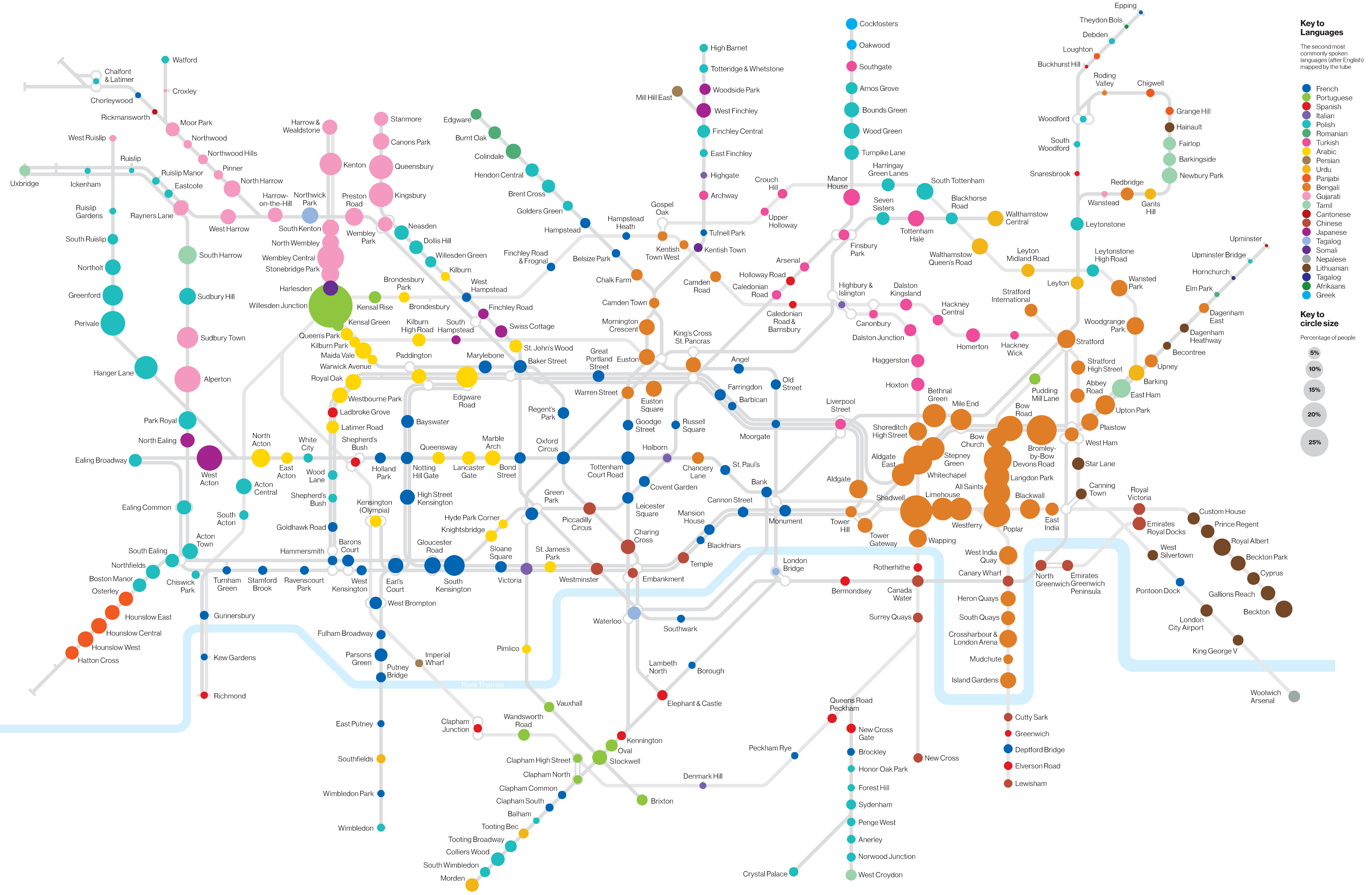
3.TubeCreature’s Tongues

Linguistic Segregation in London by Tube Stations

TubeCreatureTongue

Viz Type: Lots of Dots map

Source of Data:

Type of Data: Categorical (Nominal)

Visual Encoding used:

Our critique: In this visualization, there is too much information presented at the same time. The presence of the dots and their labels is quite cluttered, and using the geographically accurate tube map does not help make things any better. The choice of colours for the train lines is the same as the conventional London tube map, but the colours given to the various languages seem to be randomly assigned. It is also unclear as to what the size of the dots conveys.

Most of these problems seem to be addressed in the following visualisation of the same dataset. The schematic map of the London underground is used, the labels for the dots are removed, and the colours themselves feel a lot more harmonious.

Alternative Visualisation of the same Dataset:

TubeLanguageSchematic

SaiAnjan commented 4 years ago

Group 6 - Anjan, Akshat, Pranav, Dhiraj

1. Global Elevation - https://newnaw.com/pub/js/webglglobe/worldelevation/

Screenshot 2019-09-05 at 6 48 23 AM

Topic: Elevation of the geographical location at each confluence point above sea level. Geo Viz Type: 3D Visualization of a Topographic Map Dataset and type: Digital Terrain Models from ArcGSI and the data type is the elevation of the terrain at each confluence point based on orthometric values(Above sea level). Ordinal, Quantitative Data Visual Encoding: The colour spectrum is mapped to the elevation Critique: Not mentioned what each data point is(A legend would have helped) It is a very generic topographic visualization and does not exactly explain the geography like an isopleth. This visualization is easier to understand than a detailed contour map.

2. Student Debt https://mappingstudentdebt.org/#/map-1-an-introduction

Screenshot 2019-09-05 at 6 49 29 AM

Topic: Mapping student debts in USA to understand how college affects the nation Geo Viz Type: Choropleth based on Zip code Dataset and type: Average student loans in particular zip code(quantitative), Nominal data of Average debt range Visual Encoding: Average loan balance is mapped to each colour code and each zip code contains data about Balance, race, Employment. Critique: Why are Delinquency, African american and latin american people only affecting the student debts. The credit data of the households are the one’s collected by Experian excluding the poorest households. This set of data may/may not affect the visualisation. The household(Credit record) is not defined in the viz for interpretation

3. Air Quality Index in India https://app.cpcbccr.com/AQI_India/

Screenshot 2019-09-05 at 6 50 23 AM

Topic: Air quality index at AQI Stations in different cities of the country Geo Viz Type: Dot plot Dataset and type: Current Air quality index value at each AQI station in each city Visual Encoding: The impact of the AQi on public health is mapped from Red to Green colour. Critique: Dots with opacity could have been used for overlaying If a heatmap of the pollutants is presented at each station a clear idea of the pollutants to be addressed is clear.

rohanjhunja commented 4 years ago

Group 1: Gauri, Rohan, Aditya, Seema

1. Geologic Map of the South Side of the Moon https://www.lpi.usra.edu/resources/mapcatalog/usgs/I1162/72dpi.jpg image

Topic: Crater Mapping of the Moon Geo Viz Type: Choropleth Dataset and type: Moon Photographs and material sampling Visual Encoding: Craters are mapped according to material found

Color encoding could indicate age of material

2. Heartbeat of New York http://manpopex.us/ image

Topic: Manhattan Population Explorer Geo Viz Type: 3D Bins? Dataset and type: Subway turnstile entry and exit data by time Visual Encoding: Craters are mapped according to material found

3D extrusion leads to occlusion of data in an area. We cannot really zoom in and see between the blocks. The direction of the crowd is not shown The slider could be like a clock dial. Movement of people to and from an area could be indicated with a flow map.

3. SightsMap http://www.sightsmap.com/# image

Topic: Photos by Location Geo Viz Type: Heat Map Dataset and type: Panoramio photos by location Visual Encoding: Yellow: high density, Red: medium, Purple: low Marks the top 10 locations in a map area

Size of marker could be used to indicate rank of location instead of color Pop-up obscures a number of other locations

gyanl commented 4 years ago

Group 2 - Akshay, Gyan, Harshit, Prachi

1. Earth at Night

Light information from satellite images mapped as mountain peaks on globe. Writeup | Live link

himalaya_night

Source of Data: //todo

Type of Data: //todo

Visual Encoding used: //todo

Critique

2. Language Loanwords

Maps 14,680 loan words from their place of origin to their country of use. Live Link

Screenshot 2019-09-03 at 2 26 21 PM

Source of Data: //todo

Type of Data: //todo

Visual Encoding used: //todo

Critique

3. Mumbai Transit Flow

Video Demo

Screenshot 2019-09-05 at 2 24 53 PM

Source of Data: //todo

Type of Data: //todo

Visual Encoding used: //todo

Critique

avyayrkashyap commented 4 years ago

Group 5

Ameer Hamza | Avyay | Bhawna | Eeshani

1. Smellsterdam - Smellmap of Amsterdam An exploratory data visualisation using isopleth Geoviz + contour map + dots It is based on subjective views of people who participated in the mapping of the city.

timthumb php

Critique

  1. Data set changes with time, wind direction.
  2. It is very subjective.
  3. Consideration of the fact that smell evaporates over time is not considered in the visualisation.
  4. Claims to be a temporal visualisation, but no visual encoding for time.
  5. After showing the drift of smell, the source and spread of the smell are dislocated.
  6. It is unclear If it is a static data visualisation or a dynamic visualisation.
  7. Direction of wind os not clear in the static visualisation, even though it is mentioned as a primary consideration for showing the spread of smell.

2. Twenty years of India Light

This is an interactive visualisation using dot maps to show the penetration of electricity in the Indian villages. Its a visual confirmation type of data visualisation. The dots have 64 levels of encoding (0 to 63) shown through opacity.

Critique

  1. Not accurate. Light intensity can change with external conditions and parameters.
  2. Doesn't allow for comparison between states.
  3. Good for comparing temporal data within the same states.
  4. The dots also represent the villages.
  5. When more than one village is selected, there is no way to know the individual luminosities without hovering over the villages.
  6. When more than one place is selected, the population is unknown as well.
  7. It might've helped to make this a Cartographic.
  8. No cities are mapped.

3. InFLight

A flight route visual exploration. Data is provided by The Guardian.

Screenshot 2019-09-05 at 16 08 02

Critique

  1. Is it a flow map or a dot map over time?
  2. This is a pretty cool visualisation with a nicely told story.
  3. Has a time dimension, so gives a good context and pattern.
  4. Unsure of the direction of movement of flight when paused.
  5. No airports shown, making it unclear where the flights originate from and where they are going.
  6. The visualisations in other stories are overlaid over the flow path. Sometimes, the visualisation has nothing to do with the background and it just adds noise to the visualisation.
mayura7 commented 4 years ago

Group 7: Mayura, Chandrima, Poobesh, Paromita

  1. Highway safety in the US https://deck.gl/#/examples/core-layers/geojson-layer-paths

image

Geo Viz Type: Lines on the map with Choropleth scale Dataset and type: Nominall, Quantitative Data. Number of fatal accidents per 1000 miles on the US Highways. Data is sourced from National Highway Traffic Safety Administration. Visual Encoding: The number of fatalities have been colour coded in a scale of two colours. Critique: Helps to understand the direct relation between well laid out roads and number of accidents however the names of the states should have been mentioned.

2. Refugees that have migrated since 1975 till 2018 http://therefugeeproject.org/#/2018

image

Geo Viz Type: Cluster/ Bin + Flow maps http://therefugeeproject.org/#/2018 Dataset and type: Nominall, Quantitative Data- Number of refugees for every year from 1975 along with details of their origin country and asylum country. The events that caused the migration and a timeline is mentioned as well. The red colour denotes origin of the refugees and blue for the countries they went to. An interactive timeline accompanies. Lines show the flow of refugees from their origin to their asylum countries. Critique: The toggle switch is unnecessary. A cartogram could work better in this case to show the asylum bulging according to the number of refugees migrating in. A trend across the years of which countries have consistently been origin or asylum would have been nice to look at. Specific country specific migration could also have been interesting.

3. Light output at night for 20 years for 600,000 villages across India. http://india.nightlights.io/#/nation/2006/12

image

Geo Viz Type: Dots on the map, timeline Dataset and type: Nominall, Quantitative Data- Lights during nighttime in the villages of India from 1995 till 2013 captured at a particular time in every month of the year by the Defense Meteorological Satellite Program (DMSP), run by the U.S. Department of Defense. Critique: There is no relation established on the map itself. The stories have been mapped in different sections where villages are compared. The stories should have been mapped on the maps itself like- Diwali in India / impact of electricity development projects etc.

AshmiK commented 4 years ago

Group 4 - GeoViz

Ameya | Harsuyash | Rashmi | Maulashree

Example 1:

https://www.nytimes.com/interactive/2019/08/03/world/middleeast/us-iran-sanctions-ships.html

Screenshot (116)

Topic

Defying U.S. Sanctions, China and Others Take Oil From 12 Iranian Tankers

Geoviz Type

Interactive data-journalism, Visual confirmation Point and line

Dataset, Individual Properties

Categorical data - names of tankers Geographical Point data - recorded positions of tankers, ports, etc. Binomial categorical data - whether or not the position was recorded for 2 or more days Temporal - paths of tankers, changing with date, automated in chunks (the story is controlled by scrolling)

Dataset Type Encoding/Interaction
Geographical locations Point Points on the map
Whether position was recorded Binominal, Categorical Color/Type of line
Date Interval/Temporal Dynamic (Time)  Labels
Tanker names Categorical Dynamic (Space) Labels
Countries of interest Categorical Labels, Shaded geo area (Static)
Storytelling nodes/Point of interest Narrative Labels, area of focus/zoom, captions controlled by scrolling

Critique

Example 2:

https://bhuvan-app1.nrsc.gov.in/social_justice/socialjustice_census.php#

Screenshot (115)

Topic

SC/ST demographics, Social Justice and Empowerment

Geoviz Type

Exploratory, Data-driven, Visual discovery Choropleth

Dataset, Individual Properties

Dataset Type Encoding/Interaction
SC/ST Categorical Colour Family
Population Interval Colors
State of Interest Categorical Rendering the data only for the selected area

Critique

Example 3:

http://twitter.github.io/interactive/sotu2014/#p13

Screenshot (114)

Topic

Visualization of State of The Union address minute by minute on Twitter

Geoviz Type

Exploratory, Choropleth

Dataset, Individual Properties

Dataset Type Encoding/Interaction
Part of the speech/Timestamp Interval/Temporal Scroll-through
Engagement Ordinal Colour (Saturation)
Hashtag/Keyword Categorical Color (Hue)
States Categorical, geographical Shaded areas, choropleth bounds

Critique