 rasagy
commented
1 year ago
rasagy
commented
1 year ago Example:
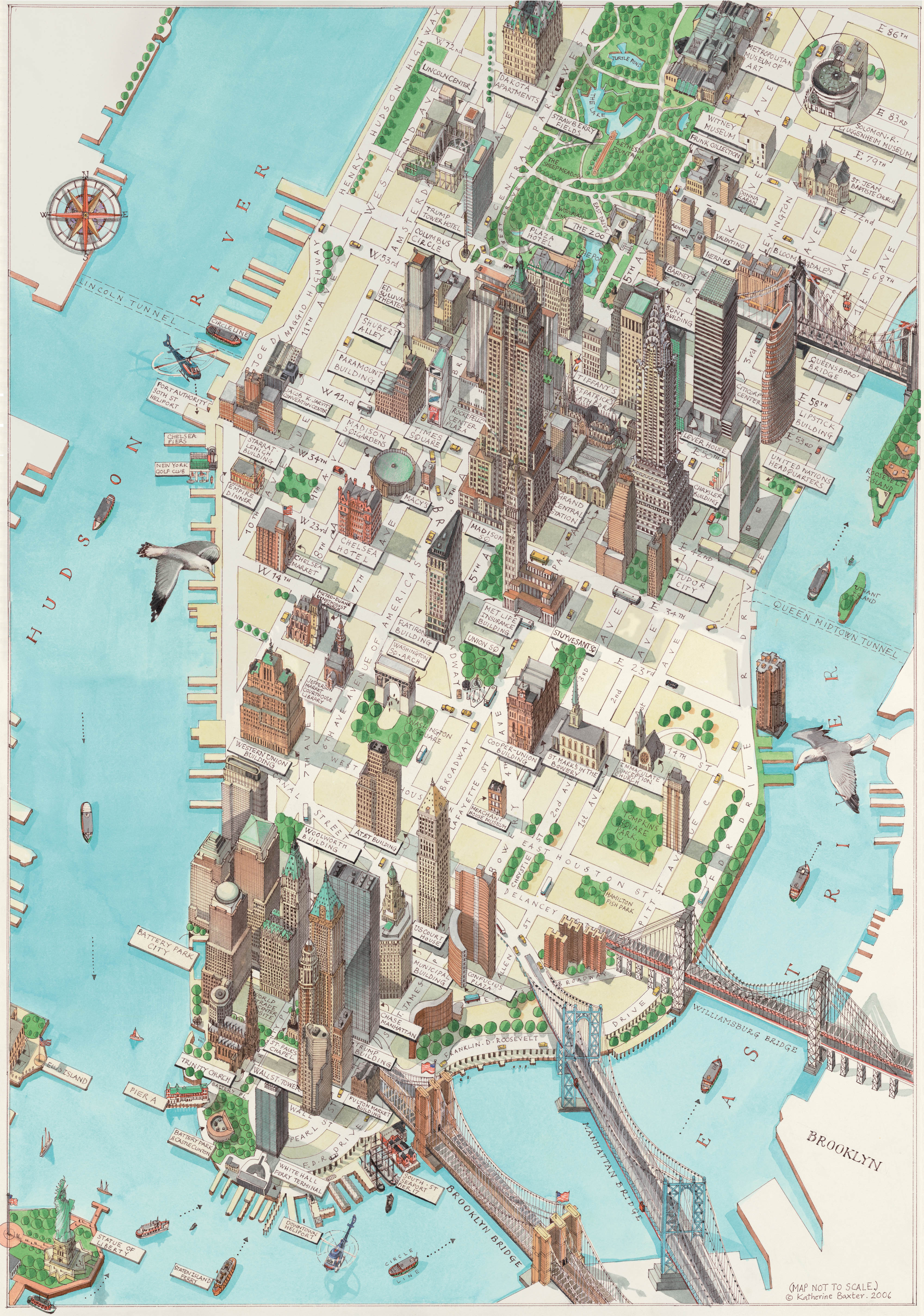
- This is a map of California Roads for Cyclers
- Made by George W. Blum (1896)
- It’s a detailed foldable pocket map with physical features (terrain, mountains), as well as key cities, beaches/port/coastal PoI etc. It also labels each major cycling path by its road condition & grade.
- I loved how the map is surrounded by hand-lettered ads from different cycling groups, and the fact that the map evaluates every road for cyclists.
 lakshrajpal1803
 SarthakRao
 jishnuthewalker
 karantanna-kt
 sparshGupta24
 shivaniv25
 Rajdeep115
 Mukul3110
 AnujsAmbhore1
 Ketaki007
 vinaydhomne
 PoojaKumari56
 Anshika1105
 RaghavSamodia1
 avanibhagdi
 abhishekshirsagar
 ANOOF-PK
 yashbhrani
 anniketmohalik
 MansiKhedekar
 AmrutaBailke
 Yash2412kothari
 manishverma612
 AnjaneshIndranil
 Vaish0204
 akashdas58
 AditiChintey
 Dhairya0802
 kashyapine
 devaharshareddy
 AhmadThahaHussain
 Chinmayk79
For B.Des. & M.Des. Students, we’re starting with a map inspiration exercise.
Find an example of a map and make a small map taxonomy chart with examples of key elements, such as:
For each map, write about:
References