Team's Response
This is a cosmetic issue, since it can still be read even without zooming in (100% aspect ratio), so we can put the severity down to very low.
Items for the Tester to Verify
:question: Issue severity
Team chose [severity.VeryLow]
Originally [severity.Low]
- [x] I disagree
Reason for disagreement: Only the point on font size has been mentioned. The team might have missed out on the second point about the helpfulness of the pictures.
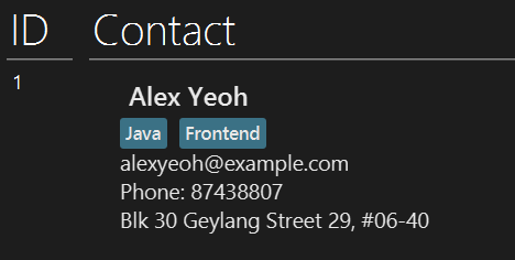
I was proposing that instead of this:

The image could be replaced with something like this:

Here, instead of just the success message, the actual changes of new tags to the contact are shown. This is much more helpful for users to understand what the command does. Since this boosts user comprehension and is not purely a cosmetic change, the severity should not be VeryLow.
The images are not very helpful for a couple of reasons:
find David), as the image is too zoomed out as compared to the font size in the UG.list contact- the image just statesListed contactsin a grey background. Users would prefer to be shown how the actual list has changed, given a specific command.In my opinion, before and after images would be much more helpful for much of the commands in the UG.