soc-pe-bot
commented
1 year ago
soc-pe-bot
commented
1 year ago Team's Response
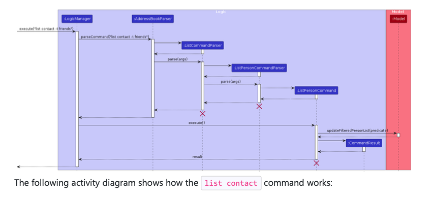
In addition to what have been mentioned in the main issue, splitting into two diagrams will further worsen readability.
The 'Original' Bug
[The team marked this bug as a duplicate of the following bug]
Font in sequence diagram too small
Note from the teaching team: This bug was reported during the Part II (Evaluating Documents) stage of the PE. You may reject this bug if it is not related to the quality of documentation.
The font is way smaller than the text size, making the sequence diagram almost impossible to read. This is true for every sequence diagram in the DG
[original: nus-cs2103-AY2324S1/pe-interim#3698] [original labels: severity.Low type.DocumentationBug]
Their Response to the 'Original' Bug
[This is the team's response to the above 'original' bug]
Since this is a cosmetic issue, the severity should be very low.
Even so, the image allows for lossless zoom, so we feel that this is a non-issue.
Items for the Tester to Verify
:question: Issue duplicate status
Team chose to mark this issue as a duplicate of another issue (as explained in the Team's response above)
- [ ] I disagree
Reason for disagreement: [replace this with your explanation]
## :question: Issue response Team chose [`response.NotInScope`] - [x] I disagree **Reason for disagreement:** > Even so, the image allows for lossless zoom Readers should not be forced to zoom into diagrams to be able to read it. ____ > splitting into two diagrams will further worsen readability. This will not be the case if the reference frames have been chosen well. ____ As per the course website on what qualifies as documentation bugs: > Even formatting issues such as too much/little padding, **font size**, alignment, inconsistencies, etc. can 'hinder' the reader in the sense they can slow down the reader or require the reader to put more effort than necessary. Therefore, I believe that the severity should be at minimum `VeryLow`, if not `Low` due to the number of diagrams with the same issues.
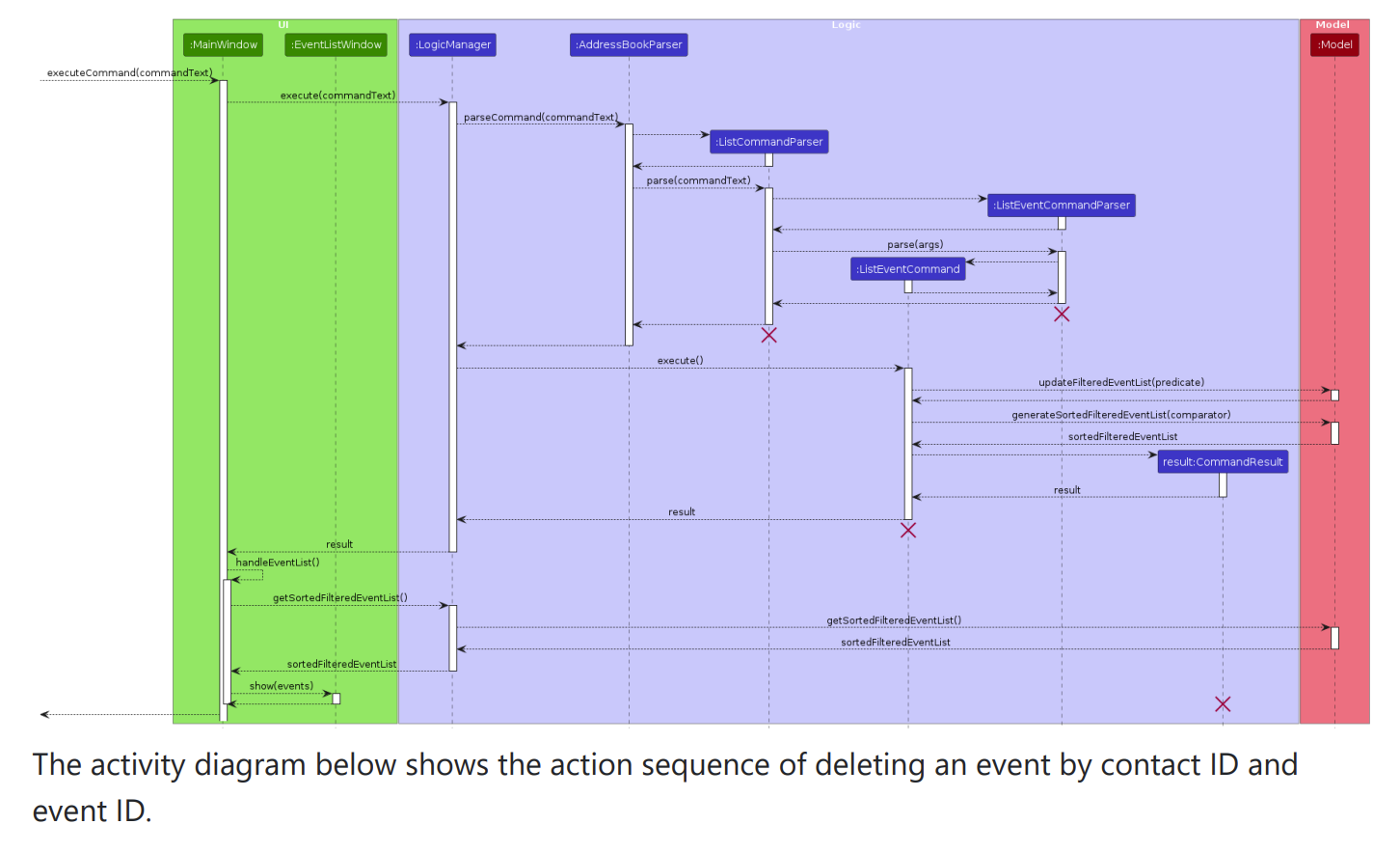
The
list contatctsequence diagram above has very poor readability and should probably be split into two diagrams instead.The same goes for almost ALL of the sequence diagrams in the DG.
I considered increasing the severity from VeryLow to Low, given the number of diagrams that have this issue, and the extremely small font size in certain diagrams: