 kthyng
commented
9 years ago
kthyng
commented
9 years ago Glad you like them!
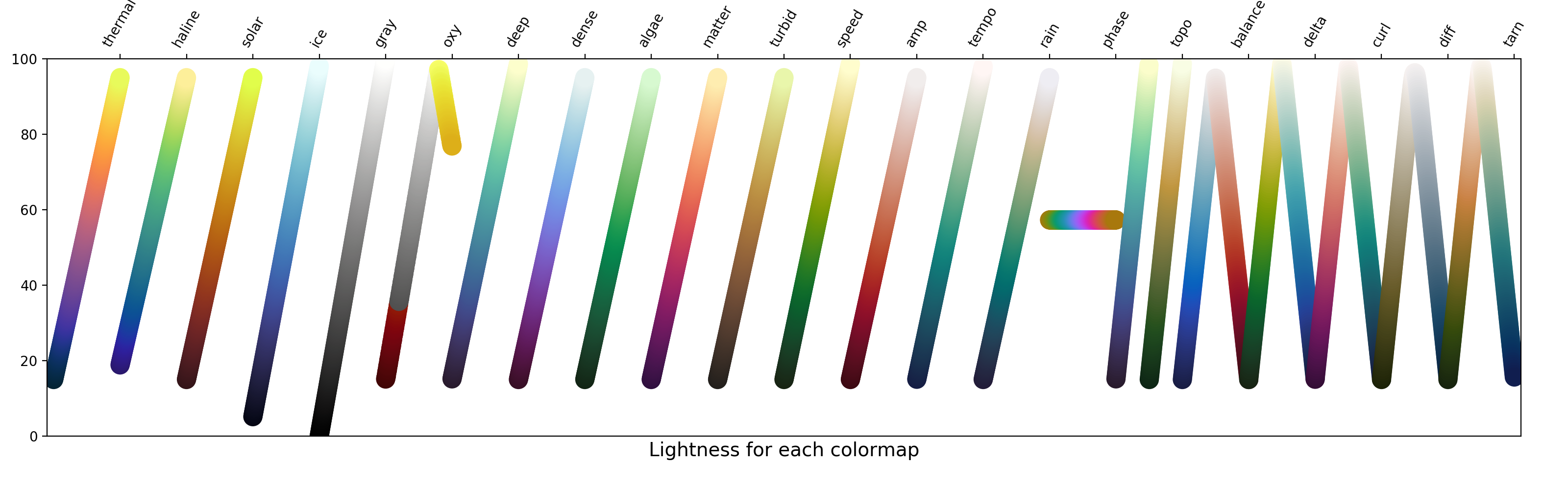
The oxygen colormap is designed for use near river plumes, for example, where there may be very low and high areas of oxygen. The bottom 20% of the colormap, colored red, is to indicate hypoxic levels of oxygen. It is meant to be essentially from black to white in gray scale but with a red hue in that lowest 20% to show the important area, though in order for the red to be noticeable at all it was necessary to have a small jump in the grayscale version — so this was a trade-off. The lightest gray color is meant to correspond to 100% oxygen saturation, so that is your peak lightness. The final 20% of the colormap goes back down in lightness and is colored yellow to indicate another change: super saturation. These choices have been made in consultation with a couple of researchers, but there are some trade-offs. I think if low and super saturated oxygen was not a concern in an area, it would not make sense to use this colormap; it is meant to be scaled so that the hypoxic and super saturated areas align properly. Maybe all grayscale would make sense in that case, or something completely different.
I will add some details to the documentation to make this more clear.
These colour palettes are wonderful. Thanks hugely for developing them, and be prepared to start seeing them in the literature!
With permission, I have copied the coefficients (as they were yesterday) into the oce R package and made a diagram (below) to illustrate the palettes. The oxygen one seems a bit strange to me because of two very sharp transitions. These are also quite striking when printed in black and white. Is this behaviour chosen to mimic something done in the literature? If so, that's great. But it seemed odd to me, so I thought I might point it out.
PS. the others all look very nice in black and white, with a bright band in diverging but smooth gradation in the others (except phase, which is of course flat in grayscale).