maxrave-dev / SimpMusic

A simple music app using YouTube Music for backend
https://simpmusic.tech/
GNU General Public License v3.0
1.38k stars 95 forks source link

Some enhancements to make the app experience better #341

Open aneesh1122 opened 4 weeks ago

aneesh1122 commented 4 weeks ago

Used this app for the first time and there are some things I think will make the experience better

1) when swiping down from the player it should minimize the player which is now done using this arrow arrow

2) ~~The area of album cover is huge and has a lot of unused space. This area can be used for lyrics. A single tap on the album cover can bring lyrics on the screen. Also add an icon below lyrics to change the source of lyrics. something like this
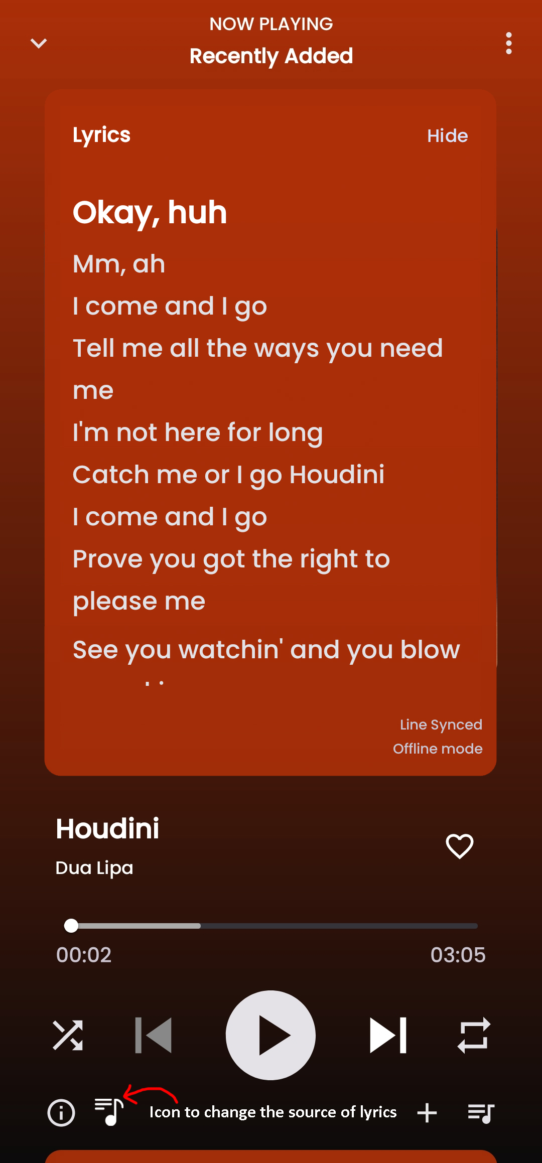
 lyrics~~ Edit : People are using this app as Spotify alternative so this can stay I guess. If given the choice I'll definitely follow the above option though.

Let the lyrics be where it is now for those who are using spotify canvas.

3) Add 'lrclib.net' as one of the lyrics sources. they have their api to let other players use their library.

4) ~~delete the 'Artists' and 'Description' from music player since these details are available in song info anyways. Also remove 'Title' from info page. something like this
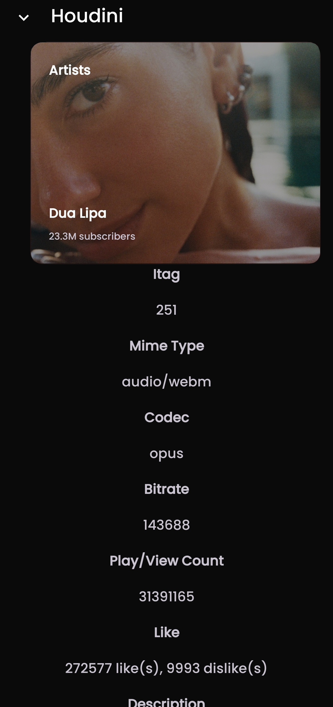
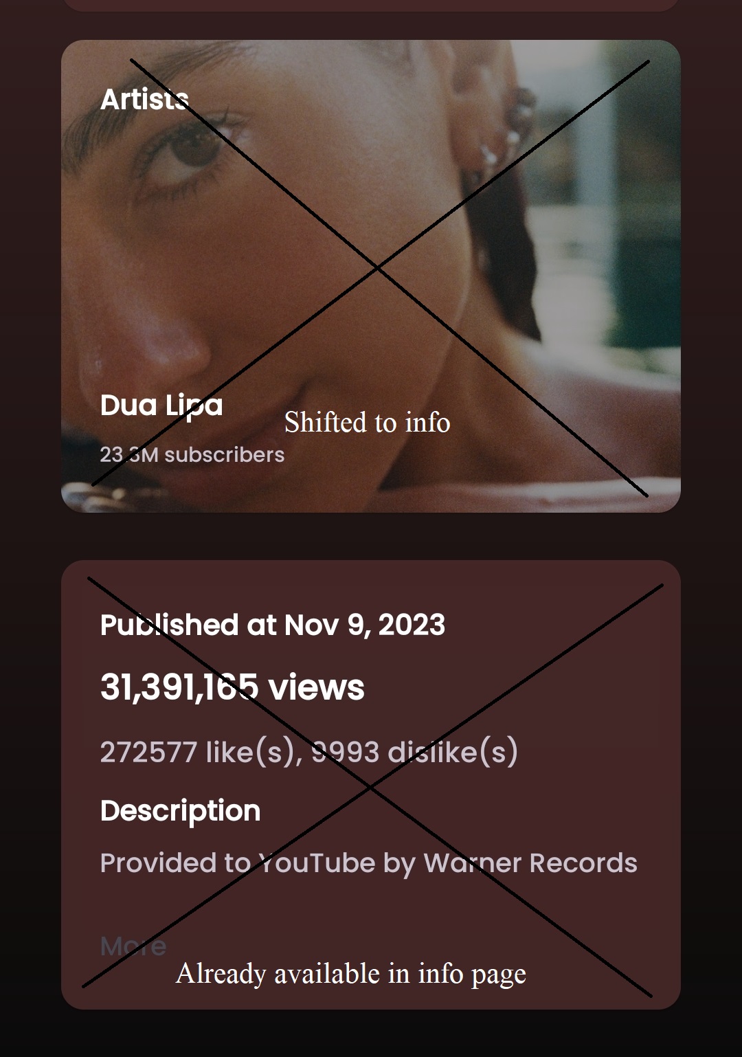
 info Screenshot_2024-04-15-19-39-01-866_com maxrave simpmusic-edit~~ Edit : People are using this app as Spotify alternative so this can stay I guess. If given the choice I'll definitely follow the above option though.

5) when the player is minimized, down swipe should close the player, left/right swipe should change the song. Screenshot_2024-04-15-19-42-49-363_com maxrave simpmusic-edit Screenshot_2024-04-15-19-42-49-363_com maxrave simpmusic-edit - Copy 
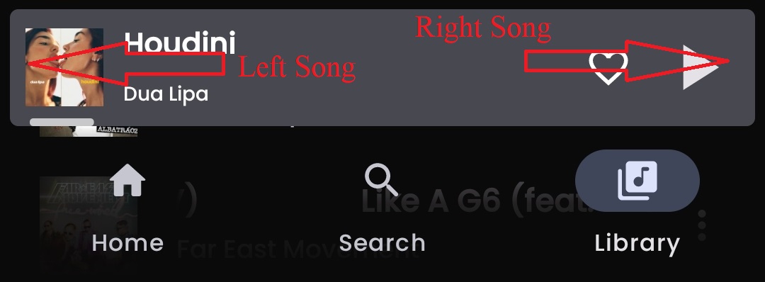
There's a mistake with labelling. Swap left and right with each other.

6) Add the download icon next to the song's name. It is easier to download individual songs that way download

7) Add a search bar in playlists

8) swipe up from the player should open queue.

I know I've asked for a lot. please try to implement as much as possible

ErMagnificoo commented 2 weeks ago

Here are more issues: 1)when searching a name with a long name, the "auto completition arrow" overlaps with the song name. 2)When sliding from right o left on a minimized song, I expect to go to the next one...not to prompt me the skip button. 3)The big play button isn't a material button: it stays always round, when it should switch from squared to round based on playing state. 4)This is a big one: when viewing an album, there is no way to add a song to the playlist or "play next", I expect the usual three dots. Steps to reproduce: press the three dots on top right corner when listening a song, and then press the song album name. 5) The heart icon when viewing a song, when pressed becomes red...a color that doesn't match the ui color map. 6) On some song the first time you open them, the song doesn'play and the song duration is NA/NA... no matter how much you wait, the song wont start. 7) A really basic ui operation is missing: Minimizing/maximizing the song by swiping up/down 8) The loading time compared to other youtube music "clone" apps is considerably slower...even by just searching 9-10) When clicking "Play next" on a song, a toast message appears with the icon of simpmusic...i would prefer a toast or a snackbar more coherent with the ui. When pressing the "Play next" button, I expect the menu to auto-close.

aneesh1122 commented 2 weeks ago

Here are more issues: 1)when searching a name with a long name, the "auto completition arrow" overlaps with the song name. 2)When sliding from right o left on a minimized song, I expect to go to the next one...not to prompt me the skip button. 3)The big play button isn't a material button: it stays always round, when it should switch from squared to round based on playing state. 4)This is a big one: when viewing an album, there is no way to add a song to the playlist or "play next", I expect the usual three dots. Steps to reproduce: press the three dots on top right corner when listening a song, and then press the song album name. 5) The heart icon when viewing a song, when pressed becomes red...a color that doesn't match the ui color map. 6) On some song the first time you open them, the song doesn'play and the song duration is NA/NA... no matter how much you wait, the song wont start. 7) A really basic ui operation is missing: Minimizing/maximizing the song by swiping up/down 8) The loading time compared to other youtube music "clone" apps is considerably slower...even by just searching 9-10) When clicking "Play next" on a song, a toast message appears with the icon of simpmusic...i would prefer a toast or a snackbar more coherent with the ui. When pressing the "Play next" button, I expect the menu to auto-close.

1) couldn't replicate the issue. Please post a video 2) he implemented it in his next update 3) this app is based on Spotify UI so it's by design 4) Yeah this is a big issue. Can't add an album or its individual songs in a playlist. 5) well, that's how the 'heart' icon works everywhere i think 6) couldn't replicate the issue. Please post a video 7) Minimising and the player right? Yeah I've listed it in OP too. 8) Yeah. Loading time in the overall app is significantly high. 9) It doesn't really bother me 10) I agree

ErMagnificoo commented 2 weeks ago

I'm using a Pixel 7, and I didn't touch any settings in app.

  1. couldn't replicate the issue. Please post a video

I didn't managed to record a video, but here's a screenshot: WhatsApp Image 2024-04-29 at 00 39 56_0fd26464

  1. this app is based on Spotify UI so it's by design

Got it

  1. well, that's how the 'heart' icon works everywhere i think WhatsApp Image 2024-04-29 at 00 43 41_c84234b0

Still find it a bit ugly....a full white heart i think it would be better.

  1. couldn't replicate the issue. Please post a video

The app does this strange behavior only on some new songs (may be related to the cache) WhatsApp Image 2024-04-29 at 00 34 44_a887a5a5

Another "issue" is that when scrolling the song page, the status bar is just transparent, which is good loking when on top page, but kills the UI look when scrolling (look at the Beatles song). i suggest a fixed status bar or a transaprent bar only when on-top or a competelly idden bar(not suggested).

Also the menu bar is buggy: i can see the info icon under the shuffle icon, but the three-dots bar overlaps with it, making it unlickable....it's just a waste of screen space.

aneesh1122 commented 2 weeks ago

I didn't managed to record a video, but here's a screenshot

Okay. That's happening in my case too. Never happened cuz I never searched a song with a long name 😅

aneesh1122 commented 2 weeks ago

Still find it a bit ugly....a full white heart i think it would be better

Maybe he can do it later. It doesn't bother me personally but I can understand why it would bother you. Still has a lot of basics to fix and Implement though

aneesh1122 commented 2 weeks ago

The app does this strange behavior only on some new songs (may be related to the cache)

Tried the same song and it played without any issues. Yeah the loading time is a little longer than the other YouTube clients. The app is overall a little slower in doing things imo.

aneesh1122 commented 2 weeks ago

Another \"issue\" is that when scrolling the song page, the status bar is just transparent, which is good loking when on top page, but kills the UI look when scrolling (look at the Beatles song).\ni suggest a fixed status bar or a transaprent bar only when on-top or a competelly idden bar(not suggested).

I don't use android's navigation bar and I guess many people don't that's why it doesn't bother anyone else.