Closed mailinglists35 closed 
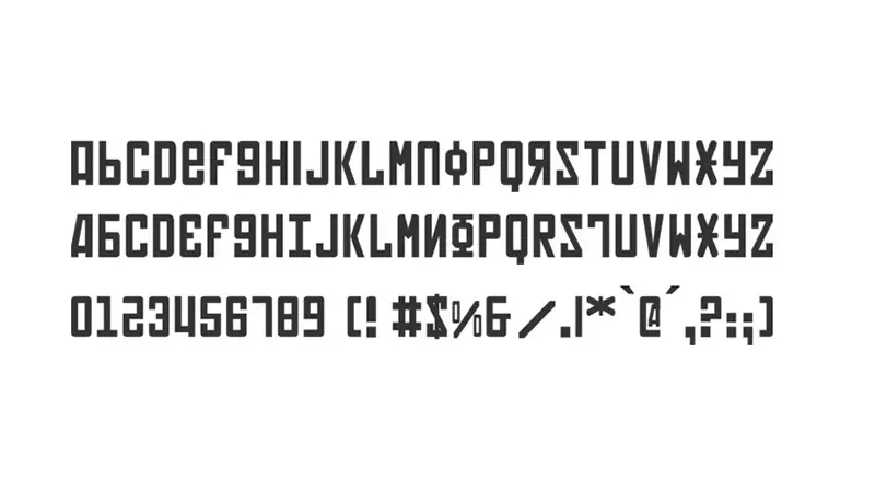
2 years ago
A slashed zero is accessible via stylistic set 19 (Please see the README).
Sorry you don't like the 4, but I don't think it looks anything like the ц and have no intention to change the design at this time.
See? :)
I don't think it looks anything like the ц
does not look to you. it definitely looks to me strong enough to make effort to file this issue and describe the feeling. but I guess you cannot imagine the feeling when you've grown out in a free country that never has been under soviet occupation
basically every variant of 4 that has the two upper lines approximately equal and not closed resembles the russian letter.
these are tolerable versions:
these along with Cascadia version are unacceptable versions: https://www.designyourway.net/drb/ths/diverse/russianfonts/Soviet.jpg https://ct.mob0.com/Fonts/CharacterMap/soviet.png https://i.pinimg.com/originals/16/42/13/16421312e6fef18a8cb29f3b2337b5a5.jpg https://allyourfonts.com/wp-content/uploads/2020/05/Soviet-Font-Free-Download1.jpg https://www.fontriver.com/font/soviet/ https://www.designyourway.net/free/back-in-the-ussr/ https://www.designyourway.net/free/kremlin-grand-duke/ https://www.designyourway.net/free/wp-content/uploads/2019/05/Kremlin.jpg
At least please provide an alternate version.
Honestly, Cascadia Code has been out and available for 2+ years now, with people from around the world using it without any issue, including folks from Eastern Europe.
Thus far yours is the only complaint that we have received regarding a perceived similarity to soviet letterforms. While I respect your opinion and the fact that the shape of the 4 bothers you, I don't plan to change the font based on a single person's opinion.
I'm sorry that the font doesn't work for you and hope you find another that works better.
Description of the new feature/enhancement (with images if possible)
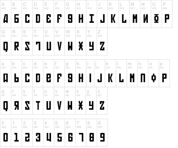
https://en.wikipedia.org/wiki/Slashed_zero and the current number four reminds me of soviet occupation of eastern europe as it resembles with their capital letter ц and only seeing that makes me sick. no matter how I like this new font, I will never be able to use it because of that character 4
Proposed technical implementation details (optional)