Closed bpsc-wkubis closed 2 weeks ago
Yes, this is the "normal" behavior of the component: the selected content is represented as text via the OptionText
property.
If you want to personalize this element, you can manually add an icon with Slot="start"
or by using the FluentAutocomplete
component.
<FluentSelect TOption="string">
<FluentIcon Value="@(new Icons.Regular.Size16.Globe())" Slot="start" />
I already have customized that with slot="start", but this is only applied to the list, not to the selected option:
<FluentSelect
Width="100px"
Appearance="Appearance.Lightweight"
TOption="CultureInfo"
Items="@([new CultureInfo("en"), new CultureInfo("pl")])"
OptionSelected="@(culture => CultureInfo.CurrentCulture?.Name == culture.Name)">
<OptionTemplate>
<img slot="start" src="assets/flags/@(context.TwoLetterISOLanguageName).svg" alt="@(context.NativeName)">
@context.NativeName
</OptionTemplate>
</FluentSelect>
OptionTemplate
is to customize an "Option" (item) only.
You can add a FluentIcon
immediately below the FluentSelect
, like in my previous example.
But you need to manage manually the content of this icon, based on the item selected.
This is the "workaround" I'm currently using, though I was hoping such functionality would be included by default. Regardless, I appreciate your quick reponse.
We prefer to use the functionality provided by FluentUI Web Components, as long as there is a possible solution :-)
🐛 Bug Report
When providing custom OptionTemplete with icons to FluentSelect, those are not displayed on selected option.
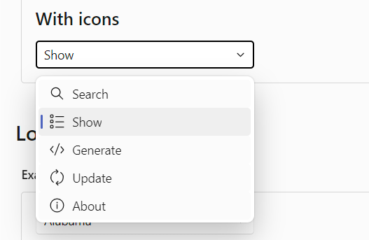
💻 Repro or Code Sample
Docs -> FluentSelect -> Custom indicator
🤔 Expected Behavior
Icons should be displayed on selected option
😯 Current Behavior
Icons are not displayed on selected option
💁 Possible Solution
-
🔦 Context
-
🌍 Your Environment
-