 eyast
commented
4 months ago
eyast
commented
4 months ago Amongst the artefacts generated in the output folder, you will find parquet files that includes graphml syntax. In other cases, you might also find files with the .graphml extension. GraphRAG saves the output of each step of the workflow to these files. You can explore graphml files using a tool such as Gephi, which is quite popular https://gephi.org/
 Ashraful512
 flikeok
 misi0202
 hemangjoshi37a
 noworneverev
 gs7vik
 danielcmm
 AlonsoGuevara
 xxWeiDG
 fskpf
fskpf ZeyuTeng96
 tawsifkamal
 Hanzhang-lang
 jexp
jexp stevetru1
 beginor
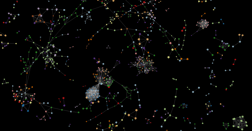
 yGuy
yGuy RipperTs
 Bai1026
 xianminx
 timothymeyers
Thank you for your great work! I have run the whole process, but it is hard to see the graph clearly. The graph data are stored in the .parquet files, so if there are some method to visualize data I have extracted. Such as neo4j or other database.