microsoft / microsoft-ui-xaml

Windows UI Library: the latest Windows 10 native controls and Fluent styles for your applications
MIT License
6.25k stars 671 forks source link

Logo Re-Design and Swag #1185

Closed SavoySchuler closed 4 years ago

SavoySchuler commented 5 years ago

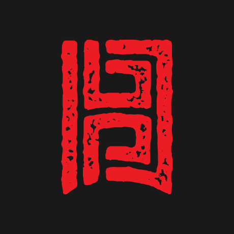
[Update 10/18/19] We have a new logo and new swag!

Hello, wonderful community! A huge thanks to all of you for driving this home. We really wanted to create something that combined all the favorite work that everyone put in here. We believe this does that.

WinUI Logo

WinUI Logo Wireframe

Let's debrief

We have the old Xaml logo here:

Original Xaml Logo

When @itsmichaelwest breathes fresh life into history, you get something wonderful:

WinUI_LogoExporation_V3_GitHub

From there, we turned to the community. After (nearly) another hundred submissions exploring re-colorization and styling, we fell in love with this simple, yet elegant twist to self-contain the brackets. As @embender put it, paraphrased, "I like the different heights on the brackets. It makes it a little abstract - paints some art onto the science," which is what UI coalesces to - art and science rolled into one."

New WinUI Logo - wireframe

As for the color - our user community spoke and demanded something that still "felt like Windows." @mdtauk made it easy to imagine this familiar blue representing our community once more:

New WinUI Logo - color

Of course, in this brief summary, I am abridged the ~300 interactions from nearly 40 contributors here and volumes more on Twitter and offline. The short story is this: We couldn't have done this without all of you, and I hope you all see a little bit of your work and your story reflect in what we've created together. It somehow looks modern and retro at the same time, hip and yet also historical, precise and asymmetrical. It’s a bit of a conversation piece, and that’s by design. 😊

New WinUI Logo - wireframe and color

Looking forward

Considering how diverse this collaborative effort was and all the colorful variations we saw, how could we not keep things lively with all the ideas you've given us? We are excited to be experimental with the colors and theme. Keep an eye on Twitter as we share fun design work and try to come up with celebratory month, holiday, and release themed variants to share! 😊

We are also going to start iterating on exciting swag designs. Make sure to stop by our booth at Microsoft Ignite to pick up one of these stickers below!

WinUI Logo Sticker

We have swag to share!

Community Team, I heard you loud and clear. You wanted the chance to buy the same swag our internal team members will be rocking at Microsoft Ignite, on stage, and across the world. We chose to design and order our swag through a company that could make that happen for you.

I placed our final order of 100+ items today. Each team member got to choose one or the other. Many liked both so much, we took one and ordered the other ourselves (me included)!

Please let me know if you have any questions. I do have a few notes:

WinUI Hoodies Ordering Link

WinUI Hoodies

WinUI Shirt Ordering Link

WinUI Shirts


[Closed 9/12/19} Logo Redesign!

The WinUI team is refreshing our logo and is inviting the community to join us in experimenting, creating, and iterating on new ideas!

Logo Requirements:

  • Trendy, hip, professional
  • Scalable from a native size of 64x64px down to 16x16px and arbitrarily large while still being recognizable.

Timeline:

To keep the effort scoped, we’re looking to pin down our final selection by September 6th.

Where will this be used?

  • Product/repo branding
  • Swag
  • Stickers
  • Media (Twitter, GitHub, etc.)

Legal Stuff:

We’re licensing a reference design under the Creative Commons Attribution-No Derivatives 4.0 https://creativecommons.org/licenses/by-nd/4.0/, which means we want you to freely distribute any reference design that is landed upon-commercially or non-commercially. However, we do not want thousands of variations of the logo running amok in the wild, which is why we chose a license that restricts the ability to further distribute adapted material.

If you have adaptations, please submit them to our GitHub project, and we will offer any adaptations submitted under the same Creative Commons license. As a reminder under the license, use of the referenced material may not be used to suggest that it is sponsored, endorsed, or granted official status by Microsoft or can be used in contexts that are illegal. In short, use common sense when referencing any of the logo designs—we’re excited for you to share, but will take action if used inappropriately.

Resources:

  • Current logo: WinUI Library Logo

  • Current repo tile WinUI Repo Tile

SavoySchuler commented 5 years ago

On the topic of naming

I actually had similar thoughts on the "UI" concept @petroemil

I want to draft a second submission that is separated from windows, agreeing with @weitzhandler that it might be a good idea to avoid connecting the style of this and Microsoft directly.

Agreed. Maybe something .Net Core UI or .Net UI would be interesting to think about. I'd however recommend to now affiliate these icons with the Office brand. Only the Office brand as of now is using the small cut out. with the droppanel. Also, if this would trigger a complete rebranding and naming - how could we better integrate the Windows Community Toolkit? WinUI WinUI Community Toolkit?

From Long term perspective, should the design be not using Windows (win) UI naming?

I see a lot of excellent debate about the product naming. These are great questions to be asking!

As @petroemil noted, WinUI is not .NET exclusive. It's the modern UI framework for Windows native apps that can be leverage by several development frameworks including React Native as well as it is the underlying framework for things like Xamarin and Uno.

Our goal is to give you all fastest, easiest, most open way to create world-class UI. Think of the "win" in "WinUI" as "🏆UI". You think I'm joking - but we do this all the time on our 🏆Dev (WinDev) team.

If anyone can think of a way to translate the 🏆 into a legitimate logo, you will make @jeffbog's week.

yoshiask commented 5 years ago

I'd also like to point out that Fabric icons (I see it's referred to here as "Office icons") are not limited to MS Office. For example, Your Phone and the new Windows Terminal all use Fabric icons, despite the fact that they are not related at all to Office.

It seems that the Fabric style is geared toward cross-platform services, including Your Phone, Terminal (as it contains Ubuntu), and Azure (the website uses Fabric). If WinUI is meant to be(come) cross-platform as well, it would be perfect to associate WinUI with other cross-platform services.

AmNotADev commented 5 years ago

@yoshiask I went with the same inspiration a few posts above yours! I also tried to make the same point about Fabric, but you drove it home way better than I did.

I like how yours turned out, but they feel a bit more compact than the current Fabric logos.

yoshiask commented 5 years ago

@AmNotADev Could you elaborate on "compact"? Do you mean color-wise (on the 'content' part), or the cutout (the 'card' with "</>")?

AmNotADev commented 5 years ago

@yoshiask the width of the "background" section of the logo doesn't seem to match any of the other Fabric logos proportions, it looks a bit... squished? I'd make it a bit wider so the overall logo feels more square.

I had the opposite problem and made mine a bit too wide to match.

yoshiask commented 5 years ago

Ah, fair point. I think I matched the proportions of the current design when I was working on it, and I forgot to change it back.

AmNotADev commented 5 years ago

Like, here's my edit to the previous submission by me if I fix my sizing and positioning. 256

yoshiask commented 5 years ago

Width is fixed (the 'undercard', it's the wrong shade of blue, whoops. I don't want to spam though, so I'll leave it for now) WinUI Fabric

yoshiask commented 5 years ago

Redid @AmNotADev 's design using my Fabric template. WinUI AmNotADev Blue WinUI  AmNotADev Green

yoshiask commented 5 years ago

@SavoySchuler Win Combined It almost looks like PowerPoint word art

mdtauk commented 5 years ago

winUI logo idea 9

Scaled versions, Office like, Windows 10 Fluent Icon style (including Acrylic Noise), retaining the Book metaphor.

Idea 9 _ all

mdtauk commented 5 years ago

image

yoshiask commented 4 years ago

Flat and monochrome versions of the same design I shared before, plus a t-shirt mock-up. It's Fabric on fabric! WinUI Fabric Mono WinUI Literal Fabric

zeealeid commented 4 years ago

Hello there!

Here are my early design ideas. What do you think? logos

lorisobi commented 4 years ago

Hi there! This my Idea for WinUI winui

petroemil commented 4 years ago

On the topic of naming

I actually had similar thoughts on the "UI" concept @petroemil

I want to draft a second submission that is separated from windows, agreeing with @weitzhandler that it might be a good idea to avoid connecting the style of this and Microsoft directly.

Agreed. Maybe something .Net Core UI or .Net UI would be interesting to think about. I'd however recommend to now affiliate these icons with the Office brand. Only the Office brand as of now is using the small cut out. with the droppanel. Also, if this would trigger a complete rebranding and naming - how could we better integrate the Windows Community Toolkit? WinUI WinUI Community Toolkit?

From Long term perspective, should the design be not using Windows (win) UI naming?

I see a lot of excellent debate about the product naming. These are great questions to be asking!

As @petroemil noted, WinUI is not .NET exclusive. It's the modern UI framework for Windows native apps that can be leverage by several development frameworks including React Native as well as it is the underlying framework for things like Xamarin and Uno.

Our goal is to give you all fastest, easiest, most open way to create world-class UI. Think of the "win" in "WinUI" as "🏆UI". You think I'm joking - but we do this all the time on our 🏆Dev (WinDev) team.

If anyone can think of a way to translate the 🏆 into a legitimate logo, you will make @jeffbog's week.

I'd like to apologize in advance for my design skills, please use your imagination when you look at the following sketch:

What if the logo would be a coin, a medal (instead of a cup/trophy)?

In case of WinUI it could be a silver coin with golden paint palette inside? Or the outer curve of the palette could be more perfect circle and the remaining part of the circle could be filled-in by a silver piece.

And WinAPI could be a silver coin with - contrary to the illustration below - a relatively thin cogwheel on the edge with many teeth.

win-ui-api-logo-sketch

One side of the coin could be either the text UI / API or the symbol </> / { # } (though symbols within symbols might be a bit too much symbolism), and the other side could be a Windows logo.

It needs a bit of imagination, but I can imagine this actually looking good.

Some extra examples from the interwebs:

schemburkar commented 4 years ago

Here is my concept

WinUI-1

yoshiask commented 4 years ago

Based on a couple of @mdtauk's sketches WinUI VS Scaled WinUI XAML Card

IUsername commented 4 years ago

1

2

3

IUsername commented 4 years ago

4

5

6

IUsername commented 4 years ago

7

8

r7dev commented 4 years ago

@SavoySchuler Change name for Hybrid + UI = HybrUI UI for all plataforms. HybrUI on GitHub.

SavoySchuler commented 4 years ago

THANK YOU FOR YOUR AMAZING IDEAS: Colors and XML Theme open to variation too!

I think we may have pushed the poll a little by having a pre-existing logo as many of these designs refer an XML theme. This is just fine! But XML is also just one of the programming languages you can use. Same with the color scheme - no need to stick to blue and white!

If you can think of hip and trendy ideas that subvert these themes and/or colors, you are encouraged to share them!

That being said - renaming WinUI is not an object of this effort, but if your logo idea hinges on a rename, please feel free to submit it anyways. Please just know that logos embracing the "WinUI" name are likely to receive more attention from those who will be making the final choices.

You all are the best. This turn out is incredible! 🏆

IUsername commented 4 years ago

winui_funky

SavoySchuler commented 4 years ago

@IUsername - What incredible turn around time and incredible designs!! 🎺 What do you think, @MikeHillberg? Are these striking a chord with your creative spirit? @mdtauk and @embender also had some experimental color schemes above.

mdtauk commented 4 years ago

I saw the use of the cube and brackets imagery as XAML rather than XML more broadly. But yes WinUI is more than XAML, so moving beyond the XAML iconography may be better.

I've tried focusing on the Book/Library aspect, and the XAML aspect (as right now, XAML is the only UI framework that WinUI uses, with WPF and GDI bringing in XAML into their frameworks)

MinnaJyvala commented 4 years ago

Here's my turquoise ideas today, enlarged 3x from 64px. FUN! WinUI_3x

yoshiask commented 4 years ago

Honestly, I don't see anything wrong with sticking to the blue & gray color scheme. Blue and purple (especially blue) seem to be the most strongly associated with Windows, so I don't see a problem with keeping the WinUI logo blue. (Unless "Windows" and "Win" are removed from the name.)

Another opinion: Fluent Design interfaces are centered heavily on a single accent color, whether it be the app's color or the user's accent color. Most of the colors in a Fluent app use only neutrals and variations of the accent color. WinUI's color palette should reflect this by sticking to only one accent color, plus neutrals like black, white, and gray.

mdtauk commented 4 years ago

Here is an idea paired down to the minimum. idea 11

NoahFeller commented 4 years ago

Fabric Icons Microsoft seems to be going in a new direction with their icons. The redesigned Office Icons and newer Fabric Icons (as I saw they were referred to by someone here) share many elements that help them be part of a cohesive design language. I noticed is that many of them incorporate depth, have vibrant colors, abstractly represent their service, and are built of what I'm calling blocks. Take the Excel icon. The blocks are vibrantly colored green (in a cool almost pixelated gradient fashion) and they abstractly represent the cells in a spreadsheet. Their is depth with the square containing the "E" casting a shadow on the rectangle below it. I made sure to incorporate these elements in my designs.

I wanted to stray from the structure of the Office Icons which I depicted in the example above. As WinUI is not an Office service, having a square with text floating above a rectangular pane was not a direction I chose for my designs. Instead I decided to use some of the elements I mentioned above which allows for a lot of room for creativity while at the same time classifying the icon as a Microsoft product.

For the colors in my design, I wanted to incorporate the solid color gradient look (shown in many of the Office/Fabric icons). Because I am not a expert in how to get a mix of colors that work well together, I just used the colors from the Outlook icon. It worked because I wanted the designs to be blue (like the original). I really just wanted to get the general idea across and those shades worked.

In many of my designs I used blocks to abstractly represent a user interface. To accomplish this in some of my designs, I used a grid which is undefined and accommodating to any layout that could be devised using the WinUI components. This felt like one of the best ways to represent the library of components and the interfaces that can be built with it.

I used depth shown with shadow in many of my designs to. The depth effect needs to be refined on some of them but as I said before, these should get the general idea across.

NoahFeller commented 4 years ago

Icons 2 Layout

NoahFeller commented 4 years ago

Icons 1 Layout

NoahFeller commented 4 years ago

And here are some of my initial sketches if any of you are curious:

321 123

NoahFeller commented 4 years ago

4 Logos

NoahFeller commented 4 years ago

I have four designs that each have multiple iterations which are shown above. I'll go into a little more detail with each of the ones pictured.

  1. A modernized version of the original logo. I really like the book and library metaphor of the original. The cover could be interpreted as showing an abstracted UI. So it contains multiple metaphors which is kind of cool. The text is done in a style similar to the new Terminal icon. The book mark showcases depth which was important to me because it's a main attribute of Fabric icons and Fluent Design.

  2. Taking the name WindowsUI somewhat literally, this design shows a user above a Windows style interface.

  3. Verticle navigation is an important piece of Windows UI, showcased in many apps and sites. This design shows a simplified version of it in a similar style to the Windows Terminal logo (both in shape and how they both emphasize a major interface element. For the Terminal icon, it's the tabs instead of the verticle navigation). The colors should probably be mixed up a bit to make the text more legible. I thought this fit the Windows design language pretty well.

  4. I tried to showcase an extreme abstraction of UIs (and the components which make them up) with the different iterations of this design. They're pretty simple but I think they look cool.

stmoy commented 4 years ago

@NoahFeller - I'm really digging icon 1! I like maintaining the book metaphor, but I'm not sure I understand the grid on the book cover. I think the blue colored grid adds a bit of noise to the icon making it difficult to parse from a distance - what would it look like with a simpler "cover"?

NoahFeller commented 4 years ago

@stmoy That's also one of my favorites. The idea behind the grid was my way to represent a UI in a very simplified and abstract fashion. I was also thinking it represents the framework that WinUI is. I agree with your point though. Maybe the color shades being more similar would help it seem less noisy. I tried my best to implement blocks to match the style of other Fabric Icons (Your Phone, Terminal, Office Icons). I have a version of the icon on the bottom left of my first image which doesn't have the grid. I'll try some different variants because I don't love the look of that one. The colors and layout of the rectangles could be improved. I'm also considering widening the bookmark a bit. Thanks for the feedback!

danzil commented 4 years ago

@itsmichaelwest, what does the cube represent in your design? To me it looks more like a 3D, AR, space symbol than a Markup based UI Framework

stevenbrix commented 4 years ago

@itsmichaelwest, what does the cube represent in your design? To me it looks more like a 3D, AR, space symbol than a Markup based UI Framework

@danzil, I'm not sure, but maybe it's the cube from Fluent that represents material?

image

mdtauk commented 4 years ago

@stmoy @NoahFeller I was inspired to try combining a few of those elements you used for your logos, along with the book idea of the original, and your No. 1 example.

Idea 12

mdtauk commented 4 years ago

@stevenbrix AFAIK the Fluent Design team have moved away from the cube designs, to simpler outlines which exhibit dimensionality.

image

image

ratishphilip commented 4 years ago

Hope I am not too late to the party!

Here is a contribution from my side

WinUI_logo

These are my thoughts behind it

What else can be done to it

Hope you like it.

Suggestions are welcome.

mdtauk commented 4 years ago

@ratishphilip Its a similar idea to one I was sketching around with, but I couldn't get it work well in small sizes when fleshed out.

image

ratishphilip commented 4 years ago

@mdtauk, you are right. In really small sizes the transparency, shadows will not work out.

ratishphilip commented 4 years ago

Here is another one - similar concept as my previous submission, but inspired by Microsoft's Oct 2 invitation. :)

WinUI_logo2

If you rotate the logo counter-clockwise 45 degrees you can see the </> element in the logo.

itsmichaelwest commented 4 years ago

@itsmichaelwest, what does the cube represent in your design? To me it looks more like a 3D, AR, space symbol than a Markup based UI Framework

@danzil The cube is a Fluent rendition of the glass/glossy cube originally used in the XAML logo:

XAML file icon

I thought it would be good for the logo for WinUI to somehow represent what it's providing: a set of XAML controls and styles.

mdtauk commented 4 years ago

Not super happy with this, but if anyone is inspired to do something with it, I'd love to see it!

image

mdtauk commented 4 years ago

Will/Should these logos be kept in sync? And should they all share the WinUI name, if it is to be all encompassing for Windows UI and XAML?

image

SavoySchuler commented 4 years ago

@mdtauk Yes - it is our ambition to cross-pollinate all of our icons with imagery from the new logo. 😄

SavoySchuler commented 4 years ago

Timeline Update: Announcing Top 5 Next Week!

Dear community, your ideas are incredible! Every time I anticipate that you will raise the bar, you raise it higher. We are so excited to be working with you all on a project like this. 😊

We are aiming at early next week to telegraph our top 5 picks so far so that everyone can have a chance to put any last spins on them before we narrow it down to one on September 9th.

Until then we will continue joining you to brainstorm and create!