Closed sonnemaf closed 4 years ago
@sonnemaf and @mdtauk, I talked to my team about the embedded calculator idea and in short we LOVE it - no exaggeration. We're beyond excited with how you all have already elevated the quality and creativity of controls we deliver.
I'll need some help from you to make this happen. The way we stay on top of the litany of awesome ideas that come through our repo is to be not just be idea-driven but scenario-driven also. (I share this because speaking this language will give your feature requests concrete clout throughout our repo.)
Can either of you enable me with real scenarios for an embedded calculator in any of the apps you develop? Context, screenshots, user profiles all help. (My email is also on my GitHub profile if you prefer to keep details confidential.) @xyzzer, @mrlacey, @robloo, @Felix-Dev, @adrientetar, and @ArchieCoder, please feel encouraged to share your use scenario if this feature is of interest to you also.
Beyond this step, the only thing that could bottleneck this feature would be a risk of inflating WinUI's DLL size with the calculator app's engine. I'll look into this in parallel to scope out the feasibility.
I previously brought up the issue of treating this control for more than just numeric types.
There is a fundamental difference between a number and a string that contains a sequence of digits.
This was before the first draft of the spec was published so I assume this was considered and the decision made to have this control handle both "traditional numeric values" and also "strings that contain numeral digits."
I don't think anyone would really try and argue that an IPv4 address was a "number" by any other definition than is't usually represented than as a formatted sequence of digits. In reality it's just a 4 byte value.
@SavoySchuler
Having a control supporting IP addresses would be a great addition to the platform but I don't think NumberBox is the right control for this scenario.
As mentioned before, NumberBox control would:
Number
virtual keyboard when used on a device without physical keyboardNone of these features make sense with IP address. Even the design of the control is very different.
Moreover, we should keep in mind that if we support IPv4 addresses, we must also support IPv6 addresses, not using digits but hexadecimals.
I think it would make more sense to not include IP address support in this control but instead working on a new MaskedTextBox
control for UWP (supporting IPv4, IPv6, phone number, postal code, SSN, etc...) with a rich UI (as demoed by @mdtauk) to replace/improve TextBoxMask
from the Community Toolkit (https://docs.microsoft.com/en-us/windows/communitytoolkit/extensions/textboxmask)
Having a control supporting IP addresses would be a great addition to the platform but I don't think NumberBox is the right control for this scenario.
As mentioned before, NumberBox control would:
- use the
Number
virtual keyboard when used on a device without physical keyboard- have 2 button -/+
- display a pop-up with a calculator or allow user to type basic arithmetic operations
None of these features make sense with IP address. Even the design of the control is very different.
Moreover, we should keep in mind that if we support IPv4 addresses, we must also support IPv6 addresses, not using digits but hexadecimals.
think it would make more sense to not include IP address support in this control but instead working on a new
MaskedTextBox
control for UWP (supporting IPv4, IPv6, phone number, postal code, SSN, etc...) with a rich UI (as demoed by @mdtauk) and replacing/improvingTextBoxMask
from the Community Toolkit (https://docs.microsoft.com/en-us/windows/communitytoolkit/extensions/textboxmask)
@rudyhuyn I agree mostly with what you just said here, and my illustrations were for the Spec proposed.
But as has been mentioned by others, a Masked Text Box need not be confined to numerals only, and could include Strings also. The Microsoft Product Key box is a good example, where there are 5 sets of 0-9 A-Z characters accepted.
Even if Masking was separated out, I still think there are good use cases for including PrefixText and SuffixText properties to the NumberBox control. Currency, Measurements, all require some kind of context.
Spin Buttons are purely for incrementing and decrementing values, so those are also within the scope of a NumberBox control.
Prefix and Suffix could become properties of the TextBox control itself, and thus inherited by the other controls. (There may need to be an exception for the PasswordBox if it opens up any vulnerabilities)
Masks for common values could be an enum (along with a CustomFormatMask) for this separated control. Some of these masks may involve a Culture context, such as a UK Postcode being alpha numeric, and UK National Insurance numbers following special formatting etc.
Example UK postcode (for No. 10 Downing Street)
It appears I did not succeed in refreshing the page this morning before sending my replying... Thank you to all you rockstars for taking this proposal to a whole new level! I know that words overused on GitHub, but I mean it!
@mdtauk - your mock ups are fantastic. I had not yet drafted prototype designs for this control. May I break your mock up down and add them to the spec as prototypes for our designers to start their palette with? I will reach out and request a designer today and see if I can get them to reply to your thread with @mrlacey here. I will read your thread and reply in more fine grained detail shortly.
@sonnemaf, thank you again! I would encourage you to copy your comment and repost it here on the Pull Request's conversation tab. This is where our engineering team will begin engaging on an API and implementation level. For sake of delivering a comprehensive answer, this is also where I begin drafting guidelines and documentation. I will preface commits with [DEV] for the former and [PM] for the latter. Otherwise, this is still the right forum for high-level requirements discussion (such as the embedded calculator and @mdtauk's mock ups).
@mdtauk: I agree with you, a Prefix/Suffix would be a good addition to TextBox
and not limited to numbers, some example:
W-
etc...
You should open another ticket so we can start a discussion about it!
@rudyhuyn do you see the ability to not support something like an IP address but the ability to support a phonenumber or zipcode as workable? My thought is if you start restricting some things but not others the rules for what is covered need to be very clearly defined. Just supporting values that can be surfaced as an integer, float, etc. makes things very clear and still creates a control that provides lots of value.
@SavoySchuler My designs are entirely at your disposal, I posted them to try to help visualise the control for everyone contributing.
@rudyhuyn If you were to post a proposal for a MaskedTextBox or FormattedTextBox, it may carry more weight! As with the NumberBox I am happy for any of my designs to be included in such a proposal, and can make more examples as you require.
@mrlacey Telephone numbers (apart from the formatting characters) are pure numbers - but they do not fall under any kind of calculation use case, so does it better fit a masked TextBox, or is there value in providing support for these in a NumberBox?
When creating the control and the documentation providing a clear use case and examples for which control to use in what context is important.
@mrlacey: I don't.
As you said before, we should separate real numbers, not only something using 0-9 characters but with associated to an arithmetical value.
An IP address, phone number, SSN, zipcode use 0-9 characters but have no arithmetical values (you can add 2 of them, if you add ".00" to the end you change the meaning of the value, etc ..). In these cases, the value is a string, not a int/double, a MaskedTextBox would make more sense.
Moreover, a zipcode only uses digits in the US, but not in Canada for example, a IPv6 address can contain A-F characters, a phone number can contain a + sign (555-123-4567 and +555-123-4567 are 2 different phone numbers), etc...
To summarize my opinion, NumberBox.Value should be a double, not a string.
@mrlacey Telephone numbers (apart from the formatting characters) are pure numbers - but they do not fall under any kind of calculation use case, so does it better fit a masked TextBox, or is there value in providing support for these in a NumberBox?
Telephone numbers may be comprised entirely of digits (plus formatting) but that doesn't make them numbers. You can't do any kind of arithmetic operation on them and get something meaningful. Also, some can start with a plus sign. Also, the number of leading zeros in a phone number is meaningful. For a numeric value it's not. The other functionality in the control, such as calculations or up&down buttons, doesn't make any sense for a "phone number".
This control should be limited to values that can be converted to a int/uint or a decimal without the risk of losing information.
To make sure I'm synthesizing this feedback appropriately, please give me a thumbs-up on this comment if you believe this is the best place for all types numerical strings input (such as telephone numbers and IPv4) through format types and a thumb-down if that functionality should be deferred to another or new control so that NumberBox focuses exclusively on math and mathematical value capture. (Noting features that support mathematical operation such as calculator mode and Up/Down buttons require enabling via respective APIs.)
I can't guarantee that this will be decided democratically as I will make the decision that results in the best return on investment for our customers globally - but it will help validate what I think I see here: no one asking for this to support numerical strings and would prefer a dedicated control for that.
@SavoySchuler Numbers that can be operated on, incremented and decremented, as well as prefixes and suffixes that add context and meaning to the value.
There's been an awesome amount of feedback that I am still responding to. Thanks for your patience, I will reply to everyone here and on the spec repo also!
(Compliment of @ryandemopoulos )
@SavoySchuler You asked for some scenario examples where the type of control(s) we are discussing could be used. I have two in my app that may be good examples.
Right now in the app Windows Community Toolkit is used for both cases with attached properties to the TextBox as below: TextBoxRegex.ValidationMode="Dynamic" TextBoxRegex.ValidationType="Decimal"
Edit: Removed idea to switch from double to decimal for the NumberBox.Value type. I was incorrect in assuming this existing in the C++ WinRT world. It does not, and instead is only in .net core/framework.
@robloo, about that final comment, there is no Decimal type in WinRT.
XAML Toolkit's Visual Tree debugger is a tool that heavily relies on the toolkit's NumericUpDown control where incrementing/decrementing with mouse drag, buttons, keyboard are all important. Calculator input might also help:
@robloo and @xyzzer, this is exactly the kind of info I am looking for!
@robloo, I am particularly interested in Case 1: Bullet 2 - validation vs masking. Let's talk through the scenario of "bad input" as of now:
Does this series of events give you the ability to create the experience you need to create?
I do understand that masking could be a desirable default, but let me share what my team discussed last week - we landed on the direction that validation (error indicator/message) is preferred in Fluent controls as the alternative, masking, can be frustrating and confusing for end users when they experience no output from their keyboard entry. Another way to think about it is that validation offers a level of transparency and information to the user that makes them more aware of the experience as opposed to being silently coerced. Thus, our current course of action was to build in basic validation while not blocking opportunity for the developer to add advanced validation (coming soon to TextBox) or masking via the ValueChanged event as needed. To understanding, this is flexible enough to allow all needs to be met while delivering the recommended experience as the default.
What are your thoughts here? I'd be interested in any ideas you have for comprising these concepts further or building an even better experience if we can.
To your other points, @robloo, I have added a DecimalPrecision precision property to the Spec. Setting this ="0" will achieve whole numbers. Additionally, setting MinValue="0" can help keep numbers non-negative (or the ValueChanged event is another opportunity to coerce input to absolute values).
Have you looked through the Spec yet? I believe I have included all the properties needed to enable your experiences fully (pending the validation vs. masking discussion) but I am eager to know if you think I have missed anything.
masking, can be frustrating and confusing for end users when they experience no output from their keyboard entry.
100% agree yeah. The better thing to do is to validate on LosingFocus/EnterPressed and restore the oldValue if the typed value does not validate, which is why a signal that triggers on LosingFocus/EnterPressed and contains oldValue/newValue would be perfect to have.
@adrientetar, great point! Is that an experience you need to create? If so, I'll see what we need to do have the ValueChanged event send both the old value and new value.
@SavoySchuler It's something I want to do in my app indeed, I'd build that behavior myself unless the control does it by default.
The other thing I'd want is Shift+↑/↓ for increments of 10 and Ctrl+Shift+↑/↓ for increments of 100, though I reckon increments of 100 don't always make sense to have.
Great point! We should make sure the control derives from RangeBase which defines both SmallChange and LargeChange and that we use both of these at the very least. Is there an example of standard keyboard combinations to use to invoke large change on either UWP's RangeBase or WinForms/ComCtl(?) NumericUpDown?
On Mon, Jun 3, 2019 at 3:50 PM Adrien Tétar notifications@github.com wrote:
@SavoySchuler https://github.com/SavoySchuler It's something I want to do in my app indeed, I'd build that behavior myself unless the control does it by default.
The other thing I'd want is Shift+↑/↓ for increments of 10 and Ctrl+Shift+↑/↓ for increments of 100, though I reckon increments of 100 don't always make sense to have.
— You are receiving this because you were mentioned. Reply to this email directly, view it on GitHub https://github.com/microsoft/microsoft-ui-xaml/issues/483?email_source=notifications&email_token=AANMBMFZBHJIE4DR2KN46TTPYWN3BA5CNFSM4HA4PBNKYY3PNVWWK3TUL52HS4DFVREXG43VMVBW63LNMVXHJKTDN5WW2ZLOORPWSZGODW25B2Y#issuecomment-498454763, or mute the thread https://github.com/notifications/unsubscribe-auth/AANMBMG4AWBK44VE4O4GYR3PYWN3BANCNFSM4HA4PBNA .
I'll check to verify, but I'm fairly confident that the keyboard shortcuts will have to be left to the apps to implement. I tried this with Accessibility justification for #21 and introducing new keyboard shortcuts are a risky game to play as nearly all of them that weren't claimed by Windows have now been taken at the app level (that being said TeachingTip was able to jump on the F6 bandwagon) - but I will check to see if control focus allows any exception here!
Build 2018 was when validation states for TextBox controls was announced, using INotifyDataErrorInfo. This would be good to use with masking to validate or invalidate the current Text string.
EDIT: The use of the Icon and the thicker bottom border colour, is to help recognition in colour blind situations, and when looked at in Black and White. The bottom error text may be done as a tooltip on the icon if space is at a premium.
@mdtauk you are phenomenal at these mark ups. I'll run these by our designer, they look great to me!
@SavoySchuler Easy extrapolation based on the example shown at Build 2018
And there are lots of examples to look at :)
Apologies, this is another long one!
@SavoySchuler @adrientetar I definitely see where you are coming from with your statements below. I won't argue that in the vast majority of cases it is the best way to handle validation. However, I have to think that there are some special cases where it is so obviously a numeric only input you are actually doing the user a favor by not allowing them to fat-finger the wrong character.
masking, can be frustrating and confusing for end users when they experience no output from their keyboard entry.
100% agree yeah. The better thing to do is to validate on LosingFocus/EnterPressed and restore the oldValue if the typed value does not validate, which is why a signal that triggers on LosingFocus/EnterPressed and contains oldValue/newValue would be perfect to have.
Nevertheless, I decided to poke around in other apps to see how it's handled. I don't think anyone does more research than Microsoft on user interaction so I pulled up the Desktop 64-bit version of Word and then the UWP version of OneNote for reference. It more-or-less completely agrees what you guys are saying. I can type in whatever text into the font size or shape size input boxes which are clearly only numerical input. It largely validates on loss of focus and reverts back to the last valid input.
Title | Pic | Comment |
---|---|---|
UWP OneNote Font Size Entry | Any value can be input from the keyboard, it's automatically validated and reset to the last valid value on lost focus | |
Desktop Word Font Size Entry | Any value can be input from the keyboard, it's automatically validated on lost focus and an error message appears if invalid. On click of [OK] resets to the last valid value. | |
UWP OneNote 2D Graph | Any value can be input from the keyboard. Invalid values will simply be ignored and the last valid input used in calculation (does not validate on lost focus). Pressing the increment +/- buttons will increment using the last valid input. | |
Desktop Word Shape Size Entry | Any value can be input from the keyboard, it's automatically validated on lost focus and reset to the last valid value on lost focus. |
So I guess I just proved myself wrong which means I should agree with you!
Side comments:
- A new user types "two" in your NumberBox.
- The NumberBox raises the "ValueChanged" event that gives you the opportunity to return non-numerical input to "0" - or otherwise - if you so choose. If no action is taken, then...
- Validation kicks in NumberBox glows red and surfaces an error message to the user informing them that only numerical input is allowed (this portion has not actually been fully rationalized yet so this is just a hypothetical). Does this series of events give you the ability to create the experience you need to create? What are your thoughts here? I'd be interested in any ideas you have for comprising these concepts further or building an even better experience if we can.
I totally understand and agree that adding input validation is great for the overall platform. However, you essentially just described input validation with no special handling for a number. Therefore, what use is a NumberBox aside from automatically parsing a value? As a developer it seems that a TextBox with data validation is more-or-less the same.
I think based on my above examples the out of box functionality should be a mix of both our ideas and is what @adrientetar is saying. The user can type in any value so they get the visual feedback. However, on loss focus the value is automatically validated and the previous valid number (or empty) is automatically reverted to. This saves the developer the hassle of having to handle input validation ourselves (we already know it should be a Number in the NumberBox). It also clearly differentiates from just a TextBox with data validation.
In terms of events, I would still like to have the opportunity to cancel text changes if ever that use case becomes more clear. Therefore, in addition to ValueChanged, I would recommend a ValueChanging and TextChanging event to allow input to be compared and cancelled. Definately an OldValue and NewValue are needed regardless, this would at least allow us to quickly change it back to the OldValue if needed (Although UWP likes to crash when you modify the TextValue within an event).
Concerning the spec: Good ideas with DecimalPrecision, I'll need more time to go through it though and add my comments. There are lots of little nuances like the default value should be String=Empty, Value=Null and when an increment +/- button is pressed the value should instead be treated as zero instead of empty.
@mdtauk It shouldn't be humanly possible to make such good illustrations so quickly :)
@robloo Thank you for the kind comment. I only have a quick comment to make regarding your +/− It may be better to stick with the Up and Down symbols used in current spin buttons, to avoid confusion with the mathematical operations this NumberBox can perform.
iOS uses a "stepper" control, but text entry is separate, and there is no inline calculation.
Here are some more designs I found
The design I picked seems to fit with Microsoft's typical style for this control, but is it the best choice, or the right choice. I would be interested in hearing what others think of it.
EDIT: Added some mock ups of alternate forms (but I think the first idea is best...)
I agree with @mdtauk on the +/- location, the first one is the best.
There is a XAML ControlTemplate so the user (developer) can always create a custom template for the other two layouts.
@robloo, you do not need to apologize for detailed responses - especially when they pack a few good chuckles! Excellent idea with the touch/virtual keyboard - I have added it to the Open Questions section on the spec to run by the devs/team and ensure there's no unacceptable performance overhead in doing so. I think it would be a wonderful convenience for users if we can make it happen.
You bring up a great point on validation...
Visually, I see the merit of the disjoint UpDownButtons in the example you posted. I believe @mdtauk and @sonnemaf are on the right track for the default. The proximity of the UpDownButtons is their true convenience, whether one is testing the back-and-forth result of different (but not distant) input or correcting overstepped input. Distance, unless merited by improved design or functionality, would appear to add avoidable labor to the experience and could also compromise clarity with Prefix/Suffix properties/labeling as oppose to grouping this distinctly as functional part of the control, e.g.: $ [ - ] 192 [+]
I believe there are scenarios for the disjoint UpDownButtons. My mind goes to tasks that expect minimal and uni-directional input or ones where the developer seeks to make input mistakes harder to make. I believe this is the experience several applications and websites give when, for example, one is purchasing movie or concert tickets.
My question then is...
I will ping @chigy for this question as Fluent Design System guidelines may override this second question.
I should include Accessibility considerations for the UpDownButtons conversation: proximity of the UpDownButtons to one another enable conceptual clarity for Narrator/screen reader users while also maintaining navigation efficiency for keyboarding navigation users and it is also important to not compromise this.
If the control isn't very wide, you would want to arrows to stack vertically (I know I need that in my app). Maybe control could be made responsive to its set width? That's up to fluent design guidelines to spec it that way if they think it makes sense.
Thank you @mdtauk for the concept designs!
@adrientetar I'm glad you pointed that out as a need. Its sounding like maybe we need an enum for these three configurations?
If the control isn't very wide, you would want to arrows to stack vertically (I know I need that in my app). Maybe control could be made responsive to its set width? That's up to fluent design guidelines to spec it that way if they think it makes sense.
There was a proposal for allowing controls to be aware and responsive to the amount of space they have available to them #677 This could be used to re-position the Spin Buttons as the control becomes narrower. Maybe there needs to be a property for NarrowWidth similar to MinWidth, or maybe even a NumberOfDigits to act as a hint?
Regarding the greyed out text example - I worry that this may encourage the user to fill in the values that appear, rather than act as a hint as to what the final result will be. It looks just like the PlaceholderText.
What about using the AccentColor and different font weight to make it stand out
Great link, @mdtauk. I imagine that if this is a road we go down, we could handle this with a enum that has values such as [Auto, Vertical, Horizontal, Detached] where Auto will prefer Horizontal until compactness mandates Vertical. Thoughts?
Also, I have updated the image! I think you are right that grayed out text could look like a prompt, which if followed, would result in an error due to the "=".
Great link, @mdtauk. I imagine that if this is a road we go down, we could handle this with a enum that has values such as [Auto, Vertical, Horizontal, Detached] where Auto will prefer Horizontal until compactness mandates Vertical. Thoughts?
An initial thought is, will the number in the container ever be big enough where a vertical orientation would be needed? The AutoCompleteBox doesn't move it's Search button, and strings are usually longer than numbers.
If it is something that is purely down to the available space, an automatic responsive behaviour (if that proposal was given the go ahead) would be better than an enum. Giving devs the option in the control itself could lead to a less than consistent usage of the control, but I think this would need to be something that the user research would have to look at I think, rather than prescribed by us alone on github.
The developers always have the option of re-templating the control if they really need a different layout for the control, and it is possible to include an alternate Style for that if you want to A) go to the effort of making both the default and vertical Style and templates - and B) ensure both styles are tested properly
@mdtauk I agree the up/down symbols are best. I just wanted to show an example with the arrows on opposite sides of the input. As previously mentioned that helps ensure the user doesn't press the wrong one which is almost mandatory in a touch-based UI. The example I gave from OneNote happened to have +/- symbols but I should have added to ignore the symbols themselves.
@SavoySchuler
[2] Question time: Should we rely on the Xaml ControlTemplate for creating a NumberBox with disjoint UpDownButtons (i.e., this is not common enough to justify supporting out of the box) or should we include a property for setting whether the UpDownButtons appear appear contiguous vs. disjoint?
I know when UWP was first created it was touch first -- therefore disjointed UpDownButtons would arguably be better. Since then the touch-first requirements have relaxed and for sure the buttons next to each other are better when the user has a precise input method such as a mouse (less travel distance). Since this is use-case dependent I agree that an enum is useful to specify how the UpDownButtons should appear.
For enum values, we have discussed several states and generalizing we can add a few more:
If all of this becomes too complex (as it quickly is) I'm happy to re-template the control for my own use cases in XAML.
Just to throw another idea out: changing the orientation of the symbol for disjointed UpDownButtons might make some sense as well [<] 123 [>] . Feel free to ignore this added complexity though as that certainly could be restyled on a per-app basis.
Also, some of the accessibility concerns might have already been addressed in OneNote which is where I pulled the example from.
@robloo I think the left and right placements you mention, should be kept for RtL and LtR localisation - rather than discreet settings.
Below are my opinions
I also am not sure placing the buttons above the text field makes sense semantically, let alone when you are putting your finger on the button, may make it hard to see the number changing.
Having every combination built into the control will lead to chaotic usage, and all of those things can be done with re-templating if there is a pressing need.
The buttons below the text field may have some use in space confined areas, and as an option on the control itself, as it makes the buttons much larger to tap on. Whether that is as a style bundled with the control, or an enum between:
NumberBox.SpinButtonOrientation = SpinButtonOrientation.Horizontal
NumberBox.SpinButtonOrientation = SpinButtonOrientation.Vertical
Just a quick question possible suggestion: In theory, in a number box one should be able to only enter numbers into a number box. How hard would it be to parse written numbers and translate them into actual numbers for these fields?
For example: one + two = 3 translates 1 + 2 = 3
Or one plus two equals three translates to 1 + 2 = 3
It's just an idea.
That makes sense, for English. It becomes a problem when you need to translate and parse those strings for other languages. And what about a polish user, typing in english words?
As it is right now, only the form of numerals 0-9, decimals, number separators and mathematical operators - have been discussed. But other number systems may need to be catered for.
Adding in language translations will be a big effort, and its not clear what the benefit will be.
Now if this control were to be manipulated by audio input, so speaking out the number or the operation - that may involve interpreting the language being spoken.
NARRATOR: "Pixels NumberBox without a value"
USER: "One Hundred and Twenty Eight pixels"
[ 128 _____ | px ]
USER: "Add Sixty Four pixels"
[ 192 _____ | px ]
NARRATOR: "One Hundred and Ninety Two pixels"
[1] Question time: Would anyone be against a validation system which automatically reverts unacceptable input back to the previous value while exposing events that would allow the developer to cancel this behavior and instead decide what to do/raise error indicators or messages?
If the entered Text becomes invalid, why would the Value be changed to something older? I don't think trying to maintain a "last know good Value
" is something that the control needs to be responsible for. Let the control handle a single current value (or error state) and let the app take care of any extra historical processing as necessary via the ValueChanged
event.
For the initial version I think it will be fine with just supporting a single position of the Up/Down buttons as they can be re-templated if necessary.
If the ability to determine the position of the Up/Down buttons is deemed a necessity then any enum that is added should remove the need to have the UpDownButtonsEnabled
property and an enum value of Hidden
could be added instead.
Note also that having built in support for manipulating the position of Up/Down buttons will add complexity for anyone needing to adjust the templates for anything other than a provided option.
@shaheedmalik, and excellent and intuitive idea. Have you checked out the spec? We have a ValueChanged event that would allow you to intercept that input and manually parse typed numbers into numeral values - so that would be a possible experience to create, especially if you have a specific language in mind. As for baking a global language parser in the default V1 of the control - @mdtauk is right, it would add complexity and overhead that would need significant justification. A benefit of open sourcing these controls is that they could can be forked by the community. In this case here, you or other community members could create language specific variants of this control. I believe that would be most realistic path for democratizing a language parsing version of NumberBox.
@mrlacey, did you have a chance to review @robloo's comparative analysis of NumberBox similar control's used throughout Windows? The behavior of resetting these fields to the last valid, numeral-only input actually has system wide precedent - which means either the control itself or the developer guidelines would be pressed to align to this pattern. My inclination would be to align this control in consistency to the standard Windows experience and create an avenue for necessary deviation as opposed to standardizing a behavior that deviates from the rest of the ecosystem and asserting guidelines to create this system default behavior as the latter would create easy and efficiency for the common case. I'm encourage disagreement, so please let me know if you think this adds unnecessary complexity to the control or, perhaps, maybe we should reevaluate this precedent?
Title Pic Comment UWP OneNote Font Size Entry Any value can be input from the keyboard, it's automatically validated and reset to the last valid value on lost focus Desktop Word Font Size Entry Any value can be input from the keyboard, it's automatically validated on lost focus and an error message appears if invalid. On click of [OK] resets to the last valid value. UWP OneNote 2D Graph Any value can be input from the keyboard. Invalid values will simply be ignored and the last valid input used in calculation (does not validate on lost focus). Pressing the increment +/- buttons will increment using the last valid input. Desktop Word Shape Size Entry Any value can be input from the keyboard, it's automatically validated on lost focus and reset to the last valid value on lost focus.
@mdtauk, noting your comment on LTR and RTL languages and the side of the control the UpDownButtons appear on. I will run this by localization experts to ensure this is a consideration that needs accounted for.
@mrlacey you are also right that the boolean would be redundant to an enum. I'll try to verify soon if any alternate configurations are needed.
@adrientetar, you are our primary customer for vertical buttons. Do you have screen snips or context that could help me better understand your space constraints? @mdtauk got me thinking with this reply earlier:
An initial thought is, will the number in the container ever be big enough where a vertical orientation would be needed? The AutoCompleteBox doesn't move it's Search button, and strings are usually longer than numbers.
@SavoySchuler (regarding resetting to the last good value) As the spec will add more capability to the NumberBox for error handling and reporting than the controls in the @robloo's review I was looking to make more of those capabilities.
Consider this:
AllowsCalculations=True
What I'd want to happen when tab to next control at step 5 is
Text
valueValueChanged
event triggered and passed (Text='99 x 12', OldValue=1100, NewValue=Double.NaN)If going to automatically revert to the last known good value on entry:
ValueChanged
event greatly diminished as it would never report on an invalid state? @SavoySchuler @mrlacey Looking at those examples in other Microsoft apps...
Any modal pop-ups should be ruled out. Instead this should be handled by a validation state on the control itself.
IMAGE
If there is a Value that is invalid, then perhaps the contents should remain in that invalid state, but only while the control is in focus. If focus is lost the Text Field value reverts, but the validation notice displays what the user had entered?
InputScope: Number or FormulaNumber?
As mentioned previously (in a PR comment), FormulaNumber
doesn't include 'space' which all the calculation examples here and in the spec include. FormulaNumber also includes mathematical symbols that aren't supported by this control
I vote for 'Number'
Number
FormulaNumber
@SavoySchuler I mean I'm just making a desktop app (not trying to make my own version of Excel or anything). I think I'll just disable the arrows altogether, mouse drag will suffice I think. If mouse drag is planned then perhaps value change should fire on every change then, because the user wants to preview a range of possible changes in that case. The sidebar:
Btw the TextBox contents won't center vertically, and this is with VerticalContentAlignment="Center".
It looks similar to the kind of property sidebar that Paint 3D uses (which also uses it's own control styling with thinner lighter borders, and what looks like a suffix property)
If Dragging is not to be implemented, then you could always do what Paint 3D did, and have a slider bound to the NumberBox.
It is also similar to what Adobe does by having a drop down slider on their control.
@adrientetar You seem to be doing your own version of a NumberBox there. The Text in your TextBox would have a baseline alignment, as the fonts will have descender that need to be accounted for.
For the NumberBox there could be a case for having visually centred characters, but then these NumberBoxes would not align when placed beside a standard TextBox or TextBox derived control like ComboBoxes.
When making the default Templates and Styles, you should considering the various Windows.UI.Xaml.Documents.Typography properties...
The WinUI Team has opened a spec and PR for this feature.
Proposal: NumberBox Control
Summary
The NumberBox control provides developers a fully featured control for receiving a numeric (integer, floating point or currency) value. The keyboard InputScope is set to Number and additional support such as Up/Down buttons, formatting, and basic computation is optionally provided.
Rationale
UWP has controls for Text, Date and Time values. Why not for Numeric values? Numbers are very common. They deserve an own input control. It will help all enterprise app developers who create data entry dialogs.
Similar proposal found on Calculator's repo: https://github.com/microsoft/calculator/issues/453
Scope
Important Notes
Calculator support It would be nice if there was a calculator support. If you type '5 + 2' in the NumberBox it calculates 7 on lostfocus. I have tried to implement this as a Behavior but I think a NumberBox control is more suitable and easier to discover. https://github.com/sonnemaf/XamlCalculatorBehavior
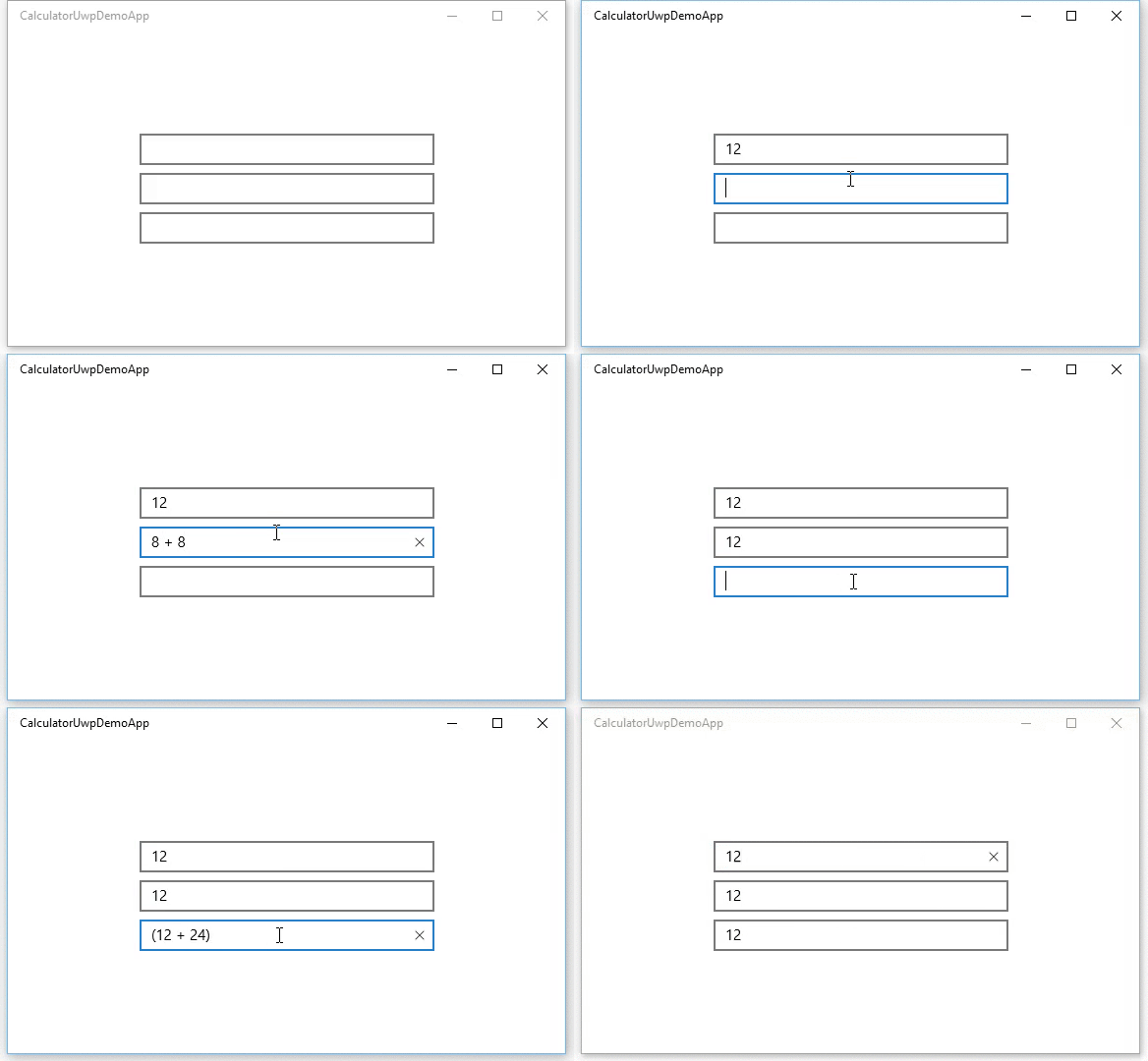
Input validation It would be nice if the control would validate all input. It wouldn't allow (for example) to enter the decimal separator twice. A CanBeNegative (bool) and DecimalsPlaces (int) properties would also be needed.
I have tried to implement this as a Behavior but I think a NumberBox control is more suitable and easier to discover. https://github.com/sonnemaf/NumberBoxBehavior
Up/Down buttons It would be nice if you can set a flag which allows met to add '+' and '-' buttons next to the NumberBox. A Minimum and Maximum properties would be nice.
Currency support Support for currency input.
Accessibility and Inputs
For Narrator users, ensure the Up/Down buttons + increment can be stated and clearly understood, as opposed to "plus" and "minus".
Will Xbox controller need any focus trapping to ensure the analog sticks and D-Pad will function as expected?
Open Questions
Does anyone have any real app scenarios that justify needing support for hexadecimal or binary?
Is there value in creating a preview for calculation results? @mdtauk created a few example visualizations: