 mdtauk
commented
5 years ago
mdtauk
commented
5 years ago This should be a wider project than just the rounded corners on buttons etc as used by Fabric.
- Buttons
- Spinners/ProgressRing
- Indeterminate ProgressBar
- Checkboxes & Radio Buttons
- ComboBoxes and TextFields And so on.
Xbox will continue to have different requirements, but with a new set of Xbox consoles on the way, perhaps the Microsoft Design teams can work together to align everything in time for WinUI 3.0 and Xbox Next.
Fabric seems to be getting a lot of focus at the moment, what with it's cross platform and PWA use cases. So perhaps Fabric becomes the blueprint - at least for the Compact Density, and move from 2px to 4px as a minimum measurement - and then you extrapolate the touch affordances and fill out the missing control states.


The ThemeShadows will need to account for the rounded corners. And Acrylic surfaces should probably include inner and outer borders to ensure they appear elevated from the backgrounds.
 chigy
chigy Ignore the Xbox stuff
  Felix-Dev
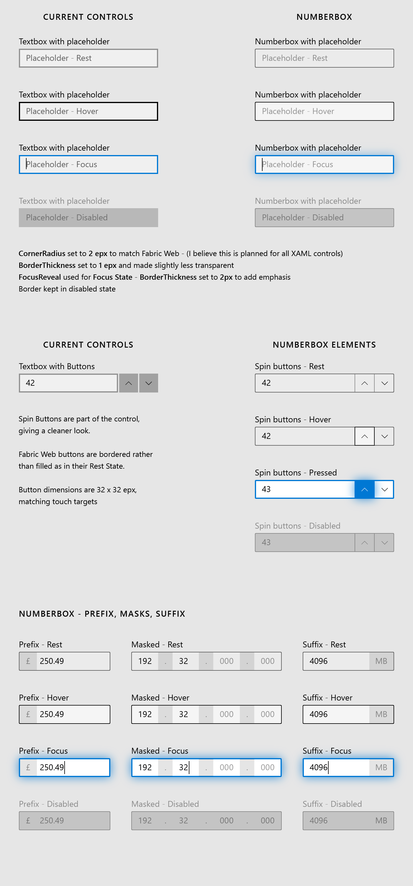


 mrlacey
 Zucce05

 Neptune-mk2
 19lmyers
 dphfox
 Tourniquet88
 quantumfrost
 zag2me
Proposal: Update default control styles with rounded corners and make them easy to customize
Corner Radius (aka Rounded Corner) How-To document PR is created.
This will be added to docs.microsoft.com as a documentation. It will be a new page under https://docs.microsoft.com/en-us/windows/uwp/design/style/.
Ask to community: I am trying out writing a little more "background explanation (WHY)" that our customers have expressed we provide with our documentation in some of our focus groups. I would like feedback as this does not follow normal documentation pattern.
Are those extra information useful/helpful, not relevant, other info missing, etc.?
Summary
Update default control styles with rounded corners and make them easy to customize. Developers should not have to retemplate the controls to "unround" the corners or round them further.
Rationale
Problems today:
XAML controls are inconsistent with how web and mobile apps are evolving – this highlights the inconsistency across app ecosystem on Windows when these UI are used intermixed with each other.
There are many different levels of corner rounding in the market today but the way XAML controls are architected require those developers who wants to update to retemplate all the controls, locking them to a version of the control that will not be able to take advantage of future updates as easily.
Functional Requirements
Important Notes
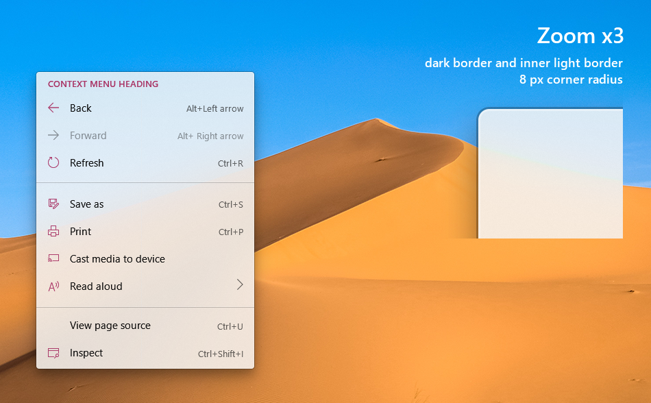
There are three categories of changes being proposed (requirement number 1.1, 1.2, and 1.3) and here are mock up of those.
Here are relevant visual comp files: https://github.com/microsoft/microsoft-ui-xaml-specs/tree/user/chigy/roundedcorner/active/RoundedCorner/ImageFiles
Courtesy of @mrlacey , we have this easier to view version of the above file folder: https://github.com/mrlacey/microsoft-ui-xaml-specs/blob/RoundedCornerVisualizations/active/RoundedCorner/ImageFiles/index.md
Form type controls (req 1.1) • Button • CheckBox • ComboBox • DropDownButton • Slider • SplitButton • ToggleButton • ToggleSplitButton • Flipview • GridView • ListView • TreeView • ContentDialog • AutoSuggestBox • PasswordBox • RichEditBox • TextBox • DatePicker • CalendarDatePicker • Tab control
Popup/transient menu type controls (req 1.2) • CalendarDatePicker • DatePicker • TimePicker • Flyout • TeachingTip • ToolTip • DropDownButton • SplitButton • Slider • AutoSuggestBox • CommandBarFlyout • MenuFlyout • ComboBox • ColorPicker • MediaPlayerElement • ContentDialog • MenuBar • ToggleSplitButton
Bars (req 1.3) • NavigationView • Pivot • ScrollIndicator • ProgressBar • Slider • ColorPicker • MediaPlayerElement • WebView (not a part of XAML change)
User Feedback
Windows 10 Reddit Thread
Open Questions