 adrientetar
commented
5 years ago
adrientetar
commented
5 years ago @sapallie, could you make the design mockups accessible publicly? Unless they're not to be shared at this point.
Closed sapallie closed 2 weeks ago
adrientetar
commented
5 years ago @sapallie, could you make the design mockups accessible publicly? Unless they're not to be shared at this point.
 mthomason
commented
5 years ago
mthomason
commented
5 years ago Currently doing XAML development, and I'd love to see something like this. Or, something like a nice scrolling message control.
From a Microsoft branding standpoint, a standardized error banner seems like it could go horribly wrong. I'd fear end users associating every application error with the Microsoft brand. I just read the proposal, and first thing that came to mind was memelords tweeting about the flashy banner of death.
 sapallie
commented
5 years ago
sapallie
commented
5 years ago @sapallie, could you make the design mockups accessible publicly? Unless they're not to be shared at this point.
Sorry @adrientetar, I can't share them just yet. The designs are Microsoft only for now.
 SavoySchuler
commented
5 years ago
SavoySchuler
commented
5 years ago @sapallie, thank you for this phenomenal feature idea! I am a Program Manager for WinUI and I am excited to pitch this to the team!
I wanted to write a little bit about our process so that you can be in tune with how we'll proceed from here. Starting now, I'll work to refine the high-level scope/requirements of this proposal and the justification for the development. Then I will pitch it to the rest of the WinUI team and we will deliberate on whether it aligns with our Road Map (#717) and if we think we can act on it relatively soon. If so, I'll be approved to figure out the details and begin spec writing so that the feature will be ready for a developer.
Here are few things I already know I need to get a bit more of an idea for...
Is your proposal for an edge-to-banner? Or a notification tile like what Windows Notifications do but in the app window such as the in the center, along the bottom edge, or in a corner?
Sorry @adrientetar, I can't share them just yet. The designs are Microsoft only for now.
I don't think I would be able to get this proposal approved without being able to include a public visual of the request as the repo is open source and close-sourcing the visual side of the conversation would entangle the process and experience for our community. Based on responses to the above, I am happy to take a shot at drafting a mock up for the proposal. Would you prefer this or do you have a timeline envisioned for granting your permission to make your design public? I love your mockup and would be eager to have them included in our brainstorming here lest we unnecessarily take the discussion in a divergent direction to your intention. Please let me know! :blush:
The banner will make users aware of errors that prevent them from using an app/a feature
The banner will be dismissable for non-critical errors
Am I correct in reading these statements to mean you also need to have the option for a non-dismissable bannerfor critical errors? If so, could you tell me more about your specific app scenario for recieving one/proceeding from the point of having a non-dismissable banner? Are the users relegated to close the app unless the problem is solved? Or is this where the buttons would come to, say, navigate them to the Network & Internet settings page?
Thanks again and I look forward to refining this idea!
 mdtauk
commented
5 years ago
mdtauk
commented
5 years ago I would like to say, there are a few proposals that all ask for a similar thing. Rather than make this specifically an Error banner - why not just bring in the In App Notification from the Community Toolkit. There could be an icon property added, which would make it show an error icon, or a confirmation icon, etc.
sapallie
commented
5 years ago @SavoySchuler – good to hear from you. I tried to answer all your questions but please let me know if you need anything else.
Visual behaviour: Ideally the banner would be similar to a Windows Notification tile and would either be pinned to the top or bottom of the app window. Where it’s pinned depends on the other visual elements in the app and where the focus lies. This decision should be made by a designer. I think the GIF @mdtauk posted would be a great starting point.
Dismissing: I think it’d make sense to dig deeper into what I mean with critical vs. non-critical errors:
And I think all of these should be dismissible (I updated that in the proposal description as well)
Example visuals
I did a few changes to the visuals and am able to share them like this:
 These examples are an iteration where the entire banner is basically a big button. Users can dismiss it or click on it to go to the system settings (critical error), open a web page with details about feature fixes (warning 1), reload the app page (warning 2) or go to the Microsoft store to update the app (informational).
It’d be possible to expand this concept to add multiple buttons within the banner.
These examples are an iteration where the entire banner is basically a big button. Users can dismiss it or click on it to go to the system settings (critical error), open a web page with details about feature fixes (warning 1), reload the app page (warning 2) or go to the Microsoft store to update the app (informational).
It’d be possible to expand this concept to add multiple buttons within the banner.
mdtauk
commented
5 years ago I really like those visuals for the banner. I would move the text and icon up by 4 px, so they are centred in the white area, rather than the white and coloured bar.
 Felix-Dev
commented
5 years ago
Felix-Dev
commented
5 years ago Agreed. The posted visuals look quite nice.
 mrlacey
commented
5 years ago
mrlacey
commented
5 years ago I really like those visuals for the banner. I would move the text and icon up by 4 px, so they are centred in the white area, rather than the white and coloured bar.
I haven't counted the pixels but it looks as if these are centered if the space for diacritic marks above the X-height is accounted for.
mrlacey
commented
5 years ago @sapallie Have you made any thought about allowing these controls to be automatically, or programmatically dismissed?
If prompting about being/going offline, it would make sense to programmatically remove such a prompt when online again. (I've seen apps not do this and it can lead to a confusing experience.)
Similarly, having non-essential messages not displayed indefinitely can avoid unnecessary UI clutter and can prevent power users from needing to get out of flow once they've read a message by not forcing them to manually dismiss the notification.
I understand that there are potential extra accessibility considerations around such a control and these behaviors but I believe these ways of dismissing the control are essential.
mrlacey
commented
5 years ago I think it is important to call out that such a control is not intended for general messaging within an app. Unless that really is a desired use case.
mrlacey
commented
5 years ago Should an app be allowed to display multiple banners at once? If so, how will they be arranged? And is this something that the app can control?
mdtauk
commented
5 years ago This would satisfy those who have asked for an Android Toast style in app notification control, it could also possibly be useful for validation scenarios, to display error text where space in the form is at a premium.
I would also call it something like a StatusTip or StatusNotification so it won't only be associated with negative uses.
I assume the design would adapt by changing the placement on the solid colored bar when it is placed at the bottom of the window?
It should probably have a timeout property, and could even have the ability to show a pending message, like a progress ring and some text like "Logging in now" before switching to a confirmation of error message.
mdtauk
commented
5 years ago I really like those visuals for the banner. I would move the text and icon up by 4 px, so they are centred in the white area, rather than the white and coloured bar.
I haven't counted the pixels but it looks as if these are centered if the space for diacritic marks above the X-height is accounted for.

I think it was more likely that the text was vertically centred in the box without taking into account the coloured bar


Here is how the coloured bar placement could change with the placement of the control
sapallie
commented
5 years ago @mrlacey yes, programmatic/automatic dismissal for when the banner is not relevant anymore is quite important – I added it to the proposal description.
Status changes and errors: That’s what the banners should be used for. Not general messaging – I agree on that.
And I think multiple banners should work. They should just be stacked.
sapallie
commented
5 years ago @mdtauk I renamed it “Status banner” – thanks for your suggestions.
For the loading state – I don’t believe that should happen in the banner. Loading content should be displayed in the app where the content would actually appear.
And when it comes to changing the placement of the coloured bar – it’d be great to have the flexibility there depending on where the error banner is placed in the app window. 👍
mdtauk
commented
5 years ago Issues #622 and #792 could also be covered by this control, if it were to be built.

SavoySchuler
commented
5 years ago @sapallie Your note on critical error circumstances is interesting with respect to the suggested guidance that status banners point the user to a solution. My intuition is saying that you may also need an API to disable, or at least temporarily dismissability?
I understand that there are potential extra accessibility considerations around such a control and these behaviors but I believe these ways of dismissing the control are essential.
@mrlacey, great callout! Fortunately, I have worked through a significant portion of this during consideration of timed auto-dismiss on TeachingTip, and while some partnering with teams that own accessibility settings would be necessary, I do not believe this feature would be blocked on account of accessibility concerns. +1 on all your other points!
mdtauk
commented
5 years ago Could there be the ability to add a HyperlinkButton linking to a solution, or to a settings shortcut, like Networking?
SavoySchuler
commented
5 years ago Could there be the ability to add a HyperlinkButton linking to a solution, or to a settings shortcut, like Networking?
I was envisioning the subtext containing a hyperlink to an in-app or Settings App (see TeachingTip's Xaml Control's Gallery Code) page. Were you thinking of something more standardized @mdtauk?
mdtauk
commented
5 years ago @SavoySchuler Content property instead of MessageText?
sapallie
commented
5 years ago Your note on critical error circumstances is interesting with respect to the suggested guidance that status banners point the user to a solution. My intuition is saying that you may also need an API to disable, or at least temporarily dismissability?
Yeah, possibly I guess… Definitely doesn’t hurt to add it. It adds flexibility after all and will probably be quite useful for some use cases.
SavoySchuler
commented
5 years ago @mdtauk - Yes, I certainly mean content property!
@sapallie
Your note on critical error circumstances is interesting with respect to the suggested guidance that status banners point the user to a solution. My intuition is saying that you may also need an API to disable, or at least temporarily dismissability?
Yeah, possibly I guess… Definitely doesn’t hurt to add it. It adds flexibility after all and will probably be quite useful for some use cases.
On one-hand you have a non-dismissable pop-up covering the UI (and possibly causing its own scenario-based error in doing so) and on the other you an have app warning/critical error that is non-persistent which also makes my spidey-senses tingle.
Perhaps rather than an over UI + tip-style pop-up, would an in UI + edge-to-edge banner (the likes of which is used by the Office Suite to notify about updates - see below) meet the needs while also being afforded persistent space in your UI?

mdtauk
commented
5 years ago @SavoySchuler There could be a behaviour on the control, where it puts the header and content on a single line, if the control width is wide enough.
My earlier suggestion with the different positioning layouts would also work if the control slides out from the edge of another control - not just within the window or panel.
sapallie
commented
5 years ago Perhaps rather than an over UI + tip-style pop-up, would an in UI + edge-to-edge banner (the likes of which is used by the Office Suite to notify about updates - see below) meet the needs while also being afforded persistent space in your UI?
Yeah, that works too. 👍
SavoySchuler
commented
5 years ago It seems like it would be ideal to have both inline and overlay options as in retrospect the Office Suite is able to rely on all of their apps having a Ribbon. @mdtauk I like your suggestion that's starting to hint at how we think about appearance/disappearance behavior.
@all, can anyone share with me specific scenarios in your real apps where you envision this control being used? Specifically, I am interest in thoughts on visual entrance and the user interaction required to prompt dismissal? Do the requirements here cover the core behaviors you need from this control?
mdtauk
commented
5 years ago @SavoySchuler Considering Entrance and Exit, it could slide in from an edge, but also animate in as a floating overlay if the developer chooses. Sliding in from the right edge of the screen at OS level - from the right edge of an app window, or out towards from the edge of a control or UI element.
There is a close button for dismissal, but for touch displays, the ability to slide it in the reverse direction from where it emerged could also work. To ensure consistency, this needs to be built into the control.
Tapping the control should probably trigger an action which the message text would specify. The exception would be for displaying the progress of an action which would not be dismissable until it times out with an error or successfully completes.
Animated Examples
 Enter, Update, Exit - YouTube Link
TeachingTip exists and is a good way to target a specific Control or UI Element, and good for highlighting a new feature in an app. It could technically be used for the same purposes as this StatusBanner, so some thought needs to go into the semantic use of each of these, and identify what makes each unique.
Below are my personal thoughts about the differentiation between Status Banner and Teaching Tip
Status Banner I believe should be encouraged for actual actionable statuses, and so should invoke a single action when tapped.
When an app or OS condition changes, that is necessary for the app, then that should trigger a Status Banner to show.
Status Banner should either persist when showing, unless dismissed with the Close button, or perhaps a swipe when in touch. With the exception for an ongoing progress scenario completing, or OS status resolves (Network is restored).
Status Banner should be used in the OS Shell in a consistent way - there could be a set of standard localised banners with content, icons, colours, as an enum.
There could be some OS logic to append Status Banners to app windows. For instance when an app tries to access the network, and it is unavailable, the OS could show a standard Status Banner within the app window, rather than in screen space, or leaving it to developers to implement.
SavoySchuler
commented
5 years ago @mdtauk, fantastic work on the videos! 🎉 They are beyond helpful in bringing life to these ideas.
The need for persistence is an excellent point and I think the dismiss feature could also be mitigated with Guidelines that suggest making the status notifications persistently available in a notification pane if critical or, possibly resurfacing them at non-invasive intervals if problems persist. These are not definite assertions, just points of consideration to make in ensuring that this solution is appropriately comprehensive in its scenario solution.
The need to distinguish TeachingTip from this feature is spot on and I agree with your points. This control would serve a distinct need that TeachingTip was not designed to solve though there may be opportunity for some shared features or code.
Are there any stakeholders that would not have their needs met by something like what @mdtauk has shared above?
mrlacey
commented
5 years ago There seems to be differences between the Status Banners mocked-up in the OP and the full-width notification as seen in Office (images above in earlier comments) or Visual Studio (as below)
The differences between the two mean I wonder if they should be the same control or separate ones.
Here's a quick list of properties that each would need. (names for example, not fixed but intended to infer meaning)
Status Banners
Full-width Notifications
Only the properties in bold exist in both. Icon is potentially confusing as different types of icon (in a circle, or outline) are needed for each type. There would also need to be a property to indicate which style to use.
To me this feels like there is too much difference for a single control and putting all this functionality together would be confusing and complicated. I think these two concepts:
will provide the most value and least confusion as separate controls.
mrlacey
commented
5 years ago How would animated status banners support displaying multiple notifications at once? Or is this now out of scope?
mrlacey
commented
5 years ago
- Status Banner should be used in the OS Shell in a consistent way - there could be a set of standard localised banners with content, icons, colours, as an enum.
- There could be some OS logic to append Status Banners to app windows. For instance when an app tries to access the network, and it is unavailable, the OS could show a standard Status Banner within the app window, rather than in screen space, or leaving it to developers to implement.
This level of OS integration shows ambition beyond a single control and beyond WinUI.
Would "standard localised banners" be all that's available or would these be in addition to being able to have something fully customizable? If providing some by default, what will they be? I would be concerned that only providing a limited set of options would be unnecessarily limiting of the potential of such a control.
Having the OS show banners in the open app for system wide scenarios like loss of network connectivity raises a number of concerns for me.
The action center already provides a way of providing system wide notifications.
With multiple windows open, seeing banners displayed in each seems unnecessarily intrusive.
Having the system display notifications (banners) within an app is something I would expect developers to want to control or disable.
If an app only occasionally needs a network connection, seeing a prompt about a loss of connection could be disconcerting or distracting for the user if not relevant to what they are currently doing.
This would tie apps to specific versions of the OS to get updates or desired behavior. A future change in the OS function might break or change an app in undesirable ways.
Updates and bug fixes would only be available at OS level release schedules. Part of the reason behind the existence of WinUI is to break that coupling with the OS and app functionality.
One of the goals of such a control as is described here is to make it easy for developers to implement. Removing their ability to control it would cause issues for apps where specific scenarios must be handled in custom ways.
 michael-hawker
commented
5 years ago
michael-hawker
commented
5 years ago Just found this issue from the Twitter post about the animated mock-ups. It does seem to overlap a lot of the work we've done with the InAppNotification control in the toolkit. Including things like how multiple messages are handled.
We've learned that while this appears like a simple control, it's pretty complex. It'd be nice to have a holistic solution that can be built-in to WinUI though to cover all these cases. Then we can deprecate the toolkit control.
SavoySchuler
commented
5 years ago Conferring with @ryandemopoulos, and I want to refactor this initial conversation a little to focus on the problem (need for error UI) before the solution (any specific piece/pieces of error UI).
To this end, my first goal is to lock down the scenarios and requirements for error UI (@sapallie, your "Critical: wifi connectivity lost" scenario is a perfect start). From there, we can work together to decide if the solution includes one piece of error notification UI or set of error UI components. From which, we'll expand @mrlacey's break down of API similarity (thank you for starting this) to decide if there's enough commonality for a derivation approach vs. distinct controls if there are several outputs of this conversation. I don't want to get ahead of myself but @mrlacey's argument for distinct solutions is already looking crisp and that's OK. My focus is on creating the right set of solution pieces for everyone here.
So, for anyone (@sapallie, @adrientetar, @EverydayApps @Felix-Dev, @mdtauk, and @mrlacey) that this control is particularly relevant to, could you provide me the following here or dm @ saschule@microsoft.com:
SavoySchuler
commented
5 years ago I have updated the Issue to reflect this problem-focused approach and I have cataloged the requirements, scenarios, and solution possibilities described so far.
@sapallie I tried to be courteous as I could in preserving your initial work. Version history is viewable under the "edited by..." drop down at the top of the issue. Please let me know if I did not capture anything correctly.
SavoySchuler
commented
5 years ago I pitched this to the WinUI team and we believe that the functionality defined here would be capable of serving not just error messages but long-lived app-wide status messages as a whole. This includes "update available" and "back-up complete" kind of status messages in addition to error-specific scenarios.
I have updated the issue to reflect this more holistic approach. I am hoping to finalize requirements and scenarios in the coming weeks so that we may being examining the necessary UI output pieces for displaying these messages.
I will rephrase my request above. @sapallie, @adrientetar, @EverydayApps @Felix-Dev, @mdtauk, and @mrlacey, for status/error messages you wish to display in your applications, could you provide me the following here or at saschule@microsoft.com:
adrientetar
commented
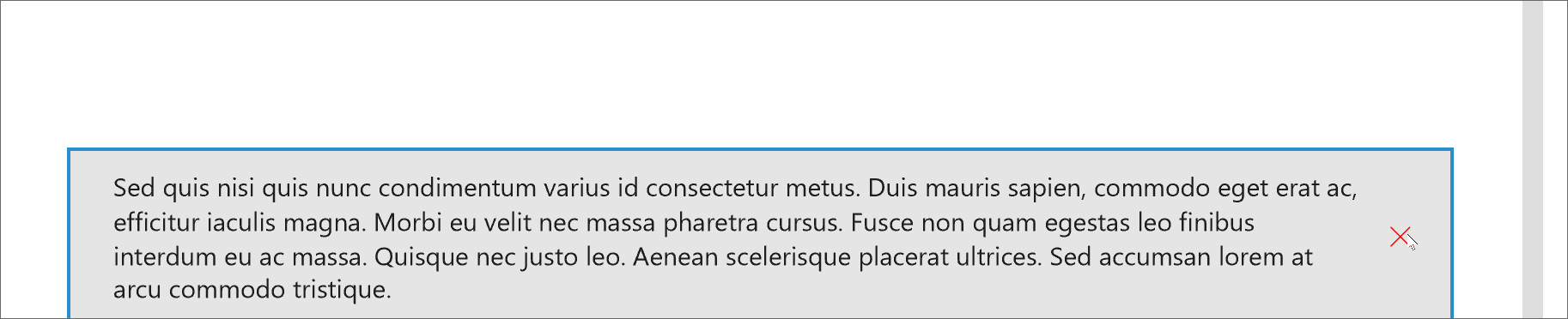
5 years ago It's worth noting that, imo, popup dialogs should be avoided if possible. The web is full of popups prompts everywhere and they interrupt the flow trying to catch your eye. For instance, I think empty status (example) should be preferred e.g. if something could not be loaded in a control.
With respect to the visuals @mdtauk posted, do we really need popups displaying from all four edges of the screen/app? The point of WinUI should be to standardize the position and look of such items so all apps would use the same, and in that respect, Android Snackbar is an obvious reference. Another thing to note with Snackbar is does not display errors with a bright red color or anything, it has a sober appearance which I think is again beneficial in not distracting the user too much from what he's doing.
We'll also need guidance on when to use this popup instead of a dialog for instance, otherwise it'll just create fragmentation (different apps using the messaging controls in different ways).
mdtauk
commented
5 years ago Flyouts have a placement concept, this control could do the same thing. Appears from the inner edge of a container control, be it a Page or Tab Content are, etc.
@adrientetar Not every app is the same, so whilst there will be a default for this control, there needs to be a way for developers to change this location, without having to re-template, or re-engineer the control.
Office uses the space below the Ribbon. Edge uses the bottom of the screen. Only Windows itself, would be able to attach it to the Shell or Screen edges, and there is probably a good reason to prevent apps from mimicking system level alerts.
Plus any developer has the ability to restyle their own alert controls, so at this stage, it needs to be as flexible as possible, and then the Shell team will have some say into what restrictions go into the control usage.
mdtauk
commented
5 years ago The Your Phone team have one of these kinds of controls, so maybe you could ask them what issues they came across, and persuade them to move to using the WinUI control when its done and included?

adrientetar
commented
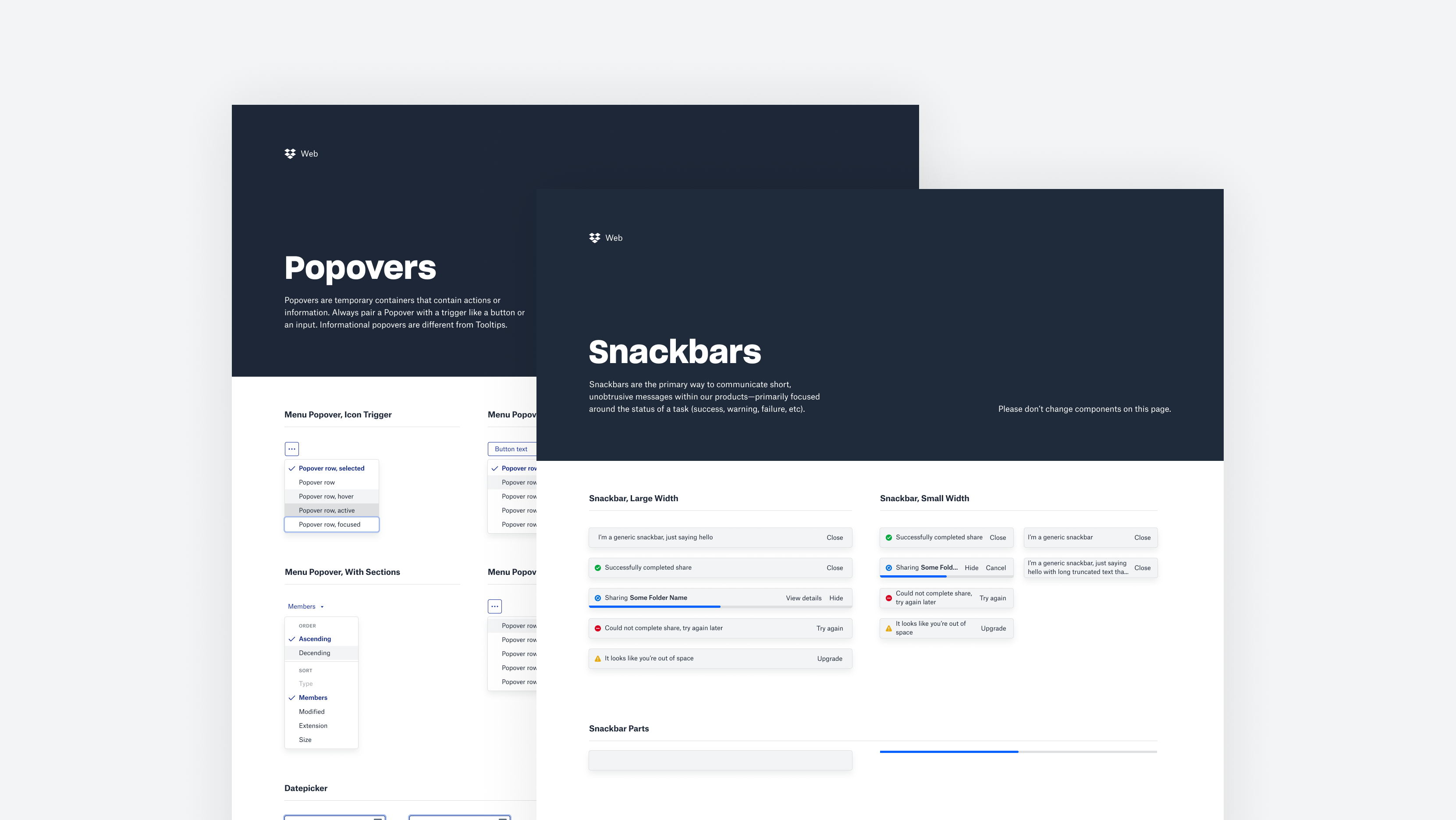
5 years ago Dropbox also using Snackbar in their design system (scroll down, second to last row of images).
 ryandemopoulos
commented
5 years ago
ryandemopoulos
commented
5 years ago Recently spotted a couple more examples of long-lived, app-wide status messages:
("recording started" message in Teams)

("trying to connect to the game coordinator" in Dota 2)

Sorry these are small--the first picture was snapped from my desktop with an ultrawide monitor. :)
 lukasf
commented
5 years ago
lukasf
commented
5 years ago Some dropbox snackbars contain a progress bar at bottom. Should this be included here? It can make sense e.g. for stuff like upload, download, update, sync progress. It's not a must-have imo, but maybe could or should?
 shaheedmalik
commented
5 years ago
shaheedmalik
commented
5 years ago Should these be rounded? Or no?
michael-hawker
commented
5 years ago Yeah, I think the key differentiation here from Teaching Tip is that apps want to coordinate their messaging space and may have multiple error/status updates to display at the same time (or in succession).
I think ideally, this is one control that the developer configures and places within their app and then pipes messages too (which I'd imagine have some sort of type to denote if it's error, status, warning, or some other general message).
In both the banner and pop-up case, I've seen apps which may have multiple messages. Sometimes they stack the banners which then dominate the UI real-estate, so it'd be nice if this solution avoided that (though nothing would prevent a developer from using multiple instances of the control to re-create that behavior still).
I'm surprised we also haven't called out VS Code, as they have their stacking pop-up notification panels on the bottom-right that also have additional action buttons on them too (to jump to settings for instance).
michael-hawker
commented
5 years ago VS Code Example Screenshot:

They have different types of icons that appear on the top-left, customizable button actions, and the ability to have the 'gear' icon to configure settings about the notifications per extension, in their case.
mdtauk
commented
5 years ago Just seen this screenshot of Cortana...

 kmgallahan
commented
4 years ago
kmgallahan
commented
4 years ago Office UI Fabric's MessageBar looks great, IMO:

 Poopooracoocoo
commented
4 years ago
Poopooracoocoo
commented
4 years ago i've noticed that Samsung Notes for Windows 10 uses notification toasts to explain that a note was discarded because there was nothing in it which is so annoying
 gabbybilka
commented
4 years ago
gabbybilka
commented
4 years ago Hi everyone! I'm a Program Manager for WinUI and am picking this proposal back up from @SavoySchuler. There's been a lot of great discussion and idea sharing already in this thread, thank you for all of your suggestions!
As it's been several months since there's been some activity here I wanted to check back in with everyone and re-iterate where we are currently.
As a summary of our current scope at the top of the proposal:
Please feel free to comment and let me know if I've missed anything in my scope summary or if you disagree. I want to be sure we're all on the same page before moving forward 😊
Now that we’ve defined the scope, there are a few specific scenarios and user experiences that still need to be defined. My hope is that defining these experiences will help guide the UI affordances for the control. What are your thoughts for your scenarios? CC: @sapallie, @adrientetar, @EverydayApps @Felix-Dev, @mdtauk, @mrlacey
The experiences are:
Thank you again for all of your thoughts and I look forward to bringing this to light!
mdtauk
commented
4 years ago Glad to see this proposal has not been forgotten @gabbybilka and thank you for taking it on!
If it is at all possible, you could contact those working on first party apps that include these kinds of notification UIs to make a list of requirements, for them to move from their custom solution, to a WinUI native control. Their needs, combined with the community's wants and needs, should cover enough for a V1 of this control.
@chigy would be someone to talk to about final design specs, as she works with the Fluent Design teams.
Microsoft should lead by example with this, if others are to be encouraged to use a consistent WinUI control.
Those are the apps that come to mind.
michael-hawker
commented
4 years ago @gabbybilka we also have the control in the Windows Community Toolkit, so happy to talk about that with you at any time. It'd be really great to have an upgrade path for our users here and migrate it from the Toolkit to WinUI.
I think from your initial summary that has most things covered, but could be good to call out something around having optional, actionable buttons as well? Or would that always just be custom content?

Proposal: UI for Long-Lived App-Wide Status Messages
Summary
Add new UI for long-lived app-wide status messages for scenarios such as updates available or errors that may occur which prevent the user from experiencing an app or its features working as intended.
Rationale
Scope
Scenarios
Critical Scenarios:
Non-critical Scenarios:
Design mockups:
Status Card
They are similar to Teaching tips but should be used for prompting users about errors or important status changes.
Status Bar
In-app-UI banner similar to what is currently in use by M365:
Your Phone App error message:
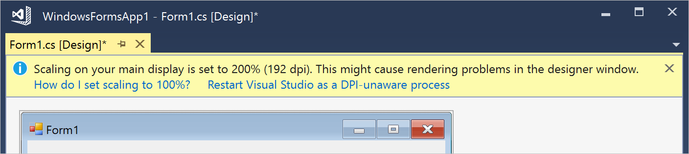
VS Designer banner showing 2 separate links:
"Recording started" message in Teams:
InAppNotification
Port from Windows Community Toolkit to appear from the edge of the app window as an overlay UI control.
Open Questions
Scenarios/Requirements for this UI: