 Poopooracoocoo
commented
5 years ago
Poopooracoocoo
commented
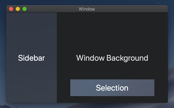
5 years ago I think that there should be some contrast between the NavigationView and the content.
Open carmellolb opened 5 years ago
Poopooracoocoo
commented
5 years ago I think that there should be some contrast between the NavigationView and the content.
 carmellolb
commented
5 years ago
carmellolb
commented
5 years ago I think that there should be some contrast between the NavigationView and the content.
Agreed, there should be some, but there may currently be bit too much. Also, an inset facing shadow and a lighter color would be another way to direct users' attention to the right. Keeping the current shadow that is on some when in small but clicked mode and adding an inset shadow when in expanded would be a solution that would justify having less contrast between the panes.
Poopooracoocoo
commented
5 years ago I just want to point out the differences between XAML Controls Gallery and Settings

carmellolb
commented
5 years ago I just want to point out the differences between XAML Controls Gallery and Settings
The Settings app's sidebar is not the standard NavigationView sidebar, which is why it still uses Background Acrylic. The NavigationView sidebars use a plain grey color.
Poopooracoocoo
commented
5 years ago Neither of those windows were in focus. I just wanted to draw a comparison between the two. @carmellolb
 Felix-Dev
commented
5 years ago
Felix-Dev
commented
5 years ago I'm still scratching my head why MS is so focused on getting rid of seemingly any kind of background acrylic for the navigation pane.
Let me propose a compromise (basically something @carmellolb already proposed but we didn't get a direct MS response to it so far if I'm correct):
There is a clear difference between the current acrylic background in the Settings app and the background acrylic used by the Windows Shell Flyouts (such as jump lists). The latter background acrylic "blocks out" much more of the background than the former does yet it's still enough to not produce a solid and boring looking single background color. (Note: I used the Windows Dark Theme for the system and apps.)
I implore MS (@YuliKl, @chigy) to consider the Windows Shell Flyout Background Acrylic for the Navigation View pane because it a) addresses the complaints by MS (the background "shine through" effect is so faint that there really isn't anything distracting or attention inviting by it) yet b) also gives us Windows 10 aesthetic lovers and Fluent Design fans something to still look forward to with this change.
Please, please consider it!
carmellolb
commented
5 years ago I'm still scratching my head why MS is so focused on getting rid of seemingly any kind of background acrylic for the navigation pane.
Let me propose a compromise (basically something @carmellolb already proposed but we didn't get a direct MS response to it so far if I'm correct):
There is a clear difference between the current acrylic background in the Settings app and the background acrylic used by the Windows Shell Flyouts (such as jump lists). The latter background acrylic "blocks out" much more of the background than the former does yet it's still enough to not produce a solid and boring looking single background color. (Note: I used the Windows Dark Theme for the system and apps.)
I implore MS (@YuliKl, @chigy) to consider the Windows Shell Flyout Background Acrylic for the Navigation View pane because it a) addresses the complaints by MS (the background "shine through" effect is so faint that there really isn't anything distracting or attention inviting by it) yet b) also gives us Windows 10 aesthetic lovers and Fluent Design fans something to still look forward to with this change.
Please, please consider it!
Agree 100%. While that may be not that transparent, it is LIGHTYEARS better than a solid color, and does not distract. Please do not take the all or nothing approach. You ask for our feedback, we are giving it to you. Please take us seriously. Add the shell’s Acrylic to NavigationView. Please.
@YuliKl @chigy
 YuliKl
commented
5 years ago
YuliKl
commented
5 years ago @Felix-Dev, @carmellolb, thank you for your persistent and passionate advocacy on this topic. We're listening. I'm not able to promise any immediate changes but appreciate hearing your opinions. I will try!
Poopooracoocoo
commented
5 years ago I just noticed that the search bar outline is invisble in XAML Controls Gallery
YuliKl
commented
5 years ago I just noticed that the search bar outline is invisble in XAML Controls Gallery
Yes. We were experimenting with a new design direction that didn't work out. We should probably revert that local change to the AutoSuggestBox control template. @Poopooracoocoo, if you could open an issue in the Gallery repo to fix this, that would be helpful.
YuliKl
commented
5 years ago Update about NavigationView
We would like to align with the upcoming UI Fabric approach to coloring their sidebar control. UI Fabric will not be using acrylic and will continue to use solid greys. The proposal is for NavigationView's pane in expanded mode to use SystemControlBackgroundChromeMediumLowBrush.
Thoughts on this proposed change?
 yoshiask
commented
5 years ago
yoshiask
commented
5 years ago Why shouldn't some kind of acrylic be used if it's available? UI Fabric doesn't have acrylic in its Nav View because it doesn't support it. But WinUI has access to the composition APIs, so why shouldn't it be used as the previous feedback suggested?
YuliKl
commented
5 years ago Why shouldn't some kind of acrylic be used if it's available?
I've attempted to capture the primary reasons for this in https://github.com/MicrosoftDocs/windows-uwp/issues/1661#issuecomment-495414399. There's more related discussion in #761.
Felix-Dev
commented
5 years ago @YuliKl It might be worth pointing out that with the new Windows ToDo update the ToDo team chose to now use background acrylic for their navigation pane and feedback regarding this UI change (and the other UI changes) seems to be quite positive (see https://twitter.com/MicrosoftToDo/status/1171046517182009344). In fact, the used background acrylic there has a much "weaker" effect than the effect of the background acrylic in the Setting app. It strongly goes into the direction me and others such as @carmellolb called for as a compromise. Alas.... it doesn't appear we have any chance to convince the Microsoft Design Team....even though teams at MS itself are following our idea here.😑
About the proposed solid colors: You know my actual background preference already 😉
carmellolb
commented
5 years ago @YuliKl And you also know my preference. I think the lack of Acrylic is ridiculous, and a simple inset shadow (as mentioned in a post here: https://github.com/microsoft/microsoft-ui-xaml/issues/1291) could potentially solve the problem of distraction, by making it seem as if the pane on the right is in the front. I'm not sure what this stuff is even about, I think there are way simpler solutions than to remove Acrylic.
But if you still feel that it shouldn't be there, I think the colors you proposed may work.
 mdtauk
commented
5 years ago
mdtauk
commented
5 years ago Rather than remove Acrylic altogether, why not implement a less Transparent opacity version by default?
 ismaelestalayo
commented
4 years ago
ismaelestalayo
commented
4 years ago I'm still scratching my head why MS is so focused on getting rid of seemingly any kind of background acrylic for the navigation pane.
Let me propose a compromise (basically something @carmellolb already proposed but we didn't get a direct MS response to it so far if I'm correct):
There is a clear difference between the current acrylic background in the Settings app and the background acrylic used by the Windows Shell Flyouts (such as jump lists). The latter background acrylic "blocks out" much more of the background than the former does yet it's still enough to not produce a solid and boring looking single background color. (Note: I used the Windows Dark Theme for the system and apps.)
I implore MS (@YuliKl, @chigy) to consider the Windows Shell Flyout Background Acrylic for the Navigation View pane because it a) addresses the complaints by MS (the background "shine through" effect is so faint that there really isn't anything distracting or attention inviting by it) yet b) also gives us Windows 10 aesthetic lovers and Fluent Design fans something to still look forward to with this change.
Please, please consider it!
I really think that Felix's idea is a good compromise, specially since when in Dark Theme with a really bright background (or the opposite) the current acrylic background of the NavigationPane is too eye catching, and so taking attention that should be on the Content.
Also, i'm gonna kill two birds with one stone and also say that I think there should be an option for high end PC to have acrylic visible for all windows and not just the active one (I know that the reason for not being always visible was for performance, but I'd be willing to take that hit for a more pleasant interface).
YuliKl
commented
4 years ago @Felix-Dev, @carmellolb, @mdtauk, @yoshiask, @ismaelestalayo - I hear what you're all saying. I'm just a lowly program manager, not a designer, so the decision to put back acrylic really isn't up to me. Nor do I have any real influence over what apps (created by other teams at Microsoft or 3rd-party) have chosen to implement.
I'm trying to work within the constraints of the design system as I understand them. So I've suggested a solid color that hopefully feels less random and less drab than the current NavigationView implementation and better aligns with other Microsoft controls frameworks.
mdtauk
commented
4 years ago @YuliKl I don't think any of us expect a change like this to be made arbitrarily by one person. Bringing the request to the attention of those on the design team that mandate these changes. So hopefully once XAML's code is lifted from the OS and added to WinUI, then these changes become easier to implement, if we are able to persuade "The powers that be" to reconsider the loss of Acrylic - as well as how Acrylic fallback works for Desktop PCs on AC Power etc
carmellolb
commented
4 years ago @Felix-Dev, @carmellolb, @mdtauk, @yoshiask, @ismaelestalayo - I hear what you're all saying. I'm just a lowly program manager, not a designer, so the decision to put back acrylic really isn't up to me. Nor do I have any real influence over what apps (created by other teams at Microsoft or 3rd-party) have chosen to implement.
I'm trying to work within the constraints of the design system as I understand them. So I've suggested a solid color that hopefully feels less random and less drab than the current NavigationView implementation and better aligns with other Microsoft controls frameworks.
We totally understand what you’re saying, but if you are just a program manager and designers never speak on here, then what is the point of even having this GitHub issues page if they can never be fixed? Is it possible to pass this along to the design team maybe?
 chigy
commented
4 years ago
chigy
commented
4 years ago @carmellolob , could you provide data that validates your original rationale? Where are these data coming from? While we are not at all perfect yet, but we are working to be more data driven when it comes to design decisions and changes and trying to understand where your rationale are coming from.
mdtauk
commented
4 years ago Design is often subjective, and is not something that can be entirely driven by data and telemetry. It was simpler when there was Acrylic and that Acrylic had a default fallback colour. Use AcrylicBrush, get Fallback colour.


Microsoft has the resources to run usability studies, and to do A/B testing with users in apps. Not all of us do.
This conversation about the choice of grey should probably be tackled by looking at all colours used as defaults from everything to content backgrounds, to Titlebar colours. ( #920 )
Part of the design team's goal has been making Windows more familiar with other platforms. The Acrylic made sense, because it is familiar with macOS and iOS which uses it's Vibrancy material with it's navigation surfaces.

The need for a fallback makes sense on low powered devices, but is arguably more distracting on a desktop PC which has the power available to use the effect on all windows. Aero Glass was performant enough on Windows 7.
chigy
commented
4 years ago This conversation about the choice of grey should probably be tackled by looking at all colours used as defaults from everything to content backgrounds, to Titlebar colours. ( #920 )
@mdtauk , you are right. That's why we do not want to be making any changes to this until other, higher priority design discussion settles and sets the right directional decisions. We do not want to be changing things multiple times so rather not do anything at this time unless there is a data that suggests the usability of the control is compromised.
mdtauk
commented
4 years ago This conversation about the choice of grey should probably be tackled by looking at all colours used as defaults from everything to content backgrounds, to Titlebar colours. ( #920 )
@mdtauk , you are right. That's why we do not want to be making any changes to this until other, higher priority design discussion settles and sets the right directional decisions. We do not want to be changing things multiple times so rather not do anything at this time unless there is a data that suggests the usability of the control is compromised.
Hopefully a case can be put forward for reconsidering Acrylic. Or Introducing a new Material for these kinds of surfaces (without strong performance implications hopefully). Oh and a recommendation for all apps like Your Phone, to extend into the titlebar! (Like with Settings, Alarms + Clock, To Do, Mail + Calendar, etc)
carmellolb
commented
4 years ago @carmellolob , could you provide data that validates your original rationale? Where are these data coming from? While we are not at all perfect yet, but we are working to be more data driven when it comes to design decisions and changes and trying to understand where your rationale are coming from.
- The current grey has too much contrast with the white or black.
- The current grey distracts the user and directs their attention to the wrong place.
- The current grey looks very unappealing.
@chigy
Yes, the grey that is currently being used has a very strong contrast with the white. It is darker than the white, and Acrylic was too, except the white background is the same material (or lack of) as the grey pane, therefore the attention is drawn to the grey pane. With the Acrylic, it was a different material than the plain white so the attention was drawn kind of not to a specific place, because the white was important, because of its brightness, and the Acrylic was also important, because of its different material. If you want to 100% draw attention to the panel on the right, why not re-add the BG Acrylic, then add an inset shadow to the NavigationView when in expanded mode by default so it makes it look like the main pane on the right is in front? You already have an image on your NavigationView page showing the inset shadow (https://docs.microsoft.com/en-us/windows/uwp/design/controls-and-patterns/images/nav-header.png), and if you re-added the BG Acrylic and then added an inset shadow, it would be perfect.
Where does this data come from? Well visual hierarchy is all about what the eye goes to, and I am a user and can tell you first hand that in my opinion and lots of others, the visual hierarchy and frankly the entire experience would be WAY better with Acrylic back and an inset shadow added.
carmellolb
commented
4 years ago This conversation about the choice of grey should probably be tackled by looking at all colours used as defaults from everything to content backgrounds, to Titlebar colours. ( #920 )
@mdtauk , you are right. That's why we do not want to be making any changes to this until other, higher priority design discussion settles and sets the right directional decisions. We do not want to be changing things multiple times so rather not do anything at this time unless there is a data that suggests the usability of the control is compromised.
Hopefully a case can be put forward for reconsidering Acrylic. Or Introducing a new Material for these kinds of surfaces (without strong performance implications hopefully). Oh and a recommendation for all apps like Your Phone, to extend into the titlebar! (Like with Settings, Alarms + Clock, To Do, Mail + Calendar, etc)
Agreed. Also I think the idea about the titlebars is definitely something Windows needs.
chigy
commented
4 years ago @mdtauk , @carmellolb , thank you for continued enthusiasm for your desire to have acrylic use for NavView's background. I heard your feedback and will consider for future. However, let me set an expectation that this is not something we have a priority from design discussion perspective. I'll be sure to bring up your points when the time is right.
Poopooracoocoo
commented
4 years ago I've noticed that despite some built-in apps (finally) switching to WinUI, they still have acrylic NavigationViews. Might as well just use acrylic.
mdtauk
commented
4 years ago Tablet Mode, and WinUI 3.0 - should use a faux version of Acrylic, using the Wallpaper image, and the blur, blending mode, and noise effects pre-applied.
This fauxcrilic would be a fallback between full live Acrylic, and the Solid Colour, and need not be a temporary fill in, but a performance option.
The Tint would be applied live, so the same Acrylic image can be used for Light, Dark, And coloured Acrylic scenarios.
Felix-Dev
commented
4 years ago @mdtauk I'm not sure I'm following you here. Acrylic (and with that "fauxcrilic") was ruled out for the non-transient NavigationView pane because it was suggested to be "distracting" among other things. I and others suggested as a compromise to use an acrylic brush like Microsoft To Do does with a greater Tint opacity but that apparently was ruled out as well. So I'm not seeing how "fauxcrilic" should come into play here. If an acrylic background is to be used here, it should be one similar to the MS To Do app.
mdtauk
commented
4 years ago @mdtauk I'm not sure I'm following you here. Acrylic (and with that "fauxcrilic") was ruled out for the non-transient NavigationView pane because it was suggested to be "distracting" among other things. I and others suggested as a compromise to use an acrylic brush like Microsoft To Do does with a greater Tint opacity but that apparently was ruled out as well. So I'm not seeing how "fauxcrilic" should come into play here. If an acrylic background is to be used here, it should be one similar to the MS To Do app.
I am also in favour of the NavigationView using a more subtle Acrylic by default. I previous suggested an 80% tint.
But my comments still count, as WinUI 3 won't support Acrylic at launch, and Tablet Mode turns it off.
Performance and some perceived distraction are the reasons it was removed. Increasing the tint and providing an alternative fallback with WinUI 3 support, would address both as a control default
Felix-Dev
commented
4 years ago @mdtauk
Performance and some perceived distraction are the reasons it was removed.
The main reason given by MS for the removal of the default acrylic background of the non-transient background was this:
As Fluent continued to evolve, we came to the realization that, thanks to its translucent qualities, acrylic’s most effective usage is in providing a visual bridge between layers of app UI. When NavigationView’s pane is placed side-by-side with the app content, this visual bridge is unnecessary and is in fact distracting because the acrylic invites unrelated content to shine through. To uphold the Fluent principles and ensure that the design system’s guidance about acrylic remained coherent for all app developers, we felt it was necessary to remove the background acrylic from NavigationView’s expanded pane and avoid implementing a style contradictory to acrylic best practices.
(Taken from here.)
Look at the calculator app. That app has a much larger acrylic background surface. If the performance impact of the Settings navigation pane using background acrylic really was significant enough to warrant a *global' change for WinUI's NavigationView, then I'm sure the calculator app would also have removed that as a default background by now (with an option to enable it).
Besides, Windows explicitly gives users the opportunity to disable acrylic in Windows Settings, so if they somehow are using a device configuration where acrylic background has a noticeable performance impact, they can always deactivate it. With this option in place, performance shouldn't be the reason to remove acrylic as the default non-transient pane background for the NavigationView. Especially as I'm under the impression the average Windows 10 user won't have noticed any significant performance impact here.
So, to my understanding, it should be reasonably assumed that the overwhelming reason why this was changed was a change in direction for when to use acrylic based on the visual aspect.
Anyway, perhaps MS Design is more open to your "fauxcrilic" suggestion than it was to our updated tint opacity proposals.
mdtauk
commented
4 years ago @Felix-Dev With Apple doubling down on their translucent sidebars in iOS and macOS - maybe Microsoft can be persuaded to change this default - until then, I will always push for it (and a less 'distracting' tint than the 60% used for settings.
Speaking of Apple legitimising UI, now Apple is getting Widgets (Live tiles) maybe Microsoft can row back on that decision in 10X. 😁 And we get Tiles made from xaml or c#UI - as well as XML content...
mdtauk
commented
3 years ago So I am wondering if this proposal can be closed, now WinUI 2.6 has introduced the new Mica material?
https://docs.microsoft.com/en-us/windows/apps/design/style/mica
Proposal: Change NavigationView's background from plain grey to another color or material
Summary
I personally believe BG Acrylic should be added back, but if it can't, the current grey definitely shouldn't stay. It draws users' attention unnecessarily to the left pane when it should be drawn to the main section on the right.
Rationale
Scope
Proposed fix
[proposed by Yulikl] We would like to align with the upcoming UI Fabric approach to coloring their sidebar control. UI Fabric will not be using acrylic and will continue to use solid greys. The proposal is for NavigationView's pane in expanded mode to use
SystemControlBackgroundChromeMediumLowBrush.