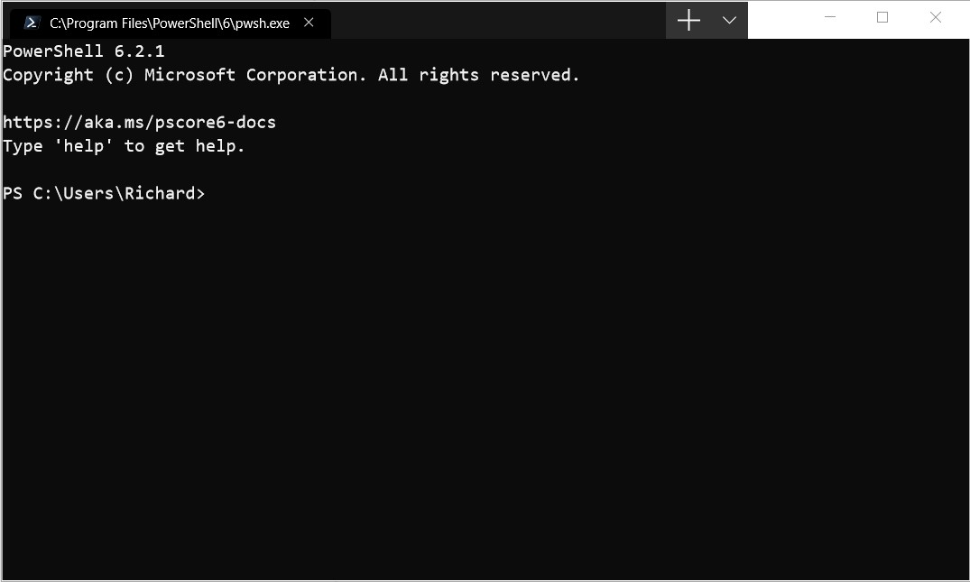
The plus glyph will probably shrink, I commented on the TabControl issue, and it seems they will push the change, to match the smaller glyph used by UWP Edge.

Closed DHowett-MSFT closed 1 year ago
The plus glyph will probably shrink, I commented on the TabControl issue, and it seems they will push the change, to match the smaller glyph used by UWP Edge.

Yeah, I think we can all agree "make the tabs like Edge Chrome" is nice, but "make the tabs like the promo video" is even better ... 😣
I think the UWP Edge had nicer tabs than Edge Chrome. 🤔
Personally I wish they'd make Edge Chrome's tabs like UWP Edge, but nobody asked me...
Yeah, yeah, but ... either of them is waaaay ahead of Terminal 🤡 Edgium has almost 20 pixels above the tabs that are ugly ... but ... draggable! And with both of them, you can at least tell which tab is active 🙄
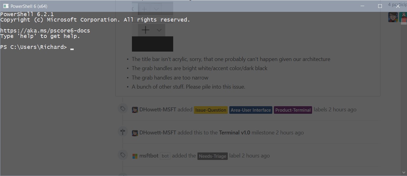
There is no PRACTICAL use for acrylic when coding. However transparency is very useful. It means I can view code beneath the Terminal window like this:
 Please add an adjustment for the BLUR factor that acrylic uses. I can't read blurred out text.
 Also if the Terminal did not go black when inactive like this:
 it would be really useful to be able to have a pin button which pinned the terminal above all other windows. This would enable seamless switching between the terminal and whatever code editor you are using (especially if you can read code beneath the Terminal window.)
I suggest that the acrylic theme should stay active instead of "going black" if an "Always on top" feature is added and enabled.
What it could look like:
 The pin icon, to pin the Terminal above all windows.
@nacorv,
I would like to know if "Always on top" is a feature that would be considered.
Selecting and dragging anywhere within the tab area currently does not move the window. This makes it necessary to move the mouse to the right of the tab area, which leaves a very small amount of titlebar which can be used to move the window. Please change this. No rush!
-abc appear near invisible.Resolution: 4K Display Scaling: 100%
Light theme:

Dark theme:


Resizing the window causes the UI to disapper/reappear. I am using the Windows Store Preview Version 0.2.1715.0
Fullscreen:

Resized:

If the window is not big enough, all the other tabs are hidden.
If the tab bar can't be acrylic, that's a major shame. Anything that can be done to make them integrate better would be most welcome
The non drag-able tab/title bar is the #1 complaint I've heard from everyone that has tried the early builds
Split panes need some visual polish, make it clear which is in focus, some animation even as it opens
When maximised on my 2nd monitor (1366x768 laptop built-in display, not set as main), the edges of the app are cut off:

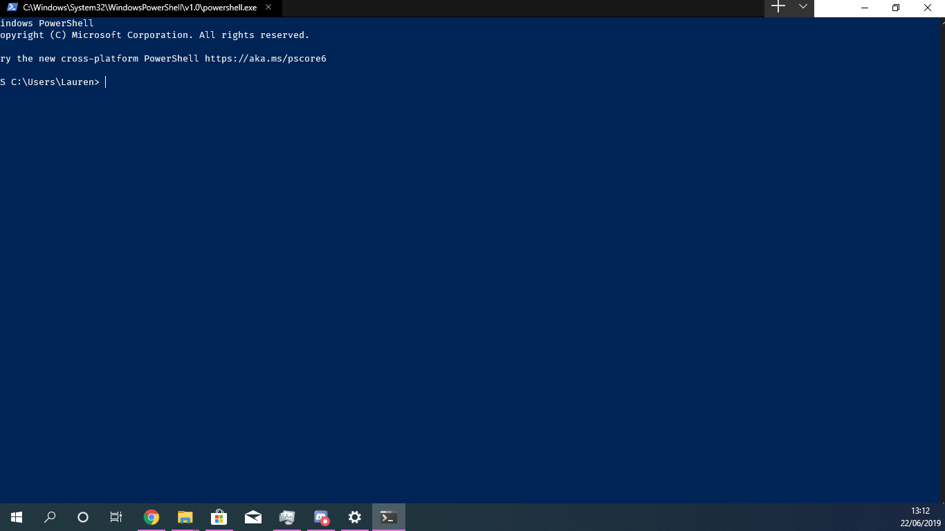
Tabs show the path to the executable instead of the name of the app; if the path is too long, the "x" to close the tab is pushed off the right side of the tab and is invisible.
Clicking "Settings" attempts to open a JSON file. I'm guessing that the UI for that hasn't been built yet. :)
As an addition to @robster2001's comments, it'd be nice if each tab showed the actual path like Ubuntu and if it was in administrator mode (e.g. Command Prompt (Admin) - C:\current\path\that\you\are\in).
When you don't have terminal maximized, as I usually don't, the issue #857 combined with the long titles allows for much less tabs than what it could be.
The tabs are just too wide to be useful. Perhaps just show the executable and give the path/etc information when you hover over the tab in a tooltip or something.
Two things: Panes are not bound by default because they are incomplete. If you enable them yourself, YMMV.
If you want a custom tab title, you should look at how to set that up for your shell. It’ll benefit you everywhere you use your shell. By making powershell set the title, you change the title for Windows Terminal, legacy console, VSCode, ConEmu and a bunch of other things. It can even change in the middle of a session!
Panes epic: #1000
I couldn't find anywhere along the caption at the top of the window that allowed me to drag and move the window. I had to resort to keyboard shortcuts.
two-finger scrolling doesn't work, although it works great on cmd.com and PowerShell.
Tabs cannot be moved/rearranged.
Default bar does not respect the Win10 Dark Theme:

I tried to find settings, but didn't find it! Some other apps does not respect either, so I think is not considered on this version
My first impression of Terminal, installed today via the Store preview was:

Is there anything we can do about the color of the titlebar? It should be all black, right?
+1 @guibirow
Messing around with my windows settings I could fix it:
Active (Firefox in the back, Terminal in front)

Inactive (Firefox in the back, Terminal in front)

Looks like some applications continue to load the settings from windows, maybe windows dark theme does not set all collors correctly, I had to enable the option to apply the accent to title bar and window borders.

And set the AccentColorInactive in the registry [_Computer\HKEY_CURRENTUSER\Software\Microsoft\Windows\DWM]
The design would be much better if the "+ \/" moved to the left (like below) and the rest become just the title bar like all other applicaitons, I think they tried to copy firefox and didn't work very well!

I can't 'pop a tab out' or drag it to another window. I'd like that feature.
Where Emoji font when used for example yarn, npm ?
Tab titlebar definitely needs cleaning up. Based on the official video made to promote the Terminal, and Edgemium, I came up with these changes (mock ups):
Before:
 After:

Full list of changes in mock up:
EDIT: This was just an issue with the bottom line not being large enough to fit a whole character, as pointed out by @DHowett-MSFT below
Padding (bottom) is not 0 when maximized. Not sure if this is a known issue or intended, so putting it in this thread.
@mikelui huh, that's probably because there aren't enough pixels to fit another whole character cell on screen. the Terminal much prefers to display full rows, as that's how it models the terminal world.
Fullscreen:
Resized:
If the window is not big enough, all the other tabs are hidden.
If you rotate the mouse wheel, you will see the tabs slide. It works for atleast for Store Terminal Preview v0.2.1715.0 . But narrowing of icons, such as Chromium-based browsers, would be more nice.
@DHowett-MSFT Also i found out another gui bug, if window too small for showing new tab and we create a new tab, new tab created but not show until we re-size the Terminal window.
Microsoft Windows 10 Pro Insider Preview [Version 10.0.18875.1000] Microsoft Terminal (Store Preview) [Version 0.2.1715.0]

@DHowett-MSFT Yes! I see that now while playing around with sizing. I'm used to using fullscreen (vs maximized), where the lack of a title bar makes the spacing better.
Make the initial window size as I left on previous time when closing.
grabbing and moving the application is not easy, need a larger area to grab the window. The whole path of the exe is overkill, it takes too much space. just Powershell node or python in cmd , tab can show "cmd : node" or "cmd : python"
Tabs can have the color theme of the scheme used in that specific terminal instead of just darker black or fade black, similar color to the terminal scheme may make finding a terminal easy.
edit
few more issues found
Also, not that important compared to other missing/broken UI things but still: the mouse pointer should be the text one (Ꮖ) when moving over some text in the terminal and not the pointer (↖) one since text is selectable.
Any chance Alt+F4 behaviour can mimic other Windows 10 functionality (close everything now) please? Ctrl+w * how ever many tabs are open is quite laborious. As is finding the top right X when I am in keyboard warrior mode :D.
I've tried setting closeWindow in settings.json but alt+F4 does not register as a valid command (console prints "S").
Out of curiosity, would it not be possible to use the underlying APIs that support WPF’s WindowChrome, cut out the native title bar and window borders entirely and build it all using XAML? I feel there’d be more control available this way and the end result would be cleaner and less dependent on the OS
I was initially expecting that split screen feature would have been already there, but it's not... It would be much more convenient than navigating between tabs.
Terminator on Linux and iTerm on macOS has it neatly implemented.
Any plans?
Selecting and dragging anywhere within the tab area currently does not move the window. This makes it necessary to move the mouse to the right of the tab area, which leaves a very small amount of titlebar which can be used to move the window. Please change this. No rush!
see #1500
@LeeChang-GitHub #608, also, you know powershell and CMD have a way to set the title themselves, right? You don’t need to rename the tab when you can make the shell do it.

I need the name of the terminal to be editable. I searched for this question but couldn't find it. Is this a reasonable requirement?
Dude, why did you delete your comment and move it after my response?
Dude, why did you delete your comment and move it after my response?
Sorry, that question was too bad. I edited it again, and I didn't receive your reply at that time. so sorry
@LeeChang-GitHub it’s okay! 😄
I would like to know if "Always on top" is a feature that would be considered.
@grigala
I was initially expecting that split screen feature would have been already there, but it's not... It would be much more convenient than navigating between tabs.
Terminator on Linux and iTerm on macOS has it neatly implemented.
Any plans?
Scrollbar should ignore the right padding or expand to the right when hovered. It is fine if it takes in count the top and the bottom.

Scrollbar in its collapsed form

Scrollbar in its wide form
The scrollbar in its collapsed form looks alright. The space between the text and the line is ok, but should follow the padding preferences. Right now it doesn't.
The scrollbar in its wide form follows the padding only on the right side and has some, but not the preferred, padding on the left side. The left padding should follow the preferences and the right padding should completely disappear. This would allow users to quickly throw their mouse cursor to the right when they wanna quickly scroll up a long distance and the window is maximized.
Additionally the scrollbar should have no delay of expanding when hovered and the scrollbar background should be transparent, so the blur (if toggled on) can be visible.
Edit: This has been resolved in #1778. Thanks!!
Most Apps (like Chrome, or explorer.exe etc) allow user to resize the window by grab on the Window's shadow. But It seems that terminal only allow user to grab on a narrow NotClient Area(about 2 pixels). Seem's the system default shadow doesn't work?
I have a possible solution.
Besides, Use Window Subclassing technology to capture message and send WM_SYSCOMMAND when handling WM_LBUTTONDOWN may fix the proble that title bar can't be grabbed.
To expand on https://github.com/microsoft/terminal/issues/1375#issuecomment-504686188, Terminal should maybe organize themes into theme family names and light/dark subcategories, sort of like VSCode. I.e. if I set the theme to e.g. "Campbell" and switch Windows app colors from light to dark, I'd expect Termianl to switch from Campbell Light to Campbell Dark. This would save manual fiddling. Specifying "Campbell Dark" as the theme would pin appearance to the dark theme, if you always want it to be dark. Or something.
The tabs space doesn't resize correctly when moving the window between monitors with different scalings, in some cases covering even the minimize button:
Monitor 1, 1920x1080 resolution, 100% scaling:

Monitor 2, 4k resolution (3840x2160), 200% scaling:

Cursor color should be defined by the theme. The default cursor color set in the profile is white, which is useless on a light theme.
I am creating this so I can pin it & to help keep track of several related issues/work-items.
Things we know:
Cascade Windows,Show windows stackedetc is completely ignored by TerminalThings related to tabs:
Things that people want, but we won't be able to fix:
Things fixed in v0.6:
Things fixed in v0.5:
Things fixed in v0.3: